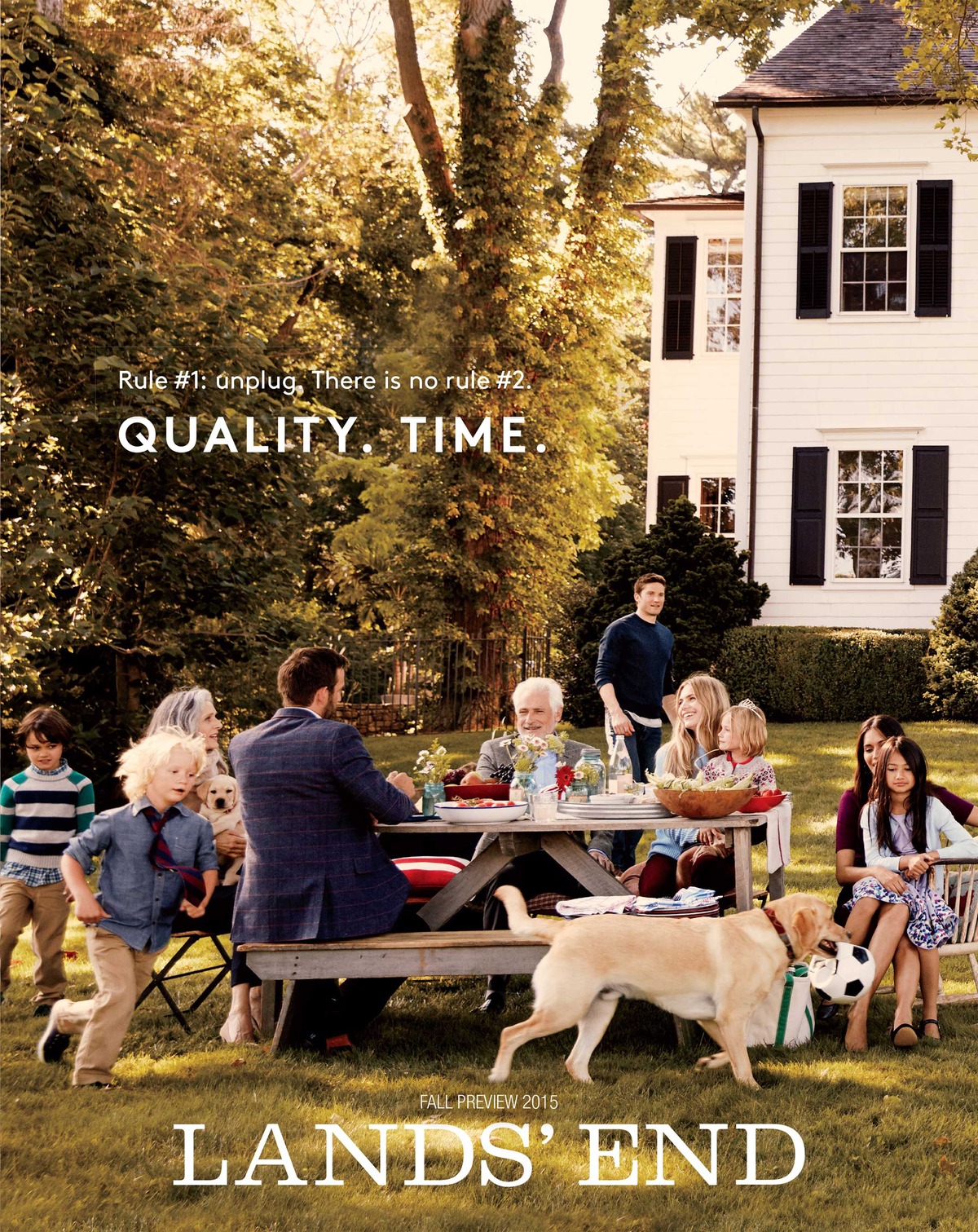
Lands’ End, a quintessential American retailer, began its journey in 1963 with an unassuming yet ambitious goal: to provide high-quality yachting supplies through mail-order catalogs. Founded by Gary Comer in Chicago, alongside gold medalist sailors and business partners, the company quickly earned a reputation for reliability and craftsmanship. Its name, inspired by Land’s End in Cornwall, England, reflects its nautical origins, though a typographical error in the company name famously remained due to early budget constraints. Over time, Lands’ End grew beyond its maritime roots to offer casual clothing, home furnishings, and luggage, embodying a distinctly American approach to timeless style and functionality.
By the 1980s, Lands’ End had cemented its place as a leader in mail-order retail, bolstered by a commitment to customer service and cutting-edge technology. Its relocation to Dodgeville, Wisconsin, in 1978 allowed for larger operations, including expanded catalog production and robust customer support systems. The company embraced early e-commerce opportunities, becoming a pioneer in live chat services and online retail. International expansion followed, taking Lands’ End from its Midwestern base to homes across the globe. Recognition from *FORTUNE Magazine* as one of the “100 Best Companies to Work For” underscored its focus on both employees and customers.
Throughout its history, Lands’ End has weathered changes in ownership, fashion trends, and consumer habits. Its acquisition by Sears in 2002 marked a new chapter, followed by its spinoff as an independent company in 2014. Despite these shifts, the brand has remained true to its roots: quality, practicality, and an understated elegance. From outfitting the U.S. national rugby team to designing everyday staples for families, Lands’ End continues to honor its legacy as a trusted name in American retail.
Y2K Lands End TV Commercial
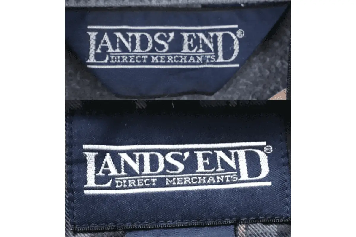
How to tell if Lands’ End is vintage from the logo
Lands’ End has undergone notable transformations in its branding over the decades. The logo is a key indicator of its vintage and has evolved in its font style, layout, and accompanying graphics. By examining specific design elements in the logo, collectors and enthusiasts can determine the era from which a particular piece originates.
1980s to 1990s Lands’ End logo
- The logo features a clean serif font with the apostrophe placed prominently between “LANDS” and “END.”
- It is framed by horizontal lines at the top and bottom, lending it a formal and classic design.
- Often accompanied by the tagline “Direct Merchants” below the main text, emphasizing its focus on direct-to-consumer sales during this period.
1980s to 1990s Lands End logo
2000s Lands’ End logo
- The logo retains the serif font but adopts a slightly bolder appearance compared to the earlier design.
- Horizontal framing lines remain, but the tagline “Direct Merchants” is no longer a standard part of the logo.
- The overall design reflects a transitional phase, bridging the classic style of the 1980s and 1990s with more modern branding approaches.
2000s Lands End logo
2010s Lands’ End logo
- The font style shifts to a bold, blocky design, with a more contemporary and simplified aesthetic.
- The iconic lighthouse graphic, a hallmark of Lands’ End branding, is integrated prominently alongside the text.
- The logo’s layout emphasizes minimalism, with a focus on the bold text and graphic elements for a modern look.
2010s Lands End logo
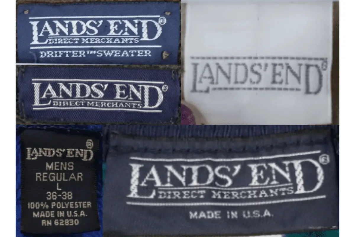
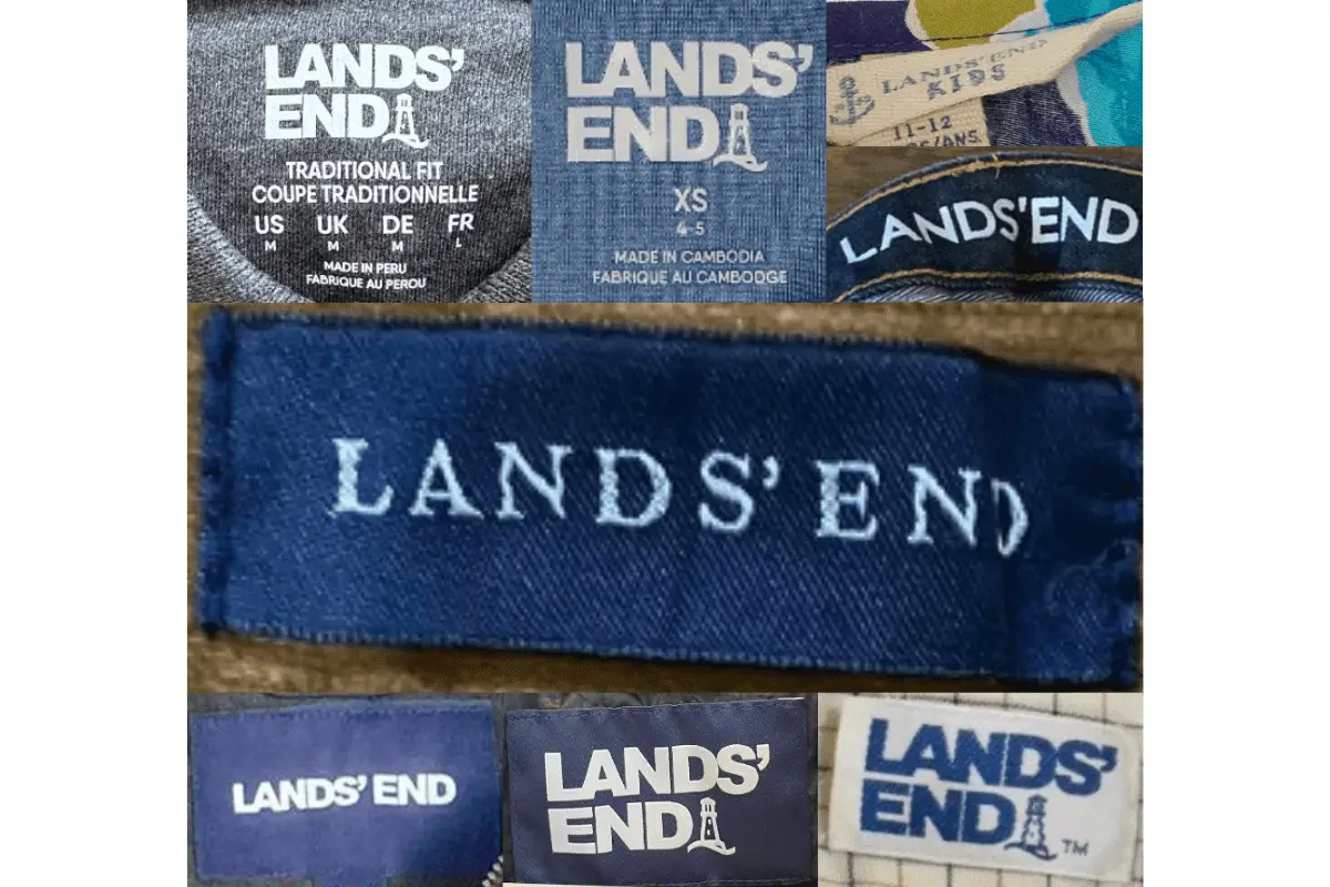
How to tell if Lands’ End is vintage from the tags
Lands’ End has undergone significant changes in its branding over the decades, with its tags reflecting these shifts. Early designs emphasized their heritage as “Direct Merchants,” while later tags incorporated more modern elements, including the use of the iconic lighthouse logo. These variations provide a reliable way to date vintage Lands’ End garments.
Need help with vintage tags or labels? Submit a picture on our vintage tag identification page, and we’ll assist you!
1980s vintage Lands’ End tags
- Tags prominently display “Lands’ End Direct Merchants” in bold, serifed white lettering on a dark blue background.
- Features additional text such as “Made in USA,” emphasizing the brand’s manufacturing origins.
- The designs are minimalist but convey a classic and premium feel associated with the brand’s heritage.
1980s Lands’ End tags
1990s vintage Lands’ End tags
- The phrase “Lands’ End Direct Merchants” is still central to the tag design, often accompanied by product-specific details (e.g., “Drifter Sweater”).
- Maintains the dark blue background with white serif lettering, a hallmark of the brand during this era.
- Some tags feature size and material information in a separate section below the logo.
1990s Lands’ End tags
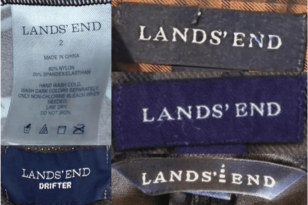
2000s vintage Lands’ End tags
- Introduction of updated tag designs with simplified layouts while retaining the “Lands’ End” branding.
- Tags sometimes feature “Made in USA” or country-of-origin details such as “Made in Cambodia,” reflecting a shift in manufacturing practices.
- Logos become slightly sleeker but still rely on serif fonts to maintain the brand’s classic aesthetic.
2000s Lands’ End tags
2010s vintage Lands’ End tags
- The iconic lighthouse logo begins to appear on tags, often accompanying the “Lands’ End” text.
- More diverse tag designs with different font styles and layouts, including sewn-in and printed formats.
- Country-of-origin and size details are more prominently displayed, catering to modern retail standards.
2010s Lands’ End tags


El juego responsable es un conjunto de principios y prácticas diseñadas para minimizar riesgos y evitar daños a los jugadores en la industria del iGaming.
Los operadores deben implementar herramientas de autolimitación , como pausas obligatorias, para fomentar la moderación.
Además, implica la verificación de la edad de los usuarios y protocolos de alerta temprana para identificar señales de riesgo.
casino 1xbet
Representa acceso a líneas de ayuda y guías sobre riesgos asociados al juego.
Dicha práctica no solo cumple con estándares legales, sino que mejora la reputación de las empresas en el sector.