Sears, Roebuck and Co. holds a storied place in American retail history, tracing its origins back to 1886. Richard Warren Sears, a former railroad station agent, founded the company after a fortuitous opportunity to purchase and resell watches. Teaming up with watch repairman Alvah Curtis Roebuck, Sears moved the burgeoning business to Chicago in 1887, where the first mail-order catalog was published. This initial venture into catalog sales laid the groundwork for what would become one of the most influential retail giants in the United States.
By the early 20th century, Sears had diversified beyond watches and jewelry, offering a vast array of products through its catalog. This innovative approach revolutionized shopping for rural Americans, who previously relied on local general stores with limited selections and high prices. The Sears catalog, affectionately known as the “Consumers’ Bible,” provided a comprehensive and affordable alternative, featuring everything from clothing and household goods to farm equipment and even automobiles. The company’s commitment to quality and value helped it weather economic downturns, solidify its customer base, and expand its reach across the country.
The mid-20th century marked Sears’ transition from a mail-order powerhouse to a dominant brick-and-mortar retailer. Opening its first department store in Chicago in 1925, Sears pioneered new retail strategies, including suburban locations with ample parking, and a diverse product mix that catered to both men and women. This period of expansion included the development of iconic brands such as Kenmore, Craftsman, and DieHard. As the retail landscape evolved, Sears continued to innovate, opening the world’s tallest building, the Sears Tower, in 1974. However, the latter part of the century brought challenges, and the company faced increased competition and strategic missteps, ultimately leading to its decline. Despite these setbacks, the legacy of Sears endures, symbolizing a significant chapter in the history of American retail.
80s Sears Musical Commercial
How to tell if Sears is vintage from the logo
Sears has undergone several logo changes throughout its history, reflecting the brand’s evolution and market positioning. Identifying the era of a Sears logo can help determine if a product is vintage. Below is a guide to the Sears logos from various periods, detailing their characteristics to help you date your vintage Sears items.
1886 to 1923 Sears logo
- This early Sears logo features a simple, serif font.
- The text reads “Sears, Roebuck and Co.” in a straightforward, unembellished style.
- The design is monochromatic, typically black on white or white on black.
1886 to 1923 Sears logo
1923 to 1945 Sears logo
- The logo from this era maintains the serif font but includes a circular emblem.
- The text “Sears Roebuck and Co.” is placed within the circle, often with a clean, bold outline.
- The design becomes slightly more sophisticated with a balanced, centered layout.
1923 to 1945 Sears logo
1945 to 1949 Sears logo
- This period sees a return to a more straightforward text-based logo.
- The font is bold and slightly condensed, emphasizing the “Sears” name prominently.
- “Roebuck and Co.” is still included but in a smaller, less emphasized font.
1945 to 1949 Sears logo
1949 to 1960 Sears logo
- The logo features a stylized, elongated serif font.
- Sears” is the focal point, with “Roebuck and Co.” in a secondary position below.
- This era’s design is clean and modern, reflecting mid-century aesthetics.
1949 to 1960 Sears logo
1953 to 1960 Sears logo
- The font becomes more stylized with unique, extended serifs.
- Sears” remains prominent, with “Roebuck and Co.” continuing to be secondary.
- The logo exudes a more contemporary and sleek appearance.
1953 to 1960 Sears logo
1960 to 1965 Sears logo
- The design adopts a bold, sans-serif font.
- Sears” is prominently displayed, often without “Roebuck and Co.
- The logo reflects a shift towards modernism and simplicity in branding.
1960 to 1965 Sears logo
1961 to 1965 Sears logo
- Similar to the previous era, this logo uses a bold, sans-serif typeface.
- The emphasis is on “Sears,” with minimal or no reference to “Roebuck and Co.
- The clean lines and bold font reflect a continued focus on modern design trends.
1961 to 1965 Sears logo
1964 to 1968 Sears logo
- The logo features a more elongated sans-serif font.
- Sears” is the primary element, with “Roebuck and Co.” often omitted.
- This design represents the brand’s streamlined and contemporary approach.
1964 to 1968 Sears logo
1968 to 1981 Sears logo
- This era’s logo features a simple, elegant serif font.
- The text is black, placed within a white rectangular background.
- The design reflects the minimalistic aesthetic prevalent in the late 1960s and 1970s.
1968 to 1981 Sears logo
1981 to 1984 Sears logo
- The logo retains the serif font but appears bolder compared to the previous version.
- The black text remains, emphasizing the brand’s established identity.
- This era’s logo is often associated with a transition period in the company’s design philosophy.
1981 to 1984 Sears logo
1984 to 1994 Sears logo
- The logo transitions to a sans-serif font, modernizing the brand’s appearance.
- The text is blue, a shift from the previous black, indicating a fresh approach.
- The font style is clean and straightforward, reflecting the 1980s design trends.
1984 to 1994 Sears logo
1994 to 2004 Sears logo
- The logo retains the sans-serif font but adopts a slightly italicized style.
- The blue text becomes more vibrant, signaling a period of modernization and growth.
- This logo represents Sears during a time of significant retail expansion.
1994 to 2004 Sears logo
2004 to 2010 Sears logo
- The sans-serif font continues, but with a more condensed and bold appearance.
- The blue color becomes deeper, emphasizing reliability and trust.
- This logo is associated with Sears’ efforts to remain competitive in the evolving retail landscape.
2004 to 2010 Sears logo
2010 to 2019 Sears logo
- The logo reverts to a lighter blue shade with a more streamlined font.
- The design is cleaner and more modern, aligning with contemporary branding trends.
- This era marks Sears’ attempts to reinvent itself in the digital age.
2010 to 2019 Sears logo
2019 to 2020 Sears logo
- The logo introduces a new symbol alongside the text, resembling a house or a heart.
- The font is rounded and friendly, moving away from the previous bold styles.
- This logo reflects Sears’ efforts to revitalize its brand image and connect with a new generation of customers.
2019 to 2020 Sears logo
2020 to now Sears logo
- The logo retains the symbol introduced in 2019 but refines it for a sleeker look.
- The text is modern and sans-serif, maintaining the brand’s contemporary appeal.
- The design reflects Sears’ ongoing evolution to stay relevant in the current market.
2020 to now Sears logo
How to tell if Sears is vintage from the tags
Sears, a renowned American retailer, has undergone significant changes in branding and tag design over the decades. Identifying vintage Sears clothing can be done by examining the labels and tags, which have distinct characteristics specific to each era. This guide outlines how to distinguish Sears clothing from the 1950s through the 2000s based on tag designs.
Having trouble identifying vintage tags or labels? Upload a picture on our vintage tag identification page, and we’ll assist you!
1950s vintage Sears tags
- Tags often feature serif fonts with simple, clean designs.
- Common descriptors include “Sears Roebuck and Co.
- Fabric content and care instructions are usually minimalistic.
- Some tags include bold lettering and iconic Sears logos.
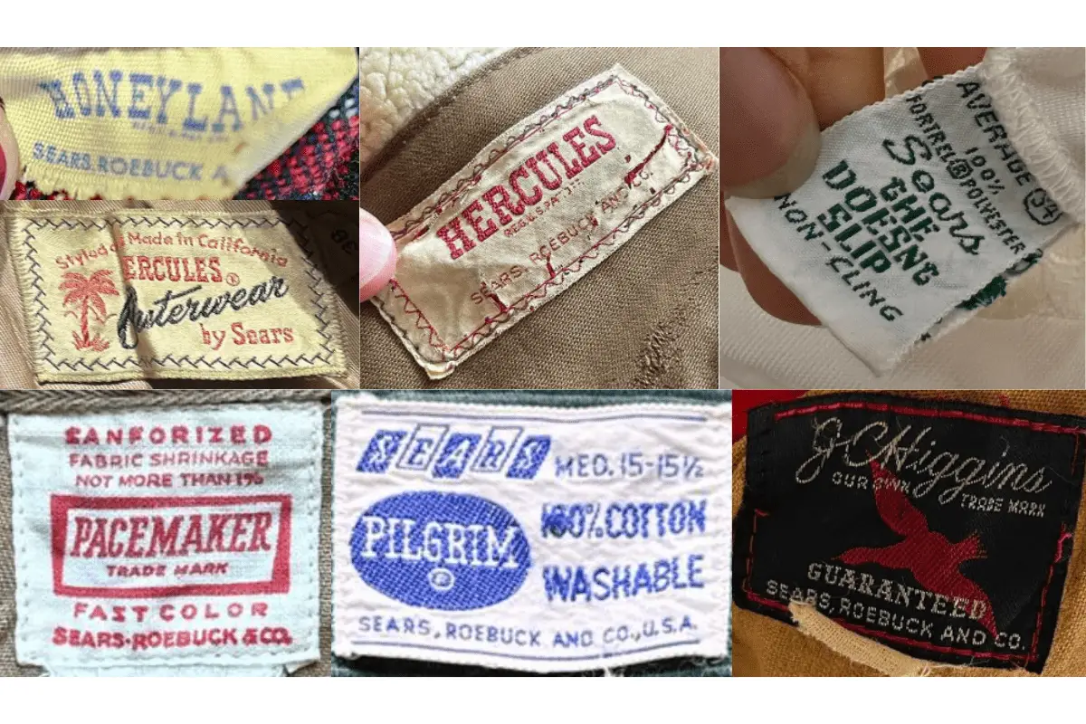
1950s Sears tags
1960s vintage Sears tags
- More detailed information on fabric content and care instructions.
- Introduction of branded lines such as “Sears Fashion” and “Kings Road.
- Tags may include more color and intricate designs.
- Serif fonts are still prevalent but with varied styling.
1960s Sears tags
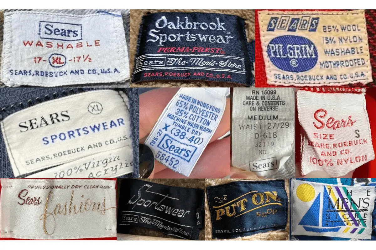
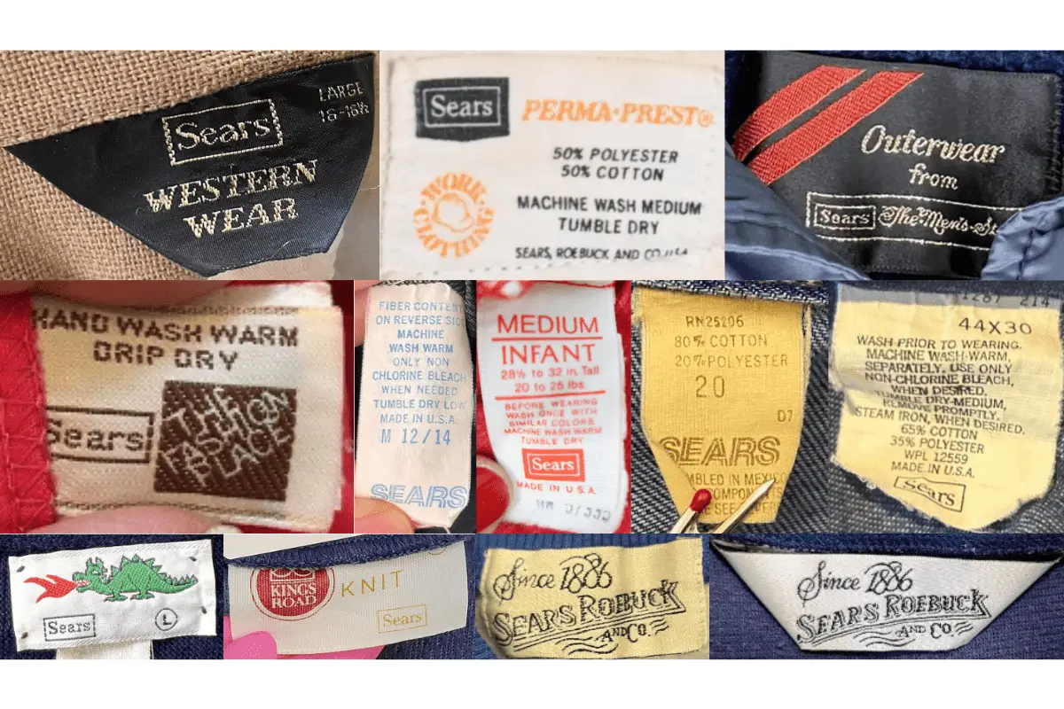
1970s vintage Sears tags
- Tags often feature bold serif lettering and branded names like “Perma-Prest” and “The Men’s Store.”
- Introduction of additional brand lines like “Western Wear” and “At Home Wear.”
- Tags may be square or rectangular with vibrant colors and detailed stitching.
- Size indicators are commonly included on the tags.
1970s Sears tags
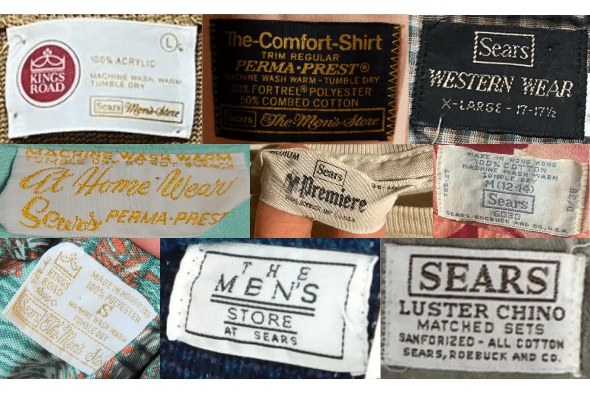
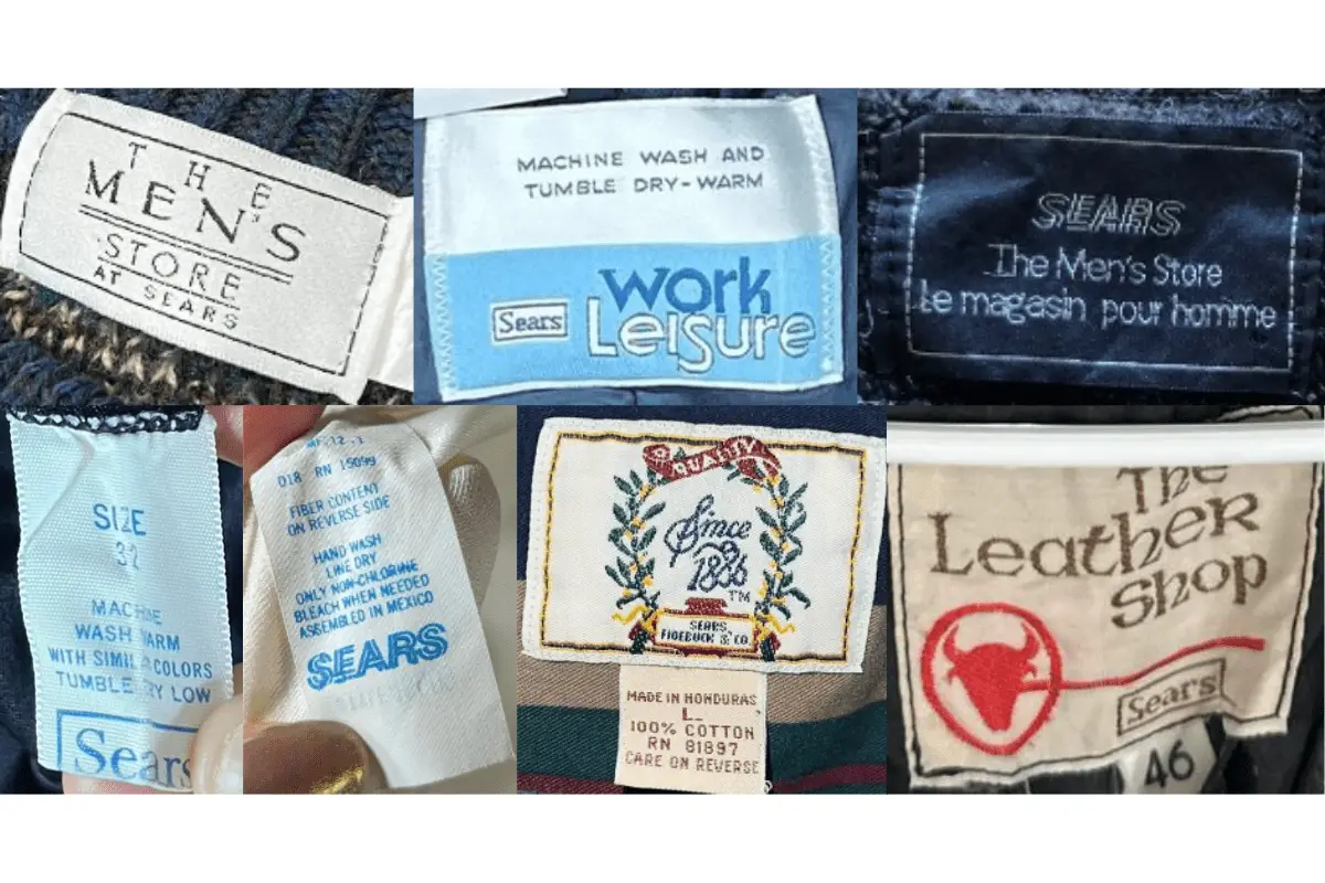
1980s vintage Sears tags
- Tags prominently display brand names such as “Sears Sportswear” and “Oakbrook Sportswear.
- More sophisticated designs with a combination of serif and sans-serif fonts.
- Tags may include slogans or additional branding information.
- Greater emphasis on care instructions and fabric blends.
1980s Sears tags
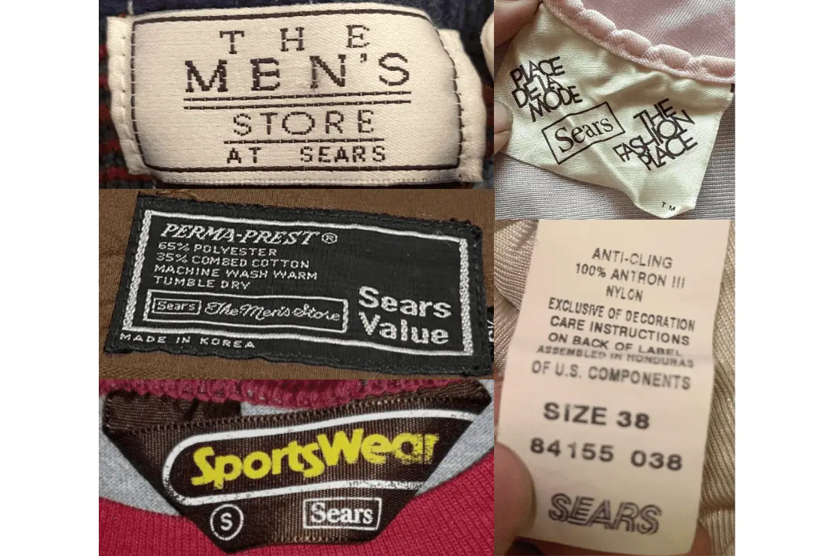
1990s vintage Sears tags
- Modern look with increased use of sans-serif fonts.
- Tags often feature detailed care instructions and fabric blends.
- Branding lines like “Sears Value” and “Sears Work Leisure” are common.
- Tags include more color variety and design elements.
1990s Sears tags
2000s vintage Sears tags
- Contemporary designs with updated fonts and logos.
- Tags often feature bold, modern layouts with detailed care instructions.
- Brand names and lines such as “The Men’s Store” continue to be used.
- Greater diversity in tag materials and styles.
2000s Sears tags


Thanks on your marvelous posting! I definitely enjoyed reading it, you’re a great author.I will make sure to bookmark your blog and will come back from now on. I want to encourage that you continue your great posts, have a nice weekend!
Hello there, I found your website via Google while searching for a related topic, your site came up, it looks great. I have bookmarked it in my google bookmarks.
??????????????????????24???????????????????????????????????
??????????? ?????????????????? ???
?? ???????????????????????? ???????????????
???????????????????? Hanna
??????????
????????????????????????????
????????????? ??????????? ???
????????????????????????? ????????????