C&A, a multinational chain of retail clothing stores, has a storied history dating back to its origins in the Netherlands. Founded in 1841 by brothers Clemens and August Brenninkmeijer, the company took its name from their initials and quickly established itself as a prominent player in the textile trade. Over the years, C&A has expanded its footprint globally, operating approximately 1,300 stores across Europe and 300 in Brazil, alongside a significant online presence. Despite this extensive reach, the brand remains rooted in its family-owned legacy, a tradition that has played a crucial role in shaping its identity and operations.
The Brenninkmeyer family’s involvement in the textile industry can be traced back to the 17th century in Mettingen, Germany. This deep-rooted expertise in linen and textiles set the foundation for C&A’s success. The company’s expansion began in earnest when Clemens’ son, Bernard Joseph, opened stores in Amsterdam in 1906. By 1910, C&A had established ten stores across the Netherlands, marking the beginning of its journey as a retail giant. This period of growth was characterized by a blend of traditional values and innovative retail strategies, which helped C&A navigate the evolving fashion landscape of the early 20th century.
Throughout its history, C&A has demonstrated a remarkable ability to adapt to changing market dynamics. From sponsoring high-profile events like the 1974 FIFA World Cup and collaborating with celebrities like Beyoncé, to navigating the competitive pressures from fast-fashion brands and expanding into new markets, C&A has continually reinvented itself. The brand’s resilience is evident in its strategic decisions, such as the shift towards online sales and the partnership with Amazon. Despite these modern advancements, C&A’s commitment to quality and affordability remains unchanged, ensuring its place as a beloved staple in the wardrobes of fashion enthusiasts worldwide.
80s C&A TV Commercial
How to tell if C&A is vintage from the logo
C&A has a rich history reflected in its evolving logo designs. Each era’s logo provides clues to the time period it was used, which is essential for identifying vintage C&A items. Here is a detailed look at C&A logos from different periods to help you determine if your C&A item is vintage.
1841 to 1912 C&A logo
- The earliest logo features a very traditional and ornate script.
- It prominently displays “C. en A. Brenninkmeijer” with detailed locations listed beneath.
- This logo has a classic and formal appearance, indicative of the era’s design aesthetics.
1841 to 1912 C&A logo
1912 to 1913 C&A logo
- The 1912 to 1913 logo introduces a more simplified round emblem.
- The text “C&A Brenninkmeyer GmbH” is in a bold, capitalized font.
- This design reflects a transition towards more modern and readable fonts while maintaining a circular badge format.
1912 to 1913 C&A logo
1913 to 1928 C&A logo
- This period features a continued use of the bold, capitalized “C&A Brenninkmeyer GmbH” text.
- The emblem shape becomes more oval, offering a distinct change from the previous circular format.
- The font remains consistent, ensuring brand recognition during this transitional phase.
1913 to 1928 C&A logo
1928 to 1947 C&A logo
- The 1928 to 1947 logo maintains the bold “C&A” text but reintroduces the full “Brenninkmeyer” name.
- The design is slightly more stylized, with a textured background that adds visual interest.
- This era’s logo reflects a blend of traditional elements with emerging modern design trends.
1928 to 1947 C&A logo
1947 to 1958 C&A logo
- This logo period showcases “C&A Modes Limited” within a decorative, scalloped-edge emblem.
- The font remains bold and capitalized, maintaining brand consistency.
- The detailed edge design signifies a post-war return to ornate and decorative branding elements.
1947 to 1958 C&A logo
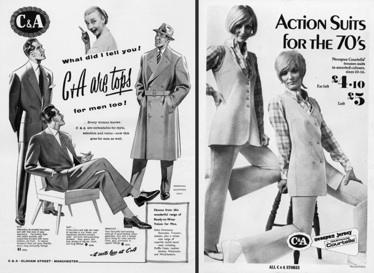
1958 to 1984 C&A logo
- The 1958 to 1984 logo modernizes the emblem with a simpler, more streamlined appearance.
- “C&A Brenninkmeyer” is featured prominently in a bold font, set against a clean, oval background.
- This design reflects mid-20th century preferences for simplicity and bold branding.
1958 to 1984 C&A logo
1984 to 1998 C&A logo
- The logo features a bold, red outline resembling a scalloped edge.
- The text “C&A” is prominently displayed in white with a dark blue background.
- This logo marks a period where the emblem was simplified yet remained recognizable with its distinctive shape and color contrast.
1984 to 1998 C&A logo
1998 to 2011 C&A logo
- This logo maintains the scalloped red outline but with a more pronounced and modern look.
- The “C&A” text is still in white but with a dark blue background that appears more saturated.
- The overall design is sharper, reflecting a more contemporary style of the late 90s and early 2000s.
1998 to 2011 C&A logo
2005 to 2011 C&A logo
- The logo features a vibrant red scalloped edge and a dark blue inner oval.
- The “C&A” text remains in white, maintaining the brand’s classic look.
- This era saw a slight increase in the intensity of the colors used.
2005 to 2011 C&A logo
2011 to 2020 C&A logo
- The scalloped edge is less pronounced and adopts a smoother appearance.
- The color scheme of red and dark blue with white text is retained.
- The font of the “C&A” text appears slightly refined, indicating a subtle shift in branding.
2011 to 2020 C&A logo
2016 to 2020 C&A logo
- The logo design becomes more minimalistic with a simpler red outline.
- The “C&A” text is still in white, but the blue background is less intense.
- The overall appearance is more streamlined, reflecting modern design trends.
2016 to 2020 C&A logo
2020 to now C&A logo
- The latest logo features a red scalloped edge with a blue inner oval that has a softer, more matte finish.
- The “C&A” text remains in white but uses a slightly updated font.
- This logo reflects the current branding strategy focused on simplicity and modern appeal.
2020 to now C&A logo
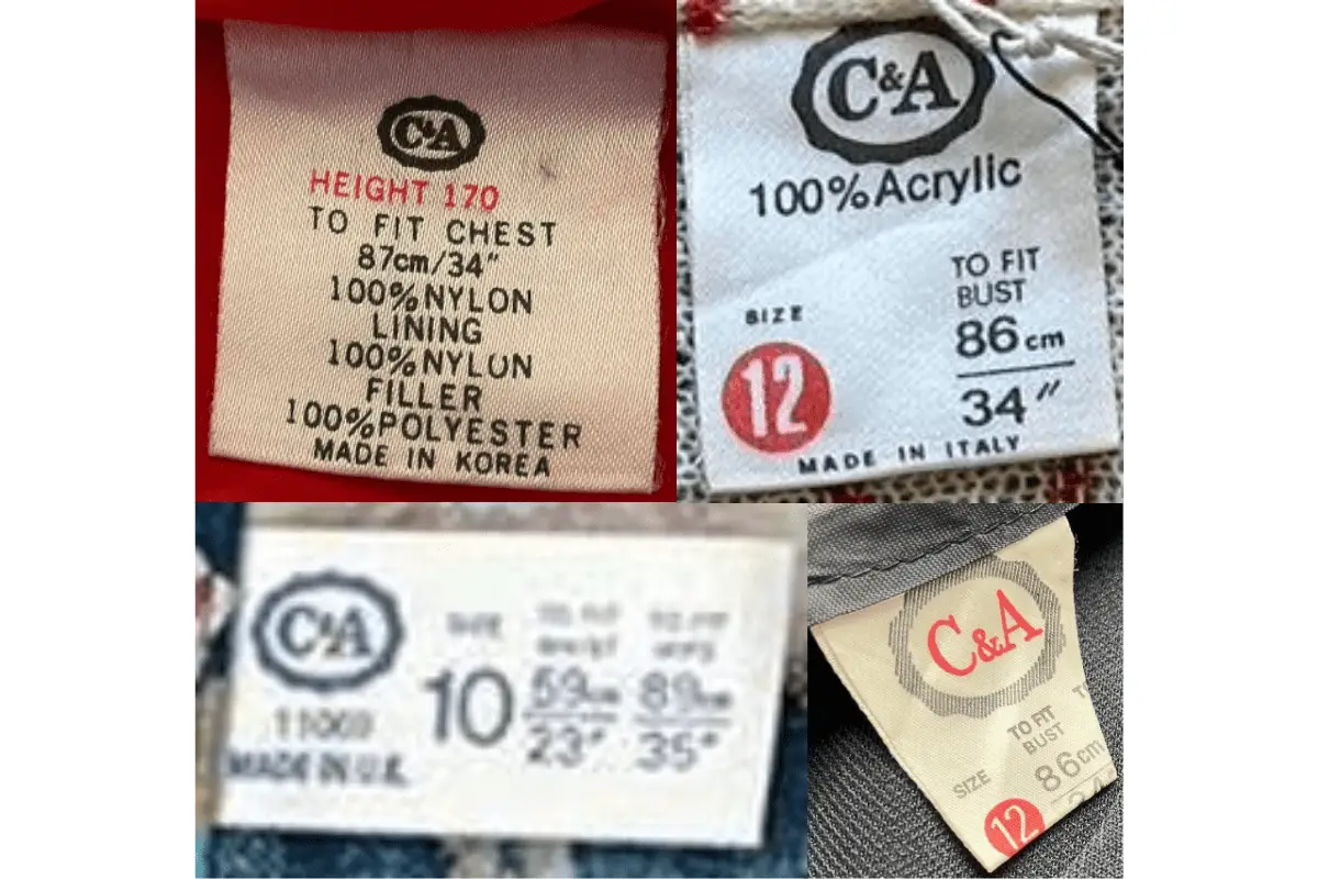
How to tell if C&A is vintage from the tags
C&A has undergone several changes in its branding and label designs over the decades. These tags provide valuable insights into the era a garment is from, reflecting the evolution of the company’s style and production methods. Here’s how you can identify vintage C&A clothing by its tags from different decades.
Having trouble identifying vintage tags or labels? Upload a picture on our vintage tag identification page, and we’ll assist you!
1970s vintage C&A tags
- Tags often include the “C&A” logo in a serif font.
- Text-heavy labels with detailed fabric content and care instructions.
- Commonly made in European countries, indicating the location of manufacture.
- Size and measurements are often prominently displayed.
1970s C&A tags
1980s vintage C&A tags
- The “C&A” logo is consistent, with a serif font and often an oval border.
- Fabric content and care instructions are detailed and multilingual.
- Tags often highlight the specific country of manufacture, reflecting a global production approach.
- Size information remains clear and prominently displayed.
1980s C&A tags
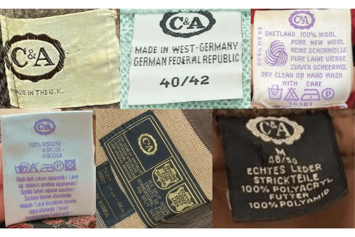
1990s vintage C&A tags
- Continuation of the “C&A” logo with a classic serif font.
- Increased emphasis on synthetic materials in the fabric content.
- Detailed washing and care instructions, sometimes in multiple languages.
- Tags often include clear size indicators and manufacturing details.
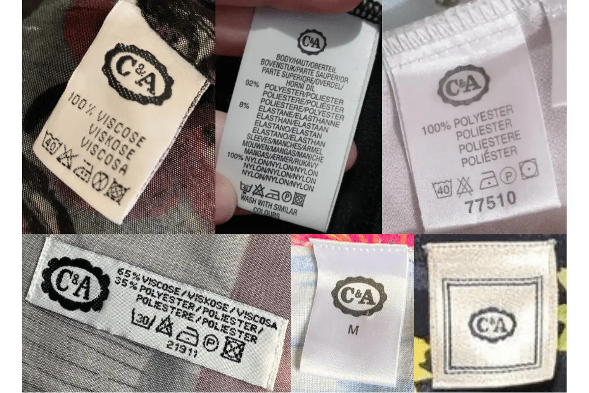
1990s C&A tags
2000s vintage C&A tags
- The “C&A” logo is modernized but retains traditional elements.
- Tags use a variety of colors and materials, including satin and woven labels.
- Detailed fabric content and care instructions continue to be present.
- Size and country of manufacture are clearly indicated.
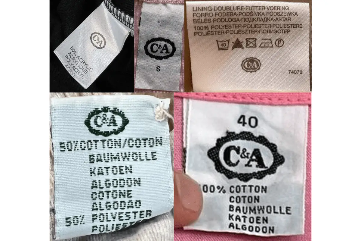
2000s C&A tags