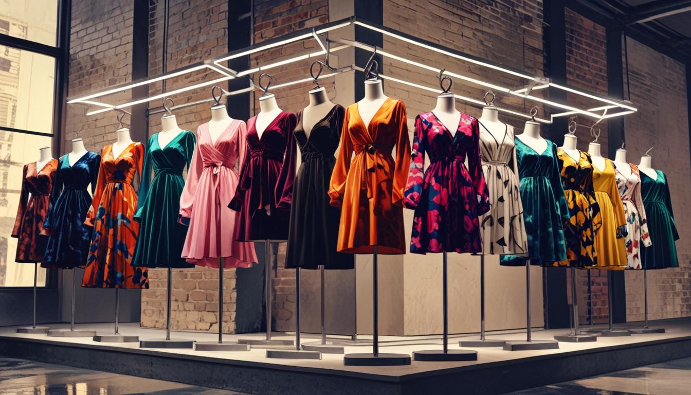
Founded in 1984 by Évelyne Chetrite, Sandro quickly established itself as a beacon of Parisian style, offering a blend of luxury and approachability that resonated with fashion-conscious consumers. With a vision to create clothing that was “casual but always chic” and “sophisticated but cool,” Chetrite’s designs embodied the effortless elegance synonymous with Paris. Starting as a womenswear brand, Sandro carved out a niche in the premium contemporary market, striking a balance between high-end designer pieces and more accessible fashion. This unique positioning allowed the brand to appeal to a wide audience, making it a staple in wardrobes worldwide.
Sandro’s evolution is marked by significant milestones, particularly the launch of Sandro Homme in 2008, led by Évelyne’s son, Ilan Chetrite. The menswear line brought a fresh perspective to the brand, described by W Magazine as “masculine but not at all macho” and “timeless but with a bit of edge.” This expansion solidified Sandro’s reputation for versatile, gender-fluid designs that defy traditional fashion norms, further ingraining the brand’s philosophy of ambiguity and sophistication across its collections. The introduction of Sandro Homme not only broadened the brand’s appeal but also showcased its ability to innovate while staying true to its Parisian roots.
As Sandro continued to grow, it transitioned from an exclusively wholesale business model to opening stand-alone retail stores in 2007. This move was pivotal in expanding its global footprint, culminating in the opening of its first U.S. boutique in New York City in 2011. Today, Sandro boasts over 50 outlets in the United States alone and continues to expand its presence with new store openings and collaborations, like its Autumn-Winter 2023 collection with Wrangler. As it evolves, Sandro remains a symbol of contemporary Parisian chic, maintaining its commitment to quality, timeless design, and sophisticated coolness.
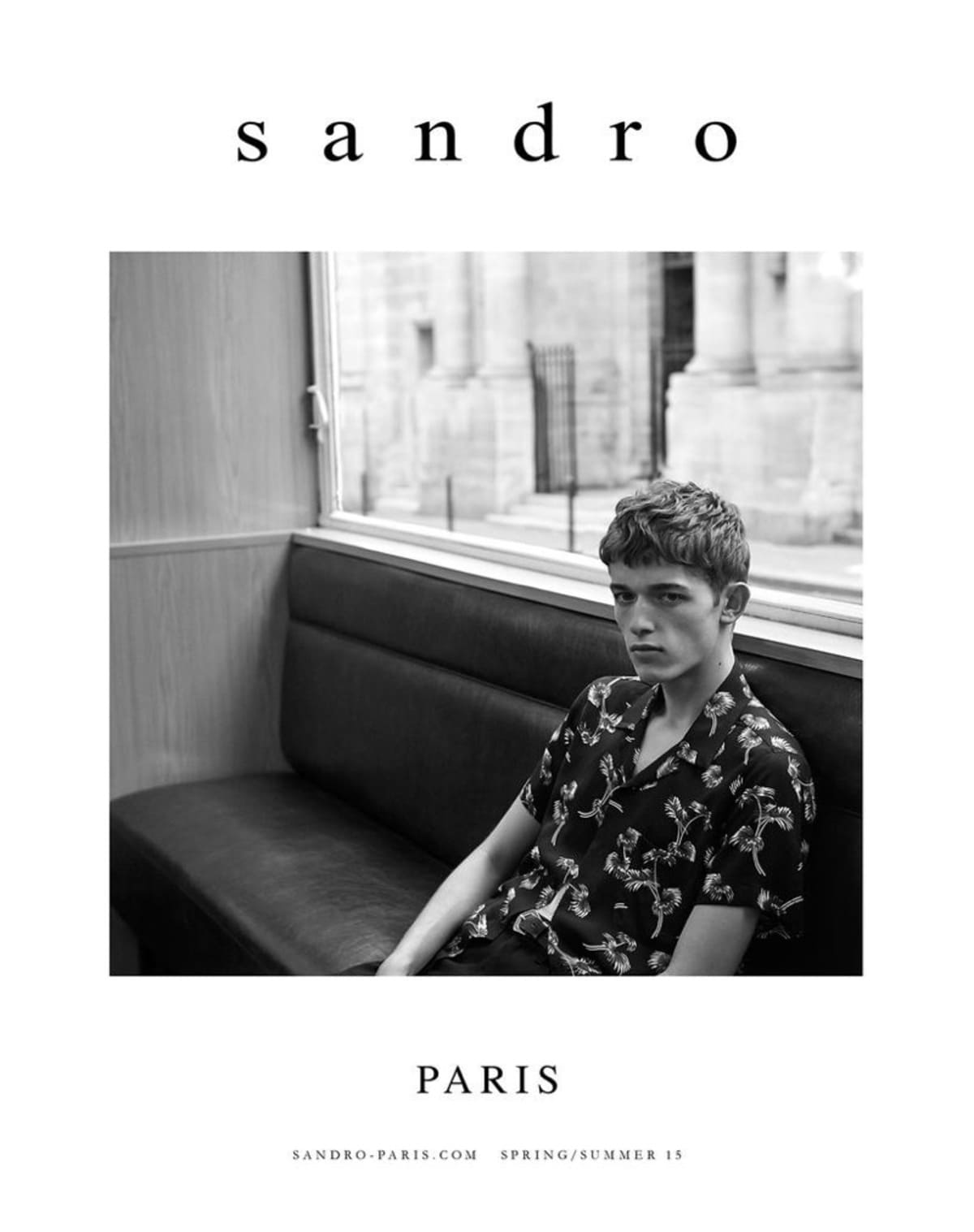
SS17 Sandro Collection
How to tell if Sandro is vintage from the logo
Sandro, known for its chic and minimalist Parisian style, has undergone several logo transformations that reflect the brand’s evolution over the decades. These changes in logo design can help identify the era of a Sandro piece, which is particularly useful for vintage collectors. Below is a breakdown of the different Sandro logos by era based on the images provided.
1980s to 1990s Sandro logo
- The logo from this era features a sleek, modern font with a distinct geometric style.
- Each letter is spaced out with sharp, clean lines that give a minimalist yet bold appearance.
- This version reflects the early days of Sandro when the brand was establishing its identity.
1980s to 1990s Sandro logo
2000s to now Sandro logo
- The logo in this era adopts a more classic and refined serif font.
- The letters are lowercased, giving a softer, more approachable look, which aligns with the brand’s Parisian elegance.
- “Paris” is prominently displayed beneath “Sandro,” emphasizing the brand’s origins and luxury appeal
2000s to now Sandro logo
1990s to now Sandro logo
- This logo is characterized by its bold, all-caps font, marking a departure from previous minimalist designs.
- The use of thick, solid letters conveys strength and confidence, aligning with Sandro’s growing global presence.
- This logo has been widely used in various marketing and branding materials, making it one of the most recognizable versions in Sandro’s history.
1990s to now Sandro logo
How to tell if Sandro is vintage from the tags
The evolution of Sandro tags over the decades reflects the brand’s journey from its inception to its current status as a staple in contemporary fashion. Sandro’s tags have seen changes in typography, design, and materials, mirroring the brand’s adaptation to changing trends while maintaining its distinct Parisian essence. Identifying the era of a Sandro garment can be achieved by examining these subtle yet significant differences in the tags.
Need help with vintage tags or labels? Submit a picture on our vintage tag identification page, and we’ll take care of it!
1990s vintage Sandro tags
- Features simple, minimalistic design with lowercase lettering.
- The “sandro” logo is presented in a basic serif font, often in light grey or muted tones.
- Tags are typically made of a plain fabric, sewn directly onto the garment.
- Some tags may include additional elements such as size indicators or fabric composition, but these are usually on separate tags.
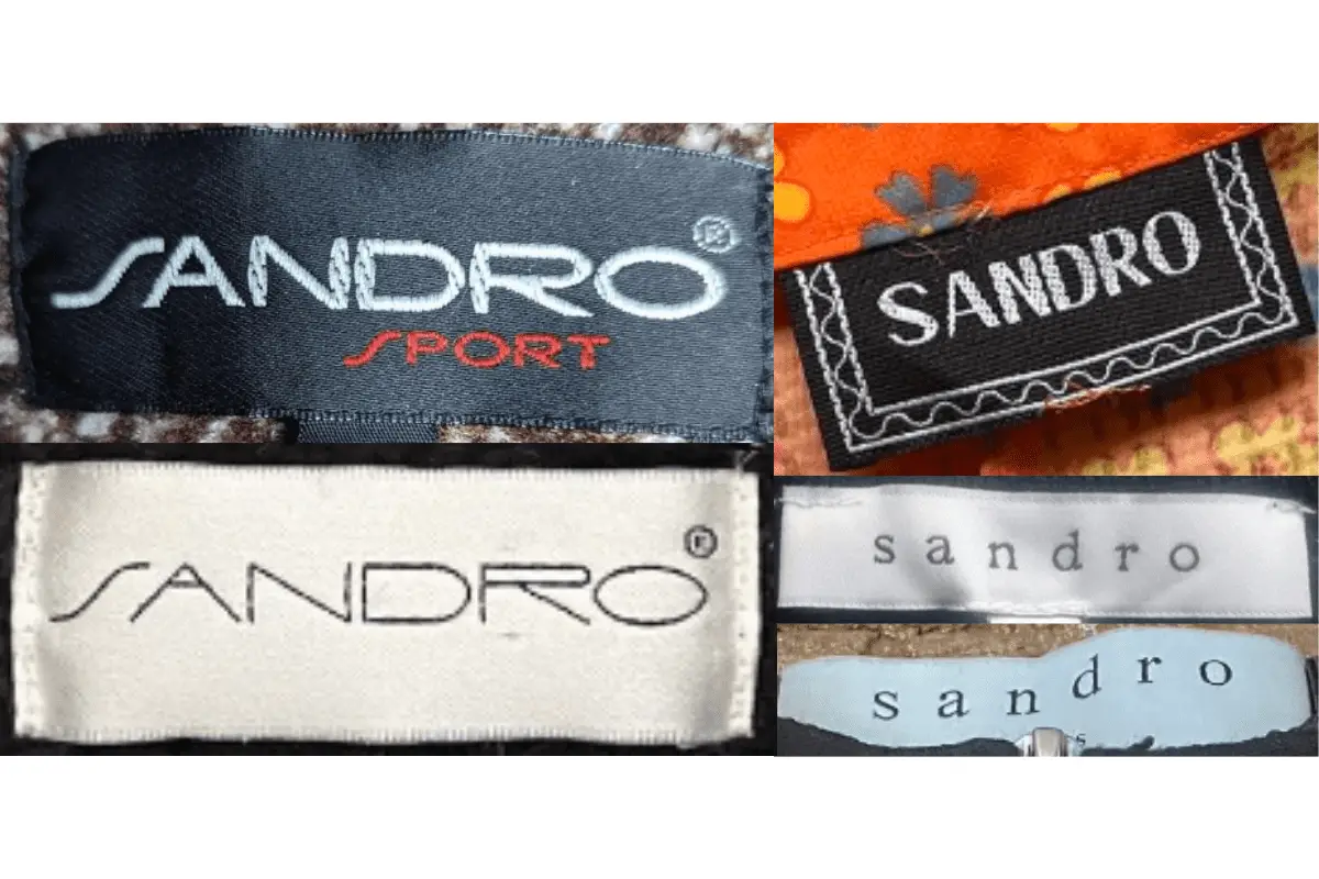
1990s Sandro tags
2000s vintage Sandro tags
- Introduction of a more structured design with emphasis on the “SANDRO” branding in uppercase.
- The tags often feature bold, black text on a contrasting white or beige background.
- SANDRO” is prominently displayed in a clean, sans-serif font, sometimes accompanied by “PARIS” in a smaller font below.
- Material of the tags became more refined, with stitched edges giving a more polished appearance.
- Occasional inclusion of decorative elements such as borders or additional text, highlighting the garment’s origin or style.
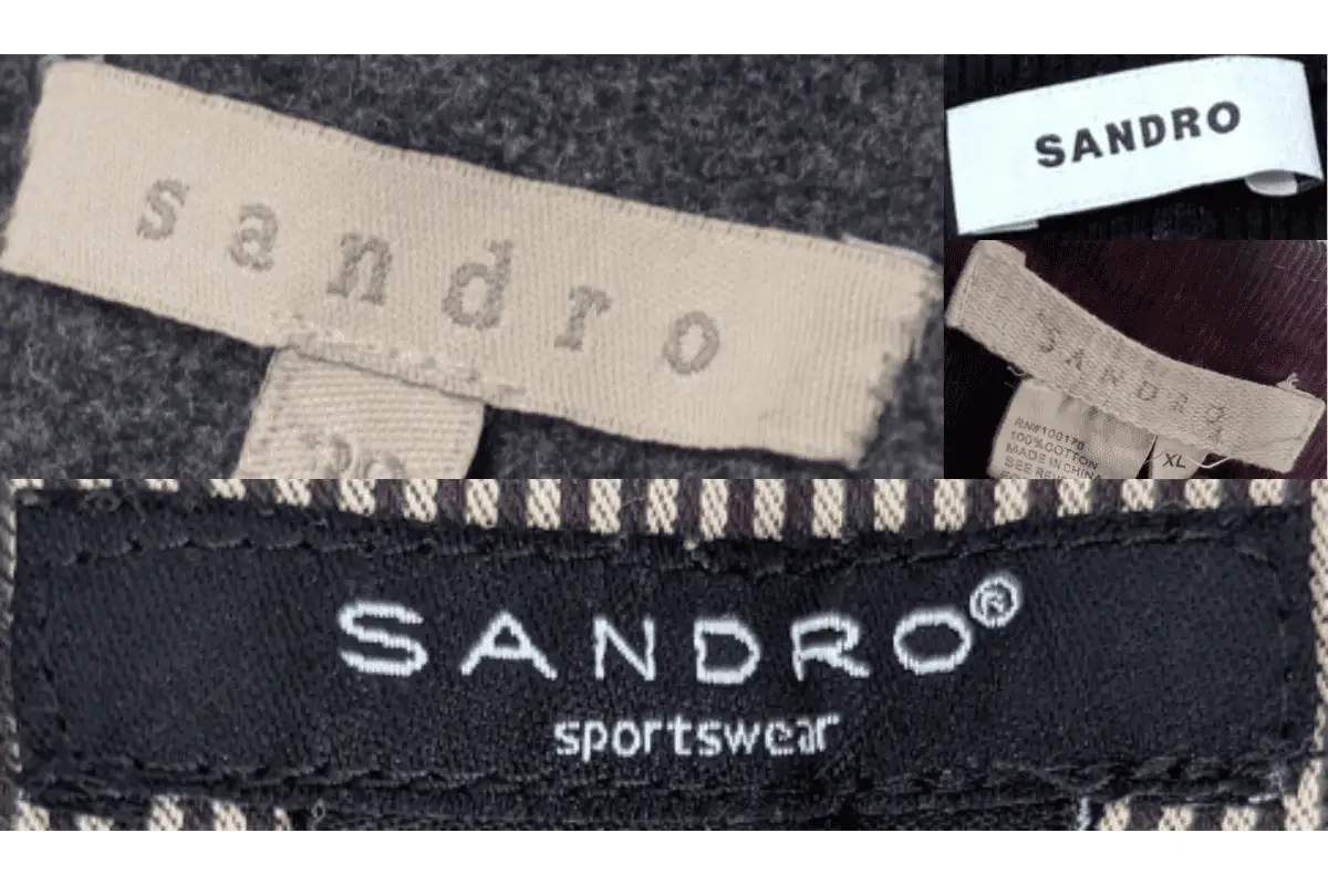
2000s Sandro tags
2010s vintage Sandro tags
- Continues the use of “SANDRO” in uppercase, maintaining the brand’s established identity.
- Tags in this era often use modern materials, with a glossy or satin finish giving a luxurious touch.
- Typography remains clean and simple, but the overall tag design is more varied, with some featuring additional information such as care instructions or store locations.
- Some tags may have a detachable string tag, which is typical for higher-end pieces from this era.
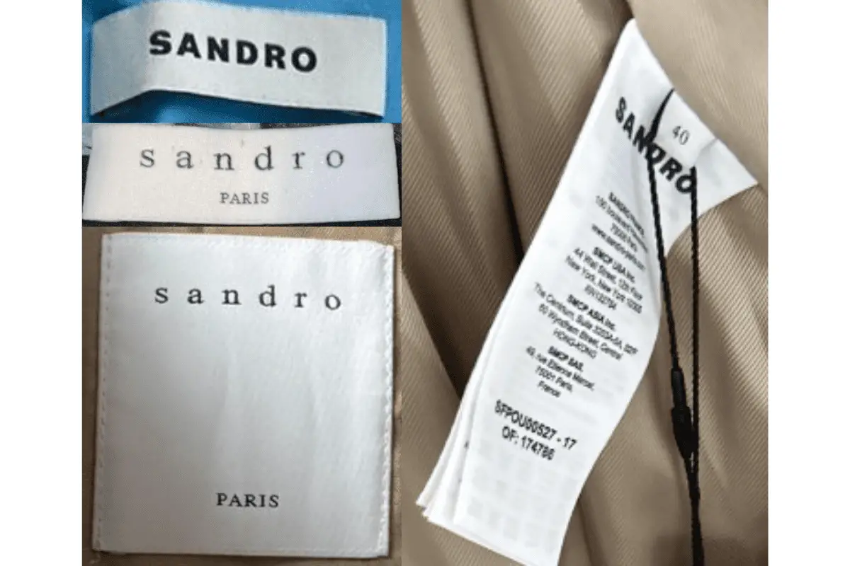
2010s Sandro tags