Topman, a British fashion retailer established in 1978, quickly grew into a global icon of men’s style. Initially a part of the Burton Group, which later became the Arcadia Group, Topman was conceived as the male counterpart to the already popular Topshop brand. Over the decades, Topman became synonymous with cutting-edge fashion for men, offering everything from sharp suits and leather jackets to casual denim and vintage rock-inspired T-shirts. The brand’s appeal lay in its ability to blend contemporary styles with affordability, making it a go-to destination for fashion-conscious men in the UK and beyond. At its peak, Topman operated over 300 stores across the UK, with a strong online presence that catered to a global audience.
Throughout its history, Topman was not just a retailer but a trendsetter, frequently collaborating with designers and engaging in high-profile partnerships. The brand’s reputation for innovation in menswear was recognized with several prestigious awards, including the ‘Best Fashion Retailer’ at the Maxim Style Awards in 2005 and ‘Best High Street Retailer’ at the FHM Fashion and Grooming awards in 2007. Topman’s flagship store in London’s Oxford Circus, shared with Topshop, became a cultural landmark, drawing shoppers from around the world who sought the latest in British fashion. Beyond its commercial success, Topman also made efforts to give back, such as its 2011 collaboration with the Teenage Cancer Trust, where the brand supported charity-driven fashion initiatives.
However, like many brick-and-mortar retailers, Topman faced challenges in the rapidly evolving retail landscape. The combination of declining high street sales and the impact of the COVID-19 pandemic led to the Arcadia Group’s collapse in late 2020. This resulted in the closure of all Topman physical stores. Yet, the brand found a new lease on life when it was acquired by ASOS in February 2021. Now operating as an online-only retailer, Topman continues to deliver its iconic styles to a loyal customer base, preserving its legacy as a pioneer in men’s fashion.
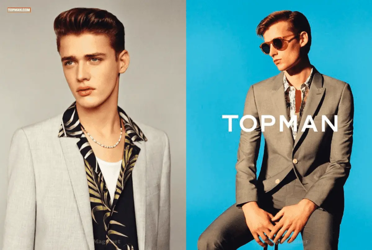
Topman Sportswear Commercial
How to tell if Topman is vintage from the logo
Topman, a British fashion brand known for its contemporary styles, has seen several logo changes since its inception. These changes are key indicators of the era from which a particular garment or accessory originates. The following guide will help you identify whether a Topman item is vintage by analyzing the logo used.
1978 to 1994 Topman logo
- The logo from this era features a thin, all-uppercase font.
- Letters are evenly spaced, with the “O” appearing slightly larger compared to the other letters.
- The overall design is minimalist, reflecting the brand’s early attempts to establish itself in the fashion market.
1978 to 1994 Topman logo
1994 to 1997 Topman logo
- The font used during this period became slightly bolder.
- Letter spacing remains even, but the font is more geometric and modern compared to the previous era.
- This logo marks a shift towards a more contemporary design as Topman started to target younger audiences.
1994 to 1997 Topman logo
1997 to 2000 Topman logo
- This logo retains the bold, geometric style of its predecessor.
- The “O” in this logo is more circular and the overall font appears to be more streamlined.
- The letters are still spaced evenly, maintaining a clean and modern look.
1997 to 2000 Topman logo
2000 to 2005 Topman logo
- During this era, the Topman logo underwent a slight refinement.
- The font remains bold, but the edges are sharper, giving a more defined appearance.
- This logo reflects the brand’s expansion and modernization during the early 2000s.
2000 to 2005 Topman logo
2005 to 2018 Topman logo
- The logo from this era features a significant change with a thicker, bolder font.
- Letter spacing is tighter, giving the logo a more solid and impactful appearance.
- This design is indicative of Topman’s peak as a mainstream fashion brand.
2005 to 2018 Topman logo
2018 to now Topman logo
- The current logo reverts to a thinner font, similar to the earlier designs but with a modern twist.
- Letter spacing is once again more generous, giving the logo a sleek and minimalist appearance.
- This logo represents Topman’s current branding as it continues to appeal to a global audience.
2018 to now Topman logo
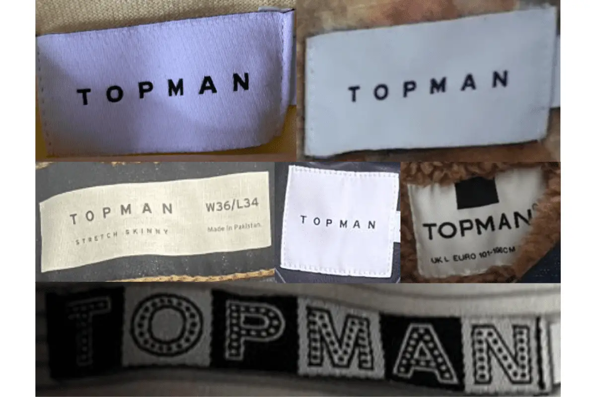
How to tell if Topman is vintage from the tags
The evolution of Topman tags reflects the brand’s changing identity and design aesthetics over the decades. From its beginnings with more elaborate and classic designs, Topman transitioned to a more minimalist and modern look in its later years. By examining the specific features and design elements of these tags, you can identify the era from which a Topman garment originates.
Can’t figure out your vintage tags or labels? Upload a picture on our vintage tag identification page, and we’ll assist you!
1980s vintage Topman tags
- Early Topman tags from the 1980s often feature a more intricate design with a strong emphasis on branding.
- The tags frequently include the “Top Man” name with a distinct font, sometimes accompanied by decorative elements like swirls and the “TM” emblem.
- Tags are typically rectangular and might include additional design elements, such as the Topman logo alongside a detailed emblem, indicating a more formal or traditional approach to branding.
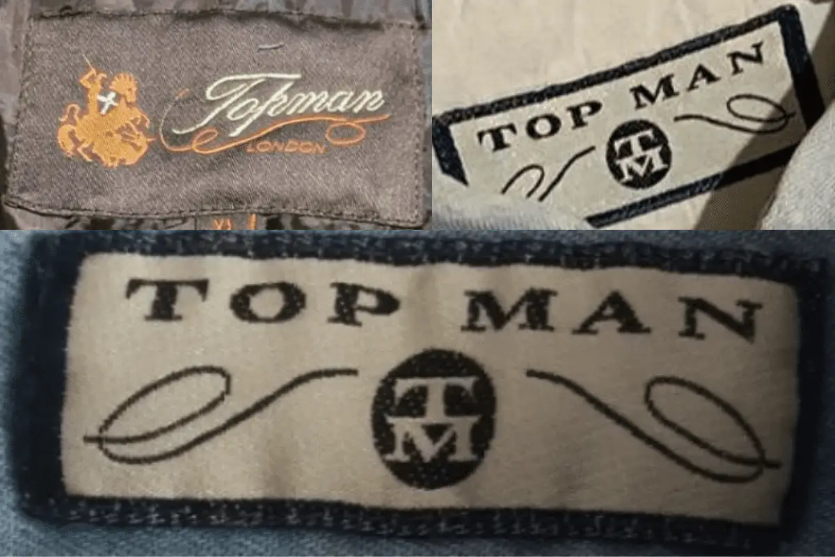
1980s Topman tags
1990s vintage Topman tags
- During the 1990s, Topman tags began to adopt a slightly more modern aesthetic, though they retained some of the classic design elements from the previous decade.
- These tags often feature the “Top Man” name with a stylized font, maintaining the use of decorative swirls and the “TM” emblem, but with a cleaner and more streamlined look.
- Some tags from this era also started to simplify, focusing more on the brand name with less intricate detailing, signifying the transition towards a more contemporary brand identity.
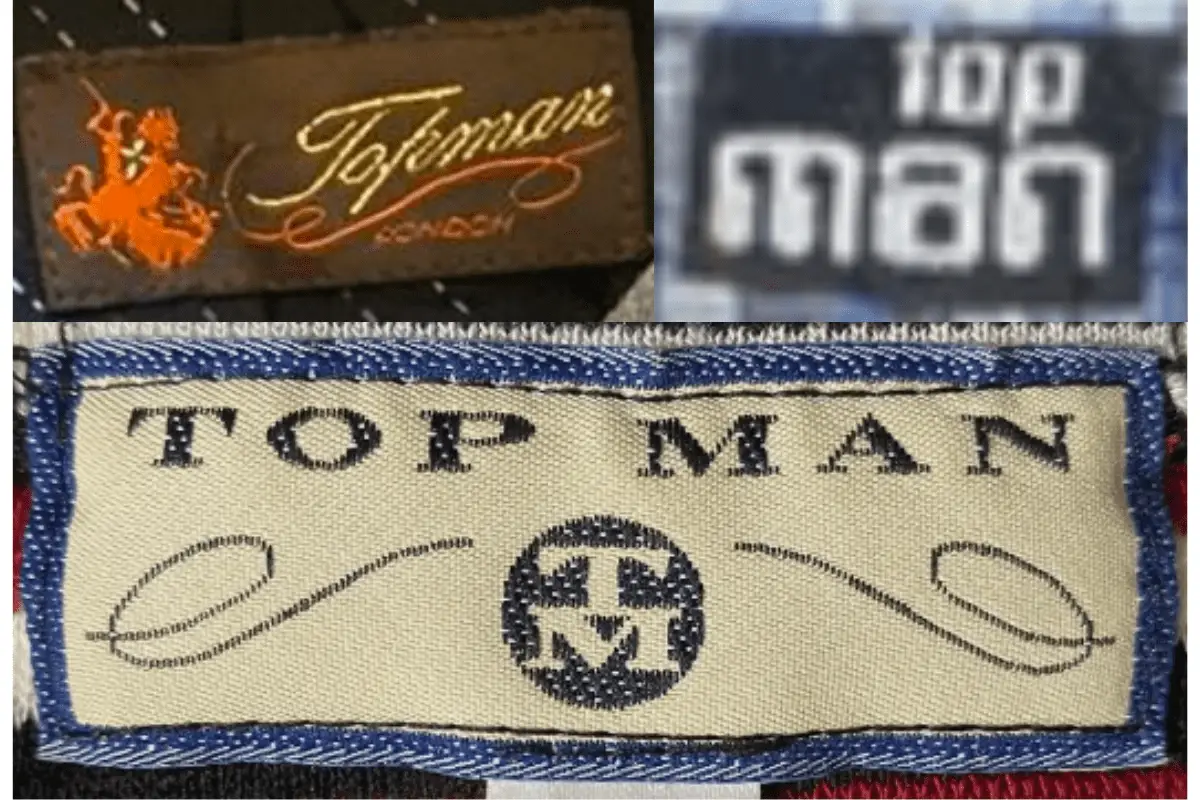
1990s Topman tags
2000s vintage Topman tags
- The 2000s marked a significant shift in Topman’s branding towards minimalism, with tags often featuring bold, simple lettering.
- Tags from this era are usually rectangular or square, with a strong focus on the “Topman” name in a clean, sans-serif font.
- This period saw the introduction of more diverse color schemes and materials, reflecting the brand’s modern and versatile image.
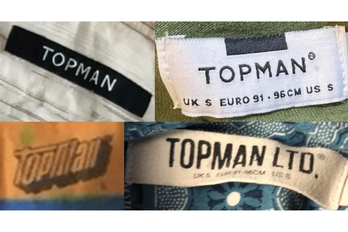
2000s Topman tags
2010s vintage Topman tags
- In the 2010s, Topman continued its minimalist trend, with tags becoming even more streamlined and straightforward.
- These tags typically feature the “Topman” name in a bold, clean font with little to no additional design elements.
- The use of neutral colors and high-quality materials became more prominent, aligning with Topman’s focus on contemporary fashion.
2010s Topman tags