
British Home Stores, or BHS as it became widely known, was a pillar of British retail history, with a legacy that spanned nearly nine decades. Established in 1928 by a group of American entrepreneurs, BHS was initially inspired by the success of Woolworths and aimed to provide affordable household goods and clothing to the British public. Over the years, it expanded its offerings, eventually becoming a staple of high streets and shopping centres across the UK. At its peak, BHS was synonymous with quality and value, offering everything from fashion to home furnishings and even venturing into new territories such as electronics and furniture in its later years.
Throughout its existence, BHS underwent several transformations, both in terms of its product offerings and its corporate identity. The 1970s and 1980s saw BHS at the height of its expansion, including international ventures and collaborations with other retail giants like Sainsbury’s. The brand adapted to the changing retail landscape by constantly updating its image and product lines, with rebranding efforts in the 1990s and 2000s aimed at appealing to a new generation of shoppers. However, despite these efforts, the brand faced increasing challenges, particularly as the retail market became more competitive and consumer habits began to shift.
The story of BHS took a dramatic turn in the 21st century. After being acquired by Sir Philip Green in 2000, the company was integrated into his Arcadia Group, but financial troubles soon loomed large. A series of ownership changes, mounting debts, and a highly publicized collapse in 2016 marked the end of BHS as a high street presence. Yet, even after its closure, the brand’s legacy continues to evoke nostalgia among those who remember its role in British retail history. Understanding the evolution of BHS through its logos and tags not only provides insight into the brand’s identity but also offers a glimpse into the broader changes in the retail industry over the decades.
80s Bhs Christmas TV Commercial
How to tell if BHS is vintage from the logo
British Home Stores (BHS) was a well-known department store chain in the UK, with a history that spanned several decades. Over the years, the BHS logo evolved to reflect changing design trends and the brand’s shift in focus. Identifying the era of a BHS item can often be done by examining the logo used, as different styles correspond to specific periods in the company’s history.
1960s to 1970s BHS logo
- This logo features the full “British Home Stores” name in a serif typeface.
- The font is bold and capitalized, giving it a traditional and established look.
- A small ship icon is placed above the text, adding a classic British element to the design.
- The overall feel of this logo is formal, reflecting the era’s design sensibilities.
1960s to 1970s BHS logo
1970s to 1986 BHS logo
- The logo adopts a more modern and simplistic approach with “BHS” stylized in a rounded, serif typeface.
- The letters are thick, and the use of blue color gives it a strong, corporate appearance.
- The design is much simpler than its predecessor, focusing on a clean and bold presentation.
1970s to 1986 BHS logo
1986 to 1995 BHS logo
- This era’s logo introduces a more playful and contemporary design.
- The “BHS” letters are presented with a textured, multicolored ribbon effect, using red, green, and blue hues.
- The font is less formal, with varying letter heights that convey a dynamic and modern identity.
1986 to 1995 BHS logo
1995 to 2010 BHS logo
- The logo shifts back to a more minimalistic design, featuring “BHS” in a bold, uppercase font.
- The font is sleek and simple, focusing on clarity and modernity.
- This version of the logo reflects the brand’s attempt to streamline its image during this period.
1995 to 2010 BHS logo
2010 to 2013 BHS logo
- The logo remains simple but incorporates a subtle change with the introduction of an orange underline beneath the “BHS” letters.
- The typeface remains clean and modern, with the underline adding a slight touch of color and emphasis.
- This version of the logo was used during a period of rebranding to refresh the store’s image.
2010 to 2013 BHS logo
2013 to 2015 BHS logo
- The logo goes through a significant change, with “BHS” presented in a large, bold, and modern font.
- The color scheme shifts to dark gray with a solid orange underline, giving the logo a contemporary and stylish look.
- This rebranding effort was part of an attempt to modernize the brand during its later years.
2013 to 2015 BHS logo
2015 to 2016 BHS logo
- The final logo before the brand’s closure features “BHS” in a simple, lowercase handwritten style.
- The design is minimalist, focusing on a more casual and approachable look.
- This logo reflects the brand’s last attempt to connect with a broader audience before its closure.
2015 to 2016 BHS logo
How to tell if BHS is vintage from the tags
BHS (British Home Stores) has undergone significant transformations in its branding and tag designs over the decades. From its earlier, more traditional tags to the more modern variations, the evolution of BHS tags can help identify the era from which a garment originates. Each decade brought subtle changes in font, layout, and additional information, making the tags a useful tool for determining whether a BHS item is truly vintage.
Having difficulty identifying vintage tags or labels? Submit a picture on our vintage tag identification page, and we’ll assist you!
1980s vintage BHS tags
- Tags often featured a simple, clean design with “BHS” in serif or sans-serif fonts.
- Size information was prominently displayed, often in a clear, bold typeface.
- Some tags included specific care instructions, and were made in the UK, reflecting BHS’s British heritage.
- The tags were typically rectangular, with a minimalistic design focused on functionality.
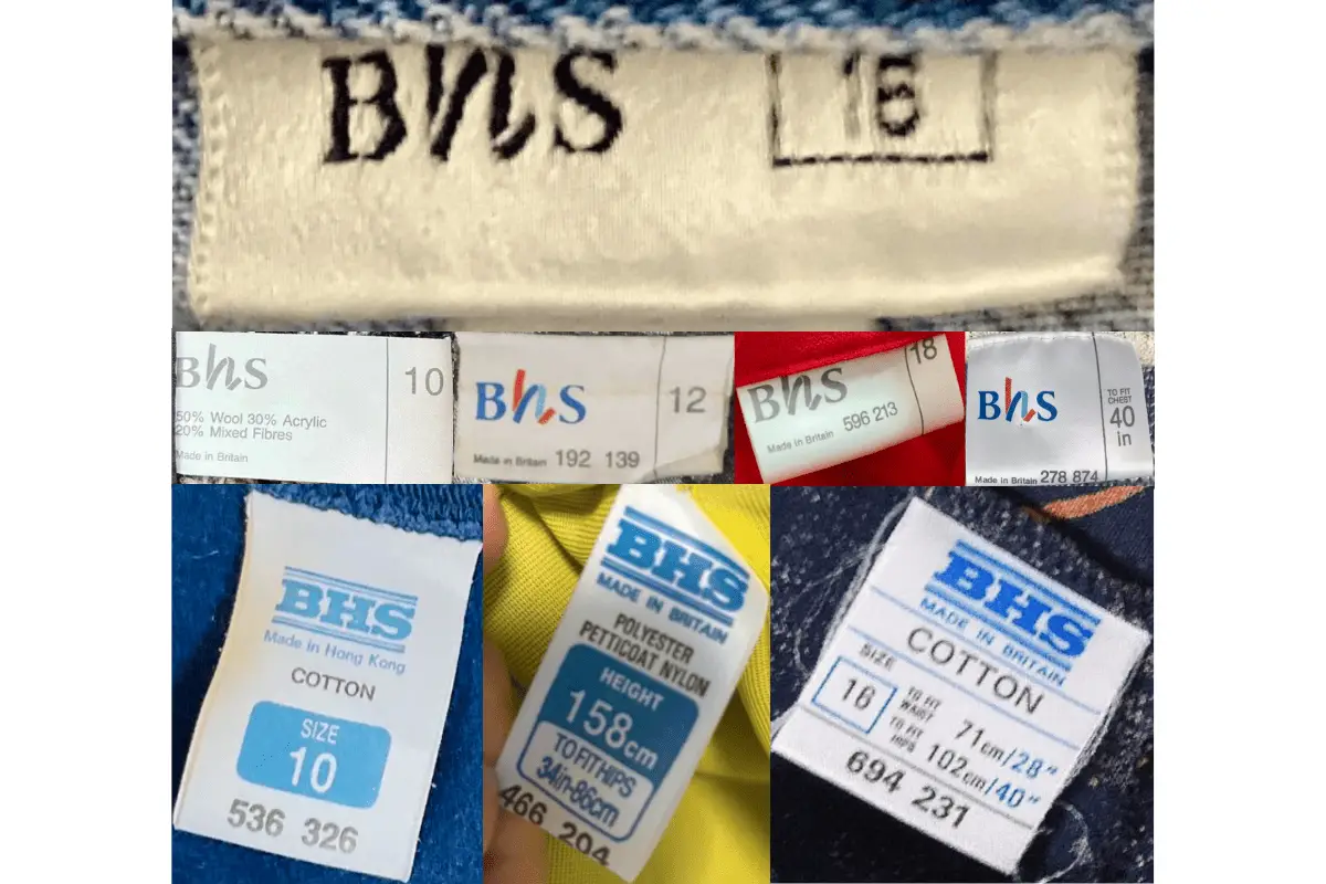
1980s Bhs tags
1990s vintage BHS tags
- Tags from this era began to show more branding elements, such as the addition of “British Home Stores” under the main BHS logo.
- Size labels became more standardized, often accompanied by measurements in both inches and centimeters.
- Some tags included country of manufacture, reflecting the beginning of outsourcing production.
- Introduction of additional lines such as “Menswear” indicated on specific tags.
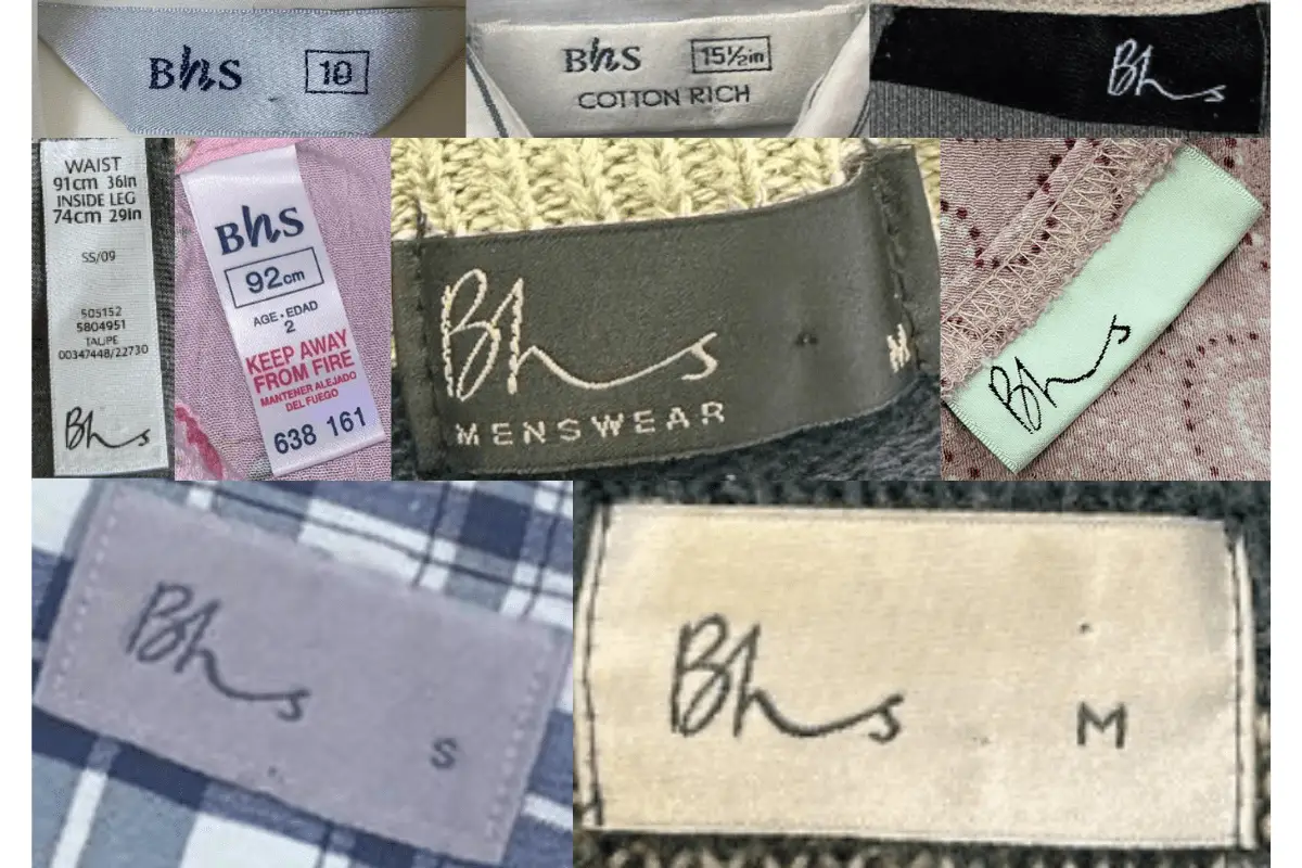
1990s Bhs tags
2000s vintage BHS tags
- The BHS logo was modernized with a more contemporary font, reflecting the changing design trends of the time.
- Tags became more varied, with some items featuring loop tags, while others retained the traditional rectangular form.
- More detailed care instructions and fabric content information were added, aligning with industry standards.
- The inclusion of specific product lines, such as “Cotton Rich,” became more common, targeting specific consumer preferences.
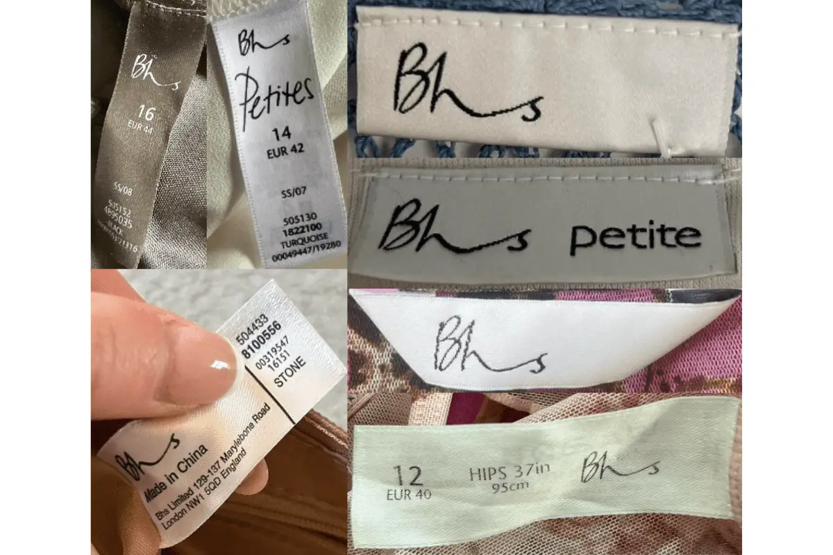
2000s Bhs tags
2010s vintage BHS tags
- Tags from this era reflected a more streamlined and minimalistic approach, with a focus on simplicity and clarity.
- Some tags featured the “Keep Away From Fire” warning in bold red letters, a legal requirement for certain clothing items.
- Branding became more subtle, with the BHS logo often appearing in a smaller size or as part of a larger care label.
- Tags frequently included sustainability messages, like “Think with Clarity, Donate to Charity,” indicating a shift towards more socially responsible messaging.
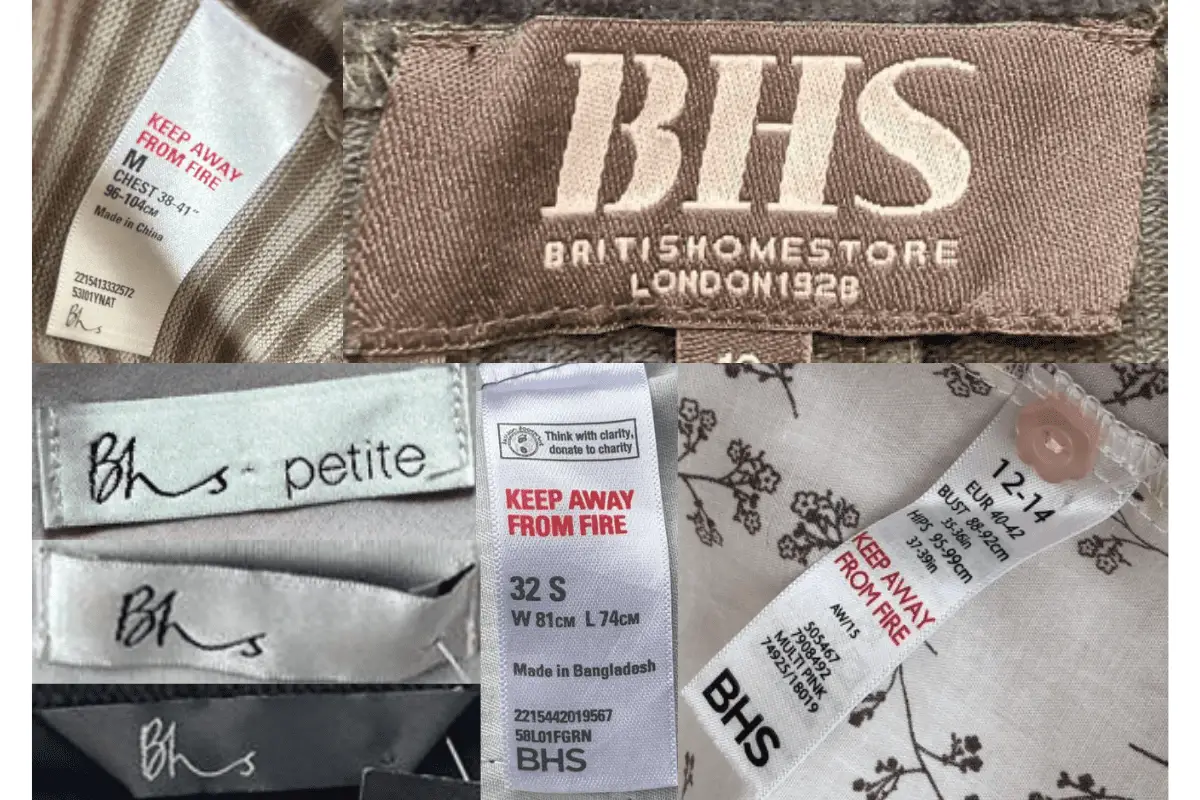
2010s Bhs tags


Your point of view caught my eye and was very interesting. Thanks. I have a question for you.
Your article helped me a lot, is there any more related content? Thanks! https://www.binance.info/es/register?ref=T7KCZASX