Abe Schrader’s journey from humble immigrant to fashion mogul is a quintessential American success story, deeply rooted in the heart of the 20th-century garment industry. Born in Poland in 1900, Schrader arrived in the U.S. in 1921 with little more than ambition. His rise began in the factories of New York City, where he honed his skills as a pattern cutter and contractor. By 1952, Schrader had transitioned from anonymous contract manufacturing to establishing his own label, Abe Schrader Corp., known for producing high-quality, elegant dresses and separates. This bold move marked the beginning of a flourishing brand that would define American women’s fashion for nearly four decades.
The Abe Schrader label became synonymous with sophistication, offering timeless ready-to-wear pieces that blended practicality with high style. Schrader’s company thrived through partnerships with renowned designers like Belle Saunders and Pauline Trigère, whose creations brought fresh appeal to his collections. The brand’s versatility, producing both refined eveningwear and stylish coats, catered to a diverse audience of women, from young professionals to high-society elites. By the 1980s, the label had grown into a $70 million business, firmly establishing itself on New York’s iconic Seventh Avenue, the epicenter of the U.S. fashion industry.
Abe Schrader’s influence extended beyond just fashion. His dedication to making New York the “fashion capital of the world” and his efforts to rename Seventh Avenue as Fashion Avenue underscore his lasting legacy. Even after selling his company in 1984, Schrader remained an iconic figure, celebrated for both his business acumen and his commitment to philanthropic causes. Through his leadership, the Abe Schrader brand not only helped define mid-century American style but also left an indelible mark on the fashion industry’s cultural landscape.
60s Fashion in London’s King Street
How to tell if Abe Schrader is vintage from the logo
Abe Schrader was a well-known brand in women’s fashion during the mid-20th century. The evolution of the logo reflects changes in design trends and branding approaches across different decades. By looking closely at the structure and style of the logos, it’s possible to identify the era of an Abe Schrader garment. Below is a breakdown of the different logo designs based on the eras represented by the logos provided.
1950s Abe Schrader logo
- The logo features a bold, stylized “Abe Schrader” text.
- The word “Abe” is written in a smaller size above “Schrader” with a decorative font, giving the logo a classical, elegant touch.
- The overall feel is sophisticated, with a vintage flair typical of mid-century fashion.
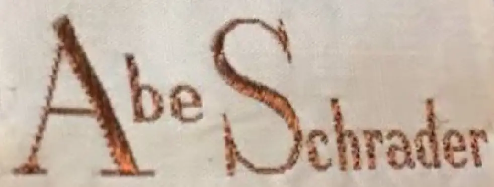
1950s Abe Schrader logo
1960s to 1980s Abe Schrader logo
- The logo shows a continuation of the “Abe Schrader” text, but the fonts used appear more refined and modern compared to earlier versions.
- The “Abe” part is more cursive, while “Schrader” maintains a bolder serif font, showing a contrast between the two words.
- The design is reflective of the more sleek and minimalist trends of the late 20th century fashion industry.

1960s to 1980s Abe Schrader logo
1980s Abe Schrader logo
- The logo during this era presents a streamlined version of “Schrader” without the “Abe” in the text.
- The font is more geometric and modern, embracing the bolder, cleaner typefaces of the 1980s.
- The minimalist approach signals a shift towards more contemporary branding, as seen in other fashion labels during this period.

1980s Abe Schrader logo
How to tell if Abe Schrader is vintage from the tags
Abe Schrader’s brand evolution can be traced through its tags, showcasing distinct shifts in design elements and materials. The progression from the 1950s to the 1980s demonstrates how the company modernized its identity while maintaining its elegant aesthetics. Vintage collectors can use these tags to identify garments from specific decades, each with unique features.
Can’t figure out your vintage tags or labels? Upload a picture on our vintage tag identification page, and we’ll assist you!
1950s vintage Abe Schrader tags
- Tags from this era feature serif lettering with intricate and elegant font styling.
- The labels often include the mention of “Union Made” with a small blue or teal label alongside the main brand tag, indicating garment worker union involvement.
- The text is typically centered, with “Abe” in a smaller font compared to “Schrader.”
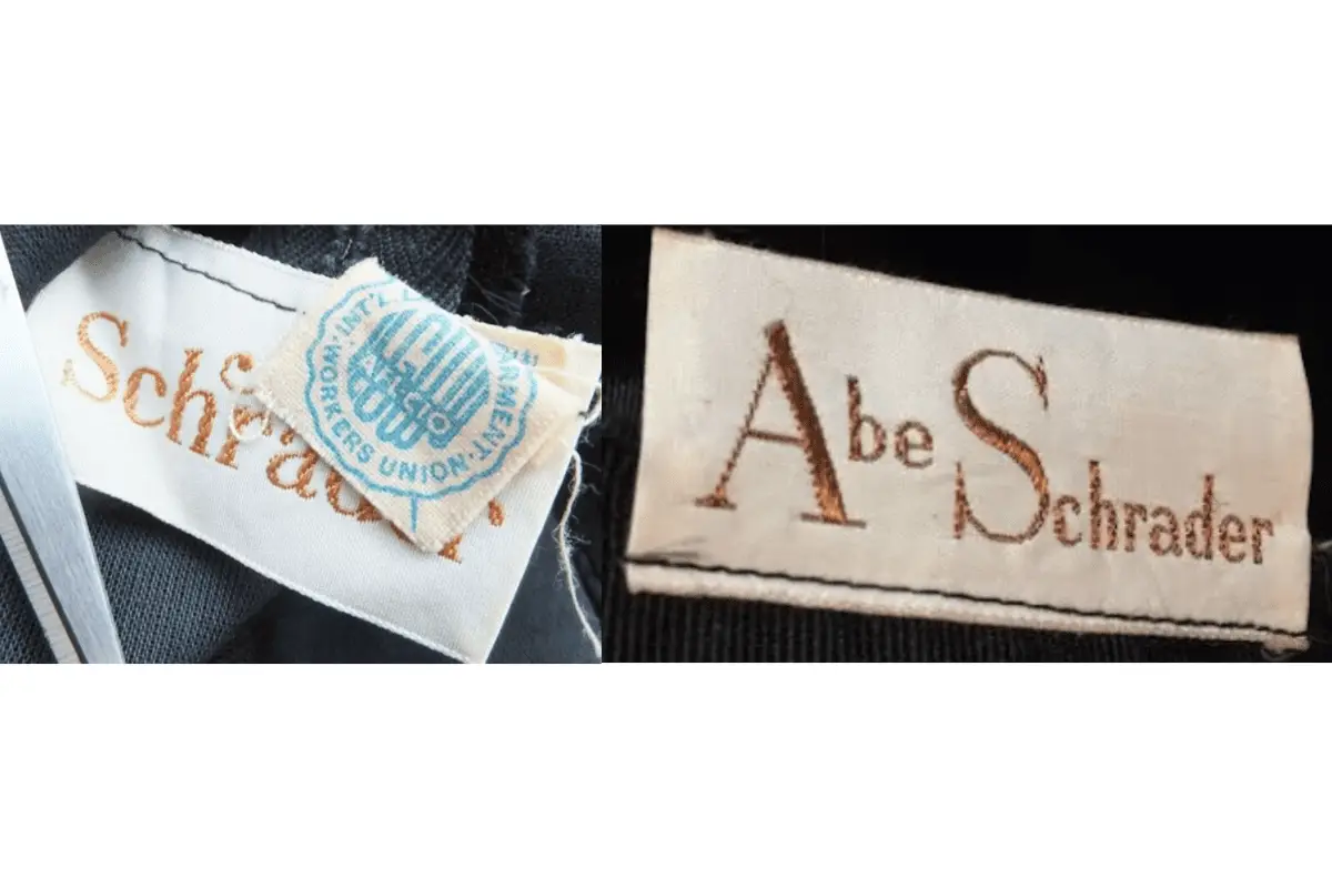
1950s Abe Schrader tags
1960s vintage Abe Schrader tags
- The serif lettering becomes bolder, maintaining the elegance associated with the brand.
- Tags generally feature white backgrounds with gold or brown thread for the lettering.
- “Abe” appears in a delicate, cursive style, while “Schrader” is often rendered in a more classic serif font.
- Some tags begin to include subtle decorative flourishes, reflecting the fashionable trends of the 1960s.
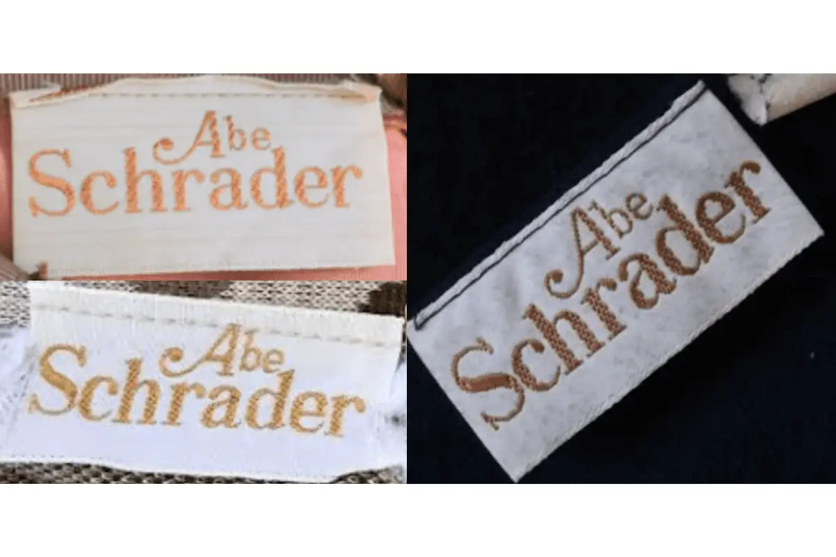
1960s Abe Schrader tags
1970s vintage Abe Schrader tags
- The font styling remains similar to the 1960s, but the tags display a more refined and simpler design.
- Labels often feature a clear contrast between the “Abe” in a smaller, elegant font and “Schrader” in a larger, more prominent font.
- Brown and gold threads continue to dominate, with slight shifts in layout for readability.
- Tags begin incorporating mentions of the brand’s location, such as “New York,” enhancing the sense of place and heritage.
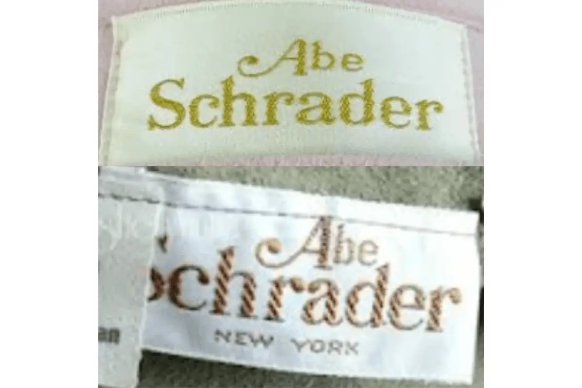
1970s Abe Schrader tags
1980s vintage Abe Schrader tags
- More modernized tags with clean, bold serif fonts.
- Focus on a minimalistic design, often with “Schrader” taking prominence in larger, simple lettering.
- Tags sometimes introduce registered trademark symbols (®) next to the brand name, indicating legal protection of the brand.
- Various tag designs include references to “New York,” with some garments showing a more detailed, modern label structure.
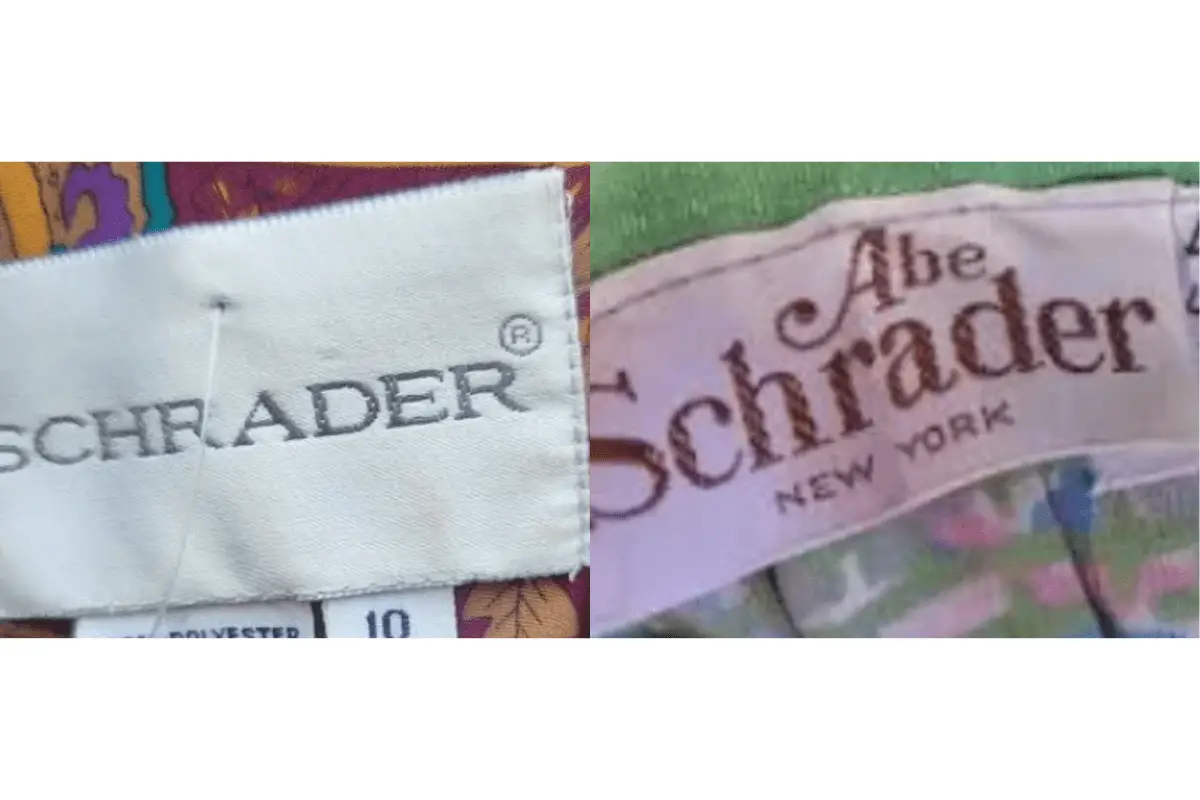
1980s Abe Schrader tags
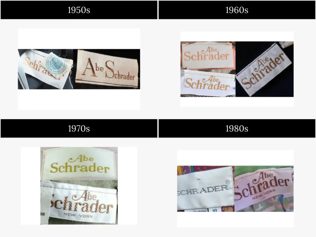
Abe Schrader tags by Year


Your point of view caught my eye and was very interesting. Thanks. I have a question for you.
Can you be more specific about the content of your article? After reading it, I still have some doubts. Hope you can help me.