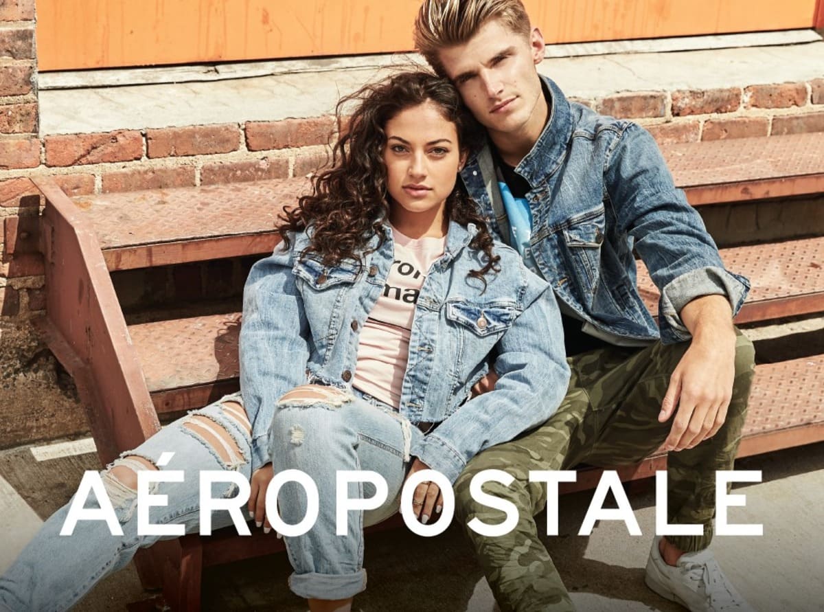
Aéropostale, an iconic American retailer, has long been a staple in shopping malls across the United States, known for its casual apparel and accessories targeted primarily at young adults and teenagers. Established in 1987 by R.H. Macy & Co., Aéropostale quickly carved out a niche in the fashion industry by offering trendy, affordable clothing that resonated with the youth market. With its roots in Thousand Oaks, California, and Short Hills, New Jersey, the brand expanded rapidly, capitalizing on its ability to design, source, market, and sell its own merchandise, which allowed it to maintain a strong brand identity and control over its product lines.
Over the years, Aéropostale has evolved significantly, both in terms of its product offerings and its brand image. The company has ventured beyond its core apparel business, experimenting with various sub-brands and collections to appeal to a broader audience. In 2009, Aéropostale introduced “P.S. from Aéropostale,” a line designed for younger children, though this initiative was eventually phased out. The brand also launched collaborations with popular influencers like Bethany Mota and introduced collections such as “Live Love Dream,” catering to the athleisure market. Despite these changes, Aéropostale has stayed true to its original mission of providing stylish, accessible clothing to its target demographic.
As Aéropostale continued to grow, it expanded its reach beyond the U.S. market, establishing a presence in the Middle East, Asia, Europe, and Latin America through its licensing agreements. This international expansion, combined with the brand’s efforts to stay relevant in a highly competitive market, has solidified Aéropostale’s status as a go-to brand for casual, youth-oriented fashion. Whether through its brick-and-mortar stores or its e-commerce platform, Aéropostale remains a significant player in the retail industry, competing with other major brands like Abercrombie & Fitch, Hollister, and American Eagle Outfitters.
How to tell if Aéropostale is vintage from the logo
Aéropostale has undergone several logo changes throughout its history, reflecting its evolving brand identity. From bold, blocky lettering in its early days to more modern and sleek designs, each era of the Aéropostale logo offers clues that can help you determine the vintage of your clothing. Below, we explore the key characteristics of Aéropostale logos from the eras represented in the images provided.
1987 to 1990s Aéropostale logo
- This logo features a bold, blocky typeface with a strong, solid presence.
- The accent on the letter “É” is prominently placed, emphasizing the brand’s French origins.
- Black and white colors were commonly used, making the logo highly visible and striking.
1987 to 1990s Aeropostale logo
1990s to 2017 Aéropostale logo
- This version of the logo maintains the bold typeface but introduces a more streamlined and modern look.
- The letters are slightly more spaced out, giving the logo a cleaner appearance.
- Blue is often used, signaling a shift towards a more casual and approachable brand identity.
1990s to 2017 Aeropostale logo
2017 to now Aéropostale logo
- The current logo is more minimalistic and refined, with a focus on simplicity.
- The typeface is thinner, and the overall design is less bold compared to earlier versions.
- The color palette is more versatile, often seen in a variety of colors, though red is commonly used.
2017 to now Aeropostale logo
How to tell if Aéropostale is vintage from the tags
The evolution of Aéropostale tags reflects the brand’s journey from its origins to its modern-day identity. Over the years, the tags have undergone several changes in typography, material, and design elements, which can help in identifying the era a particular garment belongs to. Below is a breakdown of Aéropostale tags by decade, highlighting key characteristics that can help you determine if an Aéropostale piece is vintage.
Need help with vintage tags or labels? Submit a picture on our vintage tag identification page, and we’ll assist you!
1990s vintage Aéropostale tags
- Tags from this era often feature a serif font with a slightly textured background.
- The brand name “Aéropostale” is prominently displayed, usually centered within a rectangular border.
- Some tags include the phrase “COMPAGNIE GENERALE” above the brand name, referencing the brand’s origins.
- Colors are typically neutral, with dark blues and creams being common.
- Materials used for the tags often include a woven fabric, giving a durable and somewhat rugged appearance.

1990s Aeropostale tags
2000s vintage Aéropostale tags
- The tags from the 2000s show a shift towards a more modern aesthetic, with clean, bold lettering.
- “Aéropostale” is displayed in a sans-serif font, usually in uppercase, emphasizing simplicity and readability.
- Colors are varied, with a mix of bold hues like red and blue, as well as more subdued tones.
- The phrase “Designed in NYC” often appears on these tags, reflecting the brand’s connection to New York City.
- Tags are typically made from soft fabric or printed directly onto the garment, indicating a move towards comfort and modern manufacturing techniques.

2000s Aeropostale tags
2010s vintage Aéropostale tags
- Tags in the 2010s exhibit a minimalist design, with a focus on simplicity and brand identity.
- The brand name is often in lowercase or a stylized font, reflecting contemporary design trends.
- Tags frequently include the phrase “Established 1987,” highlighting the brand’s history.
- There is a mix of woven and printed tags, with materials leaning towards soft, comfortable fabrics.
- Some tags feature “Nineteen Eighty Seven” as a stylistic element, often paired with the size information in a bold, straightforward format.

2010s Aeropostale tags


I’m ?mazed, I must say. Seldom do I com? across a blog that’s equally educative and interesting, and ?ithout a doubt, you have
hit the nail on t?e head. The problem i? an issue that too
few people are speaking intelligently abo?t.
Now i’m very happy that I csme across this during my search ffor somet?ing concerning this.