Albert Nipon was a visionary in the world of women’s fashion, known for creating ultra-feminine, elegant designs that captured the attention of both everyday consumers and high-profile clients alike. Born in West Philadelphia in 1927, Nipon’s journey into the fashion industry was not a direct one. He began his career as an accountant before making the leap into fashion alongside his wife, Pearl. Together, they started designing maternity wear in 1954, opening a small shop that would eventually grow into the chain known as Ma Mere. As the demand for maternity clothes waned with declining birth rates, the Nipons pivoted to creating sophisticated dresses that would come to define the Albert Nipon brand.
The 1970s marked a turning point for the Nipons, as they sold their maternity brand to Dekon Corporation and launched the eponymous Albert Nipon label, a move that catapulted them into the international fashion scene. Pearl’s chic design sense combined with Albert’s business acumen created a line that resonated with career women looking for fluid, comfortable, and impeccably tailored clothing. The brand quickly gained popularity, attracting the likes of Rosalynn Carter, Nancy Reagan, and Barbara Walters. By 1984, sales had reached $60 million, cementing Albert Nipon’s place as a major player in the fashion industry.
Despite facing significant legal challenges, including a prison sentence for tax evasion in the mid-1980s, Nipon’s brand endured. Though the company declared bankruptcy in 1988, it was acquired by the Leslie Fay Company, which allowed the Nipons to continue designing. Albert Nipon’s legacy as a designer who revolutionized women’s fashion remains, with his dresses and fragrances still available in boutiques worldwide. The brand’s evolution over the decades is a testament to its timeless appeal and enduring influence in the fashion world.
1984 Albert Nipon Documentary
How to tell if Albert Nipon is vintage from the logo
Albert Nipon has seen its logo evolve over the years, reflecting changes in both design trends and brand identity. By examining the logo’s typography and design details, one can determine which era a particular piece belongs to. Below is a breakdown of the Albert Nipon logos based on the images provided, categorized by the specific time periods they represent.
1970s Albert Nipon logo
- This logo features an intricate, script-like design of the initials “A” and “N” encased in a square.
- The text “Albert Nipon” appears in a serif font with slightly uneven, textured letters, giving it a more hand-crafted feel.
- This design exudes elegance and formality, fitting with the fashion trends of the time, where more luxurious, custom-looking logos were in vogue.
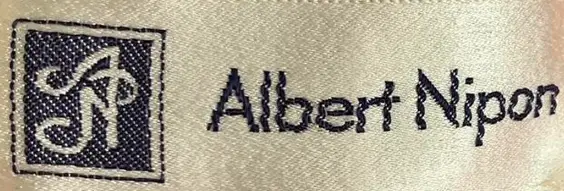
1970s Albert Nipon logo
1970s to 1990s Albert Nipon logo
- The logo becomes more minimalist during this period, losing the square around the “A” and “N” emblem and focusing more on the clean, straight text.
- The font becomes less elaborate, shifting toward a more modern, sans-serif style with thin, spaced-out letters.
- This design mirrors the general trend in the fashion industry at the time, which favored simplicity and elegance over more ornate logos.

1970s to 1990s Albert Nipon logo
1970s to 1990s Albert Nipon logo (alternative)
- An alternate logo from the same period features bold, all-caps text with slightly jagged, textured edges.
- The font is much more distinct and less polished, with a rougher, more hand-drawn appearance.
- This variant reflects a transitional phase in the brand’s identity, bridging the classic elegance of earlier designs with a more casual, ready-to-wear aesthetic.

1970s to 1990s Albert Nipon logo
How to tell if Albert Nipon is vintage from the tags
The evolution of Albert Nipon clothing labels reflects the brand’s journey through the decades. From its early years focusing on high-end fashion for women to expanding its collections with boutique lines, eveningwear, and knitwear, the label design has shifted accordingly. Each era introduced subtle changes in font, layout, and descriptor details, helping collectors and fashion enthusiasts date vintage Albert Nipon pieces accurately.
Having trouble identifying vintage tags or labels? Upload a picture on our vintage tag identification page, and we’ll assist you!
1970s vintage Albert Nipon tags
- Simple, bold “Albert Nipon” text in serif font, without extra design elements.
- The brand focused on showcasing its core identity without additional descriptors.
- Tags were straightforward, often without sub-labels like “Evening” or “Boutique.”
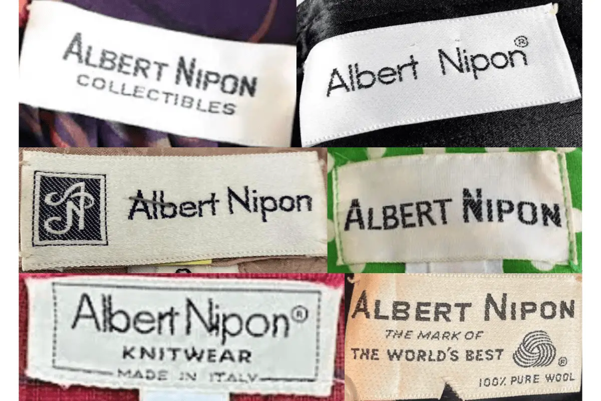
1970s Albert Nipon tags
1980s vintage Albert Nipon tags
- Introduction of sub-labels like “Boutique” and “Evening,” marking the expansion of their lines.
- Tags often featured more detailed text such as “Made in Italy” and other material descriptors like “100% Pure Wool.”
- The font remained bold, but some labels included intricate logos like the stylized “AN” monogram, adding a luxury feel.
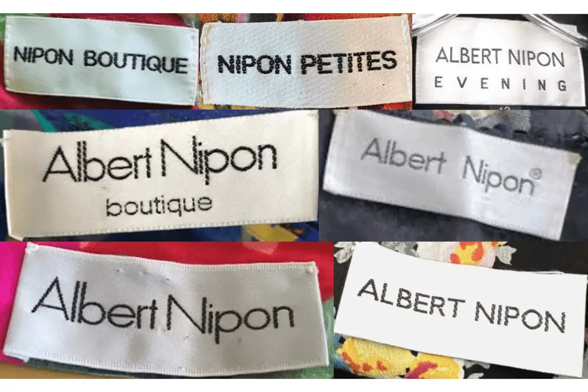
1980s Albert Nipon tags
1990s vintage Albert Nipon tags
- Tag designs became more minimalist, with thin, sans-serif fonts dominating the layout.
- Specialty labels like “Studio” and “Suits” were introduced, showcasing the brand’s tailored collections.
- Subtle shifts in fabric color and texture were common, reflecting the fashion trends of the time.
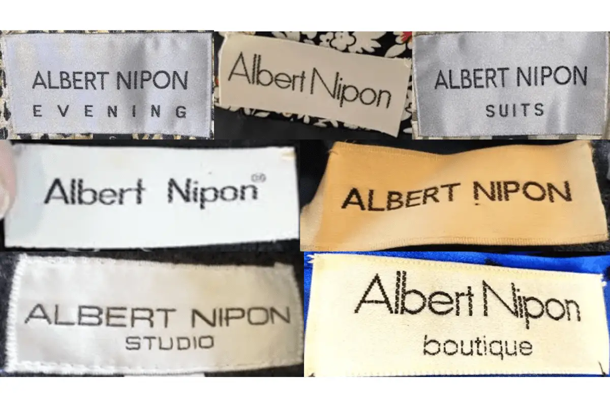
1990s Albert Nipon tags



Can you be more specific about the content of your article? After reading it, I still have some doubts. Hope you can help me.