Ann Demeulemeester, a name synonymous with avant-garde fashion, has a storied history that dates back to the mid-1980s. Born Ann Verhelst on December 29, 1959, she rose to prominence as one of the Antwerp Six, a group of influential designers who graduated from Antwerp’s Royal Academy of Fine Arts. Her distinct design philosophy, characterized by a dark, poetic aesthetic, quickly set her apart in the fashion world. Ann Demeulemeester’s collections, showcased primarily at Paris Fashion Week, have always reflected a profound artistic vision, drawing inspiration from various sources, including her collaborations with artists and musicians.
In 1985, Ann Demeulemeester launched her eponymous brand alongside her husband, Patrick Robyn, who played a significant, though unofficial, role in the creative process. Her debut collection for the fall of 1987 established her as a formidable force in the industry, leading to the introduction of shoes and accessories the following year. The brand saw substantial growth throughout the 1990s, with the launch of a menswear line in 1996 and the opening of its flagship store in Antwerp in 1999. Under the stewardship of Belgian entrepreneur Anne Chapelle, who acquired a majority stake in 2005, the brand expanded its global reach while maintaining its unique identity.
In 2013, Ann Demeulemeester stepped down from her label, handing over the reins to French designer Sébastien Meunier. This transition marked a new chapter for the brand, which continued to evolve while staying true to its core principles. After a period of significant changes, including the acquisition by Italian retailer Claudio Antonioli in 2020, Ann Demeulemeester made a notable return to the brand in 2021. This comeback not only reconnected the brand with its origins but also heralded a new direction, focusing on a broader lifestyle concept. Today, the Ann Demeulemeester label stands as a testament to the enduring legacy of its founder, blending timeless fashion with innovative design.
Iconic 1997 Ann Demeulemeester Runway
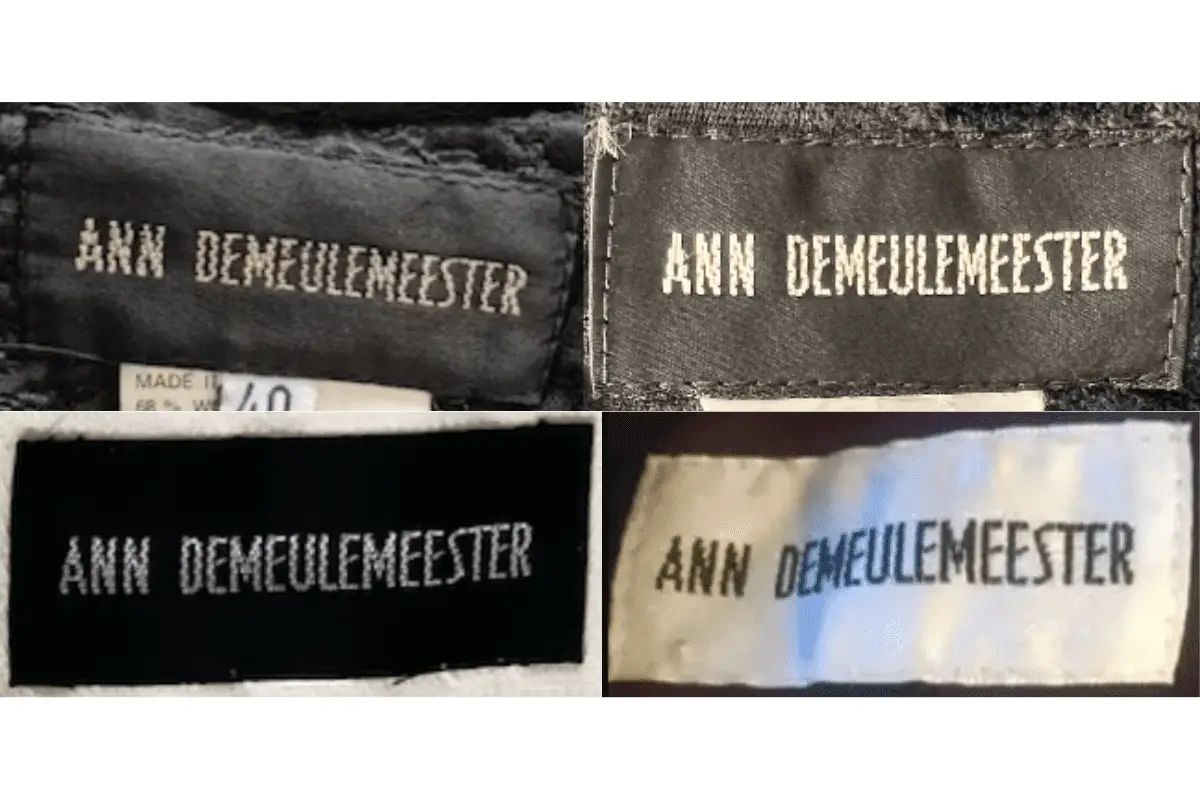
How to tell if Ann Demeulemeester is vintage from the logo
Ann Demeulemeester is renowned for her dark, avant-garde aesthetic that has left a significant mark on the fashion industry. Since its inception, the brand’s logo has reflected its unique style and identity. While Ann Demeulemeester’s designs are timeless, identifying the era of a piece through its logo can provide valuable insights for vintage collectors. Here’s a guide to understanding the Ann Demeulemeester logo from 1985 to now.
1985 to now Ann Demeulemeester logo
- The logo features the full name “ANN DEMEULEMEESTER” in uppercase letters.
- The font is distinctive with a slightly elongated, artistic style, reflecting the brand’s avant-garde approach.
- Consistency in the logo design has been maintained since 1985, making it more challenging to date specific pieces solely based on the logo.
1985 to now Ann Demeulemeester logo
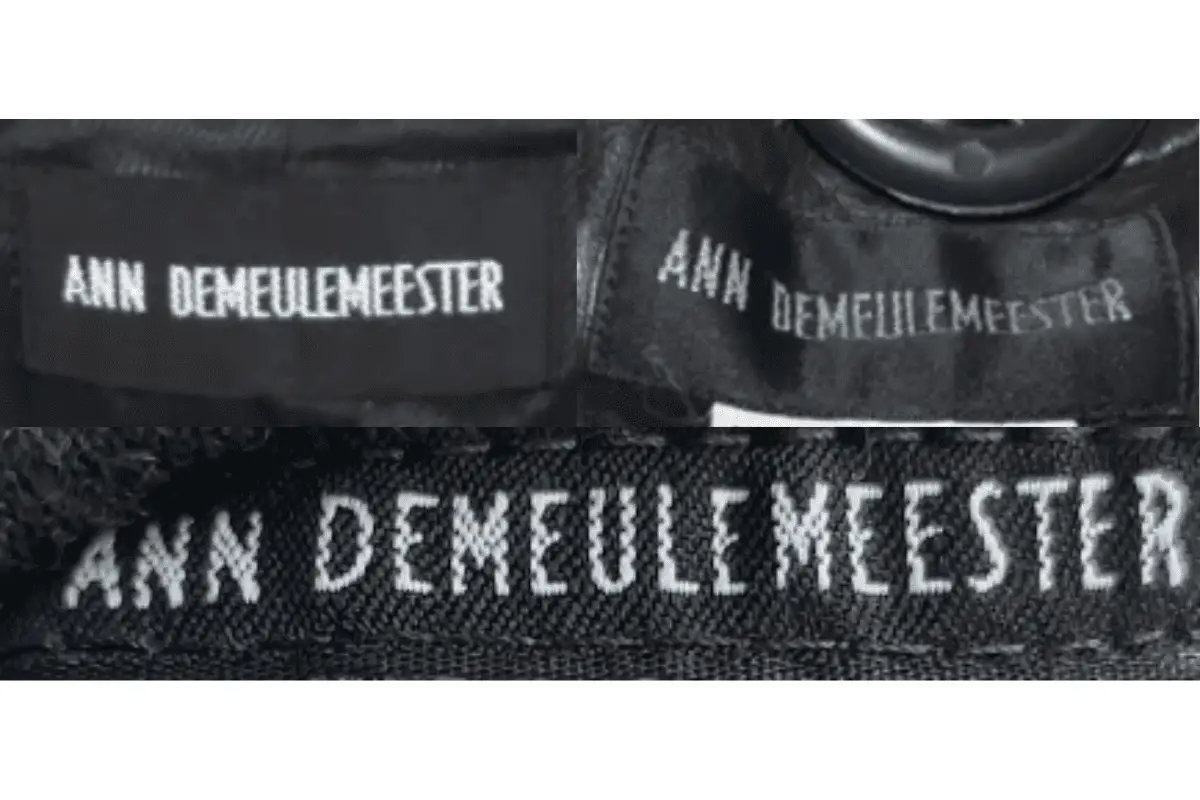
How to tell if Ann Demeulemeester is vintage from the tags
The evolution of Ann Demeulemeester’s tags reflects the brand’s distinctive style and changing design trends over the decades. From the minimalistic and stark tags of the 1990s to the more modern interpretations in the 2000s and 2010s, each era offers unique characteristics that help identify the vintage nature of the garments.
Having difficulty identifying vintage tags or labels? Submit a picture on our vintage tag identification page, and we’ll assist you!
1990s vintage Ann Demeulemeester tags
- Features simple black tags with white, bold serif lettering.
- Often the brand name is stitched directly onto the fabric.
- Tags are typically rectangular in shape.
1990s Ann Demeulemeester tags
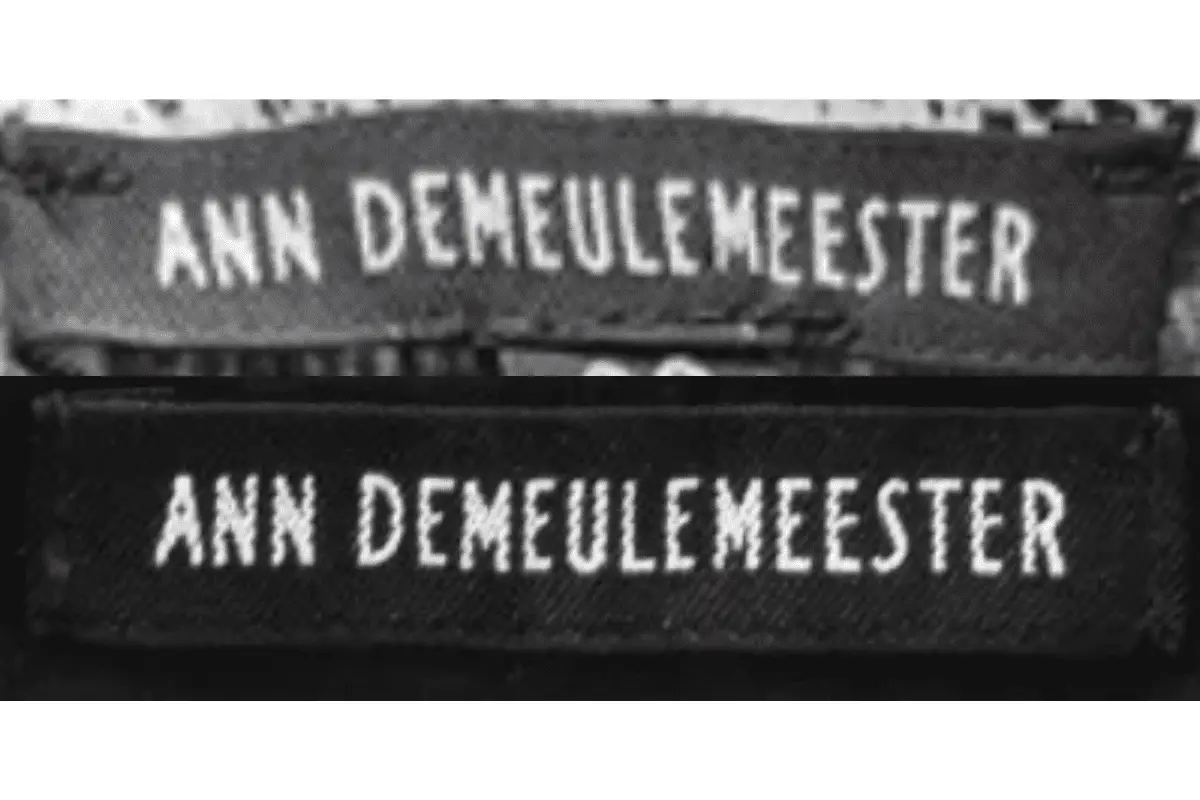
2000s vintage Ann Demeulemeester tags
- Continues with the black and white color scheme but with a slightly more modern font.
- Tags may include additional elements such as care instructions on a separate tag.
- Introduction of tags that are more refined and neatly stitched.
2000s Ann Demeulemeester tags
2010s vintage Ann Demeulemeester tags
- More diverse use of materials and layouts while maintaining the brand’s classic black and white aesthetic.
- Tags are often more detailed with finer stitching and sometimes additional branding elements.
- Continues to use bold serif lettering but with variations in font size and placement.
2010s Ann Demeulemeester tags