From its inception in the mid-19th century, Aquascutum has been synonymous with the quintessence of British style and sophistication. Established in 1851 by tailor and entrepreneur John Emary, Aquascutum began as a high-quality menswear shop located at 46 Regent Street, London. The name, derived from the Latin words ‘aqua’ (water) and ‘scutum’ (shield), reflects the brand’s innovative origins—Emary patented the first waterproof wool in 1853, revolutionizing outerwear with what would become the cornerstone of the brand’s enduring legacy.
Aquascutum’s storied history is intertwined with significant cultural and historical milestones. The brand played a pivotal role during the Crimean War, providing officers with its waterproof fabrics, and later, the iconic trench coats worn in both World Wars. These garments not only served practical purposes but also set the stage for the trench coat’s transcendence into civilian fashion. By the late 19th century, Aquascutum had already secured its first royal warrant from King Edward VII, a testament to its prestige and the royal family’s patronage which continues to this day.
Throughout the 20th century, Aquascutum expanded its influence and offerings, navigating through shifts in ownership and global expansions while maintaining its commitment to quality and British craftsmanship. The introduction of womenswear in 1900 marked another pivotal moment, broadening its appeal and aligning the brand with the progressive spirit of the times, particularly with the British suffragettes. The post-war era and beyond saw Aquascutum solidify its status as a symbol of luxury and resilience, outfitting political figures, Hollywood royalty, and cultural icons alike.
Today, Aquascutum remains a beacon of classic style and innovation. Understanding its logo and garment tags not only helps in identifying vintage pieces but also offers insight into the brand’s rich history and evolution. This guide explores the subtle nuances of Aquascutum’s branding through the decades—from the regal crests and serif fonts of the 1950s to the sleek, minimalist designs of the 21st century—providing enthusiasts and collectors with the knowledge to appreciate and verify the authenticity of their Aquascutum treasures.
Y2K Aquascutum FW Collection
How to tell if Aquascutum is vintage from the logo
Aquascutum, a storied British brand known for its refined tailoring and classic trench coats, has maintained a consistent presence in the world of luxury fashion since its inception. The brand’s logo, which often subtly evolves over the decades, offers a unique window into its rich heritage. Understanding these changes not only helps in identifying vintage pieces but also in appreciating the history and craftsmanship embedded in each garment.
The logo of Aquascutum has been a hallmark of quality and British elegance, often featured prominently on their products. This guide aims to decipher the nuances of the Aquascutum logo from the 1950s to the present, aiding enthusiasts and collectors in pinpointing the era of their items. The consistency in logo design reflects the brand’s commitment to tradition and its adaptive approach towards modernity, making vintage identification both a challenge and an intriguing pursuit.
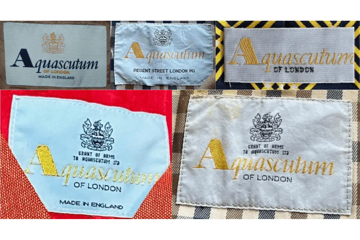
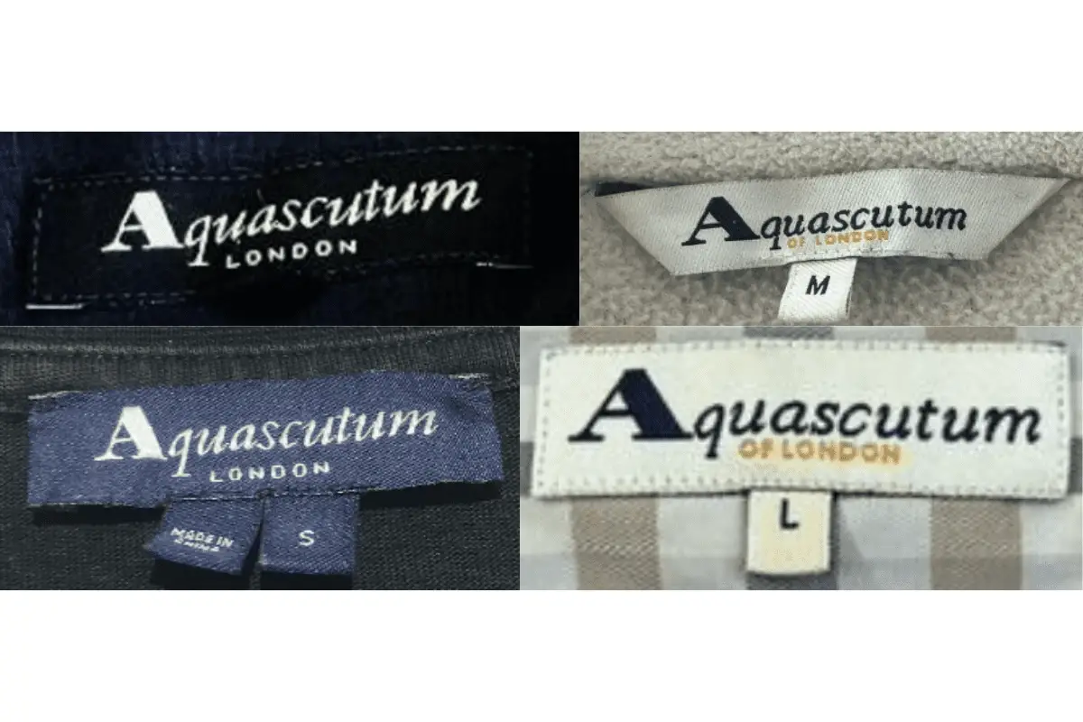
1950s to now Aquascutum logo
- The logo has maintained a relatively consistent design, featuring the brand name in a distinctive serif font.
- The crest above the text adds a regal touch, symbolizing the brand’s British roots and its long-standing association with luxury.
- Despite slight variations in the font weight and crest detail over the decades, the overall structure remains largely unchanged, making it more challenging to date pieces precisely by the logo alone.
1950s to now Aquascutum logo
How to tell if Aquascutum is vintage from the tags
Aquascutum, a storied British brand renowned for its luxurious tailoring and weatherproof fabrics, offers a fascinating glimpse into the evolution of fashion through its garment tags. Each era’s tag not only signifies the period of manufacture but also reflects broader changes in fashion, technology, and branding strategies. From royal warrants to modern minimalist designs, the tags are a microcosm of the brand’s commitment to quality and its adaptation to changing times.
Identifying the age and authenticity of Aquascutum pieces can be particularly gratifying for collectors and fashion enthusiasts. By examining the distinctive characteristics of the tags from different decades, one can appreciate the subtleties that differentiate vintage garments from contemporary productions. This guide aims to help enthusiasts discern the nuances of Aquascutum’s tags through the years.
Need help figuring out vintage tags or labels? Upload a picture on our vintage tag identification page, and we’ll help you out!
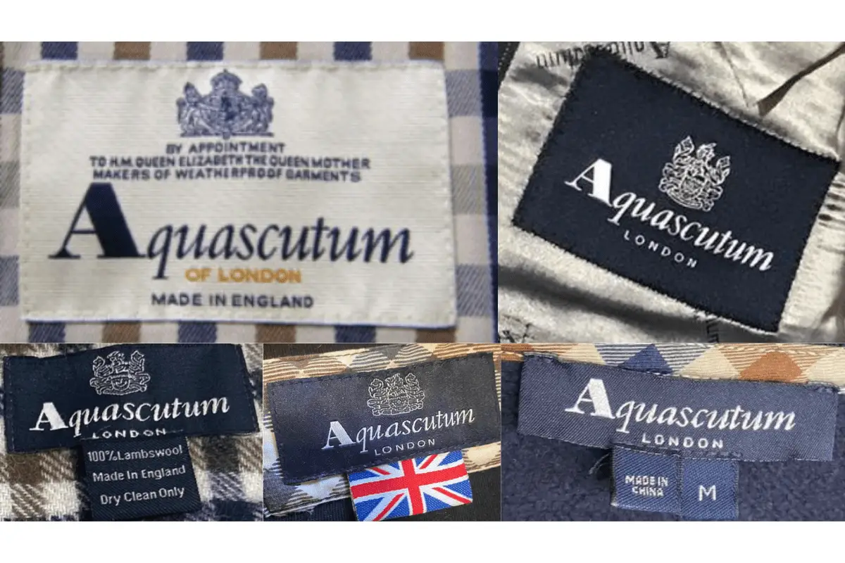
1960s vintage Aquascutum tags
- Feature the full “Aquascutum of London” branding prominently.
- Typically include the royal warrant by appointment to Queen Elizabeth the Queen Mother.
- Commonly found in simple rectangular shapes with elegant script fonts.

1960s Aquascutum tags
1970s vintage Aquascutum tags
- Continuation of the royal warrant, emphasizing heritage and luxury.
- Tags often include specific details such as “Made in England” or other local manufacturing clues.
- Sometimes adorned with simple logos and minimal additional text.
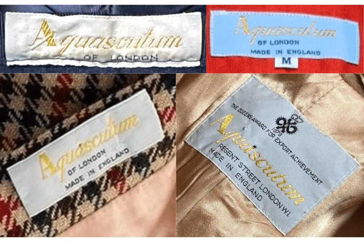
1970s Aquascutum tags
1980s vintage Aquascutum tags
- Introduction of more colorful and varied tag designs.
- Incorporation of the brand name with or without the “of London” suffix, depending on the item.
- Usage of both serif and sans-serif fonts reflecting the brand’s modernization.
1980s Aquascutum tags
1990s vintage Aquascutum tags
- Embrace of bolder, more graphic designs in tag presentation.
- Retention of the royal warrant but with updated text and styling elements.
- Often paired with care instructions and fabric compositions in detailed typography.

1990s Aquascutum tags
2000s vintage Aquascutum tags
- Shift towards a more minimalist and modern aesthetic in tag design.
- Frequent use of monochrome color schemes and streamlined logo designs.
- Inclusion of multiple languages on care tags, reflecting the brand’s global reach.
2000s Aquascutum tags
2010s vintage Aquascutum tags
- Modern tags with sharp, clean lines and a focus on the font and spacing.
- Variation in tag materials, from traditional woven labels to printed synthetic ones.
- Continued use of the iconic logo, albeit in a more restrained and contemporary fashion.
2010s Aquascutum tags