For decades, Asics has been synonymous with athletic excellence, designing gear that embodies the brand’s Latin-inspired mantra “anima sana in corpore sano,” meaning “a sound mind in a sound body.” Rooted in this ethos, the Japanese sportswear giant has long promoted the idea that sports are a vehicle for holistic wellness. Though Asics’ journey began in 1949 with a vision to uplift post-war Japan through basketball shoes, the brand has since expanded to include a diverse range of footwear, apparel, and accessories that cater to athletes of all stripes. From the courts to the trails and tracks, Asics’ innovative products have carved out a unique place in global sports culture, backed by a commitment to continuous improvement and groundbreaking design.
The brand’s distinctive logos offer a glimpse into its evolution over the years, reflecting shifts in style, technology, and vision. Early Onitsuka Tiger stripes gave way to bold Asics lettering that grew progressively streamlined and modern over the decades. Each logo iteration marks a milestone in Asics’ storied history, paralleling its journey from niche basketball shoes to a globally recognized powerhouse. It’s a history intertwined with technological leaps, like the debut of the revolutionary Gel™ cushioning in the ’80s and the launch of the lifestyle-oriented Asics Tiger brand in 2015.
Beyond the logos and products lies a legacy of dedication to sports science and innovation, exemplified by the Asics Research Institute of Sports Science. Built to understand and optimize natural human movement, this facility in Kobe, Japan, is the brand’s beating heart, continuously striving to improve the athletic experience. Asics lives by the rule that each new release must feature significant advancements in at least two of eight crucial features, ensuring that the brand remains on the cutting edge of performance.
In this blog, we delve into the history and evolution of Asics logos and tags, offering a window into the brand’s enduring commitment to excellence. Whether you’re a vintage collector, a sports historian, or a dedicated fan, understanding these elements will enhance your appreciation of Asics’ legacy and help you uncover the hidden stories behind each emblem.
Hilarious Asics Y2K Running Shoes Commercial
How to tell if Asics is vintage from the logo
Asics has been a trusted name in athletic footwear and apparel for decades, known for its innovative designs and comfortable products. Identifying vintage Asics gear can be a rewarding endeavor for collectors and enthusiasts alike. The brand’s logos have evolved over time, serving as a key indicator to determine when a specific item was produced.
From its inception, Asics logos have reflected the company’s evolving style and design philosophy. The early logos have distinct differences compared to the modern-day ones, with subtle yet notable changes that highlight shifts in brand image. Here’s how you can distinguish different eras of Asics logos based on their unique characteristics.
1977 to 2005 Asics logo
- The logo features an italicized “asics” in a bold, rounded font.
- The “A” incorporates a distinctive loop that almost circles back to itself.
- All letters are tightly packed, giving the logo a compact, cohesive appearance.
- The primary color is blue, providing a sense of trust and professionalism.
1977 to 2005 Asics logo
2005 to now Asics logo
- The logo retains the recognizable “A” symbol, but with a more open and slender design.
- The font for “asics” is now thinner and spaced further apart, offering a sleek, modern look.
- The deep blue color conveys stability while giving the brand a refreshed, contemporary identity.
- The overall look is cleaner, with more defined and streamlined lettering.
2005 to now Asics logo
How to tell if Asics is vintage from the tags
Asics is a Japanese sportswear brand renowned for its quality athletic gear and commitment to technological innovation. Identifying vintage Asics clothing requires a keen eye, as the brand has undergone multiple stylistic changes since its inception in 1949. From the logo’s evolution to variations in production locations, Asics tags from different decades reveal the brand’s rich history and technological advancements.
In this guide, you’ll learn about the distinctive features of Asics tags over the years. We’ll focus on the major stylistic shifts and design trends that help differentiate vintage tags, providing clarity on the era your item may belong to.
Need help identifying vintage tags or labels? Upload a picture on our vintage tag identification page, and we’ll take care of it!
1980s vintage Asics tags
- Early Asics tags feature a simple blue and white logo with serif fonts.
- The “Asics” text is often enclosed in a rectangular border, sometimes with an additional tagline or descriptor like “Made in Japan” or “Activewear Line.
- Specialty lines such as “Team Asics” or “Asics Tiger” have unique tag designs, often with more colorful graphics or specialized text.
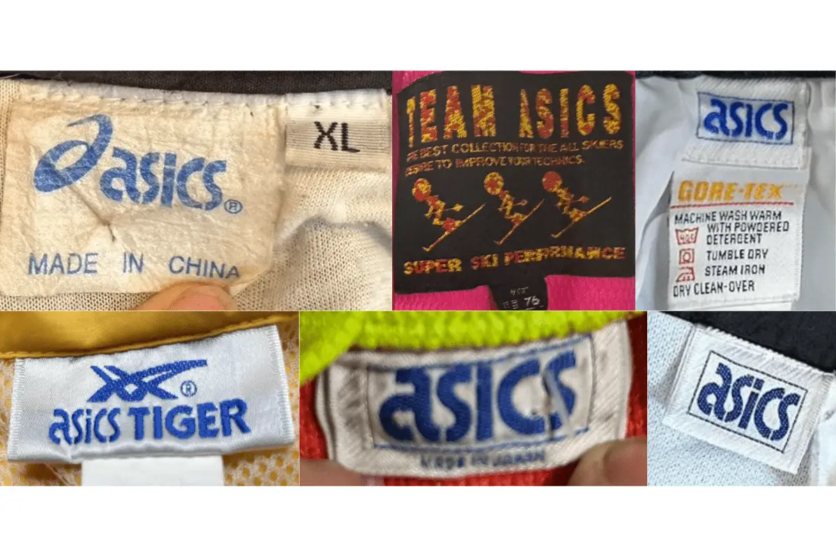
1980s Asics tags
1990s vintage Asics tags
- The Asics logo became more refined, incorporating sans-serif fonts and streamlined shapes.
- Tags often include descriptors for women’s lines or emphasize “Athletic Department” and other specialty collections.
- Manufacturing locations such as Malaysia, China, and Italy appear on tags, reflecting the brand’s global expansion.
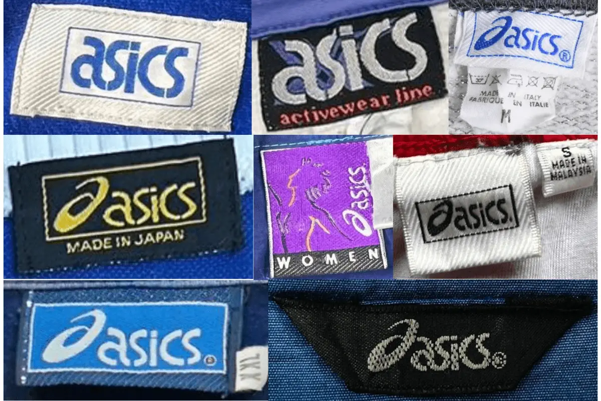
1990s Asics tags
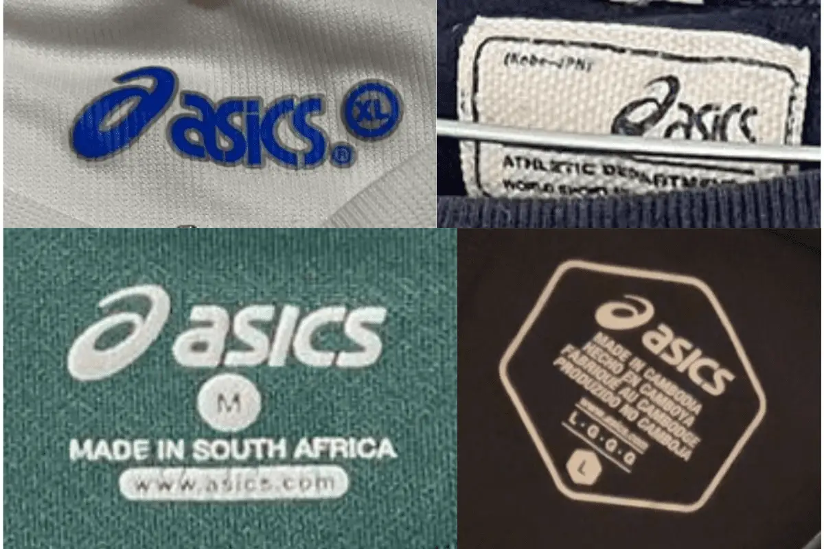
2000s vintage Asics tags
- The logo remained consistent with sans-serif fonts, but additional colors, like bright blue, became more prominent.
- Hexagonal shapes and athletic department taglines were introduced.
- Manufacturing locations include South Africa and Cambodia, marking further global expansion.
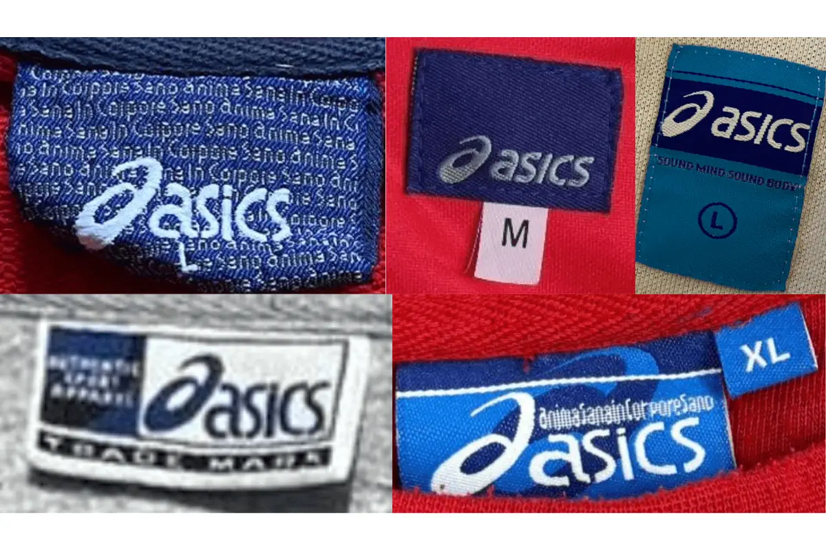
2000s Asics tags
2010s vintage Asics tags
- Tags began featuring the updated “Sound Mind Sound Body” tagline, emphasizing the brand’s focus on holistic health.
- Manufacturing locations and size indicators became standardized across tags, usually appearing below or next to the main logo.
- Graphics became more streamlined with a cohesive color palette, often incorporating shades of blue and gray.
2010s Asics tags