Arthur Benjamin Sugarman, better known as Ben Sherman, was a man who thrived on the pulse of innovation and the lure of the unattainable. Born in 1925 in Brighton, Sherman left the austere, post-war Britain at the tender age of 20 for the promising shores of America, a land teeming with opportunity and the allure of the new. In the sunny avenues of the San Fernando Valley, while working for his father-in-law’s clothing manufacturing company, Sherman cultivated not only a family but a burgeoning expertise in textiles and design. The adoption of his new American name marked a pivotal transformation not just in identity but in destiny—Ben Sherman was no longer just a man but a burgeoning symbol of fashion innovation.
The seeds of what would become a sartorial revolution were sown when Sherman returned to Brighton in the early 1960s due to family circumstances. Renting a factory in Bedford Square, he began by crafting shirts for other people, but his inherent creativity quickly took the helm. By 1963, Sherman launched his own line, ingeniously tweaking the American Ivy League shirt to suit British tastes. His vision added distinctive touches like the back hook and the button on the back of the collar, but it was his passion for vibrant colors and high-quality American fabrics that truly redefined men’s shirting. Packaged in individual boxes—a practice unheard of at the time—these shirts were not just garments but statements.
Sherman’s timing could not have been more impeccable. The swinging 60s were taking off, and London was becoming the epicenter of youth culture and fashion. The ‘mod movement’, characterized by young men who favored the sharp, Italian style, found their sartorial echo in the Ben Sherman shirt. Its quality, fit, and distinctive design resonated deeply with this vibrant youth movement, making the brand synonymous with the style revolutions of the era. Ben Sherman didn’t just sell shirts; he sold a new way of thinking about men’s fashion, emphasizing individuality and the rejection of the mundane.
Throughout the decades, Ben Sherman has remained a beacon of style, adapting and evolving with the times yet always staying true to its roots. The brand has been adopted by various style movements, witnessing a resurgence with every new generation while holding on to the original ethos of its founder. Today, as we look back on over fifty years of fashion history, Ben Sherman continues to appeal to modern sensibilities while retaining its classic heritage, a true testament to its founder’s vision of perpetual reinvention and quality craftsmanship. This exploration into the brand’s evolving logos and tags provides a visual narrative of its journey, underscoring how each era’s distinct characteristics contribute to the tapestry of this iconic brand’s identity.
The Unbelievable Story of Ben Sherman
How to tell if Ben Sherman is vintage from the logo
Ben Sherman, a quintessential British clothing brand, has remained a symbol of style and culture, particularly known for its classic button-up shirts that have dressed the mod, ska, and brit-pop movements. The brand has consistently evolved to resonate with each generation while maintaining its classic appeal. This adaptation is evident in the progression of its logo designs, which reflect shifts in fashion trends and branding strategies over the decades.
The visual identity of Ben Sherman not only symbolizes the brand’s legacy but also serves as a guide to the age of its merchandise. Recognizing the era-specific logos can be crucial for collectors, vintage fashion enthusiasts, and anyone interested in the historical context of their wardrobe. Below, we explore the transformations in the Ben Sherman logo from its inception in the 1960s to the present day, providing insights into each period’s distinctive characteristics.
1960s to 2011 Ben Sherman logo
- This logo period features the brand’s original script, iconic and flowing, which became synonymous with the mod fashion scene of the 60s.
- The logo often appeared in a dark blue hue, signifying elegance and simplicity, making it stand out on labels and shirt pockets alike.
- Its cursive, almost hand-written style evokes a sense of authenticity and tradition, attributes cherished by brand loyalists.
1960s to 2011 Ben Sherman logo
2011 to 2019 Ben Sherman logo
- In 2011, the Ben Sherman logo was refreshed to a more modern and cleaner script, aligning with contemporary branding trends.
- The update maintained the cursive nature but streamlined the characters for greater legibility and a more universal appeal.
- This logo variation often utilized a lighter shade of blue, reflecting a fresher, more youthful vibe appropriate for its time.
2011 to 2019 Ben Sherman logo
2019 to now Ben Sherman logo
- The most recent update to the Ben Sherman logo showcases a bold evolution, with a shift towards a more stylized, serif typography.
- It retains the core blue color scheme but introduces a bolder, more assertive appearance, aiming to capture the attention of a global audience.
- This logo represents a blend of tradition and innovation, mirroring the brand’s efforts to stay relevant in a rapidly changing fashion industry.
2019 to now Ben Sherman logo
How to tell if Ben Sherman is vintage from the tags
Ben Sherman, a brand synonymous with British style and mod culture, has an evolving history reflected through its garment tags over the decades. Originating in the 1960s, the brand’s tags have transitioned from simple designs to more elaborate and varied presentations, mirroring changes in fashion and branding strategies. These tags not only offer a glimpse into the brand’s design ethos but also help collectors and enthusiasts authenticate and date vintage pieces.
From the classic and understated to the bold and modern, Ben Sherman tags have moved through distinct phases. Each era brought new elements in tag design, which can be seen in the shift from minimalist styles to those incorporating more color and detail. This guide will help you identify the characteristics of Ben Sherman tags from different decades, enabling you to better appreciate the brand’s rich heritage and evolution.
Can’t identify your vintage tags or labels? Upload a picture on our vintage tag identification page, and we’ll take care of it!
1990s vintage Ben Sherman tags
- Featured sturdy rectangular tags with minimalistic designs.
- Commonly used a simple black and white color scheme.
- Tags from this era often included the “The Original Ben Sherman” slogan prominently.
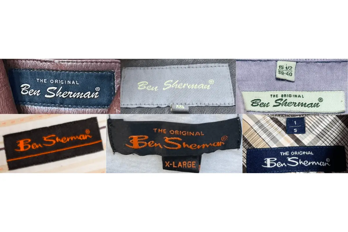
1990s Ben Sherman tags
2000s vintage Ben Sherman tags
- Introduced more color variations in the tags, including blues and greys.
- Started to use the “Ben Sherman” script more fluidly across the tag designs.
- Material of the tags was upgraded to finer textures, reflecting the brand’s push towards a premium market.
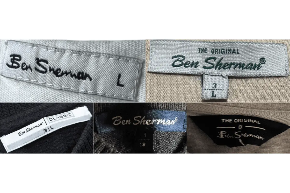
2000s Ben Sherman tags
2010s vintage Ben Sherman tags
- Modern tags featuring vibrant colors and diverse fonts.
- Incorporated additional branding elements such as the Mod target or Union Jack, emphasizing the brand’s British roots.
- Started to include QR codes and other modern identifiers for authenticity checks.
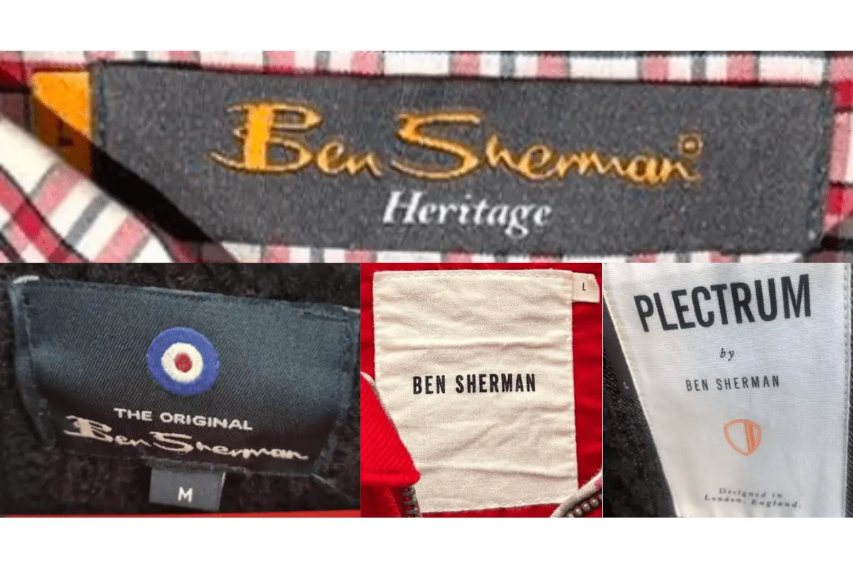
2010s Ben Sherman tags