
Bill Haire, an influential figure in the world of American fashion, carved a name for himself through decades of creative brilliance, especially in the realm of evening wear and sportswear. A graduate of the Fashion Institute of Technology, Haire initially made his mark with glamorous evening gowns, utilizing luxurious fabrics like chiffon and satin during his time at Victoria Royal Ltd. from 1959 to 1974. However, his career took a significant turn when he partnered with his wife, Hazel Keleher, in the mid-1970s to venture into sportswear, a growing trend in American fashion. Together, they designed for Friedricks Sport, where Haire’s clean, minimalist aesthetic and precise tailoring set him apart from his peers.
The 1970s marked a pivotal moment for Haire as sportswear began to dominate the American fashion scene. With his wife, Hazel, the two became known as the “Designing Couple,” creating modern, accessible sportswear collections that appealed to the stylish yet practical needs of the modern woman. While their partnership at Friedricks Sport lasted until 1981, Haire continued to innovate, launching his own label, Bill Haire Ltd., which garnered swift attention, earning him a nomination for the prestigious Coty Fashion Critics Award in 1983. Despite this acclaim, his independent venture was short-lived, closing in 1985, though he continued to freelance in the industry.
Bill Haire’s legacy in fashion is deeply intertwined with the evolving trends of the 20th century. From evening wear’s opulence to the functional elegance of sportswear, his work encapsulates a broad spectrum of American fashion history. Even today, vintage Bill Haire pieces remain sought-after by collectors and enthusiasts, each garment a reflection of his unique vision and the shifts in design sensibilities during his career. Understanding his contribution through logos and tags offers a glimpse into not only his brand’s evolution but also the broader changes within the fashion industry during his lifetime.
1985 Fashion Showcase including Bill Haire
How to tell if Bill Haire is vintage from the logo
Bill Haire, a notable name in clothing, has seen its logo evolve over the decades. Each iteration of the logo reflects the design trends and branding priorities of its time. As the brand matured, its logo shifted from minimalist designs to more refined text styles. Below is a breakdown of how to identify if a Bill Haire item is vintage based on the logo from the images provided.
1960s to 1980s Bill Haire logo
- The logo from this era features a blocky and capitalized text style.
- The font is simplistic, using uniform characters with a machine-like quality.
- There is no emblem, focusing purely on the “Bill Haire” text in a linear format.
- This design reflects the straightforward branding of the time, opting for readability and boldness.
1960s to 1980s Bill Haire logo
1970s Bill Haire logo
- This logo introduces a more stylized approach to the “Bill Haire” name.
- Unlike the 1960s to 1980s version, the font is less blocky and incorporates a modern, slightly thinner typeface.
- There is a significant difference in the treatment of the text, where the letters appear more spaced out and rounded.
- This style reflects the transition into the more fashionable, design-conscious era of the 1970s.
1970s Bill Haire logo
How to tell if Bill Haire is vintage from the tags
Bill Haire’s clothing line has gone through noticeable transformations over the years, with the brand reflecting changing design trends and production practices. From the 1970s to the 1980s, Bill Haire’s tags have evolved from simpler designs to more modern layouts. The tags can help collectors and vintage enthusiasts determine the era a specific Bill Haire garment was produced. Below is a guide to identifying Bill Haire’s vintage tags based on the decade.
Struggling to identify vintage tags or labels? Submit a picture on our vintage tag identification page, and we’ll help you out!
1970s vintage Bill Haire tags
- Features bold, block-style fonts.
- The text typically reads “Bill Haire for Friedricks.”
- Tags often include simple, monochromatic designs with no extra illustrations.
- Sometimes accompanied by a separate size tag, but the focus remains on the brand name.
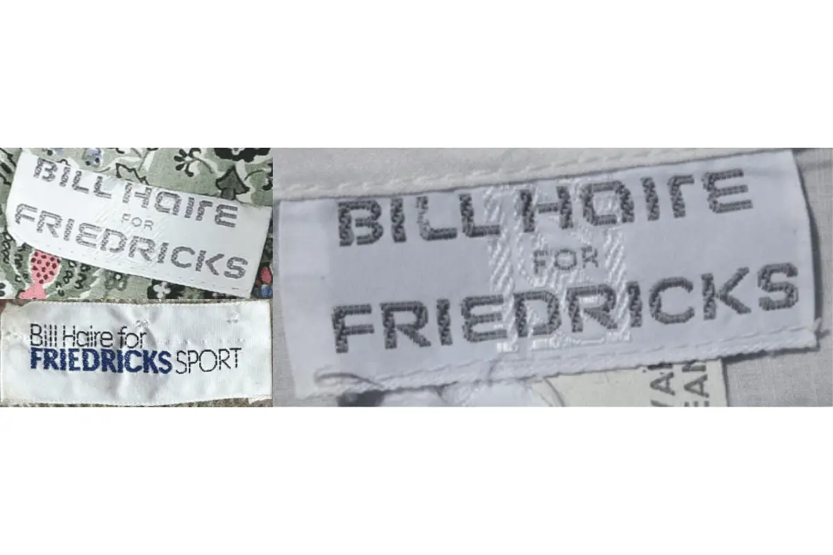
1970s Bill Haire tags
1980s vintage Bill Haire tags
- The branding evolves, incorporating sportier looks with the addition of “Friedricks Sport.”
- More modern sans-serif fonts are used, often bolder and clearer than in the 1970s.
- Tags may include the location of manufacture, such as “Made in Hong Kong.”
- The color palette remains simple, with white backgrounds and dark or blue lettering being common.
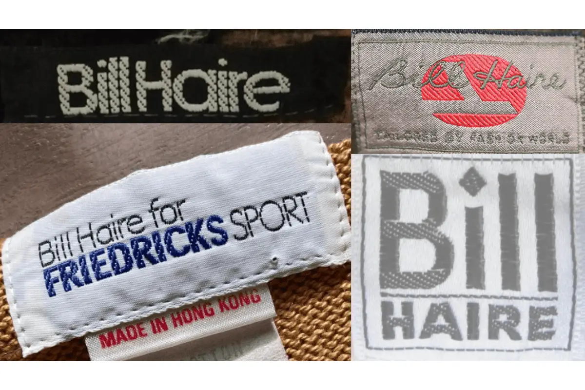
1980s Bill Haire tags


Thanks for sharing. I read many of your blog posts, cool, your blog is very good.
I don’t think the title of your article matches the content lol. Just kidding, mainly because I had some doubts after reading the article.