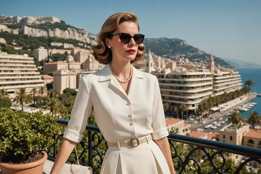
In a post-war Paris, Carmen de Tommaso, known as Madame Carven, transformed the fashion industry forever. Standing at just five foot one, she began designing clothes that suited her petite stature, a stark contrast to other designers of the time who catered primarily to taller women. This unique perspective set her apart and led to the creation of styles that flattered smaller figures. Carven’s approach was modern and accessible, especially when compared to the opulent and lavish designs of the late 1940s epitomized by Dior’s New Look. Embracing a more practical and innovative route, Carven became a pioneer in prêt-à-porter fashion, democratizing high fashion for everyday wear.
Madame Carven’s designs were characterized by their simplicity and elegance, often inspired by her extensive travels. Her fashion house became synonymous with playful, imaginative designs that resonated with France’s fashionable youth. Carven’s ability to blend traditional French couture with global influences made her a standout in the industry. The brand’s early success was marked by the introduction of fresh, vibrant designs that catered to a younger, more dynamic audience. This approach not only set Carven apart from her contemporaries but also solidified her place in fashion history as a designer who brought a breath of fresh air to the Parisian couture scene.
Despite facing challenges in the late 1990s after Madame Carven’s retirement, the brand saw a resurgence in 2009 under the creative direction of Guillaume Henry. He revitalized Carven with bold colors and unexpected fabric combinations while maintaining the classic silhouettes that defined the brand. This new era of Carven quickly garnered attention from celebrities and fashion enthusiasts alike, cementing its reputation as a label that seamlessly blends timeless elegance with modern flair. Today, Carven continues to be celebrated for its rich heritage and innovative designs, standing as a testament to Madame Carven’s enduring legacy in the world of fashion.
Nostalgic 80s Carven Fragrance Commercial
How to tell if Carven is vintage from the logo
Carven, a brand with a rich heritage dating back to the mid-20th century, has evolved its logo several times to keep up with modern design trends. Each era’s logo offers a glimpse into the brand’s history and style evolution. By examining these logos, you can determine if a Carven item is vintage.
1940s to 1990s Carven logo
- The early Carven logo features a lowercase serif font.
- The letters are bold and evenly spaced, giving a classic and timeless look.
- This logo reflects the brand’s early years and is often found on vintage pieces.
1940s to 1990s Carven logo
1990s to now Carven logo
- The modern Carven logo uses an uppercase sans-serif font.
- The letters are bold and clean, reflecting a more contemporary design approach.
- This logo indicates more recent collections, showing the brand’s evolution to modern aesthetics.
1990s to now Carven logo
How to tell if Carven is vintage from the tags
The evolution of Carven’s tags over the decades reflects the brand’s rich history and stylistic changes. From the detailed and elegant designs of the early years to the more modern and streamlined look of later decades, each era’s tags provide insight into the brand’s journey.
Need help with vintage tags or labels? Submit a picture on our vintage tag identification page, and we’ll take care of it!
1960s vintage Carven tags
- Elegant serif font.
- Includes location details such as “6. Rond Point des Champs-Elysées, Paris.”
- Tags often feature the word “paris” in a smaller, stylized font.

1960s Carven tags
1970s vintage Carven tags
- Still featuring the detailed address information.
- Bold, elegant fonts used.
- Occasionally, tags are simpler with just the brand name and “Paris.”

1970s Carven tags
1980s vintage Carven tags
- Introduction of simpler, cleaner fonts.
- Less focus on detailed address, more on brand name and “Paris.”
- Variations include “Creation Carven” tags with elegant font styles.

1980s Carven tags
1990s vintage Carven tags
- Modern serif fonts, often just “Carven” and “Paris.”
- Use of bolder, clearer text.
- Introduction of “Formal” and “Golf” specific tags.

1990s Carven tags
2000s vintage Carven tags
- More streamlined and minimalist design.
- Introduction of tags with just the brand name in bold letters.
- Occasional use of additional descriptors like “Exclusive Carven Paris.”

2000s Carven tags