
Cathy Hardwick is a name synonymous with timeless elegance and modern simplicity, revered for her ability to create clothing that speaks to the confident, active woman. Born in Seoul, Korea, and immigrating to the United States in 1952, Hardwick’s background is as eclectic as her designs. After a successful early career designing knitwear in San Francisco, she eventually moved to New York in the late 1960s to establish her own brand. Known for blending Eastern influences with Western sensibilities, her pieces offered women not just fashion, but versatility—garments that seamlessly transitioned from day to night, much like the lives of the career women she designed for.
Hardwick’s collections from the 1970s and 1980s reflect her unique approach to fashion—focused on neutral tones, clean lines, and natural fibers. Her commitment to creating cohesive wardrobes rather than standalone pieces ensured that women could build lasting collections, where each item complemented the next. This philosophy resonated with the minimalist aesthetic of the time, offering a fresh perspective on contemporary style. Through her brand, Hardwick mastered the art of simplicity without sacrificing sophistication, a testament to her early recognition as a Coty Award-winning designer in 1975.
Beyond the runway, Hardwick’s influence extended into home design, where her eye for balance and beauty also shone. Yet, fashion has remained her enduring passion. With a career that spans decades, Cathy Hardwick’s legacy in the fashion world endures, marked by her ability to fuse tradition with modernity, making her designs as relevant today as they were in the past.
How to tell if Cathy Hardwick is vintage from the logo
Cathy Hardwick’s logos reflect the shifts in fashion and design aesthetics over the years. While the brand had a consistent elegance, the evolution of its logo can help pinpoint the vintage era. The changes in typography, spacing, and design simplicity are key indicators of when a particular Cathy Hardwick piece was made. Below, we explore the distinctive logos from the 1980s and 1990s.
1980s Cathy Hardwick logo
- This logo features bold, lowercase typography.
- The spacing is tight between the letters, creating a compact and cohesive visual impact.
- The use of solid, thick font indicates a modern yet strong fashion identity that was prominent in the 1980s.
- Both the first name “Cathy” and the last name “Hardwick” are stacked one above the other, a signature look from this era.
1980s Cathy Hardwick logo
1980s to 1990s Cathy Hardwick logo
- This logo transitions into an all-uppercase font, giving it a more structured and formal appearance.
- The letters are thin and elongated, providing a more delicate and refined look compared to the bold font of the 1980s.
- The spacing between the letters is more generous, giving the logo an airy feel.
- This period marks a shift towards a more minimalistic and elegant design, typical of high-end fashion labels from the late 1980s to the 1990s.
1980s to 1990s Cathy Hardwick logo
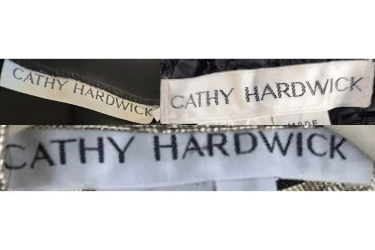
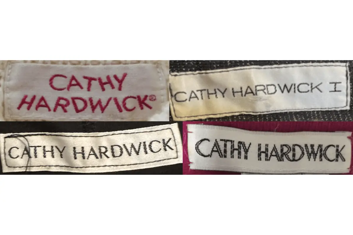
How to tell if Cathy Hardwick is vintage from the tags
Cathy Hardwick tags have evolved over the years, showcasing the brand’s development in style and presentation. Each era brought subtle changes in tag design, font, and layout. These modifications reflect not only the changing fashion trends but also the growing prominence of the Cathy Hardwick brand during the 1980s and 1990s. Here’s a breakdown of the tag characteristics from the specific eras.
Need help with vintage tags or labels? Submit a picture on our vintage tag identification page, and we’ll assist you!
1980s vintage Cathy Hardwick tags
- Tags feature bold serif fonts in either black or red, showcasing a minimalist style.
- Most tags are white or off-white, creating a contrast with the black or red text.
- The logo is centered, with “CATHY HARDWICK” taking prominence, sometimes in all uppercase.
- Some tags include “CATHY HARDWICK I” in a more refined font, highlighting specific collections.
1980s Cathy Hardwick tags
1990s vintage Cathy Hardwick tags
- Tags from this era maintain a minimalist approach with simple black serif fonts.
- Tags continue to use a clean, straightforward presentation with all-uppercase lettering.
- Materials vary, but the overall design remains focused on clarity, with “CATHY HARDWICK” consistently centered.
1990s Cathy Hardwick tags


I believe that is one of the such a lot significant info for me.
And i am happy reading your article. But wanna statement on few general issues, The
site taste is ideal, the articles is actually great : D.
Good activity, cheers
Sweet blog! I found it while browsing on Yahoo News.
Do you have any tips on how to get listed in Yahoo News?
I’ve been trying for a while but I never seem to get there!
Thanks
With havin so much written content do you ever run into any issues of plagorism or copyright infringement?
My site has a lot of unique content I’ve either authored
myself or outsourced but it appears a lot of it is popping it up all over the
internet without my agreement. Do you know any methods to help protect against content from
being ripped off? I’d really appreciate it.
Amazing! Its actually awesome paragraph, I
have got much clear idea about from this paragraph.
I don’t think the title of your article matches the content lol. Just kidding, mainly because I had some doubts after reading the article.