
Converse has cemented its legacy as a quintessential symbol of cool. Since its inception in 1908 by Marquis Mills Converse in Malden, Massachusetts, this iconic brand has journeyed through more than a century of fashion and functional evolution, making it more than just a footwear company—it’s a cultural phenomenon. Initially, Converse carved its niche within the market with winterized rubber-soled shoes and boots, primarily serving as a utilitarian option. Yet, it was their pivot to athletic footwear, notably the Converse All-Star in 1917, that marked the beginning of what would become a globally recognized brand.
The Converse story is deeply intertwined with American history and pop culture. During World War II, the company shifted gears to support the war effort, producing footwear for the military. This period underscored the brand’s resilience and ability to adapt, qualities that would be tested repeatedly in the decades to come. Post-war, Converse resumed its focus on athletic footwear, particularly the All-Stars, and by the mid-20th century, these shoes were synonymous with basketball and youthful rebellion. The endorsement by basketball player Chuck Taylor solidified their status, with his name becoming as iconic as the shoes themselves.
Despite facing stiff competition and navigating financial turbulence in the late 20th century, including a bankruptcy in 2001, Converse found its stride once more under new ownership by Nike in 2003. This acquisition opened new avenues for innovation while respecting the brand’s heritage, evident in the timeless design of Chuck Taylors. Today, Converse not only continues to be a staple on the streets but has also embraced its role as a purveyor of cool, often collaborating with artists and fashion designers to reinvent and reinvigorate its classic styles for new generations. This blog will delve into one of the most iconic elements of Converse’s identity: its logo. By exploring the evolution of this emblem, we uncover a rich tapestry of design and influence that helps vintage collectors and fashion aficionados alike identify the age and authenticity of their beloved Converse sneakers. Join us as we lace up and step into the history of Converse’s logos, from the stark simplicity of its early days to the sleek modernism that defines its current aesthetic.
1980s NBA Converse Advert featuring Magic Johnson, Larry Bird, Isaiah Thomas and more
How to tell if Converse is vintage from the logo
Ah, the journey of the Converse logo—a tale woven into the fabric of fashion history that charts the evolution of a global icon. From its humble beginnings to its contemporary chic, each era of the Converse logo not only signifies a distinct period in sneaker culture but also reflects the shifting sands of style trends. Join us as we lace up our favorite Chucks and step back through decades to explore how you can spot vintage Converse from the nuances in their logo. Whether it’s the stark simplicity of the early designs or the sleek modernism of recent years, there’s a story stitched into every star. Let’s unravel these time-capsuled details together.
1963 to 1977 Converse logo
- This era features a simplistic and bold design, focusing on the iconic Converse star.
- The logo often appears in a solid, stark black with minimalistic text, emphasizing clarity and contrast.
- It’s commonly found stamped on the inner side of Converse sneakers, particularly on classic models.
1963 to 1977 Converse logo
1977 to 2003 Converse logo
- This period marks a transition to a slightly more detailed star design and the introduction of bolder, more prominent text alongside the star.
- The text ‘Converse’ is generally in a thicker, more assertive font, reflecting the brand’s growing popularity.
- Logos from this era might appear on both merchandise tags and the products themselves, often in a monochromatic tone.
1977 to 2003 Converse logo
1977 to 2003 Converse logo
2003 to 2007 Converse logo
- During these years, the logo includes a refined star and sleeker text placement.
- The star design is cleaner with less pronounced edges, and the text maintains a modern sans-serif style.
- It’s a period of subtle refinement, aiming to modernize the brand’s appeal.
2003 to 2007 Converse logo
2003 to 2007 Converse logo
2007 to 2011 Converse logo
- This logo phase involves minimalistic yet striking use of the star, often encircled or featured with dynamic elements.
- There is a noticeable shift towards a more contemporary look, with sharper angles and streamlined design features.
- The use of black and white colors remains dominant, maintaining the brand’s iconic contrast.
2007 to 2011 Converse logo
2011 to 2017 Converse logo
- The logo from this era showcases a return to classic elements, combining the star with robust and clear typeface.
- There is a focus on symmetry and alignment, with the star often centered directly above the brand name.
- This logo is commonly found on new product lines and is used widely in brand marketing.
2011 to 2017 Converse logo
2017 to now Converse logo
- The current logo builds on its predecessors by refining the star and text even further, aiming for minimalism and modern aesthetics.
- The logo is streamlined, with even thinner typography and more subtle use of spacing.
- It often appears in a versatile array of colors depending on the product style and marketing focus.
2017 to now Converse logo
How to tell if Converse is vintage from the tags
The Converse brand is iconic for its casual footwear and apparel, with each era marked by distinctive tag designs that can help identify the vintage of the items. Notable changes in the tag designs include shifts in logo style, material, and country of manufacture.
Confused by your vintage tags or labels? Upload a picture on our vintage tag identification page, and we’ll help you identify them!
1980s vintage Converse tags
- Introduction of the “Chuck Taylor” name alongside the star, emphasizing the endorsement.
- Tags often contain a red, white, and blue color scheme reflecting American origins.
- Material tags are simple and functional with increased use of care symbols.
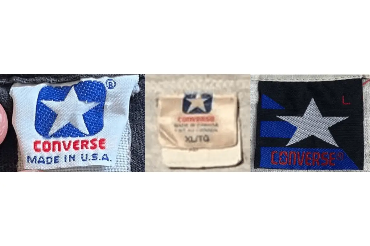
1980s Converse tags
1990s vintage Converse tags
- Began to feature more detailed corporate branding and care instructions.
- Introduction of barcode tags, with some tags showing global sizing standards.
- Fabric and care tags are more detailed, often separate from the brand logo tag.
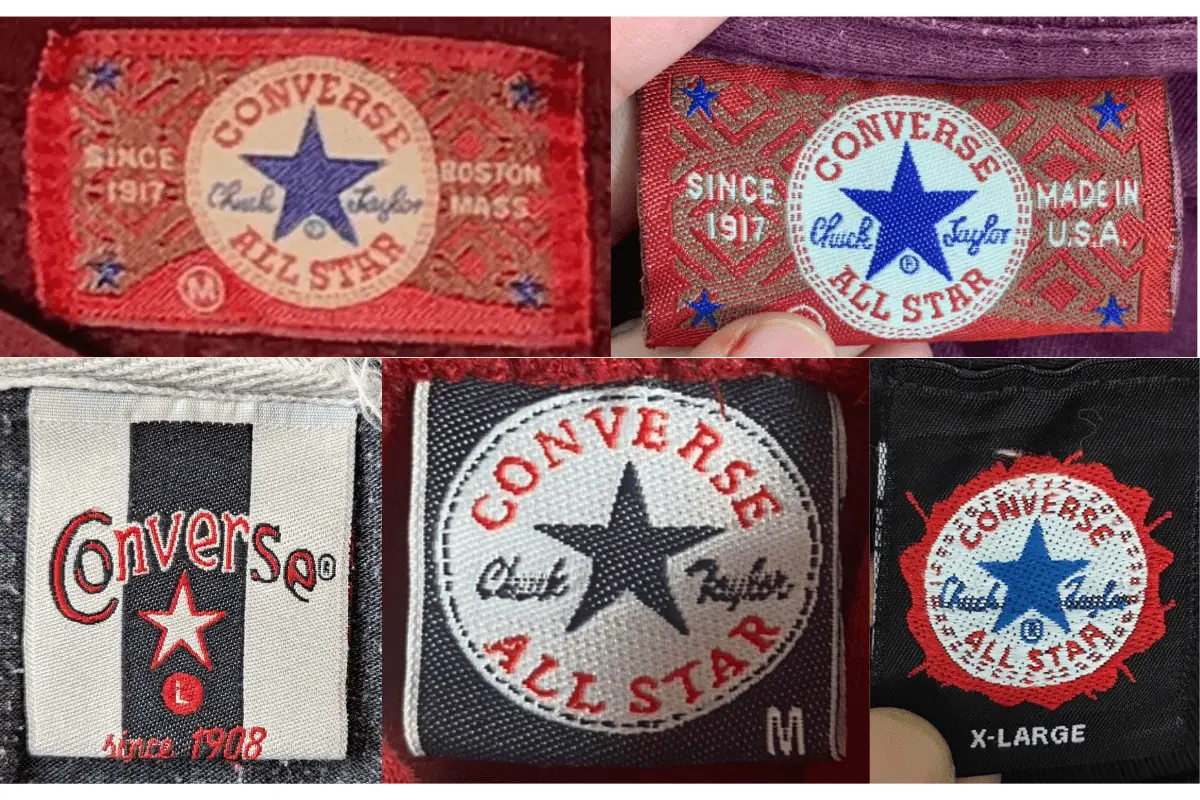
1990s Converse tags
2000s vintage Converse tags
- Tags become more colorful and varied in design, reflecting broader product lines.
- Use of different materials for tags, like plastic or synthetic fabrics.
- Manufacturing tags often show a shift to production outside the USA.
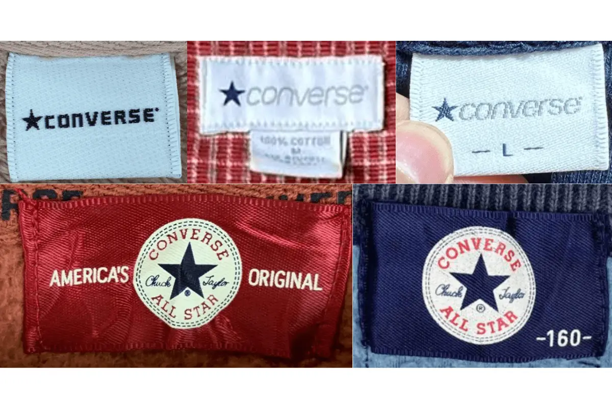
2000s Converse tags
2010s vintage Converse tags
- Modern, sleek designs with clearer typography and contemporary branding.
- Tags often include multiple languages, reflecting a global market presence.
- Increased emphasis on material information and care instructions, often using recycled materials for the tags themselves.
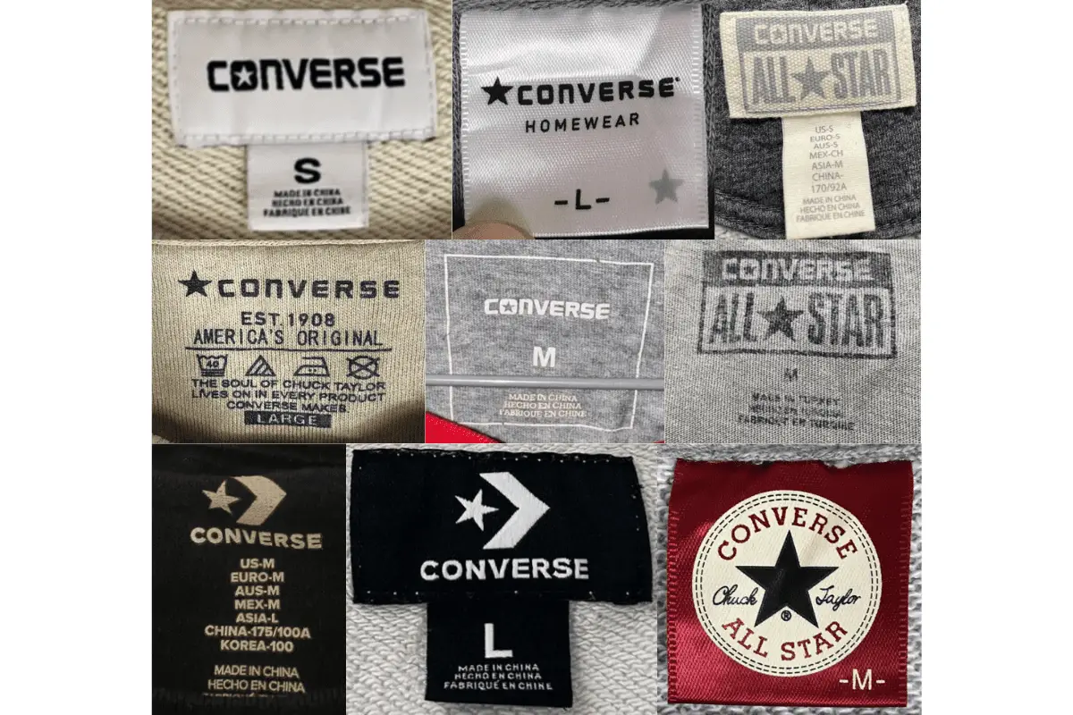
2010s Converse tags


Wonderful article! We will be linking to this particularly great content on our site. Keep up the great writing.
I like it when folks come together and share thoughts. Great site, stick with it!