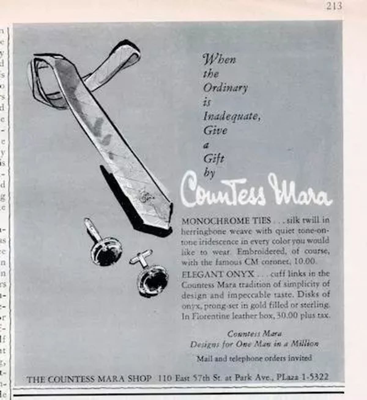
Countess Mara, a storied name in men’s fashion, has a rich history dating back to its founding in 1935 by Lucilla Mara de Vescovi. The brand, renowned for its high-end pictorial neckties, was named after Mara’s noble lineage, reflecting an old-world charm infused with artistic flair. Originating from a noble family in Italy, Lucilla Mara de Vescovi channeled her aristocratic elegance into the creation of Countess Mara, a brand that quickly became synonymous with luxury and distinctive design. Her journey into fashion began after creating a tie from silk dress material for her husband, which sparked a passion that would define her career and influence men’s fashion for decades.
Lucilla Mara de Vescovi’s ties were groundbreaking for their time, known for their vibrant colors and unique patterns that ranged from astrological signs to whimsical scenes. Each tie featured the initials “C.M.” on the outside blade, a signature mark that set them apart and made them highly collectible. This branding, along with the limited production runs, ensured that Countess Mara ties were exclusive items sought after by the elite. The brand’s commitment to quality and artistic expression won it the Neiman Marcus Fashion Award in 1944, solidifying its place in the annals of fashion history. Notable figures such as Frank Sinatra and J. Edgar Hoover were among the brand’s famous clientele, showcasing its widespread appeal.
In 1998, Countess Mara was acquired by Randa Accessories, a company that has since expanded the brand’s offerings beyond neckwear to include belts, leather goods, shirts, and other accessories. This acquisition marked a new chapter for Countess Mara, blending its rich heritage with contemporary fashion trends. Today, Countess Mara products continue to be a testament to the brand’s enduring legacy of elegance and innovation, making it a cherished name in the world of luxury menswear. Whether through its iconic logos or vintage tags, Countess Mara’s pieces remain a symbol of sophistication and timeless style.
Cool Countess Mara Tie Commercial
How to tell if Countess Mara is vintage from the logo
Countess Mara is known for its high-quality neckties and has a long history dating back to the mid-20th century. The brand has undergone several logo changes that reflect different eras of its evolution. Identifying the specific logo style can help determine if a Countess Mara item is vintage and from which period it originates. Below are the logos from the specific eras based on the images provided.
1950s to 1990s Countess Mara logo
- The logo features the text “Countess Mara” in a classic serif font.
- Above the text, there is a detailed crown emblem, symbolizing the brand’s regal elegance.
- The use of serif font and detailed crown indicates a vintage style, commonly used in the mid to late 20th century.
1950s to 1990s Countess Mara logo
1990s Countess Mara logo
- The logo retains the text “Countess Mara,” but with a shift towards a more stylized, script-like font.
- The crown emblem is simplified, with fewer details compared to the earlier versions.
- This period marks a transitional phase where the brand started modernizing its logo, maintaining the crown while simplifying the overall design.
1990s Countess Mara logo
How to tell if Countess Mara is vintage from the tags
Countess Mara, a brand known for its refined and elegant neckties, has seen an evolution in its label designs over the decades. From the mid-20th century, each era has distinct features in tag designs, reflecting changes in branding and style preferences. Below is a guide to identifying vintage Countess Mara pieces through their tags.
Can’t figure out your vintage tags or labels? Upload a picture on our vintage tag identification page, and we’ll assist you!
1950s vintage Countess Mara tags
- Tags often featured the brand name in a cursive, elegant script.
- Use of the crown logo, symbolizing luxury and sophistication.
- Simple color schemes, typically black and white or gold on white.
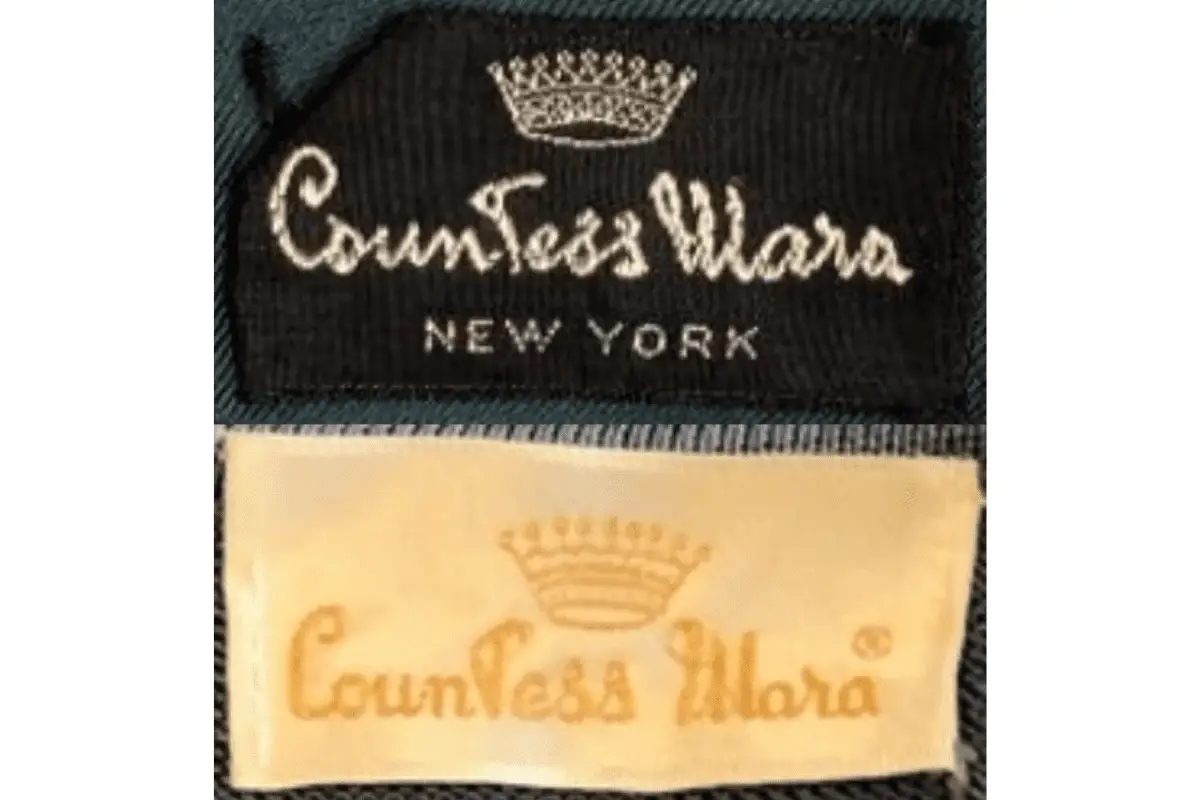
1950s Countess Mara tags
1960s vintage Countess Mara tags
- Introduction of a more modern, blocky font for the brand name.
- The crown logo continued to be a prominent feature.
- Tags were often white with gold or black text, maintaining a classic appearance.
1960s Countess Mara tags
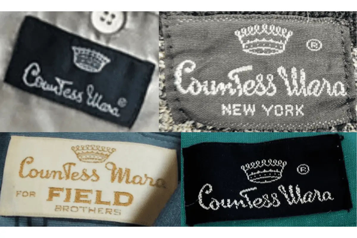
1970s vintage Countess Mara tags
- Tags displayed a mix of cursive and block fonts, reflecting transitional branding styles.
- Use of additional text such as “NEW YORK” to emphasize the brand’s origin.
- Tags began to show more variety in color, including the use of navy blue and gold.
1970s Countess Mara tags
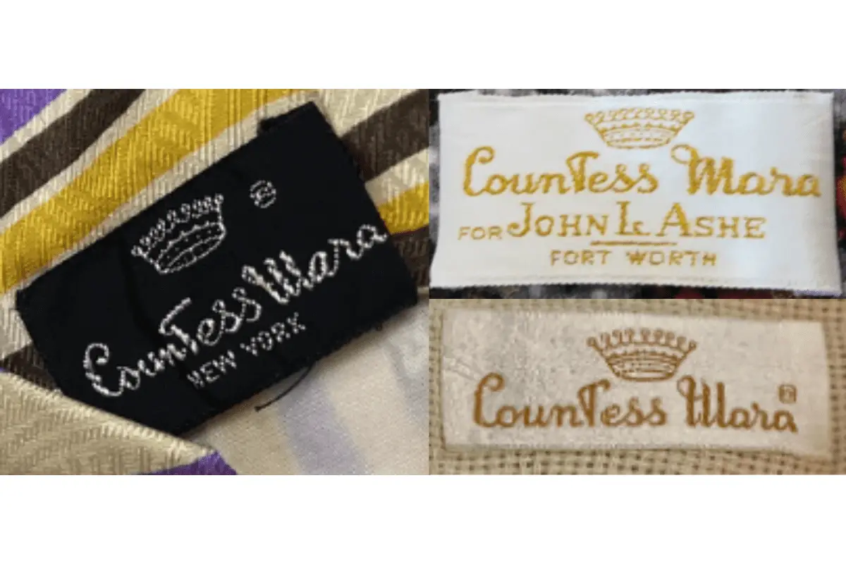
1980s vintage Countess Mara tags
- More standardized use of block lettering for the brand name.
- The crown logo remained consistent, often placed above the brand name.
- Tags often included additional lines like “FOR JOHN L. ASHE” indicating special collaborations or collections.
1980s Countess Mara tags
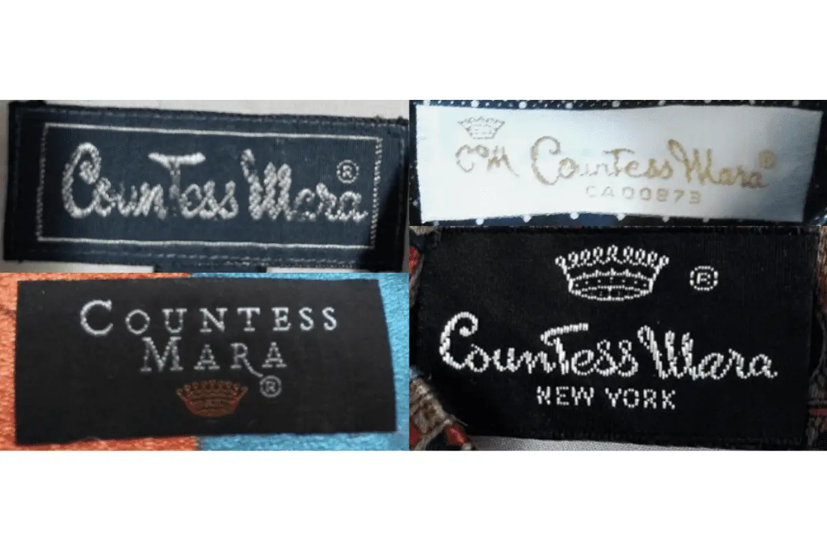
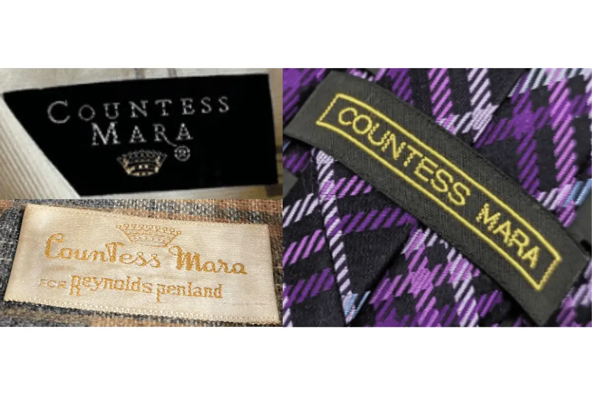
1990s vintage Countess Mara tags
- Modern and bold fonts became prevalent, often with a sleek black and white color scheme.
- Increased use of collaborations noted directly on the tags, such as “FOR FIELD BROTHERS” or “FOR REYNOLDS PENLAND”.
- Tags also began to use different materials, such as satin or woven fabrics, reflecting the garment’s premium nature.
1990s Countess Mara tags