Dana Buchman, an iconic name in American fashion, has a rich history that spans decades, marked by innovation, classic design, and a loyal customer base. Born in Memphis, Tennessee, around 1965, Dana Buchman had an early fascination with fashion, leading her to pursue degrees from both Brown University and the prestigious St. Martin’s School of Art in London. Her academic achievements also included becoming a President’s Fellow at the Rhode Island School of Design. These accomplishments set the stage for her rise in the fashion industry, beginning with her role as Creative Head at the women’s label Ellen Tracy. It wasn’t long before Dana Buchman’s talents caught the eye of Liz Claiborne, one of the most influential figures in fashion, who personally recruited her in 1982.
Buchman’s partnership with Liz Claiborne proved to be a turning point in her career. She initially started as a knitwear designer but quickly rose to prominence, leading to the launch of her own diffusion line under the Liz Claiborne brand in 1987. Dana Buchman’s designs were known for their timeless elegance and comfort, appealing primarily to sophisticated, professional women. Her collections of dresses, separates, and cardigans became highly sought after, and by the late 1990s, her brand was generating annual profits exceeding $250 million. The success of her brand led to the expansion of multiple lines, including a luxurious range called Dana Buchman Luxe, as well as accessories, solidifying her position in the fashion world.
In 2008, Dana Buchman made the strategic decision to transition from high-end fashion to a more accessible market, partnering with Kohl’s to design an exclusive line. This shift allowed her to reach a broader audience while maintaining her signature style of refined and wearable pieces. Kohl’s carried the Dana Buchman brand until 2020 when the company decided to discontinue it as part of a larger move toward activewear and athleisure, ending a long chapter of classic American fashion. Despite the discontinuation, Dana Buchman remains a respected name in fashion, known for her ability to blend sophistication with everyday wearability.
Y2K Dana Buchman Interview
How to tell if Dana Buchman is vintage from the logo
Dana Buchman has been a well-recognized name in the fashion industry, especially known for its stylish women’s apparel. Over the years, the brand has undergone a few transformations, including subtle yet significant changes to its logo. By examining these logos, you can often determine the era of a Dana Buchman item. Below is a breakdown of the Dana Buchman logos over time, specifically from the logos provided, helping to identify whether your item is vintage or more contemporary.
1980s to now Dana Buchman logo
- The Dana Buchman logo from the 1980s and beyond often features a clean, bold serif font, with both “DANA” and “BUCHMAN” in capital letters.
- In some iterations, the logo is divided into two lines, with “DANA” in a larger font size on the top line and “BUCHMAN” below it in a smaller font, creating a clear hierarchy between the two names.
- Another common version of the logo maintains the serif font but places the two words side by side on a single line.
- This modern and sophisticated design has remained relatively consistent over the years, making it challenging to pinpoint an exact date for items from this era. However, minor typographic adjustments over the decades can offer some clues.
1980s to now Dana Buchman logo 1
1980s to now Dana Buchman logo 2
How to tell if Dana Buchman is vintage from the tags
The Dana Buchman brand has undergone notable evolutions over the decades, and the tags attached to its garments are key indicators of the era they belong to. These tags reflect shifts in design trends, materials used, and branding choices. By examining the font styles, colors, and layout of the tags, you can determine whether a piece is from the 1980s, 1990s, 2000s, or 2010s.
Having difficulty identifying vintage tags or labels? Submit a picture on our vintage tag identification page, and we’ll assist you!
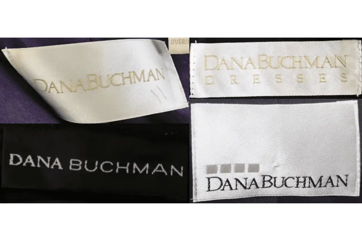
1980s vintage Dana Buchman tags
- Often features simple, serif-style fonts.
- Tag colors are often neutral or pale, such as white or cream, with contrasting bold letters.
- “DANA BUCHMAN” is often in capital letters, emphasizing clarity and boldness.
- Clean and minimalistic design, with no additional embellishments.
1980s Dana Buchman tags
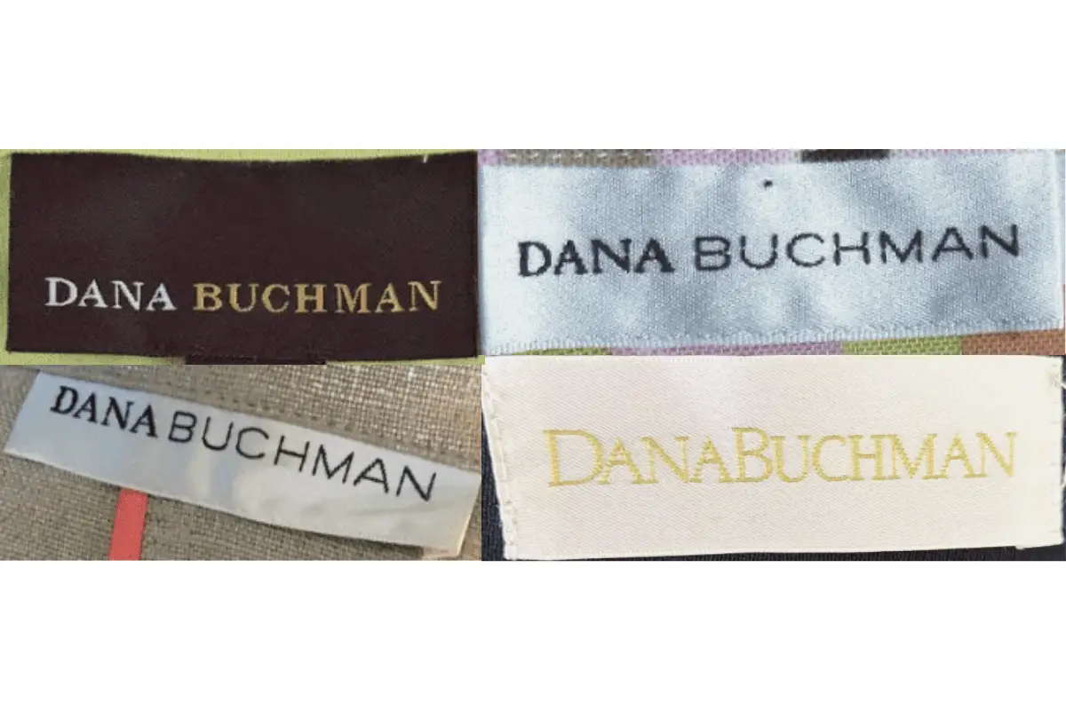
1990s vintage Dana Buchman tags
- Text remains bold, with more varied styles between tags.
- Some tags feature elegant italicized fonts, indicating a shift toward a more upscale presentation.
- Colors such as dark brown or black with white or gold lettering are common.
- The logo may appear larger, taking up more space on the rectangular tag.
1990s Dana Buchman tags
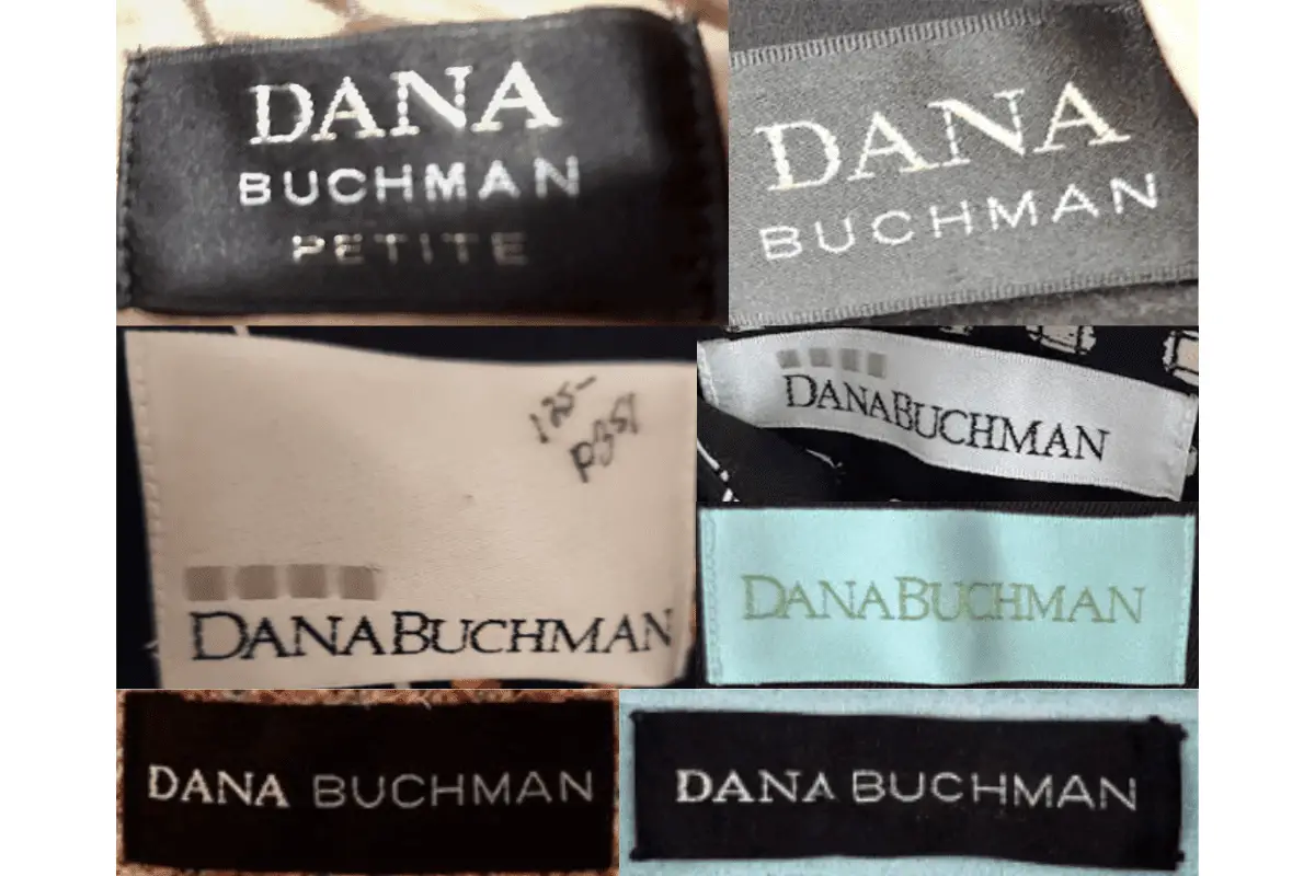
2000s vintage Dana Buchman tags
- Introduction of more colorful backgrounds, such as black, brown, and even pastel shades.
- Fonts often vary in size, with “DANA” sometimes being more pronounced than “BUCHMAN”.
- More complex tag layouts, such as the inclusion of a “WOMAN” descriptor or “PETITE” label underneath the brand name.
- Some tags also feature the introduction of small box logos or additional graphics.
2000s Dana Buchman tags
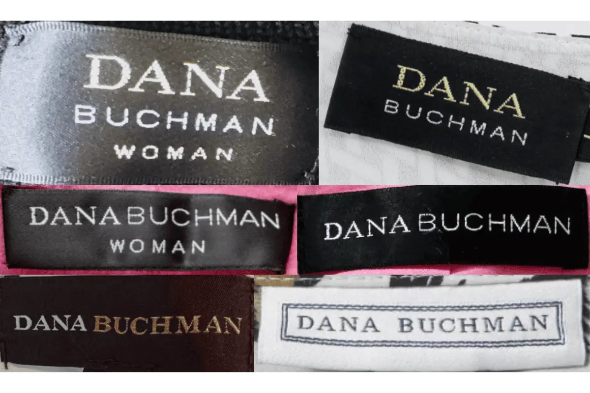
2010s vintage Dana Buchman tags
- Even more modern, clean, and refined designs, often with lighter fabric choices.
- Use of different color schemes, with softer pastel colors making an appearance, alongside classic black and white combinations.
- The font style remains bold and clean, but more experimentation is present in the alignment and layout of the logo on the tag.
- Occasionally, special collections will have additional identifiers, such as “DRESSES” on separate lines.
2010s Dana Buchman tags