Born in the vibrant 1980s under the Levi Strauss & Co. family, Dockers quickly became a household name in men’s fashion. With their hallmark khaki pants leading the charge, Dockers were the pioneers who championed the “casual Friday” look before it even had a name. They made it cool to wear comfort, combining class and utility with their iconic pants that danced between the boardroom and the golf course with equal ease.
The Dockers logo is like a time capsule, capturing the brand’s evolution through its signature anchor and wings. In their earliest form (1986-2005), bold capital letters spelled “DOCKERS” beside an intricate anchor and wings motif. The 2005 update embraced simplicity, slimming down the details for a more refined, centered look. Fast-forward to the present day, and the minimalist approach rules, with streamlined lines and a navy-blue hue giving it a polished, modern edge.
But the secrets to vintage Dockers don’t just lie in the logo. Their tags have their own stories to tell. In the 1980s, Levi’s legacy peeked through Dockers tags, with bold branding and hints of the parent company’s founding year, 1850. The 1990s brought a horizontal alignment in darker shades, while the 2000s turned the tags vertical for a simpler, navy-toned elegance. By the 2010s, minimalist style was in full swing, guiding you to Dockers’ online presence while clearly marking sizing and care.
Dockers’ journey hasn’t just been about looking good – it’s about embodying a lifestyle. From the moment Bob Siegel launched the brand, Dockers became a symbol of effortless style. And through each era, they’ve adapted and evolved, staying relevant and refining their vision of versatile menswear. Whether you’re after the crisp, unmistakable vintage charm or the cutting-edge lines of their latest collections, Dockers ensures you’re always wearing the pants.
80s “As Seen on Seinfeld” Dockers Advert
How to tell if Dockers are vintage from the logo
When you think of Dockers, their logo immediately comes to mind, embodying the brand’s seamless blend of style and practicality. Since 1986, Dockers’ iconic emblem has represented their vision of versatile menswear – a distinctive anchor and wings motif that reflects their maritime inspiration and commitment to both comfort and durability. It’s an image that’s grown and evolved over the years while remaining true to the brand’s core identity. Whether stamped on a crisp pair of khaki pants or etched onto a sleek leather wallet, the Dockers logo symbolizes the brand’s dedication to creating clothing that effortlessly suits both work and leisure.
The anchor and wings emblem isn’t just a nod to Dockers’ nautical heritage; it’s also a celebration of their deep roots in casual business wear. Over the years, the logo has shifted and transformed to align with changing styles and customer needs. From the original detailed anchor and wing design to today’s minimalist and streamlined look, each iteration of the Dockers logo has carried the same promise of reliability, freedom, and adventurous spirit that defines the brand itself. Join us as we explore the visual journey of the Dockers logo and discover how its evolution mirrors the brand’s enduring legacy in menswear.
1986 to 2005 Dockers logo
- The logo from this period features the bold, all-caps “DOCKERS” text.
- It includes the iconic anchor and wings symbol, often accompanied by “Est. 1986.”
- The anchor and wings are designed with prominent details and are placed to the left of the brand name.
1986 to 2005 Dockers logo
2005 to 2018 Dockers logo
- The 2005 to 2018 logo retained the anchor and wings symbol but in a simpler, sleeker style.
- The “DOCKERS” text remained in all caps but adopted a new font, with slightly rounded corners.
- The logo became horizontally aligned, with the anchor and wings now centered directly above the text.
2005 to 2018 Dockers logo
2018 to now Dockers Logo
- The current logo maintains the same anchor and wings emblem, simplified for a minimalist look.
- The “DOCKERS” text has become more streamlined and refined, featuring a modern sans-serif font.
- The logo incorporates a navy-blue and white color scheme for a classic aesthetic.
2018 to now Dockers logo
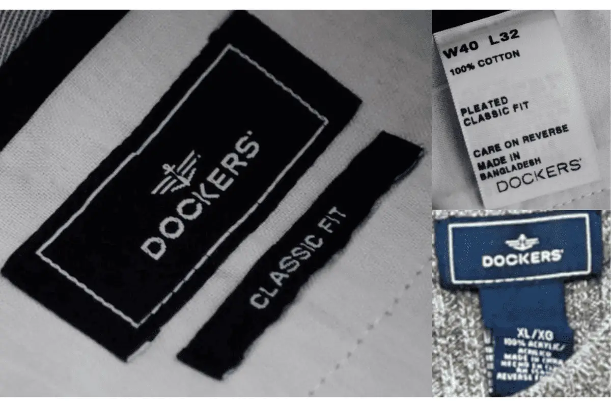
How to tell if Dockers are vintage from the tags
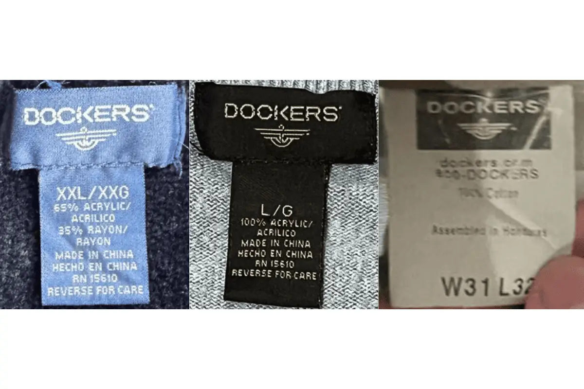
Dockers tags are more than just practical identifiers—they are timestamps that trace the brand’s evolution, reflecting changing trends and consumer preferences over the decades. In the 1980s, the tags were bold statements, often marked with Levi’s heritage and featuring “Since 1850” to pay homage to the parent company’s long-standing legacy. They showcased bold branding and practical information like sizing and country of origin. As the brand grew in the 1990s, the tags took on a more streamlined, rectangular design with a darker palette, prominently featuring the Dockers logo alongside Levi’s emblem. These tags reflected the growing sophistication of the brand, providing clear sizing information and care instructions to meet the demands of increasingly discerning customers.
The 2000s saw a shift to vertical tags that embraced simplicity and practicality, adopting the iconic anchor and wings logo in a streamlined style. In the 2010s, as Dockers fully embraced the digital era, their tags became even more minimalistic, often including a direct reference to “Dockers.com” to help guide customers to their online presence. The inclusion of the brand’s website on tags marked a new age of accessibility and engagement, inviting consumers to explore more products and information at their fingertips. From bold declarations of heritage to the sleek, tech-savvy designs of today, each tag reflects a different chapter in the brand’s story while underscoring the enduring values of quality and versatility that Dockers embodies.
Struggling with vintage labels? Submit a picture on our vintage tag identification page, and we’ll take care of it!
1980s vintage Dockers tags
- The 1980s Dockers tags were usually white or blue, often with a visible “Levi’s” marking since the brand is a subsidiary of Levi Strauss & Co.
- The tags displayed bold branding and contained the text “Since 1850,” referring to Levi’s founding year.
- They were commonly marked with the size and the country of manufacture.
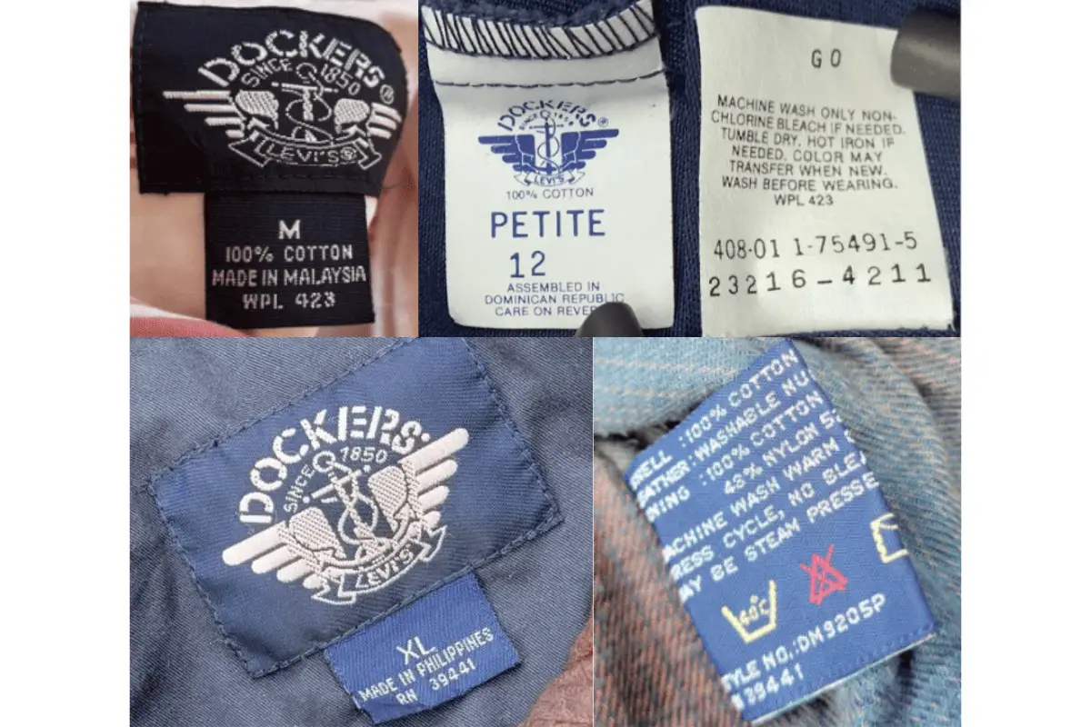
1980s Dockers tags
1990s vintage Dockers tags
- In the 1990s, the tags took on a rectangular shape and were often placed horizontally on garments.
- The color palette included dark shades like navy blue and black.
- They prominently featured the “Dockers” logo with the wings icon, Levi’s emblem, and text specifying material composition and care instructions.
1990s Dockers tags
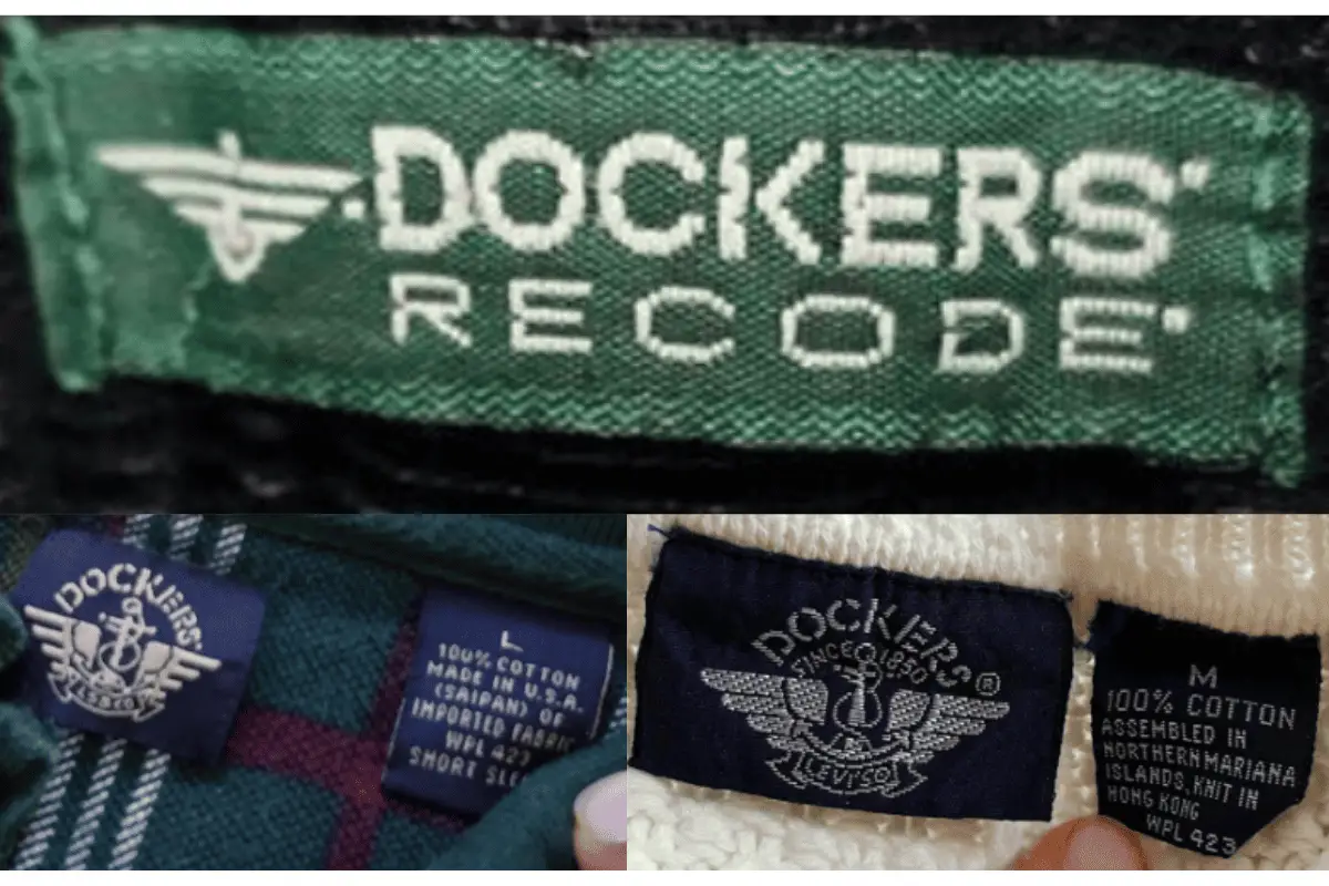
2000s vintage Dockers tags
- Tags from the 2000s shifted to simpler and more streamlined designs, often vertically aligned.
- They were typically black or navy with white text.
- Tags continued to feature the iconic wings logo with “Dockers” and contained international sizing information.
2000s Dockers tags
2010s vintage Dockers tags
- Tags from the 2010s became even more minimalistic, often featuring a plain white or black background with the “Dockers” logo.
- They were focused on clear labeling of size and care instructions.
- Some designs began incorporating “Dockers.com” to direct customers to the brand’s website.
2010s Dockers tags


References:
Circus casino