When it comes to vintage swimwear, few brands boast a heritage as rich and influential as Gabar. Established in the 1930s, Gabar made its mark by outfitting the U.S. Olympic synchronized swimming team, setting the stage for decades of iconic designs and swimwear innovations. Throughout its history, Gabar collaborated with renowned designers like Howard Greer and Tina Leser, both of whom brought couture-level expertise and Hollywood glamour to swimwear. These partnerships not only positioned Gabar as a key player in the swimwear industry but also cemented its reputation for high-quality, stylish designs that have withstood the test of time.
By the mid-1950s, Gabar was expanding its influence even further, particularly in the U.S. Elizabeth Stewart, daughter of Catalina founder Edgar Stewart, launched her own swimwear line in Los Angeles, which featured collaborations with top designers. Tina Leser, who had made her name with Tina Leser Originals, joined Gabar in a long-term design contract, bringing a fresh and creative perspective to the brand. During this era, the brand’s designs became synonymous with fashionable, yet functional swimwear, capturing the attention of fashion-forward women across America.
As Gabar continued to evolve, so did its signature look. The 1960s and 1970s saw designer Brigance shape the brand’s aesthetic with chic, modern swimwear that became must-have items for women looking for both style and sophistication at the pool or beach. Even after Brigance’s retirement in the late 1970s, his best-selling designs remained popular, testament to their timeless appeal. Today, Gabar’s swimwear pieces remain cherished by vintage collectors, not only for their style but for the brand’s deep-rooted history that speaks to decades of American fashion.
60s Fashion in London’s King Street
How to tell if Gabar is vintage from the logo
Gabar has a distinctive logo evolution that reflects its brand’s aesthetic changes over the years. Known for its swimwear, Gabar’s logos have ranged from bold and structured to more refined and classic typographies. These logo variations can help identify which era a Gabar piece is from, especially valuable for vintage collectors. Below is a guide to identifying the Gabar logo from different decades, based on the eras specified by the logos provided.
1950s to 1970s Gabar logo
- The logo features the brand name in uppercase letters.
- The font is bold with a distinctive “B” that is larger and more prominent than the other letters, giving it a unique style.
- This era of the Gabar logo reflects a robust and playful design that was typical of mid-century branding.
1950s to 1970s Gabar logo
1960s to 1990s Gabar logo
- The logo shifts to a lowercase format, with each letter uniformly sized.
- The font style is serif with a more classic and refined appearance compared to the previous logo.
- This design suggests a move towards a more timeless and elegant look, popular during these decades.
1960s to 1990s Gabar logo
1980s to 1990s Gabar logo
- This logo continues with a lowercase serif typeface but with a smoother and more polished finish.
- The font is simplified further, maintaining the brand’s classic look while aligning with a modern aesthetic of the late 20th century.
- This era’s logo represents the brand’s transition towards a more understated yet sophisticated identity.
1980s to 1990s Gabar logo
How to tell if Gabar is vintage from the tags
The evolution of Gabar’s tags reflects the brand’s journey from its origins in the 1950s through various decades of style. Gabar’s vintage tags provide clues about the era, with distinct design changes over time. From the serif fonts of the early years to the introduction of swimwear branding and “Made in USA” inscriptions, each period captures the brand’s unique identity.
Need help with vintage tags or labels? Submit a picture on our vintage tag identification page, and we’ll take care of it!
1950s vintage Gabar tags
- Tags often feature “GaBar” in bold, serif lettering.
- Color schemes are usually simple, with red or blue text on a white background.
- Some tags emphasize “New York” underneath the brand name, indicating its American roots.
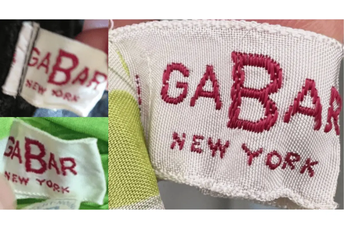
1950s Gabar tags
1960s vintage Gabar tags
- Still prominently displays “GaBar,” though the font may vary slightly from the 1950s style.
- Bold serif text remains a constant feature, often accompanied by “New York.”
- Tags continue to use simple color schemes, mostly red and white, indicating a minimalistic design approach.
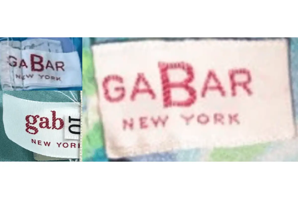
1960s Gabar tags
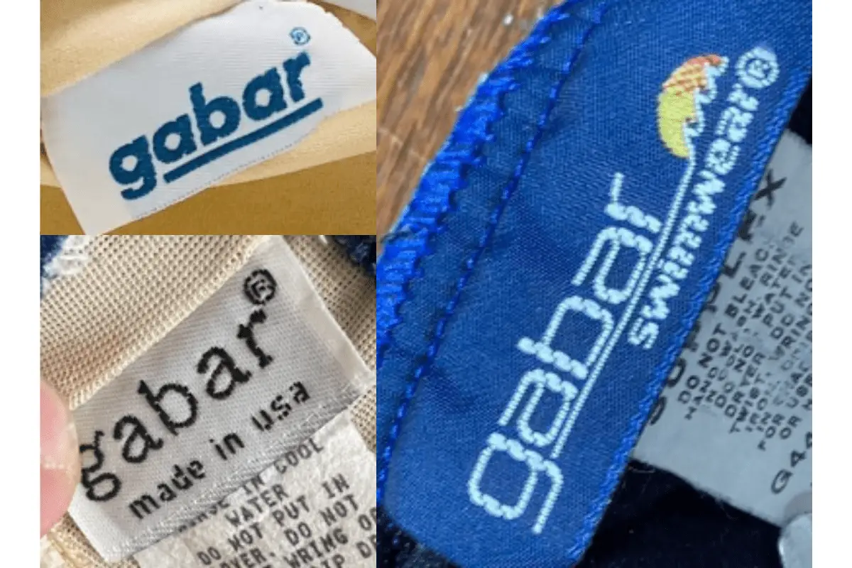
1970s vintage Gabar tags
- Shifts to lowercase “gabar” with a distinct underline beneath the logo.
- Typography moves away from the bold serif style, favoring a softer, modern look.
- Some tags start to include “Made in USA,” highlighting domestic production.

1970s Gabar tags
1980s vintage Gabar tags
- Features lowercase “gabar” with the addition of the “®” symbol, signaling registered branding.
- The text “Made in USA” becomes a prominent feature, reinforcing American manufacturing.
- Introduction of the “Swimwear” line, identifiable by a sun graphic and more vibrant colors.
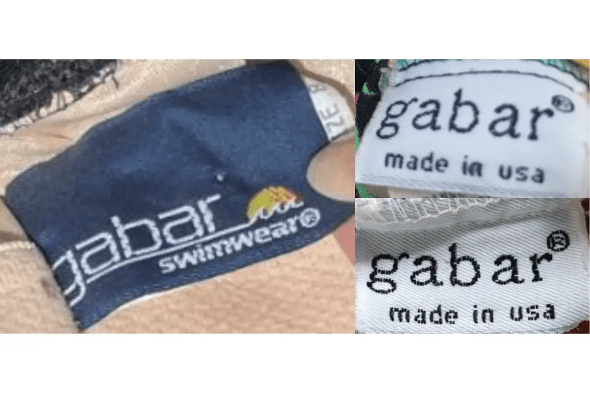
1980s Gabar tags
1990s vintage Gabar tags
- Continues with lowercase “gabar” branding, often accompanied by “Made in USA.”
- The “Swimwear” line remains popular, with distinct logos that incorporate both the sun graphic and bold typefaces.
- Tags are more varied in color, with navy and other dark backgrounds becoming common.
1990s Gabar tags