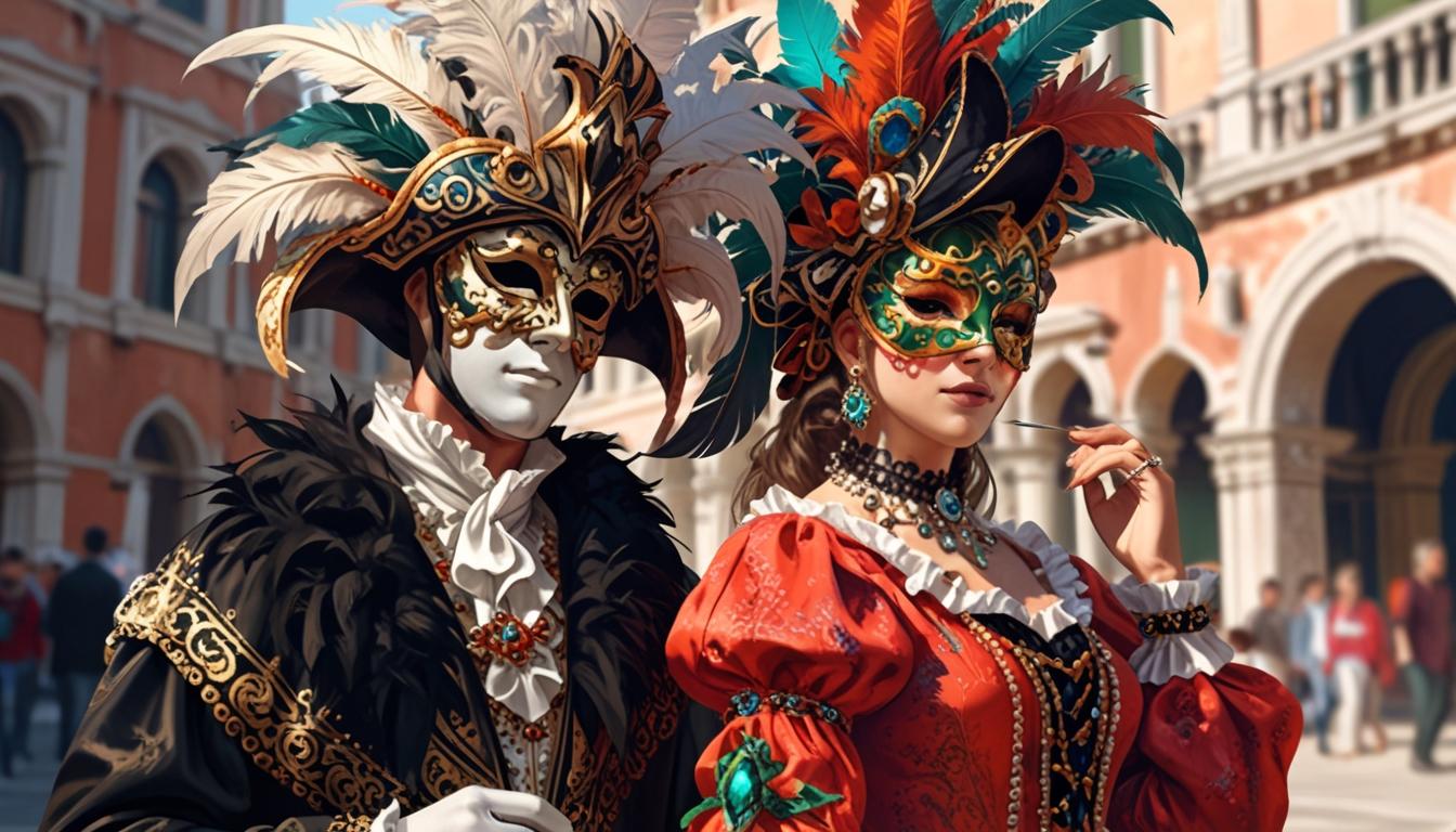
In the early 20th century, Garfinckel’s was a name synonymous with elegance, luxury, and the pinnacle of American department store shopping. Founded in 1905 by Julius Garfinckel, this Washington, D.C.-based retailer quickly rose to prominence, catering to a clientele who demanded the finest goods and impeccable service. The store’s flagship location at 14th and F Streets became an architectural landmark, an eight-story marvel designed to embody the sophistication that Garfinckel’s offered. This iconic structure wasn’t just a place to shop—it was an experience, drawing in generations of discerning customers who saw it as a hallmark of quality and prestige.
As the decades rolled on, Garfinckel’s expanded its reach and influence through strategic acquisitions. The 1946 purchase of Brooks Brothers marked the beginning of a retail empire, eventually forming a conglomerate that included upscale brands like Miller & Rhoads and Ann Taylor. This expansion cemented Garfinckel’s position as a major player in the American retail scene, making it a sought-after shopping destination that blended high fashion with an air of exclusivity. At its height, the Garfinckel, Brooks Brothers, Miller & Rhoads, Inc. conglomerate encompassed nearly 190 stores across the country, with Garfinckel’s as its crown jewel, embodying refined taste and heritage.
However, the winds of change swept through Garfinckel’s in the 1980s, as a series of mergers and acquisitions began to take their toll. Despite its storied past, the store struggled to maintain its footing amidst a rapidly shifting retail landscape. By 1990, Garfinckel’s had filed for bankruptcy, bringing an end to its 85-year legacy as a beacon of luxury. Though the original building now serves a different purpose, the legacy of Garfinckel’s endures—its name and history still evoke memories of a golden era in American retail, where style, service, and sophistication reigned supreme.
1981 Garfinckel’s TV Commercial
How to tell if Garfinckel’s is vintage from the logo
Garfinckel’s, once a prestigious department store chain, has had several variations of its logo throughout its history. These logos can help date items from the brand and offer a glimpse into its evolution over the years. By identifying the specific characteristics of each logo, you can determine if a Garfinckel’s piece is vintage and which era it belongs to. Here is a breakdown of the key logo variations from Garfinckel’s across different periods.
1950s to 1970s Garfinckel’s logo
- The logo features the full name “Julius Garfinckel & Co.” in a serif typeface.
- The font has an old-fashioned, elegant style with slightly embellished serifs.
- It often appears embroidered on tags, with a classic and refined appearance, reflecting the brand’s upscale image.
1950s to 1970s Garfinckels logo
1970s to 1980s Garfinckel’s logo
- The logo is simplified to just “Garfinckel’s,” omitting “Julius” and “Co.” from the earlier version.
- The font remains a serif type but has a more modern and streamlined look compared to the previous era.
- This era’s logo often appears in print or on tags, signifying a shift towards a slightly more contemporary branding approach.
1970s to 1980s Garfinckels logo
How to tell if Garfinckel’s is vintage from the tags
Garfinckel’s, a renowned American department store known for high-quality apparel, has a rich history reflected in its garment tags. Over the decades, the tags have evolved in style and design, capturing the brand’s changes in branding and production. Identifying vintage Garfinckel’s pieces by their tags can provide insight into their era and authenticity. Below, you’ll find a guide to Garfinckel’s tags from the 1940s through the 1980s based on distinct characteristics from each period.
Having difficulty identifying vintage tags or labels? Submit a picture on our vintage tag identification page, and we’ll assist you!
1940s vintage Garfinckel’s tags
- Tags typically feature “Julius Garfinckel & Co.” prominently.
- Classic, elegant serif fonts are used for the brand name.
- Often includes the location “Washington,” signifying the store’s prestigious standing.
- Some tags may showcase the designer’s name, such as “Henry Friedrich,” as part of the brand’s high-end, tailored appeal.

1940s Garfinckel’s tags
1950s vintage Garfinckel’s tags
- Continued use of the full “Julius Garfinckel & Co.” branding in serif typeface.
- Incorporates luxurious materials, sometimes with raised embroidery for a premium look.
- Location details like “Washington” or “Washington, D.C.” are often included, emphasizing the brand’s roots.
- Tags may be embossed or feature subtle detailing, reflecting the elegance of this era.

1950s Garfinckel’s tags
1960s vintage Garfinckel’s tags
- Branding evolves slightly to include more modern typefaces, while retaining the classic serif style.
- Some tags feature phrases like “Made in Hong Kong expressly for Garfinckel’s,” indicating the period’s shift towards international production.
- Occasional use of unique fabric backgrounds or color combinations for a distinct appearance.
- Simple, refined tags, reflecting the understated elegance popular in the 1960s.

1960s Garfinckel’s tags
1970s vintage Garfinckel’s tags
- Tags may feature the “Garfinkel’s” name in a refined serif font, sometimes without the “Julius” prefix.
- Increased presence of international production notes, such as “Made in Hong Kong expressly for Garfinckel’s.”
- Some tags may include sub-brands or specialized lines, like “Junior” or “Design Thai Bangkok,” reflecting a broader product range.
- Introduction of more colorful and diverse tag designs, matching the eclectic style of the 1970s.

1970s Garfinckel’s tags
1980s vintage Garfinckel’s tags
- Tags often showcase a bold, simplistic “Garfinckel’s” or “Julius Garfinckel & Co.” logo.
- Use of darker colors and sturdy materials, aligning with the brand’s luxurious appeal.
- Frequently accompanied by city identifiers like “Washington,” emphasizing heritage.
- Modernized layout while retaining classic serif lettering, indicating a blend of tradition and contemporary style.

1980s Garfinckel’s tags