Gémo, a prominent French low-cost shoe and clothing brand, has been a significant player in the fashion industry since its inception in 1991. Created by the Éram group and operated by the Vétir company, Gémo is part of a broader portfolio that includes Tandem and Hyper aux Chaussures brands. The origins of Gémo trace back to the diversification efforts of the Éram group, which consolidated various brands like Hyper aux Vêtements, Hyper aux Chaussures, and Tandem. The name “Gémo” itself is a blend of the first names of the then-directors of the Éram group, Gérard Biotteau and his wife Simone, highlighting the personal touch and familial roots of the brand.
Over the years, Gémo has established itself as a staple for affordable fashion in France. Positioned primarily on the outskirts of city centers, the brand has become a go-to destination for consumers seeking trendy yet budget-friendly clothing and footwear. This strategic location choice allows Gémo to cater to a broad demographic, offering a wide range of products that meet the needs of diverse customers. The brand’s success is reflected in its impressive growth and widespread presence, making it the second-largest distributor of shoes and textiles on the outskirts of towns by 2011.
Gémo’s evolution is not only marked by its expanding product range and customer base but also by its distinctive branding elements. The brand’s logo and tags have undergone several changes over the decades, reflecting the shifts in design trends and consumer preferences. These elements serve as a crucial identifier for vintage Gémo items, allowing enthusiasts to trace the history and authenticity of their finds. From the bold, minimalist logos of the 1990s to the more refined designs of the 2000s, each era’s branding tells a story of Gémo’s journey and its place in the fashion landscape.
Lovely Family Gemo Commercial
How to tell if Gemo is vintage from the logo
Gemo, known for its stylish and accessible clothing, has maintained a distinctive brand identity over the years. The logo of Gemo is a crucial aspect of this identity, offering clues to the vintage of the item. Let’s delve into the specifics of the Gemo logo from different eras to help identify vintage pieces.
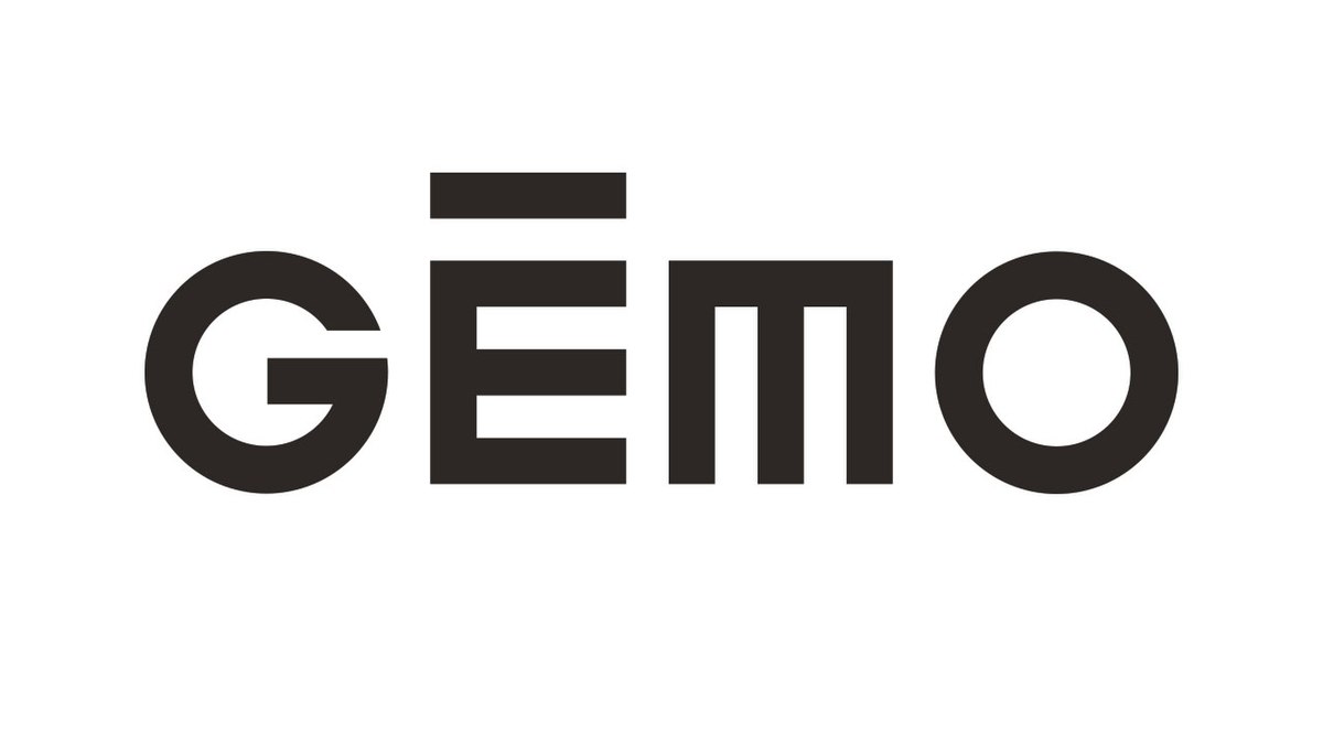
1991 to now Gemo logo
- This era features the iconic “Gemo” logo with a modern and minimalist design.
- The text “Gemo” is in all caps, with a stylized ‘G’ that has a unique bar across the top, giving it a distinctive look.
- The use of a clean, sans-serif font reflects contemporary design trends and makes the brand easily recognizable.
- The logo often appears in black, providing a bold and timeless appeal.

1991 to now Gemo logo
How to tell if Gemo is vintage from the tags
Gemo, known for its accessible and trendy fashion, has seen its brand evolve over the decades. The brand’s tags have also undergone transformations, reflecting different design trends and branding strategies. Here’s how to identify vintage Gemo clothing based on tag designs from different eras.
Having trouble identifying vintage tags or labels? Upload a picture on our vintage tag identification page, and we’ll assist you!
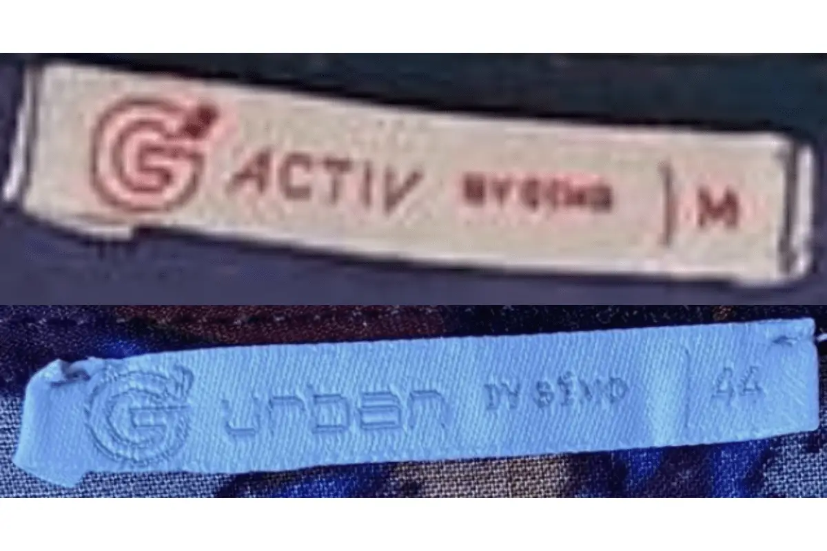
1990s vintage Gemo tags
- Features a simple logo with a stylized “G” followed by the brand name “Gemo.
- Tags are often rectangular with bold, sans-serif fonts.
- Includes additional size information, usually marked with a clear “M” for medium sizes.

1990s Gemo tags
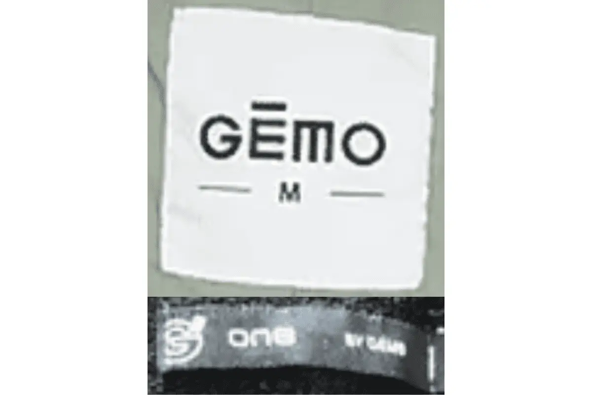
2000s vintage Gemo tags
- Introduces a more modern logo design with a distinct accent over the “E” in “Gemo.
- Tags are rectangular with a cleaner, minimalist aesthetic.
- Size information continues to be clearly marked, often in a bold font.

2000s Gemo tags


