Founded in 1891 as the Parisian Cloak Company, Harzfeld’s grew from a modest venture into one of Kansas City’s most esteemed department stores, celebrated for its refined selection of women’s and children’s apparel. Established by Siegmund Harzfeld and Ferdinand Siegel, the store embraced luxury, sophistication, and a commitment to style, making it a destination for those seeking the latest in high fashion. When it was rebranded in 1913 as Harzfeld’s, the store symbolized a move towards a modern Kansas City icon, anchored in its newly designed flagship location at Main Street and Petticoat Lane. This address quickly became a landmark, drawing in clientele with its elegant displays, innovative layout, and carefully curated collections.
Over the decades, Harzfeld’s continued to innovate, becoming a public company in 1959 and expanding its influence through high-end merchandise and quality customer service. This commitment to excellence cemented its status as a prestigious institution, with the store’s clientele often including Kansas City’s social elite. The flagship store, designed by the prominent architect John McKecknie, embodied this vision with its graceful architecture and unique layout, sprawling from Main to Walnut Streets. Harzfeld’s not only shaped local retail but also contributed to the city’s cultural landscape, notably commissioning Thomas Hart Benton’s mural “Achelous and Hercules” in 1947, a work that later found its way to the Smithsonian Institution, underscoring the store’s lasting cultural impact.
Harzfeld’s met its end in 1984, following its acquisition by Allied Stores after the parent company was sold. Although its doors closed, the legacy of Harzfeld’s lives on through its unique vintage items, which are coveted by collectors and fashion enthusiasts alike. Each garment or accessory, especially those bearing the original logo or tag, tells the story of a department store that defined elegance for nearly a century. Today, Harzfeld’s pieces stand as reminders of a time when fashion in Kansas City was synonymous with class, quality, and enduring style.
History of Harzfeld’s Documentary
How to tell if Harzfeld’s is vintage from the logo
Harzfeld’s, once a prominent luxury department store in Kansas City, used several distinct logos during its long history, which can help in identifying vintage pieces. The logos evolved subtly over time, reflecting changes in design aesthetics and branding approaches, but the core style remained recognizably tied to its heritage. Below are the descriptions of the Harzfeld’s logos from the eras attached.
1940s Harzfeld’s logo
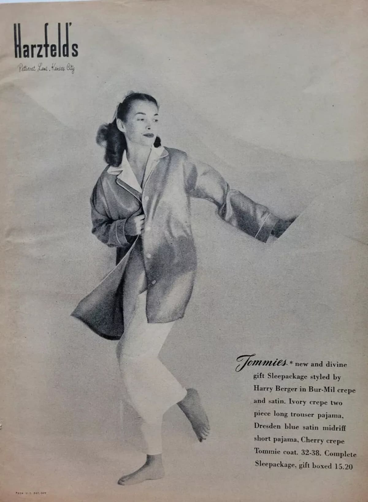
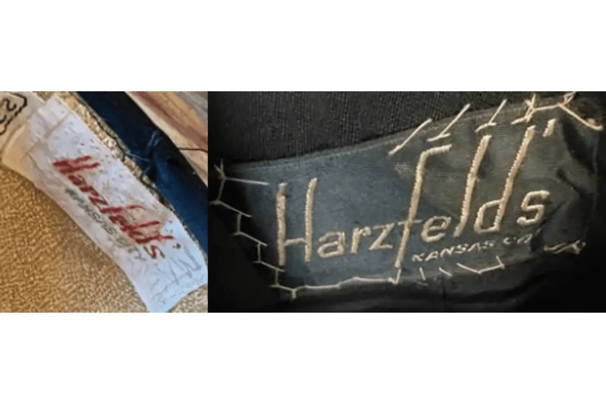
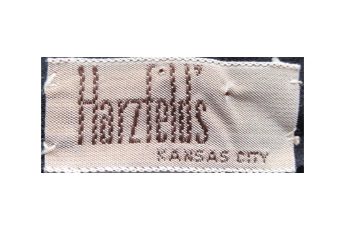
- The 1940s Harzfeld’s logo features a slender, elongated font style.
- The embroidery is often seen in contrasting colors, enhancing the sharpness of the brand name.
- It emphasizes a clean, minimalistic style with a distinctive stitched look, which was popular during this era.
- This logo often had the store location, “Kansas City,” stitched beneath it on garments, though not always.
1940s Harzfelds logo
1940s to 1980s Harzfeld’s logo
- This version keeps the iconic slender font but often appears with more intricate embroidery or printing, depending on the material.
- It maintains the minimalistic, elongated design, but the stitching often feels more refined and closely spaced.
- Unlike earlier versions, some iterations of this logo do not feature the “Kansas City” location text.
- The color palette typically includes neutral shades like brown or white, which are common in high-quality fashion items from this era.
1940s to 1980s Harzfelds logo
How to tell if Harzfelds is vintage from the tags
The evolution of Harzfelds tags across the decades provides an insight into the brand’s rich history and attention to detail. From the early days, when the company was a key player in Kansas City, to its later years, the labels evolved in design and color while retaining the classic Harzfelds typography. Identifying vintage Harzfelds garments can often be done by observing the style, font, and color of the tag.
Having difficulty identifying vintage tags or labels? Submit a picture on our vintage tag identification page, and we’ll assist you!
1940s vintage Harzfelds tags
- Soft, woven fabric tags featuring the brand’s name in bold, cursive-style embroidery.
- Made in Kansas City is often indicated under the main logo in smaller font.
- Classic serif font used for the brand name, with a slightly condensed letter spacing.
1940s Harzfelds tags
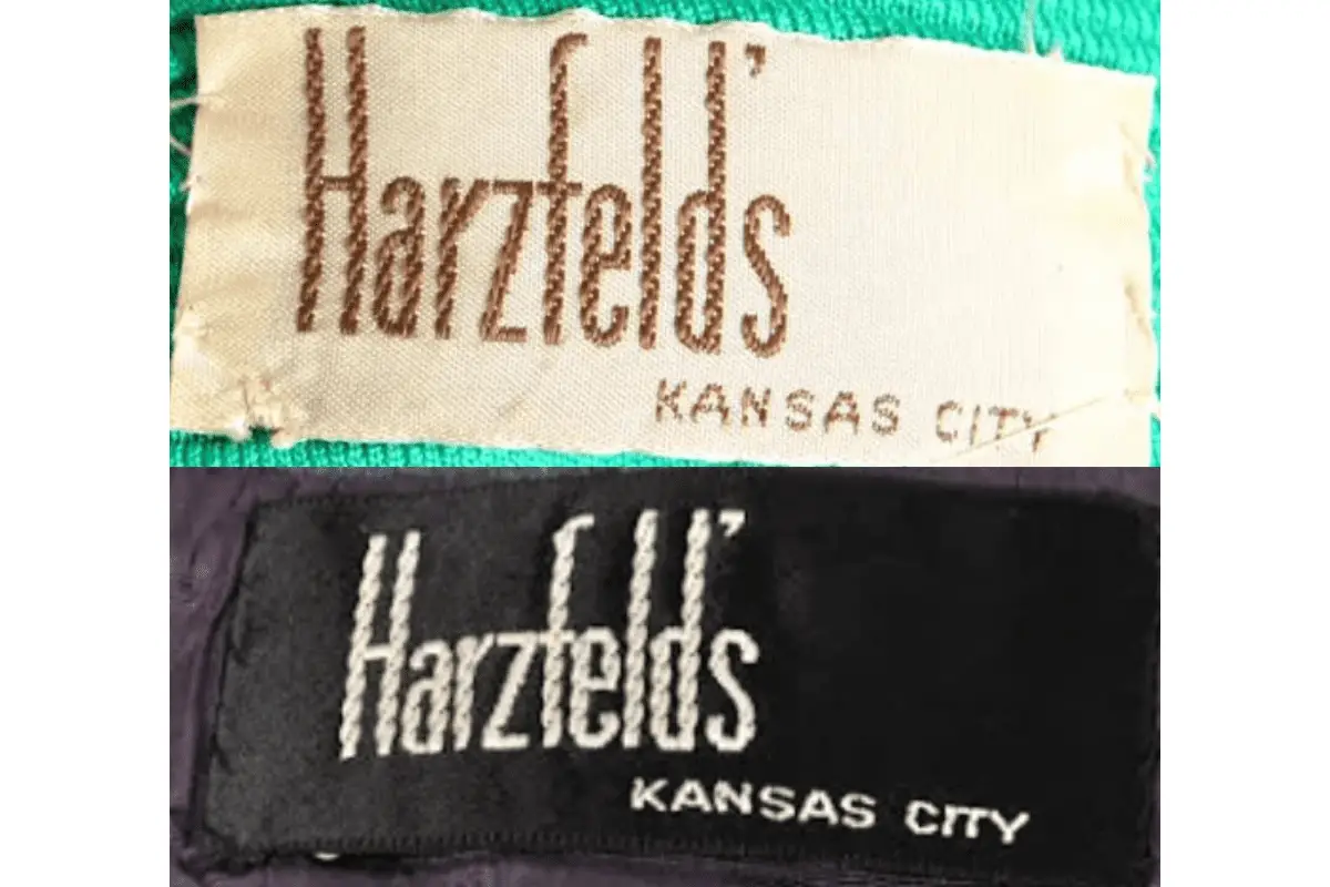
1950s vintage Harzfelds tags
- Tags often used lighter fabric material, typically cream or beige in color.
- The Harzfelds logo remained consistent, featuring bold serif-style lettering with elongated tall letters.
- Kansas City remains present in small, capitalized letters under the logo.

1950s Harzfelds tags
1960s vintage Harzfelds tags
- Tags become more standardized in size and shape, often rectangular and flat.
- Light brown or dark stitching of the Harzfelds name on a plain, cream-colored background.
- Inclusion of location, Kansas City, often remains beneath the brand name.
1960s Harzfelds tags
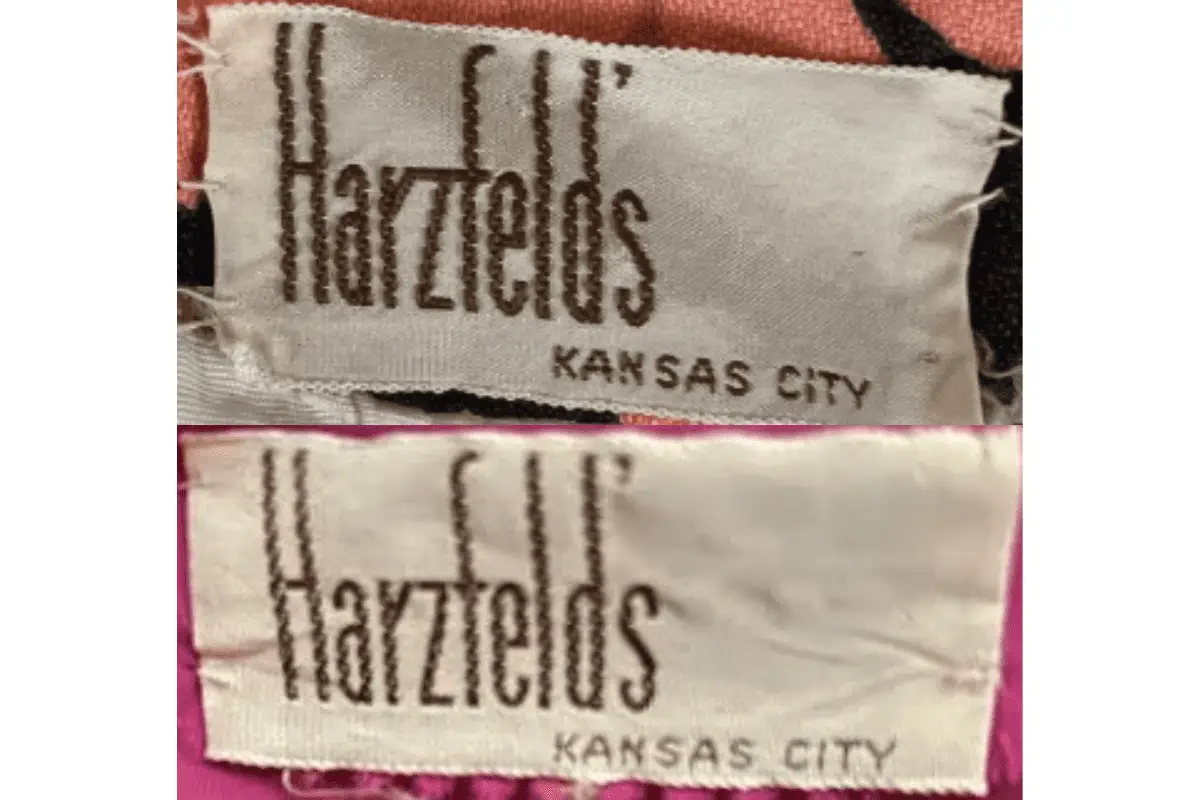
1970s vintage Harzfelds tags
- Tags continued the trend of cream or beige backgrounds with darker lettering.
- The classic Harzfelds font remained largely unchanged, still featuring tall, condensed letters in serif typeface.
- Made in Kansas City in a smaller font is often included beneath the brand logo.
1970s Harzfelds tags
1980s vintage Harzfelds tags
- Black or darker-colored tags with white or cream lettering become more common.
- Tags often used stronger materials like woven or thicker fabric for durability.
- The Harzfelds logo remains prominent in its serif style, with Kansas City beneath.
1980s Harzfelds tags