Few designers can claim a career as eclectic and influential as Hubert Latimer’s. Emerging from California’s vibrant fashion scene, Latimer initially made a name for himself working alongside Charles Cooper before collaborating with renowned designer Irene. After Irene’s passing in 1962, Latimer continued her legacy, gaining label credit for his work and building his own reputation as a designer of taste and refinement. By the 1970s, his growing expertise saw him appointed as head designer for Christian Dior-New York, where his debut collection in 1971 was a hit. However, Dior soon shifted focus, moving the design operations back to Paris. Latimer, however, had already cemented his place in the industry and moved on to other notable collaborations.
After leaving Dior-New York, Latimer joined forces with designer Mollie Parnis in 1973, handling the high-end line while Morty Sussman took charge of the boutique collections. Latimer’s designs continued to resonate with high society, and his pieces became coveted among the fashion-conscious elite. This partnership lasted until he returned to California in 1975, where he began an iconic collaboration with Rudi Gernreich at Atelier 7. This period marked a significant creative synergy, with Latimer’s designs embracing both classic and avant-garde aesthetics, though by 1976, Gernreich became the primary designer at Atelier 7.
Beyond his design career, Latimer also influenced future generations of designers through his teaching at the Fashion Institute of Design & Merchandising in Los Angeles, where he taught into the late 1980s. His mentorship extended his legacy, with several of his students going on to create garments for prominent figures, including Marilyn Quayle’s Inaugural wardrobe. Today, collectors and vintage enthusiasts alike seek out Hubert Latimer pieces, not just for their elegant style but for the designer’s unique, multifaceted contributions to fashion history.
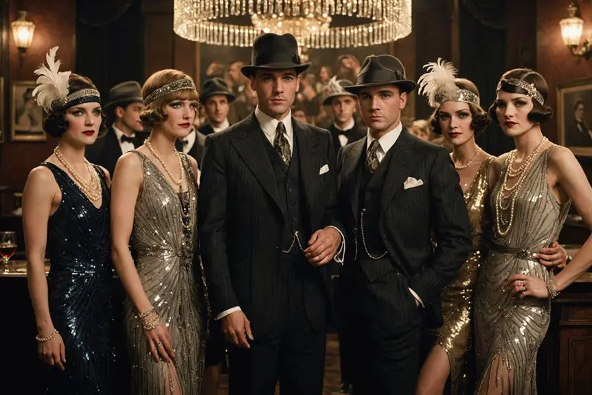
60s Fashion in London’s King Street
How to tell if Hubert Latimer is vintage from the logo
Hubert Latimer has a distinctive logo style that can help determine the era of vintage pieces. The company’s visual branding has changed subtly over the years, and identifying these specific characteristics in the logo design can indicate whether a piece is from a certain vintage period. Here, we focus on the specific logo styles Hubert Latimer used from the 1960s to the 1980s.
1960s to 1980s Hubert Latimer logo
- The Hubert Latimer logo from this era has a classic serif font, which gives it a timeless and traditional appearance.
- Each letter is elongated and features distinct serif accents, lending a sophisticated look to the brand name.
- The letters are closely spaced, maintaining a compact and cohesive feel across the wordmark.
- This logo design reflects the mid-20th-century style, where elegance and simplicity were prioritized in branding.
- Perfect for identifying vintage items, this logo represents the period when Hubert Latimer solidified its brand presence in the fashion market.
1960s to 1980s Hubert Latimer logo
How to tell if Hubert Latimer is vintage from the tags
The evolution of Hubert Latimer’s tags reflects the changing aesthetics and branding preferences of the fashion industry over several decades. Each era’s tags highlight unique design elements, from serif fonts and elegant layouts to more refined, bordered designs. These distinct characteristics provide clues to identifying the age and authenticity of vintage Hubert Latimer pieces.
Can’t figure out your vintage tags or labels? Upload a picture on our vintage tag identification page, and we’ll assist you!
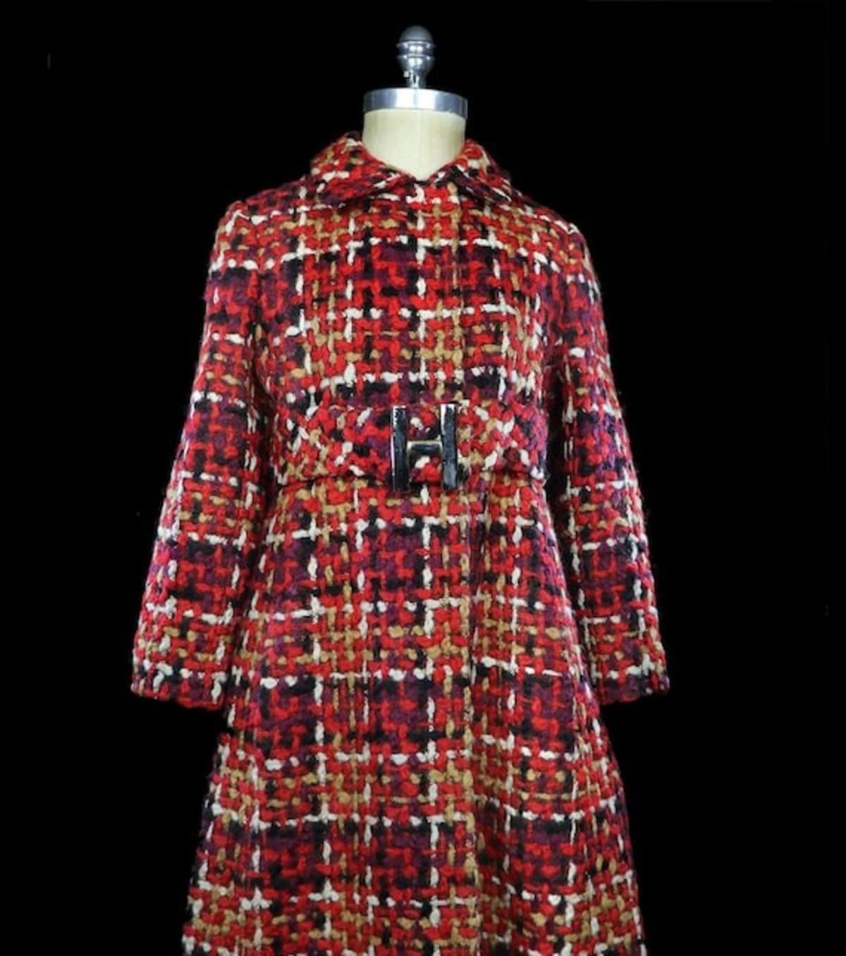
1960s vintage Hubert Latimer tags
- Features the name “Hubert Latimer” in an elegant, serif typeface, showcasing the refined style of the era.
- Typically includes minimalistic design elements with a focus on readability and sophistication.
- The tag has a simple layout without additional borders or decoration, highlighting the brand name prominently.
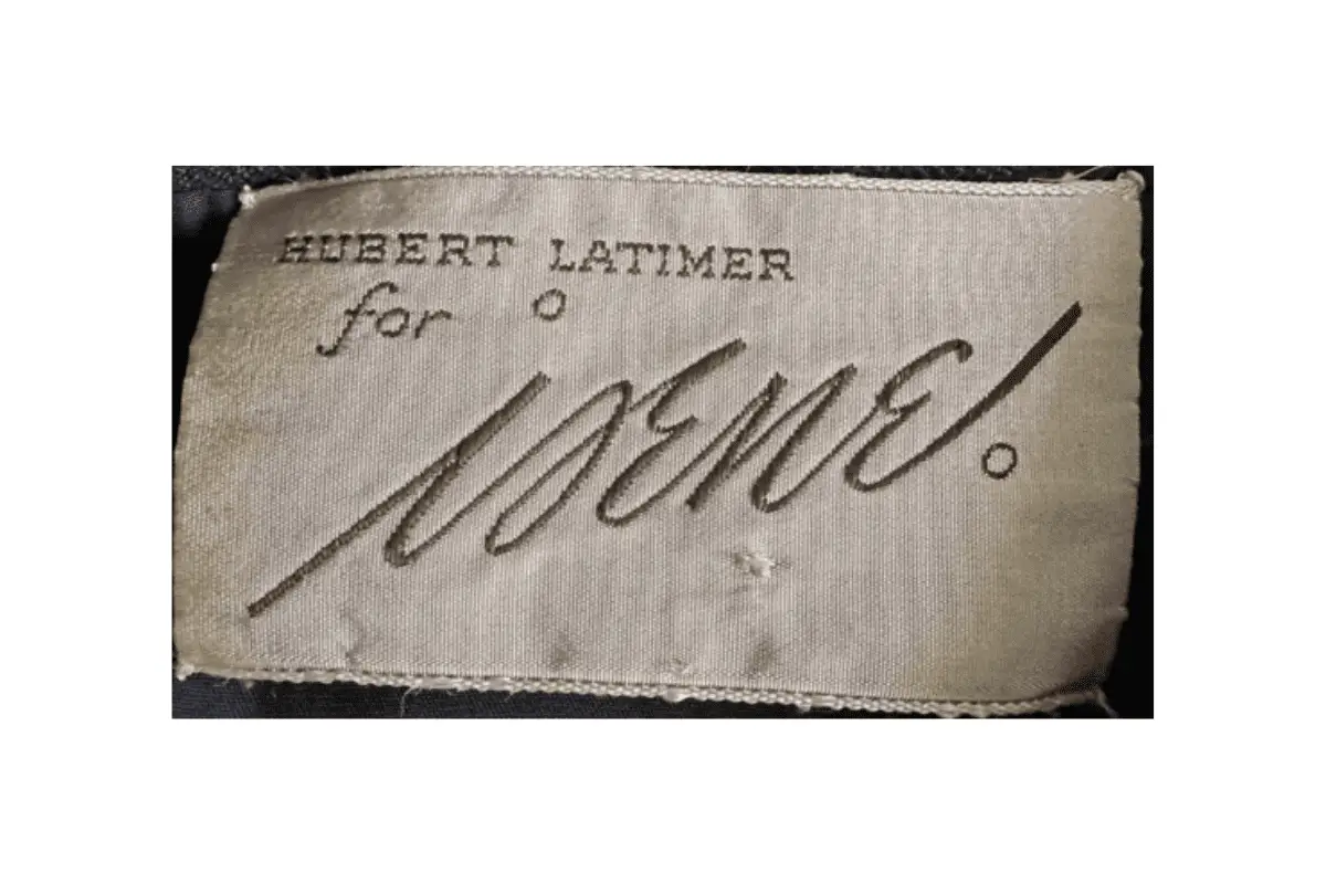
1960s Hubert Latimer tags
1970s vintage Hubert Latimer tags
- Continues to emphasize the “Hubert Latimer” name, now with a bolder serif font to stand out.
- Design shifts slightly to a more structured appearance, reflecting the fashion trends of the 1970s.
- Tags may include additional embellishments or accents, such as the “for Irene” script, indicating special collections or collaborations.
1970s Hubert Latimer tags
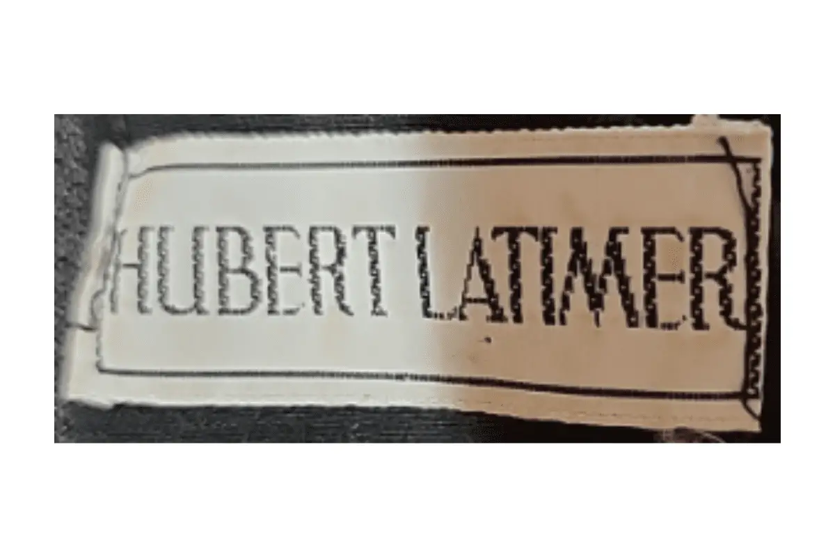
1980s vintage Hubert Latimer tags
- Maintains the “Hubert Latimer” name with a refined serif font, enclosed in a rectangular border for a polished look.
- Tags appear more durable with higher quality material, indicating a shift towards long-lasting branding elements.
- The overall design is clean and structured, focusing on a modern yet timeless appeal.
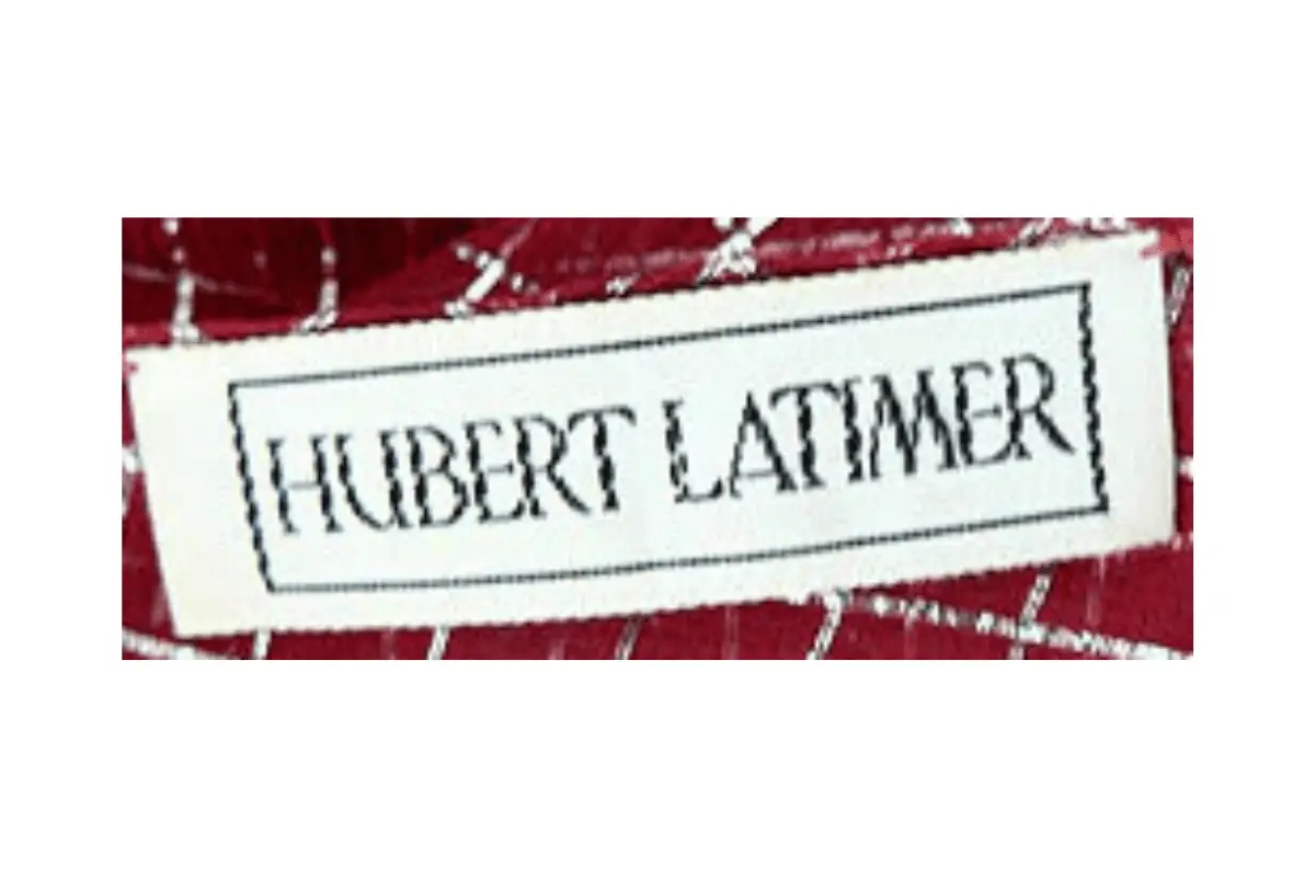
1980s Hubert Latimer tags