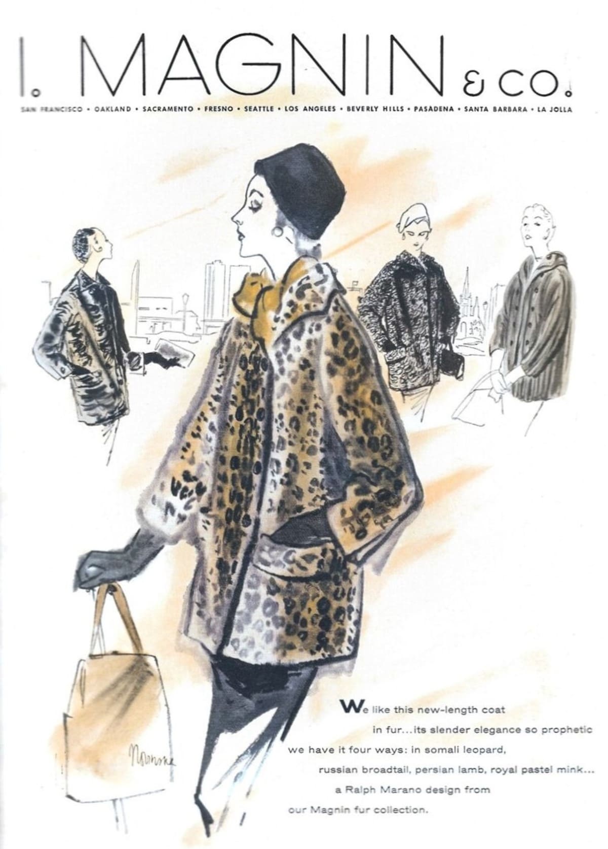
I. Magnin & Company, founded in 1876 by Mary Ann Magnin in San Francisco, stands as a hallmark of luxury and high fashion in American retail history. Initially specializing in infant wear and bridal attire, the brand quickly gained prominence for importing couture from leading European designers like Jeanne Lanvin and Christian Dior. Over the decades, I. Magnin established itself as the go-to destination for exclusive, high-quality fashion, catering to a sophisticated clientele who valued its emphasis on elegance and craftsmanship. The brand’s early success was fueled by Mary Ann Magnin’s vision and the store’s reputation for delivering the latest trends from Paris to the burgeoning West Coast elite.
Throughout the 20th century, I. Magnin expanded its presence across California and beyond, carving a niche for itself in luxury retail. Its flagship stores, such as the “White Marble Palace” in San Francisco and the iconic Wilshire Boulevard store in Los Angeles, became architectural and cultural landmarks. These grand spaces reflected the opulence of the brand, hosting visits from global fashion icons like Christian Dior, who famously praised the Union Square store’s magnificence. This period of growth, marked by expansion into suburban markets and collaborations with high-end designers, solidified I. Magnin’s position as a pioneer in luxury department store retailing.
Despite changing ownerships and challenges in the latter half of the century, I. Magnin remained synonymous with sophistication and exclusivity. From its early days as a small shop to its heyday as a West Coast retail powerhouse, the brand’s history is a testament to its enduring influence on American fashion. Today, vintage enthusiasts cherish I. Magnin pieces as symbols of timeless elegance, with the brand’s legacy living on through its distinctive designs, exquisite craftsmanship, and iconic logo and tags.
60s Fashion in London’s King Street
How to tell if I. Magnin is vintage from the logo
I. Magnin & Co. has a rich history in the fashion industry, with its logos evolving over decades to reflect changes in design aesthetics and branding strategies. The logo provides valuable insights into the era of an I. Magnin piece, making it a key indicator for vintage identification. Here’s a breakdown of the logo changes across different decades based on the examples provided.
1950s I. Magnin logo
- This logo prominently features a serif typeface with a classic and elegant style, reflecting the mid-century design aesthetic of the 1950s.
- The text is bold, with slight spacing between letters, which gives it a formal and traditional look.
- The “& co” text is small and closely integrated with the “I. Magnin” text, indicating the company’s full name while maintaining visual cohesion.
1950s I Magnin logo
1960s to 1970s I. Magnin logo
- The 1960s to 1970s version shows a subtle modernization of the previous design, with slightly thinner letter strokes.
- This logo retains the classic serif typeface, but the design appears less bold compared to the 1950s, reflecting the minimalist trends of the period.
- The “& co” text remains small, maintaining the brand’s traditional structure while adapting to more modern tastes.
1960s to 1970s I Magnin logo
1970s to 1990s I. Magnin logo
- This era introduced a significant shift with a more stylized and modern logo design.
- The letters have a rounded, sans-serif style, giving a distinctly retro yet futuristic look popular during the late 20th century.
- The design emphasizes simplicity and fluidity, with a unique, continuous curve that modernized the brand’s image.
1970s to 1990s I Magnin logo
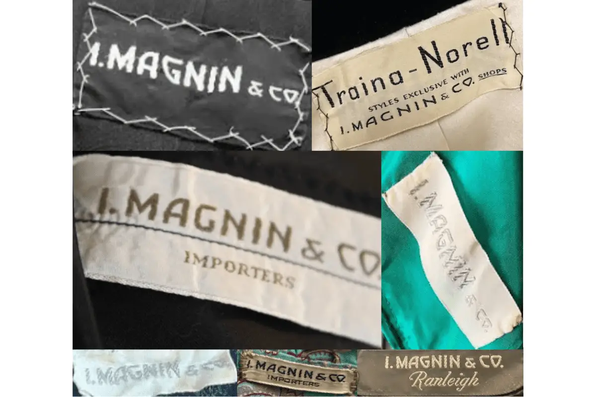
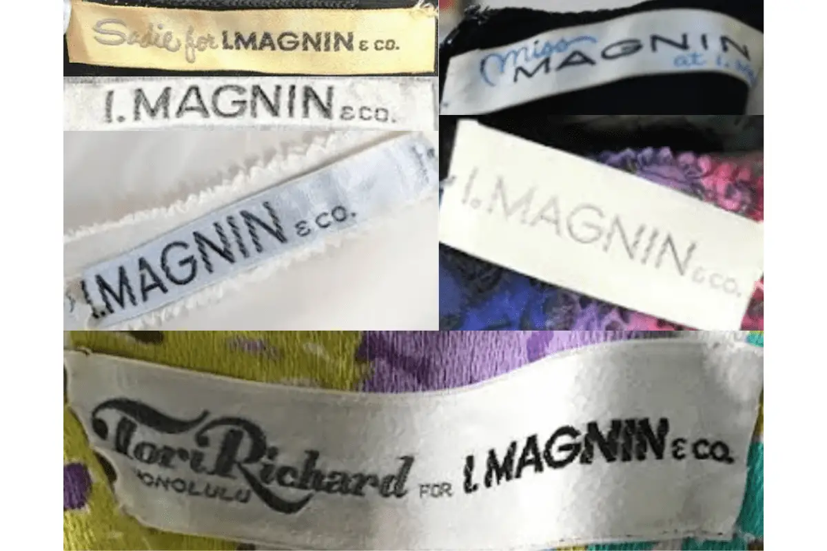
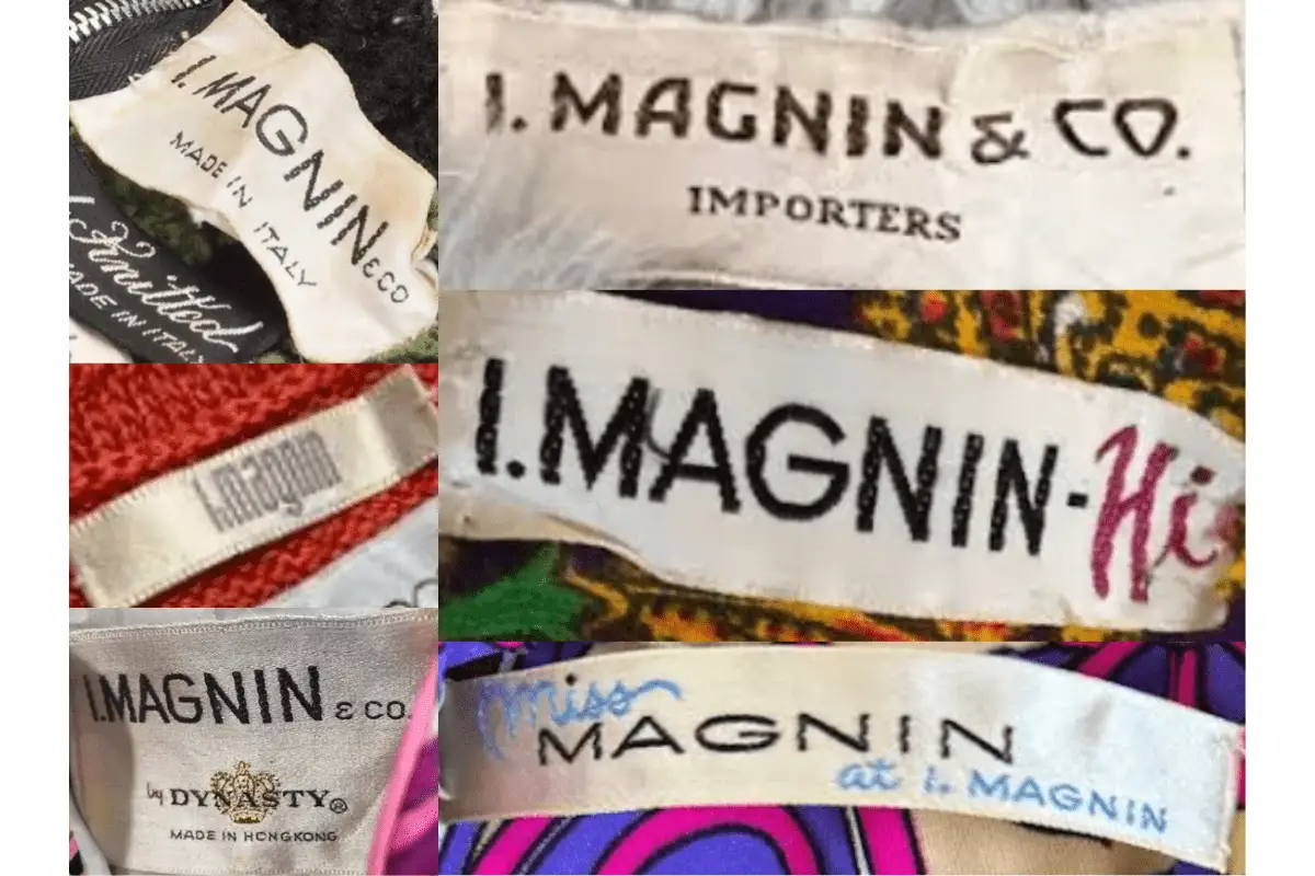
How to tell if I. Magnin is vintage from the tags
I. Magnin’s tags have evolved over the decades, reflecting changes in fashion, branding, and design aesthetics. Vintage I. Magnin tags often help to identify the era of a garment and provide insights into its history. From the serif lettering of the 1950s to the modern styles of the 1990s, each decade’s tags showcase distinct characteristics that reflect the brand’s legacy and design trends of the time.
Need assistance with vintage tags or labels? Upload a picture on our vintage tag identification page, and we’ll help you out!
1950s vintage I. Magnin tags
- Classic serif font with “I. MAGNIN & CO.” prominently displayed.
- Tags are usually sewn onto garments with visible stitching, providing a handmade feel.
- Some tags include “IMPORTERS,” indicating the brand’s international sourcing and prestige.
- Materials often feel thicker, showcasing quality and durability.
1950s I Magnin tags
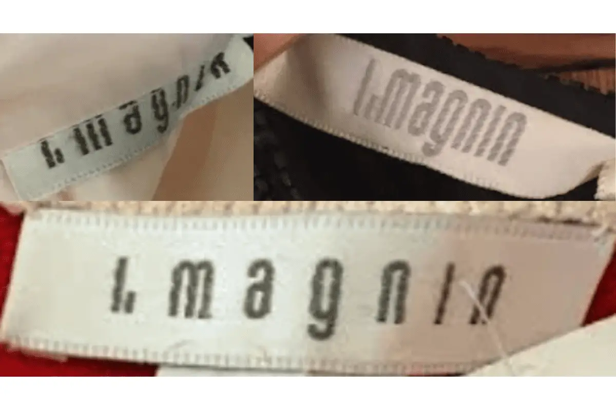
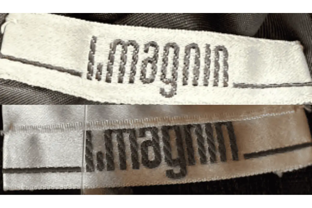
1960s vintage I. Magnin tags
- Continued use of “I. MAGNIN & CO.” with clean, bold lettering.
- Some tags are collaborative, mentioning designers like “Traina-Norell,” highlighting exclusive styles.
- Tags may be on a neutral fabric with visible stitching, emphasizing craftsmanship.
- Unique placements of logos and collaborative branding reflect the exclusivity of certain collections.
1960s I Magnin tags
1970s vintage I. Magnin tags
- More refined font, sometimes in italicized or stylized designs, like “Miss Magnin” for special lines.
- Collaborations continue, with mentions of exclusive lines such as “Ranleigh.”
- Color variations appear, with tags sometimes featuring colored text or borders.
- Focus on branding, often displaying “I. MAGNIN & CO.” in a distinct, bold style on simpler backgrounds.
1970s I Magnin tags
1980s vintage I. Magnin tags
- Tags feature simple yet bold “I. MAGNIN” text, sometimes accompanied by “eco.” indicating the brand’s eco-conscious shifts.
- Introduction of lighter and sometimes pastel-colored tags, reflecting 1980s fashion trends.
- Some tags are embroidered, with a refined and modern look compared to earlier decades.
- Occasional designer collaborations mentioned on the tags, emphasizing unique fashion partnerships.
1980s I Magnin tags
1990s vintage I. Magnin tags
- Modernized look with sleeker fonts, retaining “I. MAGNIN” branding with a minimalist approach.
- Tags are often smaller and more subtle, focusing on brand name without additional text.
- Neutral colors dominate, aligning with the 1990s minimalistic aesthetic.
- Some tags reflect a more international influence, marking a shift in production styles and materials.
1990s I Magnin tags