JCPenney, an American department store chain with a storied history, has long been a staple in the retail landscape. Founded by James Cash Penney in 1902, the company began as a small dry goods store in Kemmerer, Wyoming, under the name Golden Rule. Penney’s vision of providing quality goods at affordable prices resonated with customers, allowing the brand to expand rapidly across the Rocky Mountain States. By 1912, JCPenney had grown to 34 stores, and just a year later, all locations were consolidated under the J.C. Penney banner, marking the beginning of a nationwide presence that would come to define American retail.
Throughout the 20th century, JCPenney adapted to the changing retail environment. Initially focusing on downtown locations, the company began anchoring shopping malls during the 1960s, capitalizing on the suburban boom. This move not only increased accessibility for customers but also solidified JCPenney’s status as a household name. The company’s willingness to innovate was further demonstrated by its entry into catalog sales in 1963, making it a pioneer in the direct-to-consumer market long before the advent of e-commerce.
Despite facing financial challenges, including filing for Chapter 11 bankruptcy in 2020, JCPenney has remained a resilient force in the retail sector. The acquisition by Brookfield Asset Management and Simon Property Group later that year provided a lifeline, allowing the company to continue operating 663 stores across the United States and Puerto Rico. With a renewed focus on revitalizing its brand and modernizing its retail strategies, JCPenney continues to honor its legacy while striving to meet the needs of contemporary shoppers.
Iconic 70s Slacks JCPenney Commercial
How to tell if JCPenney is vintage from the logo
JCPenney has undergone numerous logo changes since its inception, each reflecting the branding trends and market strategies of its time. The evolution of the JCPenney logo can help in identifying vintage items, as each era’s logo has distinct characteristics. Below is a guide to help you determine if your JCPenney item is vintage based on the logo.
1951 to 1962 JCPenney logo
- The logo prominently features the brand name “PENNEY’S” in all caps.
- It includes the tagline “ALWAYS FIRST QUALITY!” underneath the main text.
- The design is black and white, emphasizing a straightforward, no-nonsense aesthetic typical of the time.
1951 to 1962 JCPenney logo
1962 to 1963 JCPenney logo
- This era’s logo continues to use “PENNEY’S” in all caps.
- The font style remains bold and clear, with a more modernized touch compared to the previous version.
- The tagline “ALWAYS FIRST QUALITY!” is still present, maintaining consistency in brand messaging.
1962 to 1963 JCPenney logo
1963 to 1971 JCPenney logo
- The logo transitions to “JCPenney” with the initial introduction of a more streamlined and modern design.
- It features a distinctive “J” element that adds a contemporary flair.
- The font used is more sleek and rounded compared to the previous blocky styles.
1963 to 1971 JCPenney logo
1969 to 2006 JCPenney logo
- The logo is simplified to just “JCPenney” in a clean, sans-serif font.
- The text is black, emphasizing simplicity and elegance.
- This version of the logo remained consistent for several decades, indicating a stable brand image.
1969 to 2006 JCPenney logo
2000 to 2006 JCPenney logo
- This period sees a slight update, maintaining the “JCPenney” text but in a more refined font.
- The logo often appears in red, adding a vibrant touch to the brand’s image.
- Overall, the design is minimalist, reflecting early 2000s design trends.
2000 to 2006 JCPenney logo
2006 to 2008 JCPenney logo
- The logo features “JCPenney” in white text on a red square background, creating a strong visual impact.
- The use of a background shape is a significant change, making the logo more eye-catching.
- The font remains clean and modern, consistent with earlier updates.
2006 to 2008 JCPenney logo
2008 to 2011 JCPenney logo
- This era introduces “JCPenney” in a lighter red shade with a more rounded font.
- The logo is placed within a red square, but the design is more refined compared to the previous version.
- The overall look is sleek and contemporary, aligning with late 2000s design trends.
2008 to 2011 JCPenney logo
2011 to 2012 JCPenney logo
- The logo features lowercase “jcpenney” in a modern, sans-serif font.
- It is presented in a simple, red color, emphasizing a minimalist approach.
- The absence of additional graphical elements marks a departure from previous designs.
2011 to 2012 JCPenney logo
2012 to 2013 JCPenney logo
- This logo introduced a new format with “jcp” in lowercase letters.
- The “jcp” is enclosed within a blue square, which is positioned in the upper left corner of a larger red square outline.
- This logo reflects a more modern and dynamic visual identity.
2012 to 2013 JCPenney logo
2013 JCPenney logo
- The logo reverts to the full “jcpenney” in lowercase, placed inside a red square.
- This design combines the simplicity of text with a bold background element.
2013 JCPenney logo
2013 to 2019 JCPenney logo
- The logo returns to a more traditional look with “JCPenney” in uppercase letters.
- The font is bold and red, offering a classic and recognizable appearance.
- It aims to bridge the brand’s past with a contemporary style.
2013 to 2019 JCPenney logo
2019 to now JCPenney logo
- The current logo features “JCPenney” in a bold, red font, similar to the previous version.
- It maintains the traditional uppercase letters but with slight modifications for a modern touch.
- This logo represents the latest iteration of JCPenney’s visual identity, focusing on consistency and brand recognition.
2019 to now JCPenney logo
2019 to now JCPenney logo
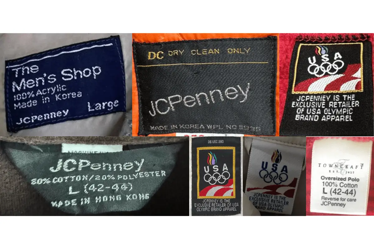
How to tell if JCPenney is vintage from the tags
The evolution of JCPenney tags over the decades reflects the brand’s adaptation to changing fashion trends and manufacturing technologies. Early tags often featured simple, bold designs with straightforward information about fabric and care, while later tags began to include more detailed branding and varied materials.
Can’t figure out your vintage tags or labels? Upload a picture on our vintage tag identification page, and we’ll assist you!
1940s vintage JCPenney tags
- Tags often feature the brand name “Penneys” in a simple, bold font.
- Basic information about fabric composition and care instructions.
- Minimalist design with emphasis on functionality.
1940s JCPenney tags
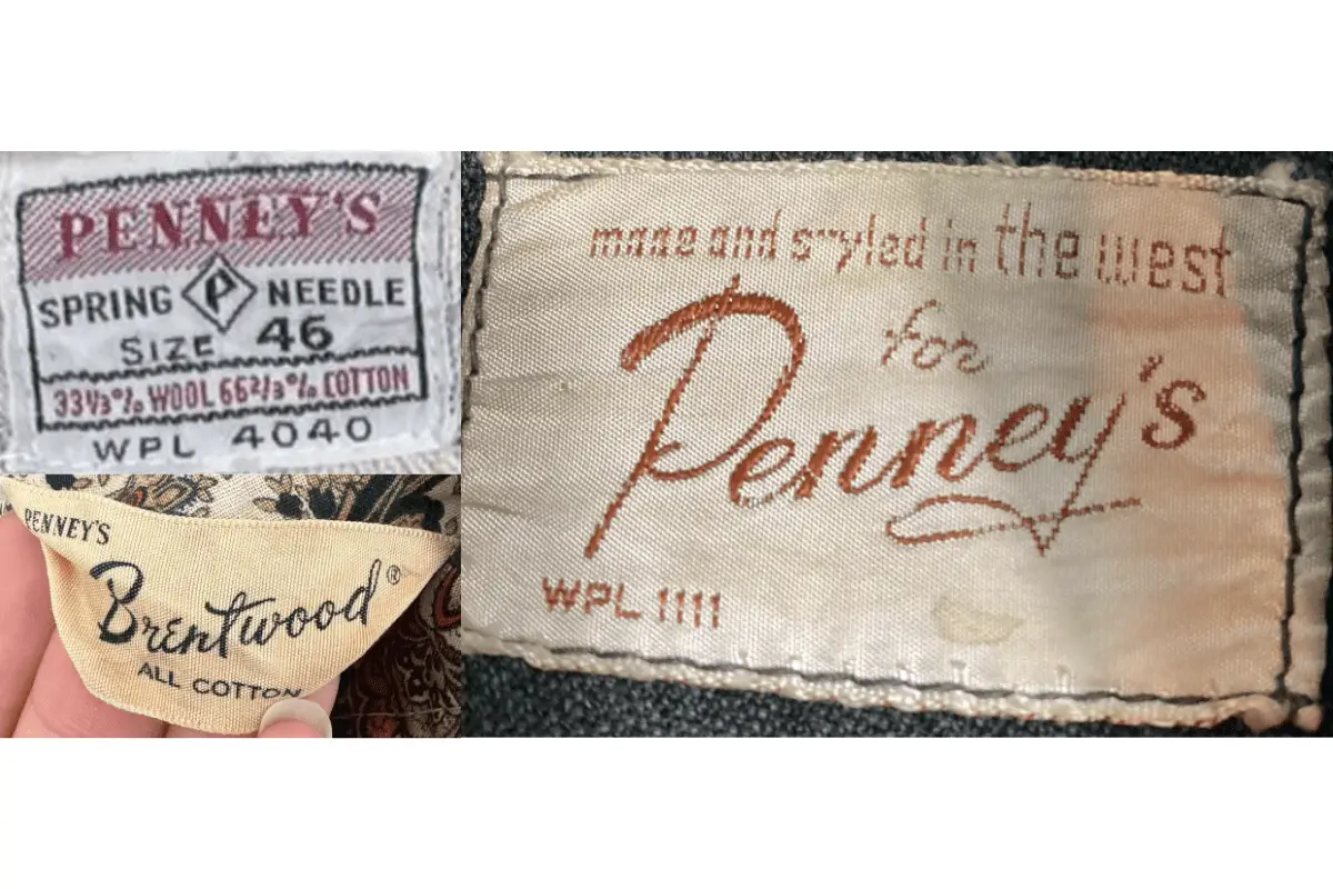
1950s vintage JCPenney tags
- Introduction of more detailed branding, including the full “JCPenney” name.
- Tags may include specific product lines such as “Brentwood” and “Penneys.”
- Use of various fonts and decorative elements to enhance visual appeal.
1950s JCPenney tags
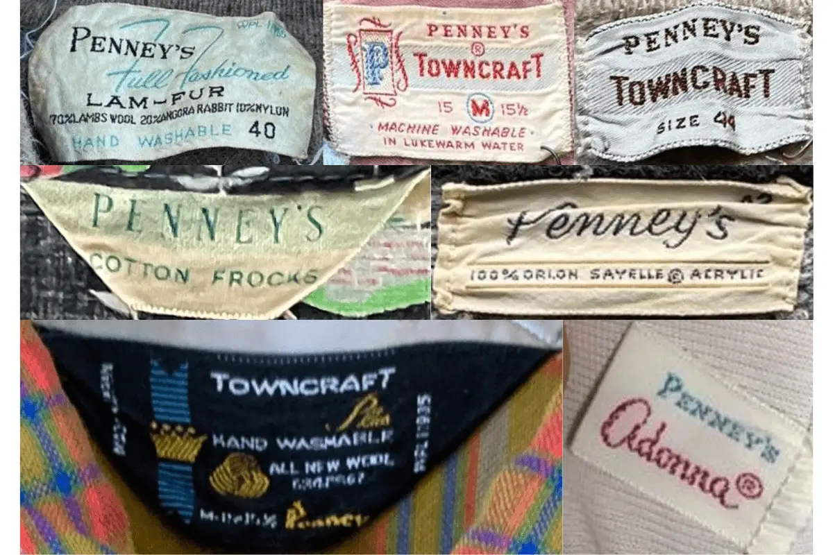
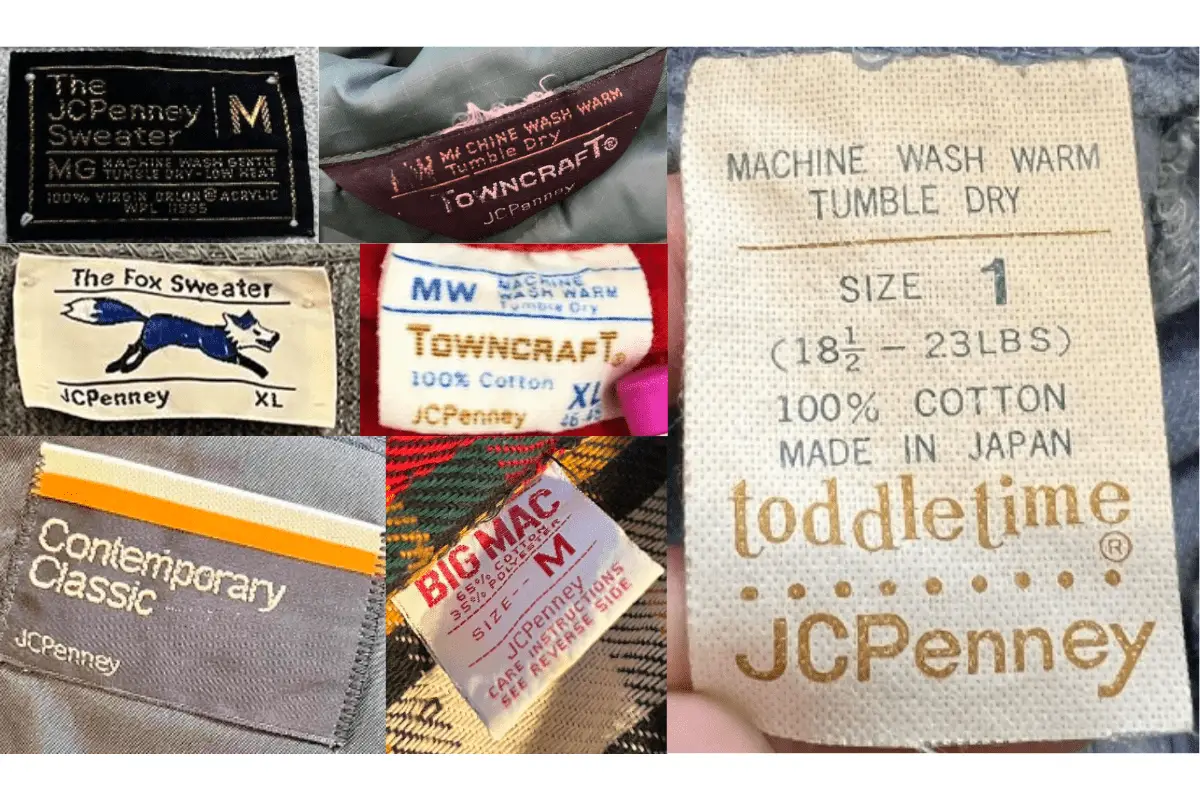
1960s vintage JCPenney tags
- Tags start to include more elaborate designs and logos.
- Introduction of specific collections and product lines like “Towncraft.”
- Use of bold colors and intricate details to distinguish different lines.
1960s JCPenney tags
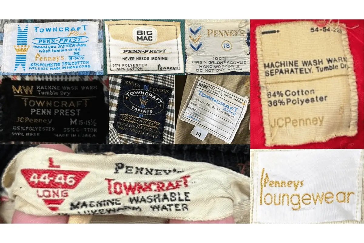
1970s vintage JCPenney tags
- Continuation of detailed branding with diverse collections such as “Big Mac” and “Towncraft.”
- Use of vibrant colors and high-quality materials.
- More comprehensive care instructions and fabric composition details.
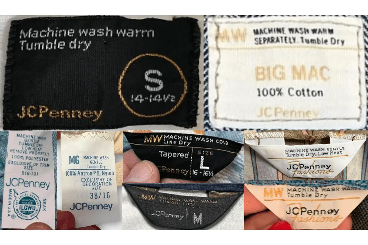
1970s JCPenney tags
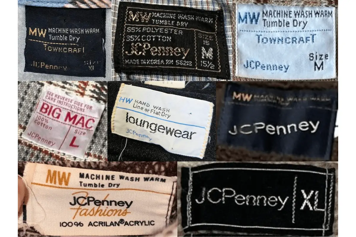
1970s JCPenney tags
1980s vintage JCPenney tags
- Introduction of modern designs and logos, reflecting contemporary trends.
- Tags often include country of manufacture and specific care instructions.
- Bold, high-contrast colors and intricate designs for better brand recognition.
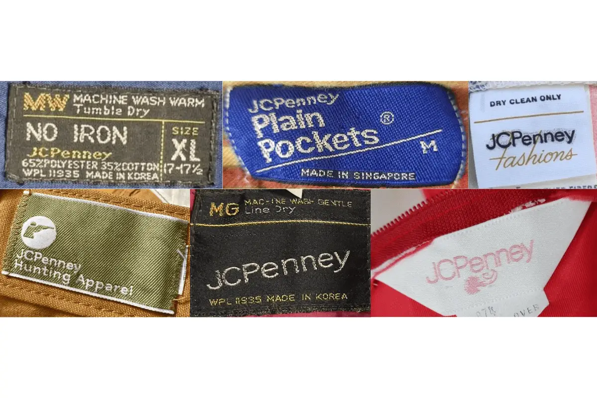
1980s JCPenney tags
1980s JCPenney tags
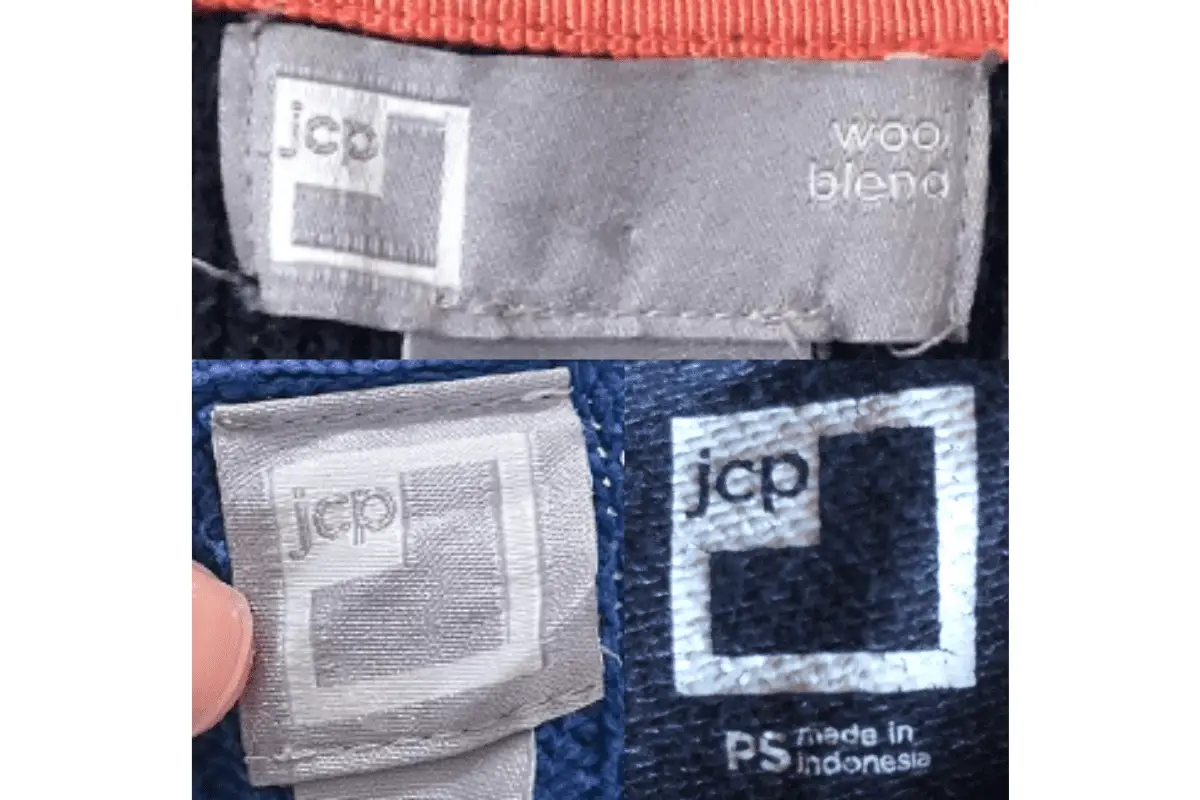
1990s vintage JCPenney tags
- Further modernization of tag designs with sleek, minimalistic aesthetics.
- Focus on simplicity while maintaining essential information like care instructions and fabric composition.
- Tags may feature various textures and materials for added durability.
1990s JCPenney tags
2000s vintage JCPenney tags
- Tags feature a highly modern look with a mix of bold and sleek fonts.
- Introduction of tags with loop designs for easy attachment and visibility.
- Clear and detailed branding, often with a focus on eco-friendly materials and production methods.
2000s JCPenney tags

One Comment