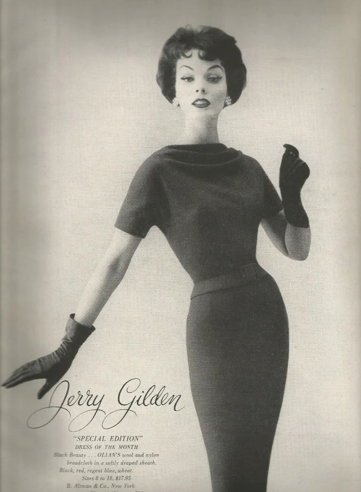
When it comes to iconic American fashion brands of the mid-20th century, Jerry Gilden holds a distinguished place in history. Known for its moderately priced yet stylish women’s ready-to-wear garments, the brand flourished from the 1940s to the early 1960s. Founded in 1945 by Jerry Gilden, the company quickly gained recognition for its accessible yet sophisticated designs, becoming one of the top five producers of women’s dresses in the United States by the mid-1950s. Its popularity was driven by a commitment to quality and a keen understanding of the fashion desires of post-war women, positioning Jerry Gilden as a household name in the world of American dressmaking.
Jerry Gilden’s rise in the fashion world was deeply rooted in his early experiences in the garment trade. Starting as a teenage worker at Majestic Specialty Company, Gilden gained invaluable knowledge about product development and sales. With this expertise, he established his own manufacturing company, partnering with designer Giselle to create the dresses and separates that would define the brand’s identity. Giselle’s innovative designs captured the essence of mid-century women’s fashion—practical yet elegant—and played a critical role in the brand’s early success. Even after Giselle’s untimely death in 1952, the company continued to thrive under the creative direction of Sayde Weinberg, who, alongside her husband Abe, carried on the legacy of thoughtful design and mass appeal.
At its peak, Jerry Gilden was producing over a million garments annually, a testament to its immense popularity and efficient production methods. The brand’s designs reflected the optimism and innovation of post-war America, offering women a balance of style and affordability. Although Jerry Gilden closed its doors in 1960, its influence endures, with its vintage pieces still cherished by collectors and fashion enthusiasts today. Understanding the history of Jerry Gilden not only provides insight into mid-century American fashion but also underscores the enduring appeal of vintage design.
60s Fashion in London’s King Street
How to tell if Jerry Gilden is vintage from the logo
Jerry Gilden, an iconic American fashion brand popular during the mid-20th century, produced distinct logos that varied subtly across decades. These logos serve as a valuable reference for identifying vintage pieces. If you’re looking to determine the vintage status of your Jerry Gilden clothing, the logo can be a helpful indicator. Below is a guide to identifying a vintage Jerry Gilden logo based on the era specified by the logo you provided.
1940s to 1960s Jerry Gilden logo
- The Jerry Gilden logo from this era features a classic script font, with an elegant, cursive style that was typical of the time.
- The lettering is smooth and flowing, with distinctive loops and a slightly slanted orientation, giving it a hand-drawn look.
- It has a strong vintage feel with the use of intricate curves, especially noticeable in letters like “J” and “G.”
- This logo embodies the mid-century aesthetic, aligning with the brand’s reputation for stylish, accessible fashion for women during the 1940s to 1960s.
1940s to 1960s Jerry Gilden logo
How to tell if Jerry Gilden is vintage from the tags
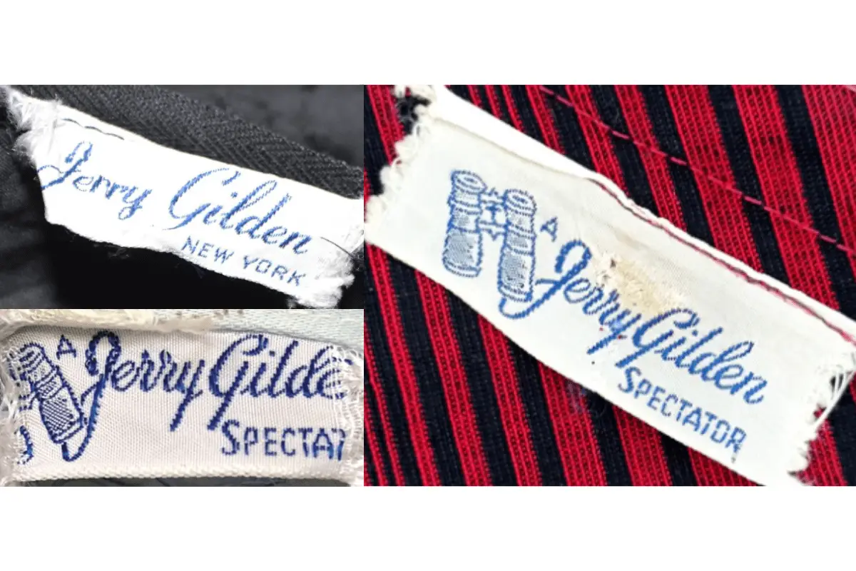
The evolution of Jerry Gilden tags provides unique insights into the brand’s history and design shifts over the decades. From the 1940s through the 1960s, Jerry Gilden tags underwent notable transformations, incorporating both stylistic elements and branding that reflect the period’s aesthetics. These vintage tags not only help in identifying the garment’s era but also reflect the brand’s design ethos during each period.
Struggling to identify vintage tags or labels? Submit a picture on our vintage tag identification page, and we’ll help you out!
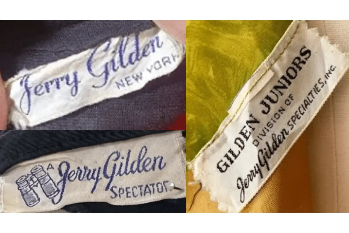
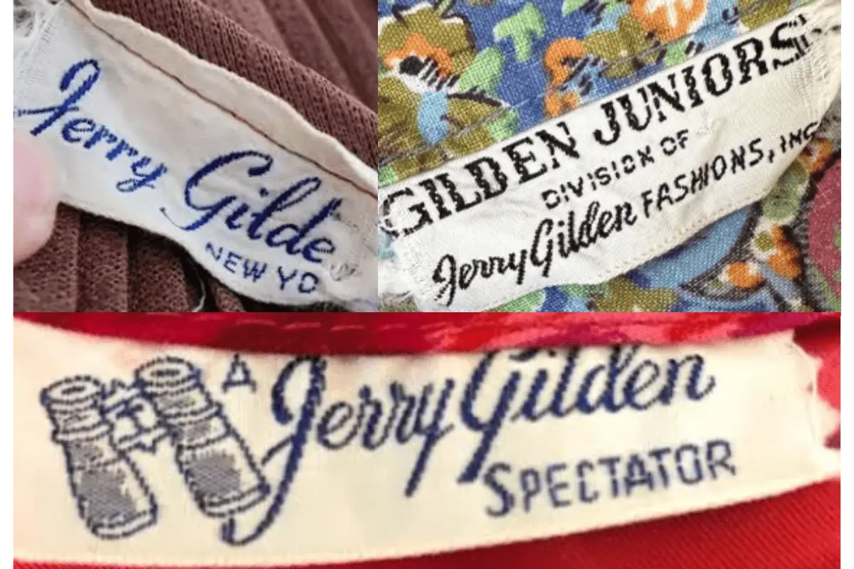
1940s vintage Jerry Gilden tags
- Tags from this era feature the “Jerry Gilden” name in a cursive, flowing font, embodying the refined and sophisticated style of the 1940s.
- Includes “New York” below the brand name, emphasizing the brand’s American origins.
- Often minimalistic, with a focus on simple typography in a dark blue shade.
1940s Jerry Gilden tags
1950s vintage Jerry Gilden tags
- The 1950s tags retain the cursive “Jerry Gilden” name, often accompanied by a distinct binocular logo, symbolizing the “Spectator” line of the brand.
- “Spectator” is usually displayed in a bold, all-caps serif font, adding a unique flair to the design.
- The tags are predominantly blue on a white background, reflecting a classic mid-century aesthetic.
1950s Jerry Gilden tags
1960s vintage Jerry Gilden tags
- In the 1960s, tags continue to use the cursive “Jerry Gilden” logo, but with subtle design updates to modernize the appearance.
- Some tags include “Gilden Juniors,” marking a specific line under the brand, with “Division of Jerry Gilden Specialties, Inc.” printed below.
- Tags from this era show a mix of blue and black fonts, adding variation to the branding while retaining a cohesive vintage look.
1960s Jerry Gilden tags