Joop! is a name that resonates with boldness, sophistication, and an undeniable flair for contemporary design. Founded in 1986 by the visionary German designer Wolfgang Joop, the brand quickly established itself as a powerhouse in the fashion world. Known for its luxury appeal and accessible elegance, Joop! carved out a unique space, offering everything from high-end menswear and womenswear to fragrances and home goods. The brand’s signature exclamation mark was more than just a punctuation choice—it symbolized the energy and innovation that defined its approach to modern fashion. With roots in Hamburg, Joop! grew from a designer’s dream to an international phenomenon, captivating audiences worldwide.
The evolution of Joop! is a testament to its resilience and adaptability. From launching its iconic fragrance line in 1987 to showcasing collections at New York Fashion Week in the 1990s, the brand consistently pushed boundaries. The introduction of Joop! Jeans in 1988 further diversified its portfolio, catering to a younger, trend-conscious demographic. However, like any great story, Joop!’s journey included its fair share of challenges. After a series of corporate shifts and changes in ownership, the brand emerged stronger, continuing to reflect Wolfgang Joop’s original vision of marrying bold designs with functionality and accessibility.
Today, Joop! remains a staple in the European fashion scene, recognized for its contemporary yet timeless aesthetic. Whether through its meticulously crafted clothing, statement accessories, or unforgettable fragrances, Joop! continues to define modern luxury with a distinct edge. Its enduring popularity, particularly in Germany, Austria, and Switzerland, underscores its ability to stay relevant while honoring its rich heritage.
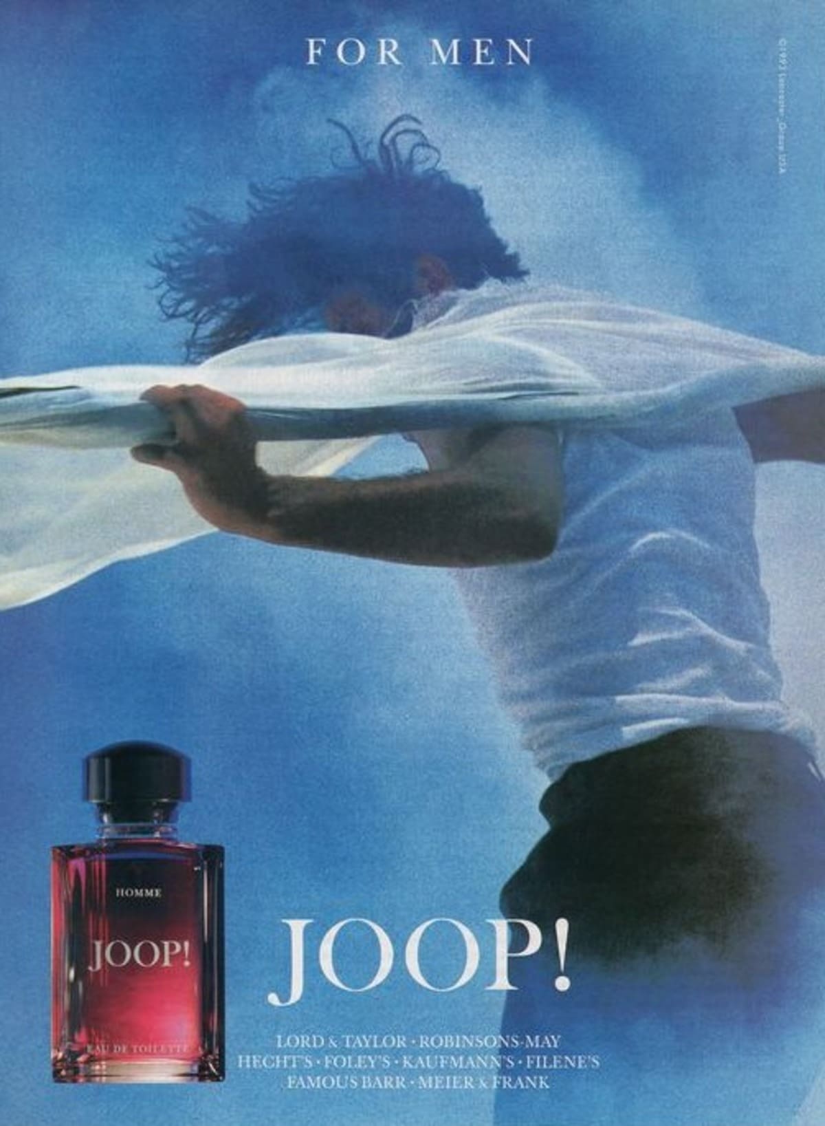
90s Joop! Fragrances TV Commercial
How to tell if Joop is vintage from the logo
Joop is a renowned brand recognized for its bold and stylish designs. Over the decades, the logo has evolved while maintaining its distinct personality. The evolution of Joop’s logo offers insights into identifying vintage pieces. Here is a breakdown of the logo changes based on the eras represented in the provided images.
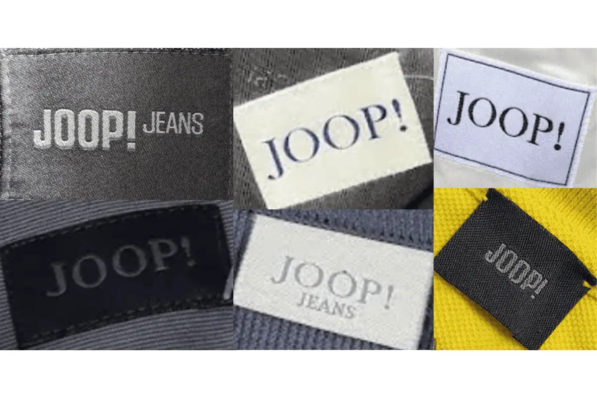
1990s Joop logo
- The 1990s logo is bold and striking, featuring uppercase “JOOP!” in thick, solid black lettering.
- The exclamation mark is a standout feature, conveying the brand’s energetic and daring identity.
- The font is sans-serif and heavily weighted, making it iconic and easy to recognize from this era.
1990s Joop logo
1990s to now Joop logo
- The updated logo retains the uppercase “JOOP!” format but adopts a more refined and sleek appearance.
- The exclamation mark remains a key element, preserving the brand’s unique flair.
- The font is slimmer and more modern, indicating the brand’s evolution toward contemporary design trends.
- This logo highlights a balance between classic boldness and modern sophistication.
1990s to now Joop logo
How to tell if Joop is vintage from the tags
The evolution of Joop tags reflects the brand’s journey through decades of innovative and stylish designs. From the bold simplicity of earlier tags to the more refined and modern layouts of later years, Joop tags serve as a timeline of the brand’s heritage. This guide will help you identify vintage Joop pieces based on their tags from different eras.
Can’t identify those vintage tags or labels? Upload a picture on our vintage tag identification page, and we’ll help you out!
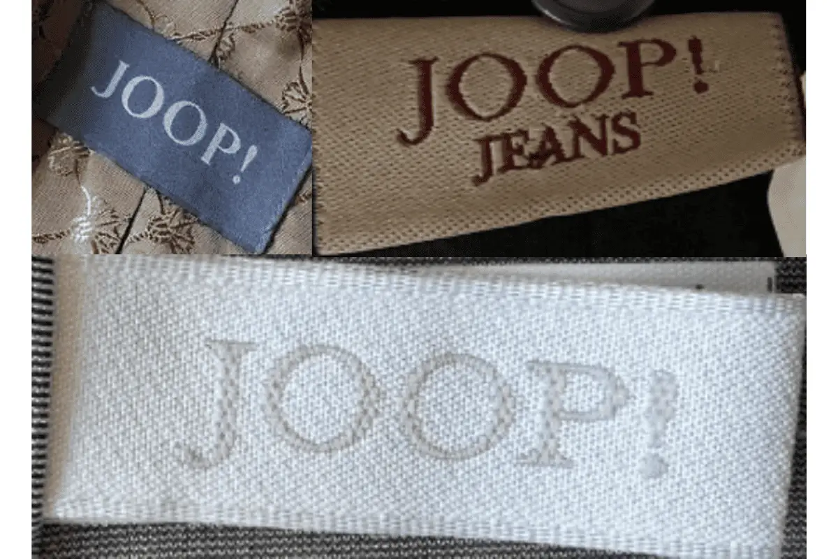
1990s vintage Joop tags
- Characterized by the bold “JOOP!” logo in uppercase letters, often embroidered or printed prominently.
- Tags often featured simple rectangular designs with plain borders.
- Some tags included “Jeans” as a secondary descriptor, showcasing Joop’s denim-focused collections.
1990s Joop tags
2000s vintage Joop tags
- Introduced more textured and woven labels, adding a premium feel to the garments.
- The “JOOP!” logo remained central, often presented in bold white or neutral tones on darker backgrounds.
- Occasionally included unique color palettes, such as vibrant blue tags with minimalistic logos, reflecting a shift toward more modern branding.
2000s Joop tags
2010s vintage Joop tags
- Modernized tags with sleek and minimal designs, incorporating neutral and pastel color schemes.
- High-quality woven materials used for a refined and durable appearance.
- Tags often emphasized simplicity while maintaining the iconic “JOOP!” logo as the focal point.

2010s Joop tags


????????? Nautilus, ????????? ????????? ??????, ???????? ???????????? ? ??????? ??????? ??????????. ?????? Nautilus 5711 ? ??????????????? ?????????? ????? ??????????????????? ?? 2 ???? ? ?????? ?? ??????????? ?????.
?????????????? ?????? ? ???????? ??????? ? ????? ????????? ????????? ???????????? ???????????? ??????. ??????? ? ???????????????? ???????? ???????????? ??????? ???? ??? ???????? ?????? ?????.
???? ???????? ?????????? ????? ? ??????? 3 ???? ? ???????????? ?????????.
??? ?????? ? ???????????? ???????? ?????????, ?????? ????????? ? ??????? Travel Time.
patek-philippe-nautilus.ru
????????, ?????? 5712/1R-001 ?? ???????? ?????? ? ?????????? ?? 265 ??????? ? ??????? ???? ?? 48 ?????.
Nautilus ???????? ???????? ???????, ????????? ????????? ? ???????? ???????????? ???????? ????.
????? ??????? ?????? ? ???????? ? ???? ??? ??????? ????????? ????? ? ?????? ????????? ??????? .
?????????????? ??????????? ??????????? ??? ??????? ???????? ?????? ? ???????? .
???????? ????? ?????? ??? ???????? ????? ??????? ??????????? ? ????????? ???????? .
???? ???? ????????? ????
??????? ????????????? ? ?????? ?????? , ??????????? ???????? ?????? .
???????? ??????????? ????? ? ??????????????? ??????? ? ??????? ??????.
?????????? ???????????? ??????? ??? digital-????????????? — ?????????? ??? ?????? !
????? ??????? ?????? ? ???????? ? ??? ?????? ??????????? ????????? ????? ?????????.
?????????????? ?????????? ????????? ??? ?????? ???????? ?????? ? ???????? ??????????.
???????? ?????????? ?????? ??? ???????? ????? ?????????????????? ???? ? ????????? ???????? .
???? ???? ?? ?????? ????????
??????? ????????????? ? ?????? ?????? , ????????? ?????? ???????? ?????? .
???????? ???????????????? ??????? ? ???????? ????????? ? ????????? ?????????? .
?????????? ????????? ????????? ??? ???????????? — ???????? ?????????????!
???????????????? — ??? ???????? ?????, ????????? ? ????????? ????????? ????????.
??? ???????? ???????? ???????????? ????? ? ?? ???????????? ????????.
?????? ????? ???????????? ?????????????????, ????????????? ?? ?????? ?????????? ?????.
????????????? ??????? ????? ? ???????????????? ???????????? ?????????? ????????.
????