Founded in 1905, Jos. A. Bank has a rich history that exemplifies the evolution of American menswear. Originally a modest tailoring shop run by Lithuanian immigrant Charles Bank in Baltimore, the brand steadily grew into a symbol of quality and refinement. By the early 20th century, the addition of Charles’ grandson, Joseph Alfred Bank, helped transform the family business from a local tailor into a regional clothing manufacturer. Through its commitment to craftsmanship and classic design, Jos. A. Bank quickly became a trusted name for high-quality suits and menswear, catering to the sophisticated tastes of the era.
The company’s transformation into a retail powerhouse was marked by its decision in the 1940s to shift from wholesale to direct-to-consumer sales. This pivotal move allowed Jos. A. Bank to build a closer relationship with its customers and solidify its reputation as a purveyor of timeless men’s clothing. With headquarters established in Baltimore, the company expanded its reach, opening its own stores and offering exclusive lines that balanced tradition with innovation. This focus on quality and accessibility paved the way for its steady growth in the latter half of the 20th century.
Despite challenges, including changes in ownership and industry shifts, Jos. A. Bank has maintained its status as a cornerstone of American menswear. From its roots in tailoring to its modern retail presence, the brand continues to embody the values of craftsmanship, style, and reliability. As a part of Tailored Brands today, Jos. A. Bank’s enduring legacy reflects its ability to adapt while staying true to its heritage.
Jos. A. Bank TV Commercial
How to tell if Jos. A. Bank is vintage from the logo
Jos. A. Bank, a renowned men’s clothing retailer, has maintained a consistent and iconic branding style over the years. While its logo has undergone minimal changes, its elegant and timeless design can help identify the era and authenticity of vintage pieces. By analyzing the logo’s typography and design, you can determine if an item is vintage and the time period it may originate from.
1905 to now Jos. A. Bank logo
- The logo features a traditional serif font with a distinct, formal appearance that reflects the brand’s classic and professional image.
- The use of “Jos. A. Bank” in an abbreviated form demonstrates the historical branding style common in early 20th-century businesses.
- The typography is clean and balanced, with wide kerning that gives the logo a stately and refined look.
- This logo has remained largely unchanged since its inception, emphasizing the brand’s timeless appeal and commitment to quality.
1905 to now Jos A Bank logo
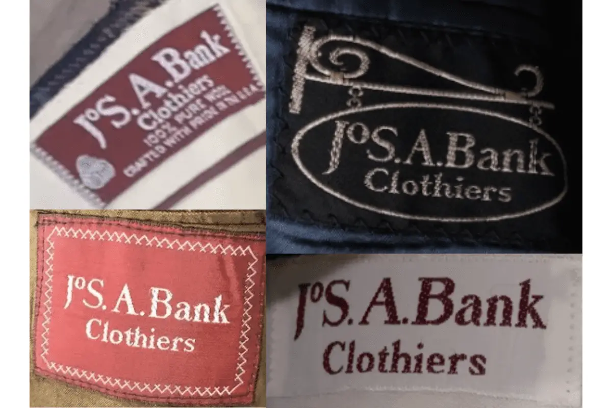
How to tell if Jos. A. Bank is vintage from the tags
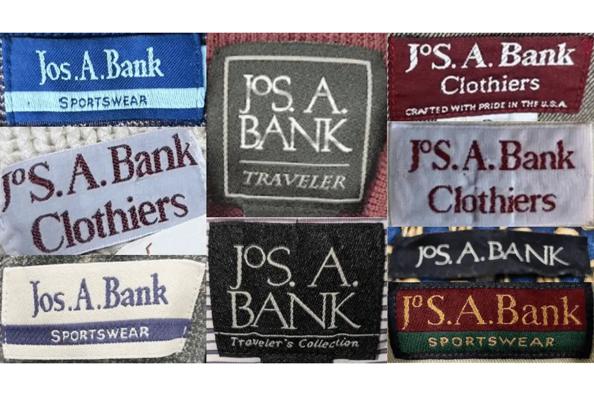
Jos. A. Bank has a long-standing history of producing high-quality menswear. Over the decades, the brand’s tags have evolved significantly, reflecting changes in branding, materials, and design aesthetics. By identifying the era of a garment through its tag, collectors and vintage enthusiasts can pinpoint its authenticity and value. Below is a guide to identifying Jos. A. Bank vintage pieces through their tags from the 1970s, 1980s, 1990s, and 2000s.
Can’t identify those vintage tags or labels? Upload a picture on our vintage tag identification page, and we’ll help you out!
1970s vintage Jos. A. Bank tags
- Tags often featured “Clothiers” prominently in serif fonts, emphasizing the brand’s heritage as a classic menswear provider.
- Bold stitching details around the tag, often rectangular in shape, were common during this era.
- Rich colors such as maroon and white were frequently used, highlighting the brand’s traditional aesthetic.
1970s Jos A Bank tags
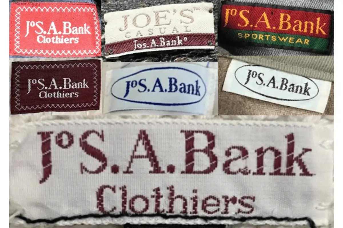
1980s vintage Jos. A. Bank tags
- The brand leaned into cleaner, bolder designs while maintaining the “Clothiers” subtitle on many tags.
- Tags began to introduce additional descriptors such as “Crafted with Pride in the USA,” showcasing a focus on American manufacturing.
- Decorative stitching, such as zigzag borders, added a unique touch to some tags during this period.
1980s Jos A Bank tags
1990s vintage Jos. A. Bank tags
- The design of tags became more refined, with the use of block-style fonts and sleek color schemes like black and white.
- Collections such as “Traveler’s Collection” and “Traveler” appeared on tags, signifying the introduction of new product lines tailored for functionality and style.
- Tags often included minimalist designs, removing decorative borders for a sleeker presentation.
1990s Jos A Bank tags
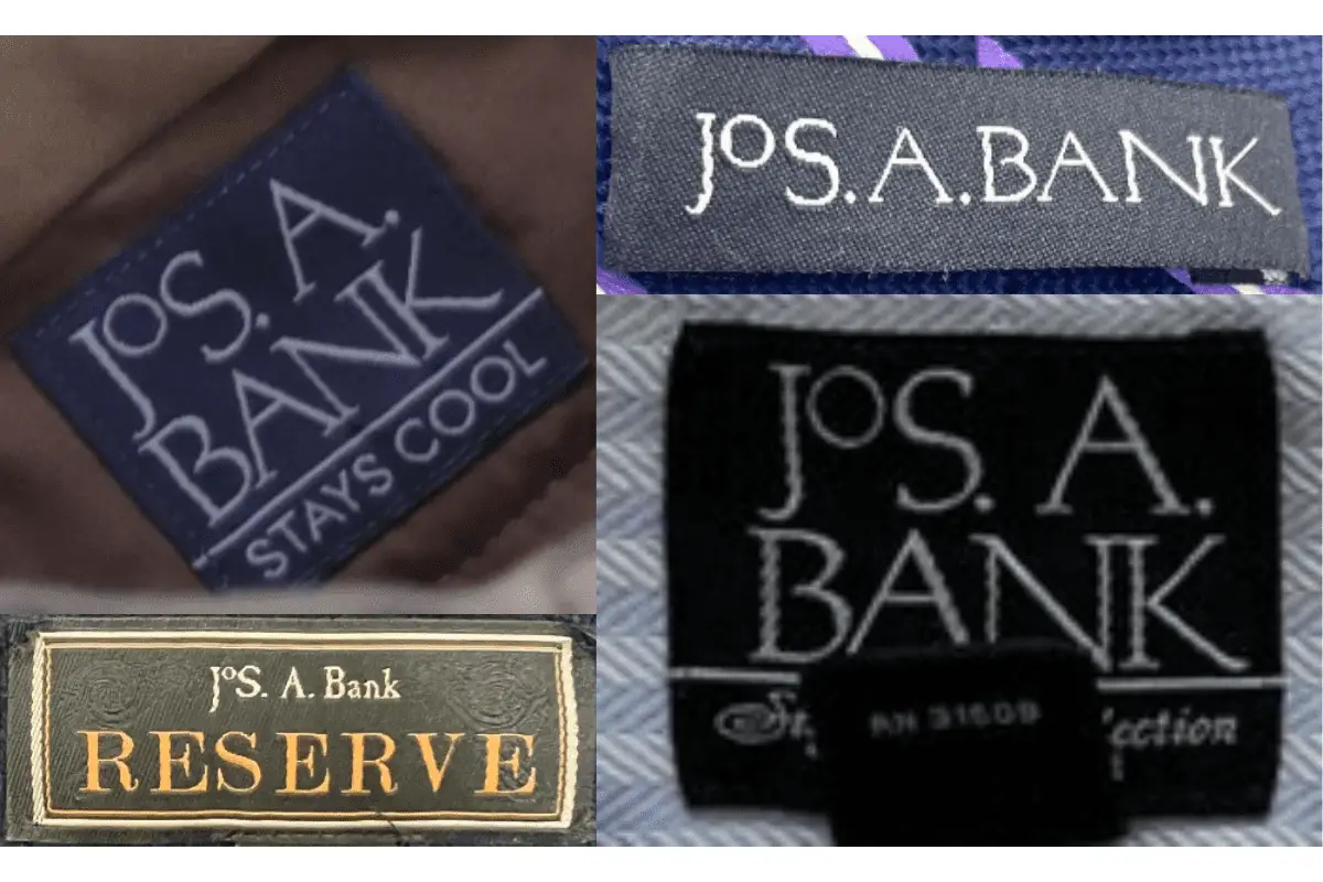
2000s vintage Jos. A. Bank tags
- Tags from this era introduced more modern and versatile branding, such as the “Stays Cool” line with functional descriptors.
- Gold detailing appeared on collections like “Reserve,” indicating premium offerings from the brand.
- Dark backgrounds with sharp, contrasting fonts were frequently used, showcasing the shift to contemporary branding elements.
2000s Jos A Bank tags