Kappa, the storied Italian sportswear brand, stands as a symbol of both sporting excellence and contemporary fashion. Founded in Turin, Italy, in 1978 by Marco Boglione as a sportswear offshoot of “Robe di Kappa,” the brand’s journey into the global consciousness began long before that, with roots reaching back to 1916. Initially established as a sock and underwear manufacturer known as Maglificio Calzificio Torinese (MCT), Kappa’s rise began in earnest following a manufacturing mishap in 1956. The successful recovery from this mishap saw all new products stamped with a “K” for “Kontrolle,” a German term symbolizing the newfound quality control that would define the company’s identity. By 1967, the K line had become formally known as Kappa, the Greek letter for “K,” representing the brand’s formal shift toward sportswear and apparel.
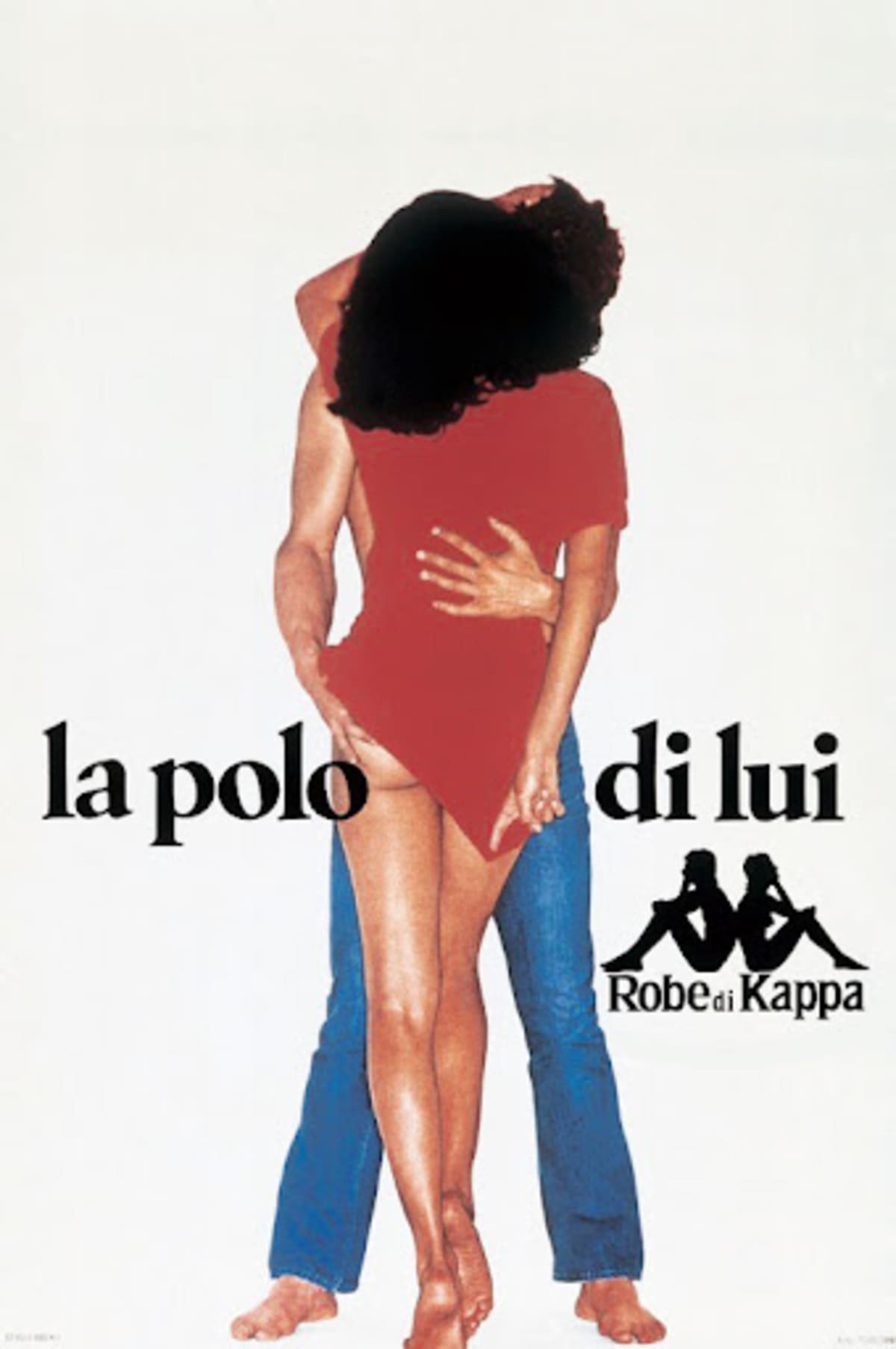
The company’s iconic “Omini” logo, a silhouette of a man and woman sitting back-to-back, was born serendipitously during a swimsuit photoshoot. Founder Maurizio Vitale noticed the symmetrical shape formed by the two figures bathed in backlight and envisioned a logo that would symbolize equality and collaboration between men and women in both sports and life. This logo, now instantly recognizable worldwide, cemented Kappa’s identity as a brand that stands for inclusivity and timeless style.
Kappa’s influence grew throughout the late 20th century, particularly in European football. The groundbreaking sponsorship with Juventus FC in 1979 marked the first time a technical apparel brand’s logo appeared on a football team’s kit, sparking a long and successful partnership. Throughout the 80s and 90s, Kappa further solidified its presence in football by partnering with elite clubs like AC Milan, FC Barcelona, and national teams including Italy, Jamaica, and South Africa. The introduction of the Kombat™ 2000 jersey revolutionized sports kits with its innovative tight-fit design and technical fabric, setting a new standard in performance wear.
Kappa’s journey was not confined to the football pitch. Its debut at the Los Angeles Olympics in 1984 as the sponsor of the U.S. Track and Field Team brought a futuristic touch to sportswear with designs influenced by NASA scientists. The luminous silver uniforms echoed the aesthetics of space suits while offering superior functionality. Since then, Kappa has evolved into a global icon, influencing contemporary fashion and captivating streetwear enthusiasts, musicians, and athletes alike.
Today, Kappa embodies avant-garde Italian flair, blending retro hip-hop style with a technical sportswear heritage. With its distinctive logo and commitment to individuality, Kappa continues to shape global fashion, sport, and culture through brand collaborations, innovative campaigns, and major event sponsorships. From Seoul to London, its apparel, footwear, and accessories are beloved by a diverse audience, reinforcing Kappa’s enduring legacy as a leader in the ever-evolving world of sportswear.
Y2K Kappa Italia Commercial
How to tell if Kappa is vintage from the logo
Kappa, originally established in Italy, has evolved its logo over the decades, representing different eras of style and branding. Its iconic “Omini” logo is now instantly recognizable and synonymous with sportswear, particularly in football. However, earlier logos were quite different, reflecting the brand’s growth and changing identity.
From its initial “Aquila” eagle logo to the familiar silhouettes of the “Omini” couple, Kappa’s logo history tells the story of its journey. This guide breaks down the significant changes in Kappa logos over time, helping you identify the era your Kappa apparel belongs to.
1916 to 1956 Kappa logo
- The earliest Kappa logo features an eagle with wings spread wide, perched above a banner bearing the Latin motto “Flectar non Frangar” (“I may bend, but I will not break”).
- Below the eagle is an intertwined circular monogram with the letters “MC,” referencing the brand’s earlier name, “Maglificio Calzificio.”

1916 to 1956 Kappa logo
1956 to 1958 Kappa logo
- This logo introduces a bold “K” emblem in pink, with “Kontroll” and “Aquila Calze-Maglie” written inside.
- The design emphasizes the letter “K” to reinforce brand recognition.
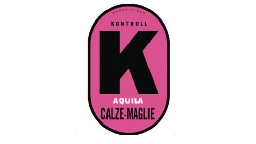
1956 to 1958 Kappa logo
1958 to 1967 Kappa logo
- The logo retains the “K” theme but introduces a stylized depiction of a tank top within the “K,” alongside the word “Kappa” beneath.
- This imagery reflects the company’s focus on knitwear and hosiery.
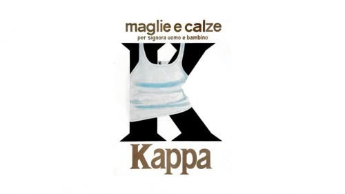
1958 to 1967 Kappa logo
1967 to 1969 Kappa logo
- Kappa’s well-known “Omini” logo makes its debut, symbolizing the brand’s association with activewear and gender equality.
- The logo features a silhouette of a man and woman sitting back-to-back, with “Kappa” text below in a distinctive serif font.

1969 to 1978 Kappa logo
- The “Omini” logo continues to evolve with a shift to black silhouettes, reinforcing brand identity.
- The “Kappa” text becomes bolder and more distinct.

1969 to 1978 Kappa logo
1978 to 1984 Kappa logo
- The “Omini” logo remains consistent but adopts a red outline, which contrasts with the previous monochrome look.
- The “Kappa” text below the silhouettes is in a solid red font.
1978 to 1984 Kappa logo
1984 to 1994 Kappa logo
- The “Omini” silhouette maintains its red outline, with an additional black outline for emphasis.
- Kappa” below features a thicker red outline with white fill, creating a distinctive, bold look.
1984 to 1994 Kappa logo
1994 to now Kappa logo
- The “Omini” logo remains consistent in form, with a simplified red outline around the silhouettes.
- The “Kappa” text retains a black border and is filled with red, ensuring brand consistency while being visually striking.

1994 to now Kappa logo
How to tell if Kappa is vintage from the tags
Kappa is an iconic sportswear brand known for its distinctive logo featuring a man and a woman sitting back-to-back. Founded in Italy in 1967, Kappa quickly became recognized for its innovative designs and sponsorship of top athletes. The brand evolved through the decades, adjusting its logo, tag designs, and product lines to stay relevant in the competitive sportswear market. Vintage Kappa tags not only mark the heritage of the brand but also provide a window into different eras of its evolution.
Identifying the specific period of vintage Kappa clothing can be achieved by studying the subtle changes in tag designs over time. From the simple yet distinctive labels of the 1980s to the diverse styles of the 2010s, Kappa tags reflect the changing trends and branding strategies the company employed. Below is a guide to help differentiate between various eras of Kappa tags.
Need help with vintage tags or labels? Submit a picture on our vintage tag identification page, and we’ll assist you!
1980s vintage Kappa tags
- Kappa Sport branding prominently displayed in bold serif lettering.
- Tags often feature “Made in Italy” to emphasize quality and authenticity.
- Incorporates the iconic back-to-back figure logo with blue and red accents.
- Occasionally includes product composition details in red or blue text.
- Robe di Kappa” line tags often have a distinct illustration of shields or emblems.
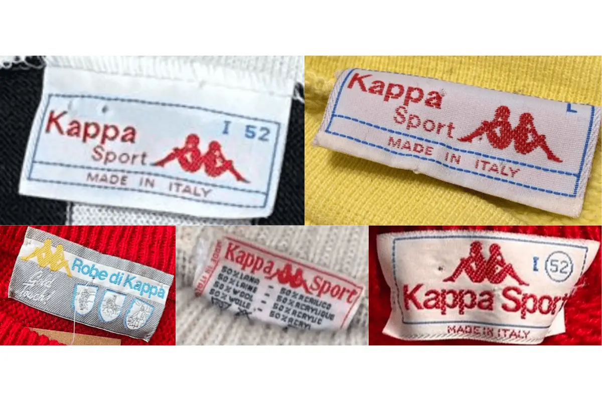
1980s Kappa tags
1990s vintage Kappa tags
- Prominent back-to-back logo often set against contrasting black or red backgrounds.
- Introduction of bolder lettering and modern design elements.
- Includes phrases like “For the Spirit Within” or “World’s Finest” in gold or silver embroidery.
- Tags more frequently specify the garment’s size in bold colors like red or yellow.
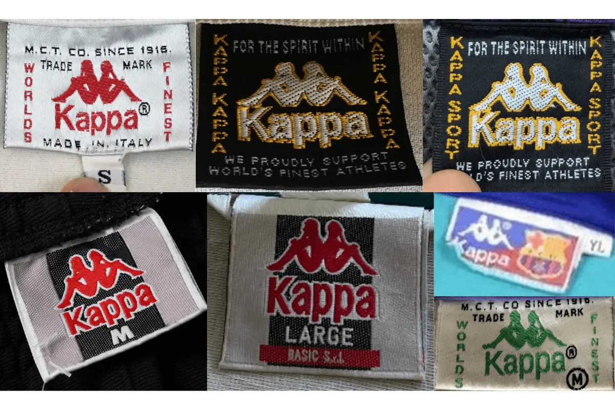
1990s Kappa tags
2000s vintage Kappa tags
- Tags reflect a minimalist approach with simple color schemes and block lettering.
- Back-to-back logo remains prominent but is integrated into streamlined designs.
- Includes size markers like “Small,” “Medium,” and “Large” in large, clear lettering.
- Occasionally paired with additional brand collaborations, e.g., Zara.
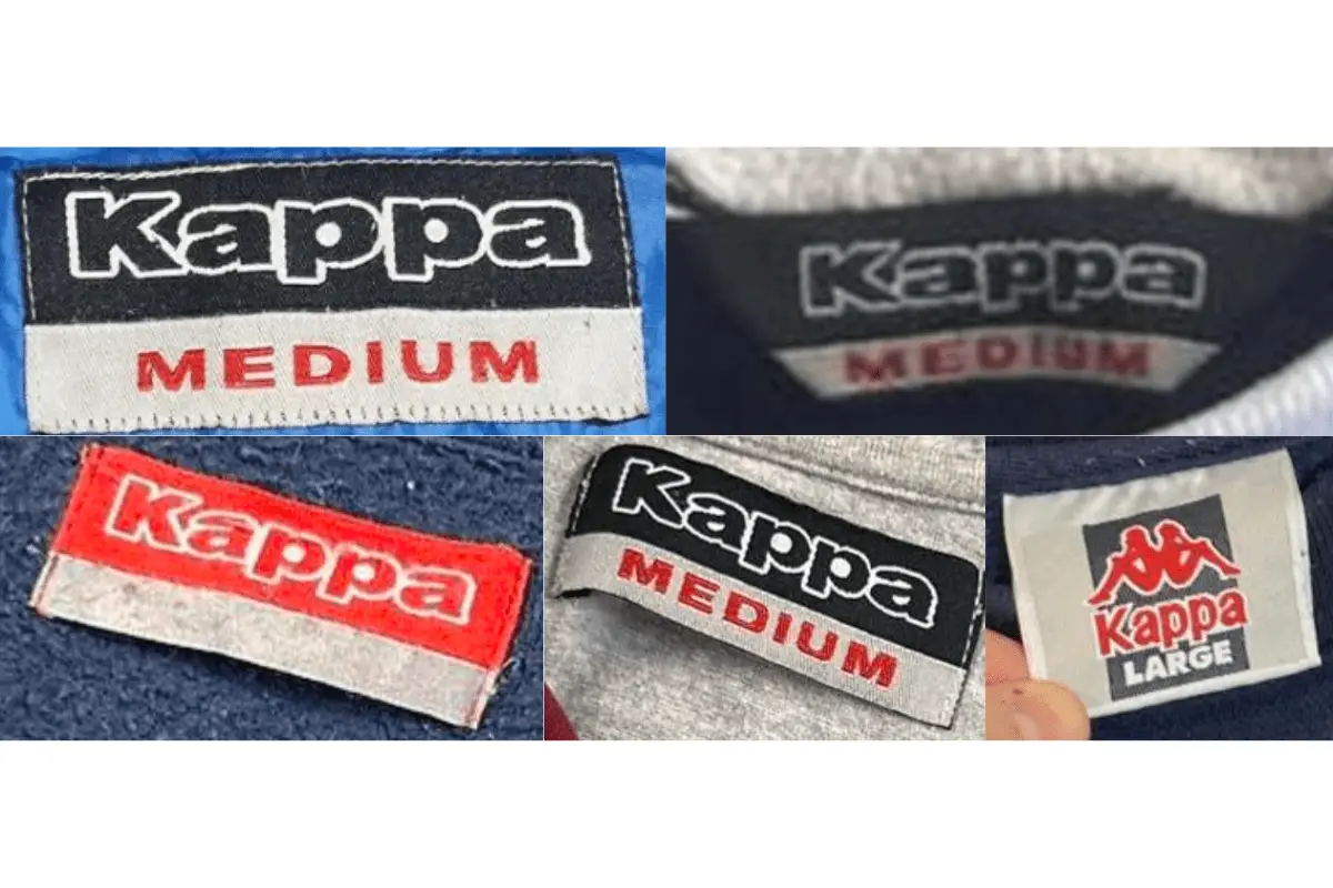
2000s Kappa tags
2010s vintage Kappa tags
- Tags exhibit a return to traditional logos with a modern flair.
- Various collaborations highlighted on tags, reflecting partnerships with other fashion houses.
- Bold colors and modern fonts used for sizing information and branding.
- Incorporates catchphrases and distinct descriptors like “Authentic Sportswear Brand.”
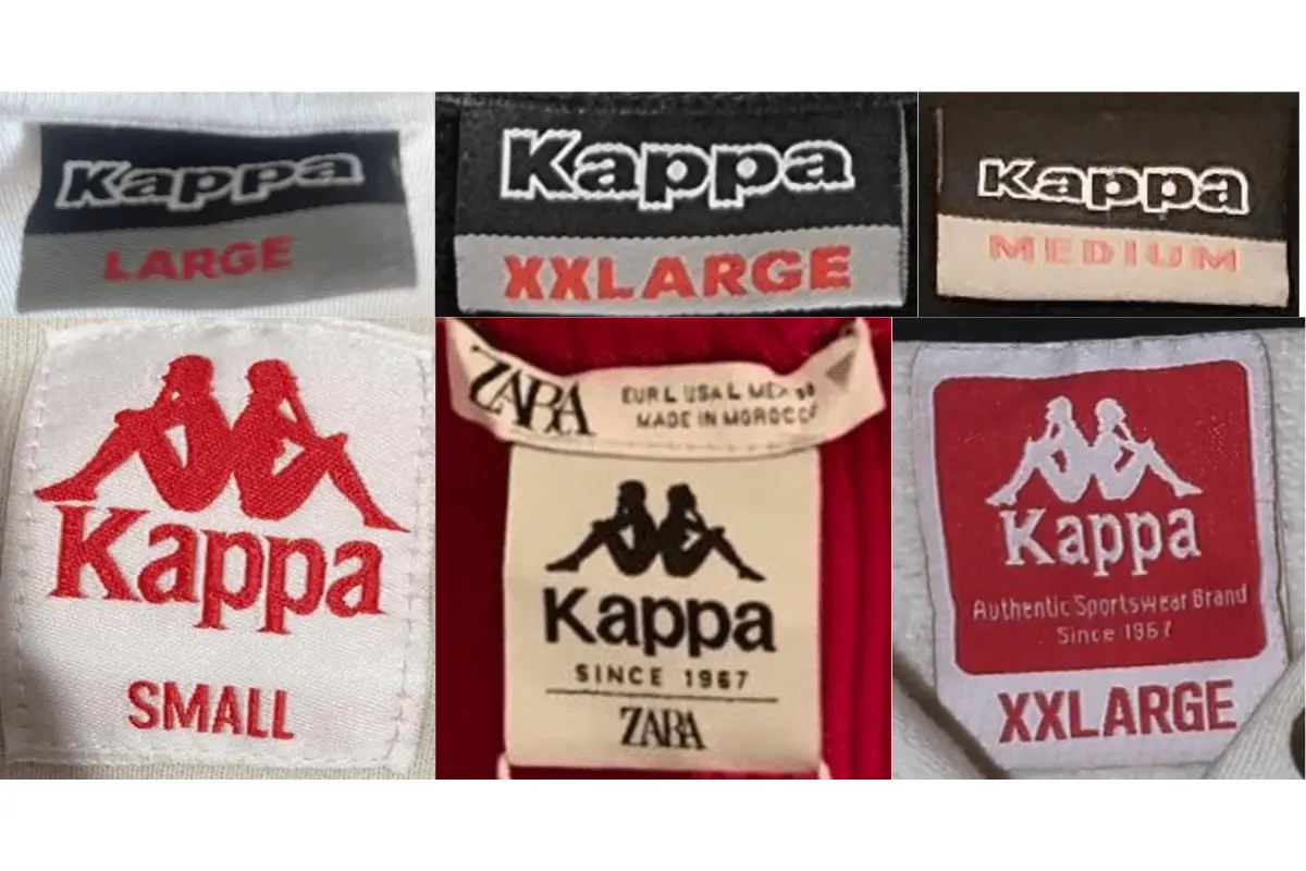
2010s Kappa tags


One Comment