Koret of California is a name synonymous with innovation and timeless style in American fashion history. Founded in 1939 by Joe and Stephanie Koret, the brand began as a modest endeavor and quickly grew into a powerhouse in the women’s apparel industry. What set Koret apart from the beginning was its knack for combining practicality with sophistication. Stephanie’s talent for designing versatile garments and Joe’s business acumen birthed the Trikskirt—a revolutionary adjustable skirt that became an instant success. This innovation propelled Koret to unprecedented heights, amassing over a million dollars in revenue within just two years. This marked the beginning of Koret’s legacy as a pioneer in women’s sportswear and separates.
The Koret brand became known not just for its fashionable designs but also for its trailblazing use of fabrics and garment technology. They introduced wardrobe staples like the Slim Hip Slax and Pleetskirt, which redefined women’s sportswear with their superior fit and ease of wear. However, their crowning achievement came in 1961 with the invention of Koratron, a permanent-press fabric that revolutionized the industry. Koratron earned Koret millions in licensing revenues, cementing its position as both a fashion and technological innovator. Throughout the mid-20th century, Koret’s ability to blend practicality, elegance, and groundbreaking design turned the brand into a household name, solidifying its influence in department stores and beyond.
Though the brand underwent significant changes after being acquired by Levi Strauss in 1979 and later by Kellwood Corporation, Koret’s enduring legacy is a testament to its ingenuity and impact on American fashion. From its roots in San Francisco to its eventual distribution in mid-priced stores across the United States, Koret of California remains an icon of vintage fashion. For collectors and enthusiasts, each Koret piece represents a piece of history—a blend of innovation, style, and functionality that continues to captivate decades later.
60s Fashion in London’s King Street
How to tell if Koret of California is vintage from the logo
Koret of California has had a distinct evolution in its logos, reflecting changes in branding trends and production techniques over the decades. Identifying the logo era can help determine the vintage authenticity of Koret pieces, making it a valuable tool for collectors and enthusiasts. Below is an overview of Koret of California’s logos through the eras, based on the images provided.
1940s to 1950s Koret of California logo
- The logo features elegant, cursive handwriting that is stylistically in line with mid-century fashion branding.
- The text “Koret of California” is written in a flowing script, with an organic and hand-drawn feel.
- This era’s logo reflects the sophisticated and refined image Koret aimed to convey during its early years.
1940s to 1950s Koret of California logo
1970s Koret of California logo
- The logo transitions to bold, capitalized text, demonstrating a shift towards a more modern and clean aesthetic.
- “KORET OF CALIFORNIA” is presented in a strong sans-serif font, emphasizing clarity and readability.
- This design reflects the streamlined branding trends of the 1970s, aligning with broader consumer tastes.
1970s Koret of California logo
1970s to 1990s Koret of California logo
- The introduction of a symbol—a trolley—above the brand name marks this era of the logo.
- The text remains bold and capitalized, but the addition of the trolley adds a nod to heritage and nostalgia.
- This combination of symbol and text illustrates a balance between modern branding and vintage imagery.
1970s to 1990s Koret of California logo
1980s to 1990s Koret of California logo
- The logo simplifies further, with only the brand name “KORET” in a clean, serif font.
- The minimalist approach mirrors branding trends of the late 20th century, focusing on versatility and sophistication.
- This design reflects the brand’s evolution toward timeless and classic branding while maintaining a sense of heritage.
1980s to 1990s Koret of California logo
How to tell if Koret of California is vintage from the tags
Koret of California has undergone significant branding and design evolution over the decades. Known for its innovative and fashionable designs, the brand’s tags reflect the aesthetic and manufacturing trends of their respective eras. From classic script fonts to modern typefaces, Koret’s tags provide valuable clues for dating vintage garments. Below is a breakdown of Koret of California tags by decade, based on the images provided.
Can’t identify those vintage tags or labels? Upload a picture on our vintage tag identification page, and we’ll help you out!
1940s vintage Koret of California tags
- Features elegant script handwriting with “Koret of California” prominently displayed.
- Tags often include mentions of patented designs, such as “Press-Free” or “Never Needs Pressing.”
- Soft, muted tones for the background, with emphasis on a refined and sophisticated presentation.

1940s Koret of California tags
1950s vintage Koret of California tags
- Introduction of “Pair-Offs” branding, emphasizing the versatility of Koret clothing.
- Tags commonly incorporate the signature bow illustration, symbolizing femininity and elegance.
- Clean, structured lettering combined with simple layouts for easy readability.

1950s Koret of California tags
1960s vintage Koret of California tags
- Classic “Koret of California” script remains, with the addition of “Koratron” technology branding on some tags.
- Some tags showcase bold, geometric designs with bright colors to reflect mid-century modern aesthetics.
- “Dry Clean Only” or “Hand Washable” care instructions often included.

1960s Koret of California tags
1970s vintage Koret of California tags
- Modernized font styles while retaining the signature bow illustration.
- Introduction of fabric-specific tags, such as “Tubinyl” or “Press-Free,” highlighting the material used in the garments.
- Tags often carry a more minimalist look compared to previous decades.

1970s Koret of California tags
1980s vintage Koret of California tags
- Bold, sans-serif fonts become more prevalent, reflecting the era’s emphasis on simplicity and function.
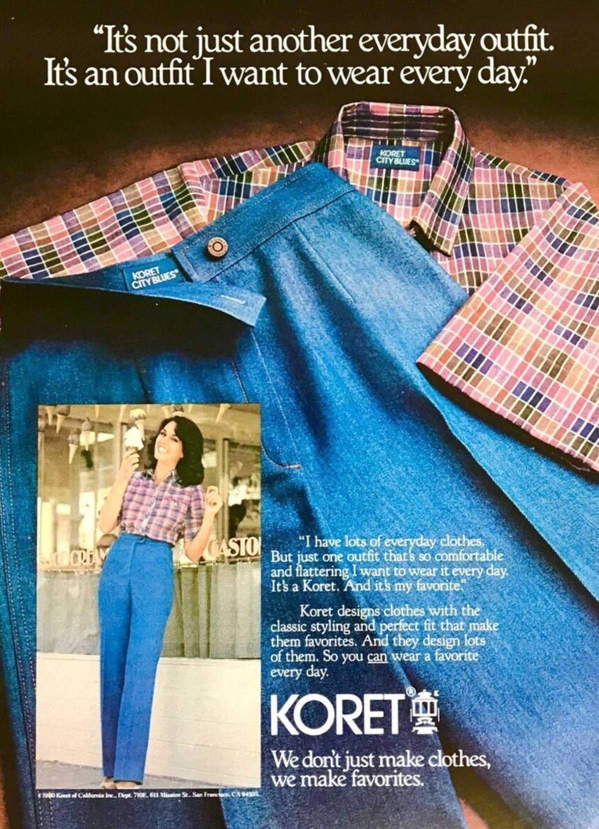
- Incorporation of brand sublines like “City Blues” or “Francisca” to distinguish specific collections.
- Tags include country of manufacture and care instructions in larger text formats.

1980s Koret of California tags
1990s vintage Koret of California tags
- Shift towards a more modern, minimalist logo with cleaner lines and bolder typefaces.
- Tags often feature “Made in U.S.A.” prominently as a mark of quality and origin.
- Sub-brands like “City Blues” remain but are presented with more streamlined designs.

1990s Koret of California tags
2000s vintage Koret of California tags
- Tags adopt contemporary aesthetics, with sleek, monochromatic fonts and minimalistic layouts.
- Care instructions and fabric composition are more detailed and standardized across garments.
- Branding focuses on practicality, with a strong emphasis on easy-care fabrics.

2000s Koret of California tags


2 Comments