The Marlboro brand, synonymous with rugged masculinity and the iconic Marlboro Man, has a rich history that dates back to its origins in 1846 when British tobacconist Philip Morris opened a shop on Bond Street, London. After his death, his brother Leopold and widow Margaret continued the business, expanding it significantly. By the early 20th century, Marlboro had established itself in the United States, with its name derived from Great Marlborough Street in London. Initially marketed as a luxury cigarette, it soon faced the challenge of rebranding to maintain relevance in a competitive market. This transition from a women’s cigarette to a symbol of rugged masculinity was pivotal in the brand’s history and set the stage for its future success.
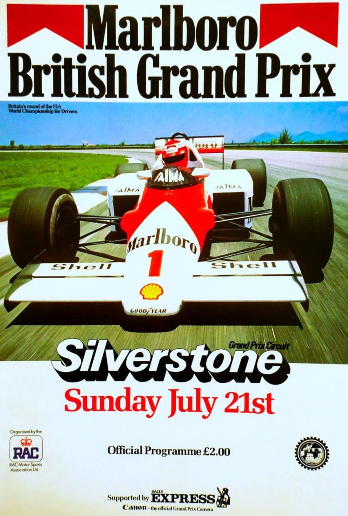
Marlboro’s advertising strategy in the 1950s, particularly the introduction of the Marlboro Man, was a game-changer. This new image was aimed at men who were concerned about lung cancer but still wanted to maintain a sense of masculinity while smoking filtered cigarettes, which were previously associated with women. The Leo Burnett advertising agency created a visual personality for Marlboro, featuring manly figures such as sea captains, athletes, and, most famously, cowboys. This shift not only revitalized the brand but also solidified its place in American culture. By the 1970s, Marlboro had become the world’s best-selling brand of tobacco, thanks to its innovative advertising and strategic repositioning.
Beyond cigarettes, Marlboro’s branding extended into various merchandise and apparel, particularly from the 1980s onwards. This expansion was part of their broader marketing strategy to create a lifestyle around the brand. Items like lighters, ashtrays, sunglasses, and clothing were produced, often given away as promotional items. The “Marlboro Adventure Team” campaign in 1983 epitomized this approach, combining rugged outdoor adventures with branded apparel and accessories. These efforts not only reinforced the brand’s rugged image but also fostered a sense of community and loyalty among its consumers. The evolution of Marlboro’s logo and the use of apparel as a marketing tool reflect the brand’s adaptability and commitment to maintaining its iconic status in the market.
Iconic 90s Marlboro Country Commercial
How to tell if Marlboro is vintage from the logo
Marlboro’s logo has undergone several significant changes over the years, each reflecting different phases in the brand’s history and market positioning. From its early designs focusing on the brand name to the introduction of its iconic red roof design, each logo can help determine the era of the product. Below is a detailed guide to identifying the vintage Marlboro logos based on their design elements.
1924 to 1955 Marlboro logo
- The earliest Marlboro logo featured a highly detailed and ornate design.
- It prominently displayed the brand name “Marlboro” with decorative flourishes.
- This logo is characterized by its classic and elaborate typography, often seen on early cigarette packaging and advertising.
1924 to 1955 Marlboro logo
1954 Marlboro logo
- The 1954 logo marked a shift towards a more streamlined and modern look.
- It still featured the brand name prominently but with simpler typography.
- This design was a precursor to the more iconic logos that followed.
1954 Marlboro logo
1955 to 1959 Marlboro logo
- This era introduced the famous “red roof” design element above the brand name.
- The font remained bold and blocky, emphasizing the brand’s strength and reliability.
- This logo started to establish the visual identity that would become synonymous with Marlboro.
1955 to 1959 Marlboro logo
1955 to 1961 Marlboro logo
- During this period, the red roof design became more pronounced.
- The typography was refined, maintaining a bold presence but with cleaner lines.
- This logo version solidified the visual consistency that Marlboro would carry forward.
1955 to 1961 Marlboro logo
1961 to 1963 Marlboro logo
- The red roof design remained a key feature, with slight modifications to its proportions.
- The typography was further refined, enhancing readability and brand recognition.
- This logo represented a period of growing brand identity and market presence.
1961 to 1963 Marlboro logo
1959 to now Marlboro logo
- This era saw the introduction of the iconic packaging design that is still in use today.
- The logo featured a bold, black font with the red roof design, creating a strong visual identity.
- Subtle updates over the years have kept the logo modern while retaining its classic elements.
1959 to now Marlboro logo
1977 to now Marlboro logo
- The logo continued to evolve with minor adjustments in typography and design elements.
- The red roof remained a constant, signifying the brand’s heritage and consistency.
- The logo’s enduring design has become an iconic symbol in the tobacco industry.
1977 to now Marlboro logo
How to tell if Marlboro is vintage from the tags
Marlboro’s branding has evolved significantly over the decades, reflecting changes in fashion trends and manufacturing practices. This guide will help you identify vintage Marlboro clothing by examining the tags from different eras. Below, we provide details on the characteristics of Marlboro tags from the 1980s, 1990s, and 2000s.
Having difficulty identifying vintage tags or labels? Submit a picture on our vintage tag identification page, and we’ll assist you!
1980s vintage Marlboro tags
- Typically features bold serif lettering with the Marlboro logo prominently displayed.
- Tags often include “Made in Italy” or “Made in Taiwan,” indicating the place of manufacture.
- Designs might include red and white color schemes with a mountain-like graphic element.

1980s Marlboro tags
1990s vintage Marlboro tags
- Continued use of bold serif lettering with the Marlboro logo.
- Introduction of “Adventure Team” branding on some tags, emphasizing an outdoorsy and adventurous lifestyle.
- Tags may feature additional slogans like “Unlimited” to denote specific collections or styles.
- Maintained use of red and white color schemes, sometimes with additional graphics or text emphasizing the brand’s rugged image.
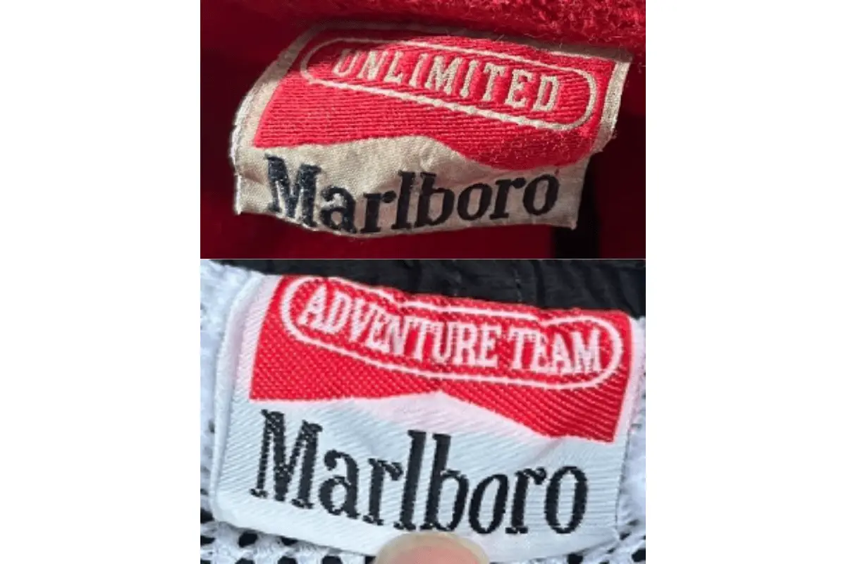
1990s Marlboro tags
2000s vintage Marlboro tags
- Tags from this era often display a more modern design while retaining the classic Marlboro logo.
- Introduction of more elaborate graphics, such as a cowboy or other thematic imagery, enhancing the brand’s rugged, Western aesthetic.
- Continued use of “Adventure Team” and “Unlimited” branding, reflecting a consistent brand theme.
- Manufacturing locations indicated, such as “Made in Italy” or “Made in Taiwan,” similar to previous decades.
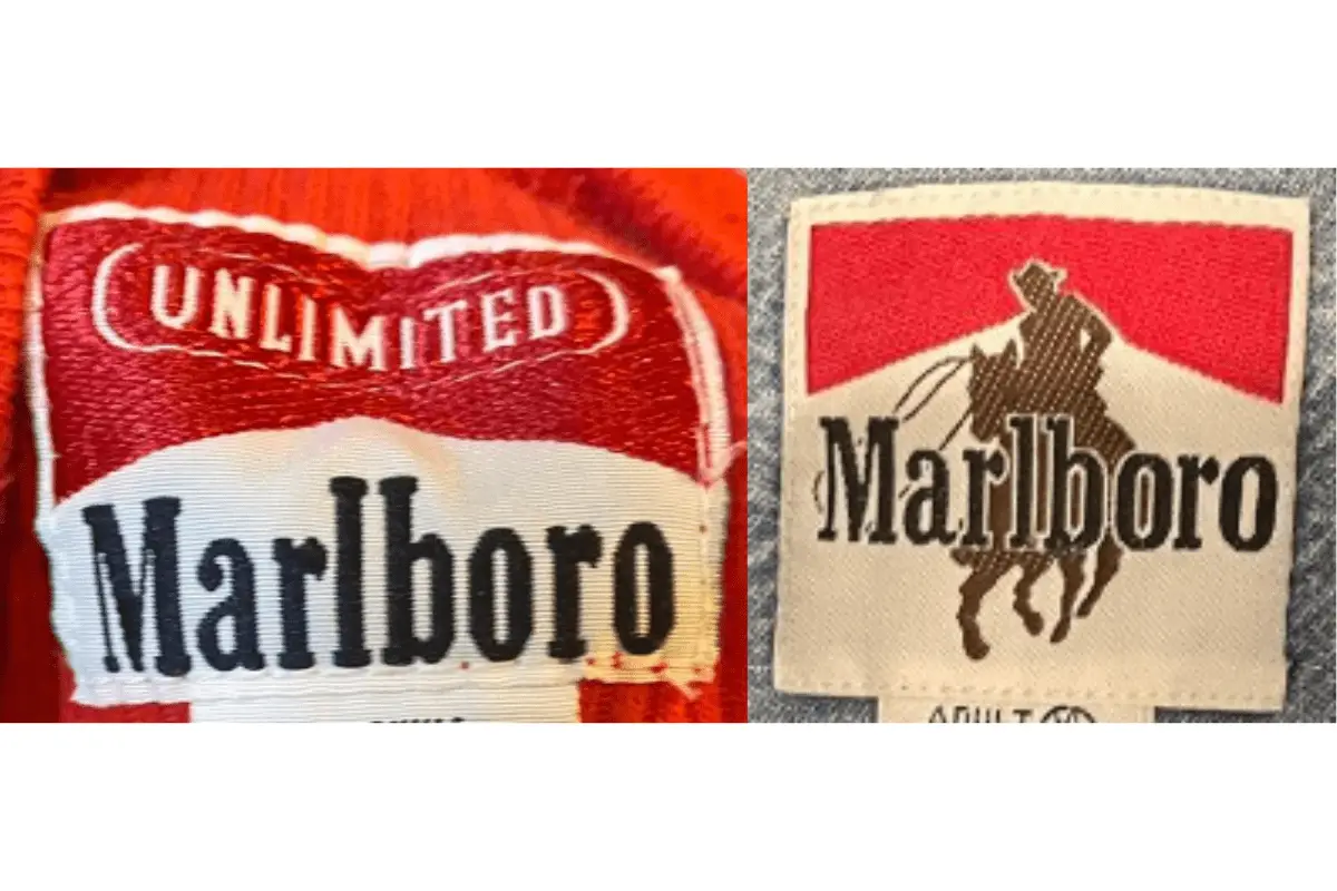
2000s Marlboro tags


[url=https://canadapharmacy-usa.net/drug/mintop-solution/]buy mintop solution[/url]
buy triamcinolone without prescription