
Old Navy: a powerhouse of affordable style and quirky charm that emerged from Gap Inc.’s strategic vision to create a family-friendly brand with its own distinctive flair. In the early 1990s, as competitors in retail sought to outdo each other, Gap Inc. pivoted toward everyday affordability, launching Old Navy Clothing Co. in 1994. With its debut in northern California, the brand quickly became a sensation, thanks to its distinctive warehouse-style stores, playful advertising, and eclectic mix of clothing and accessories.
The first logo, featuring a distressed “OLD NAVY” text nestled in a blue oval with a red outline, captured the brand’s edgy yet approachable identity. Over the years, as Old Navy’s influence grew, so did its logo, evolving to reflect changing styles while retaining the iconic blue oval. By the time the early 2000s rolled around, the logo and tags became visual markers of its vintage era—clean, modern fonts, and designs that evoke nostalgia for its heyday.
Each iteration of the logo and tag narrates a chapter of Old Navy’s journey—from the funky flair of the ’90s to the high-fashion experimentation of the mid-2000s, to the family-friendly aesthetic of the 2010s. Whether you’re digging for tags that read “Made in Vietnam” or “Classic,” or logos with the lighter blue ovals, these artifacts embody Old Navy’s commitment to affordability, style, and fun.
Today, Old Navy remains a global icon, with flagship stores in New York, Manila, and Mexico City, embodying a quirky, welcoming vibe that’s unmistakably its own. So whether you’re hunting for a distressed denim jacket or scouting the aisles for a retro sweatshirt, knowing Old Navy’s history gives you the savvy to spot vintage treasures hidden in those blue oval tags.
Julia Louis-Dreyfus starring in Old Navy Advert
How to tell if Old Navy is vintage from the logo
As Gap Inc.’s playful yet affordable fashion label, Old Navy has captured hearts globally, from its vibrant stores across America and Mexico to its presence in dozens of countries worldwide. The brand, known for its eclectic mix of clothing and accessories, was founded in 1994 as a budget-friendly alternative to Gap, and its logos reflect this dynamic journey.
From the earliest days as Gap Warehouse, Old Navy’s solid blue oval has evolved to embody a sense of quality and trust, all while maintaining a minimalist, yet striking, aesthetic. Whether outlined in red or framed by a darker shade of navy, the distinctive oval badge and uppercase lettering have grown more polished over time, refining the brand’s spirit while staying true to its origins. Join us as we dive into the history and meaning behind each Old Navy logo, tracing how this simple yet memorable emblem has anchored the brand’s identity as a global icon of family-friendly fashion.
1995 to 1998 Old Navy logo
- Logo features the text “OLD NAVY” in a distressed font within a blue oval.
- Outlined with a red border around the oval.
1995 to 1998 Old Navy logo
1998 to 2005 Old Navy logo
- The “OLD NAVY” text is now in a clean, modern font.
- Blue oval remains but without the red border.
1998 to 2005 Old Navy logo
2005 to 2009 Old Navy logo
- Features a more refined, thicker font for “OLD NAVY.
- The blue oval remains but with a slightly lighter shade.
2005 to 2009 Old Navy logo
2009 to now Old Navy logo
- Refined “OLD NAVY” text font with even spacing between letters.
- Blue oval has a consistent, darker shade.
2009 to now Old Navy logo
How to tell if Old Navy is vintage from the tags
Old Navy’s tags offer a fascinating glimpse into the brand’s evolving identity over the decades, reflecting shifts in fashion trends and the brand’s approach to affordability and accessibility. From the 1990s to today, the tags tell a story of how Old Navy has modernized while staying true to its roots as a family-friendly fashion powerhouse.
In the 1990s, Old Navy tags were marked by the unmistakable blue oval logo, often paired with bold labels like “BLUE JEANS” or “The Best in Denim.” These tags signaled an era when Old Navy was cementing its place as a leader in casual, accessible fashion. Moving into the 2000s, the brand embraced clean and simple designs, incorporating square or rectangular tags that emphasized the “CLASSIC” style while adding international flair with “Made in Vietnam” or “Made in Indonesia” labels.
By the 2010s, Old Navy tags leaned into vibrant colors and added extra designations, like “Pixie” for pants or “Outlet” for discount items, reflecting a more diverse product line and global audience. The consistent use of the blue oval logo throughout these decades reinforces the brand’s identity while adapting to changing consumer tastes. Join us in exploring these trends and uncovering how Old Navy tags capture the brand’s evolution in style, quality, and global reach.
Having issues identifying your vintage labels? Upload a picture on our vintage tag identification page, and we’ll help you out!
1990s vintage Old Navy tags
- Rectangular white tag with “OLD NAVY” in a blue oval logo.
- Tags include size information, such as “S” or “L,” and “Made in Mexico” or “Made in Vietnam.”
- Denim tags have “BLUE JEANS” or “The Best in Denim” text in blue with a red border.
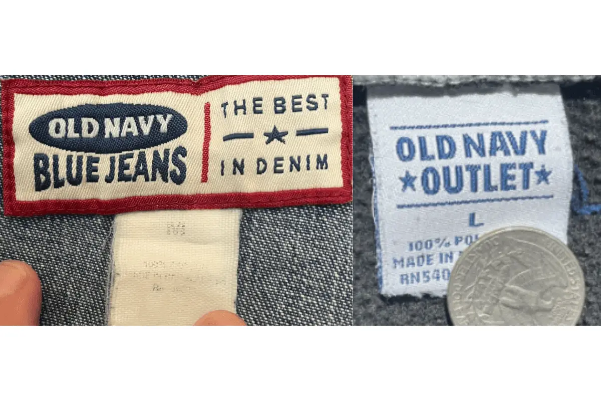
1990s Old Navy tags
2000s vintage Old Navy tags
- Square or rectangular tags often in black or blue, including the oval “OLD NAVY” logo.
- “Classic” styles feature a black tag with “CLASSIC” and size information in yellow.
- Some include “Made in Indonesia” or “Made in Vietnam” labels
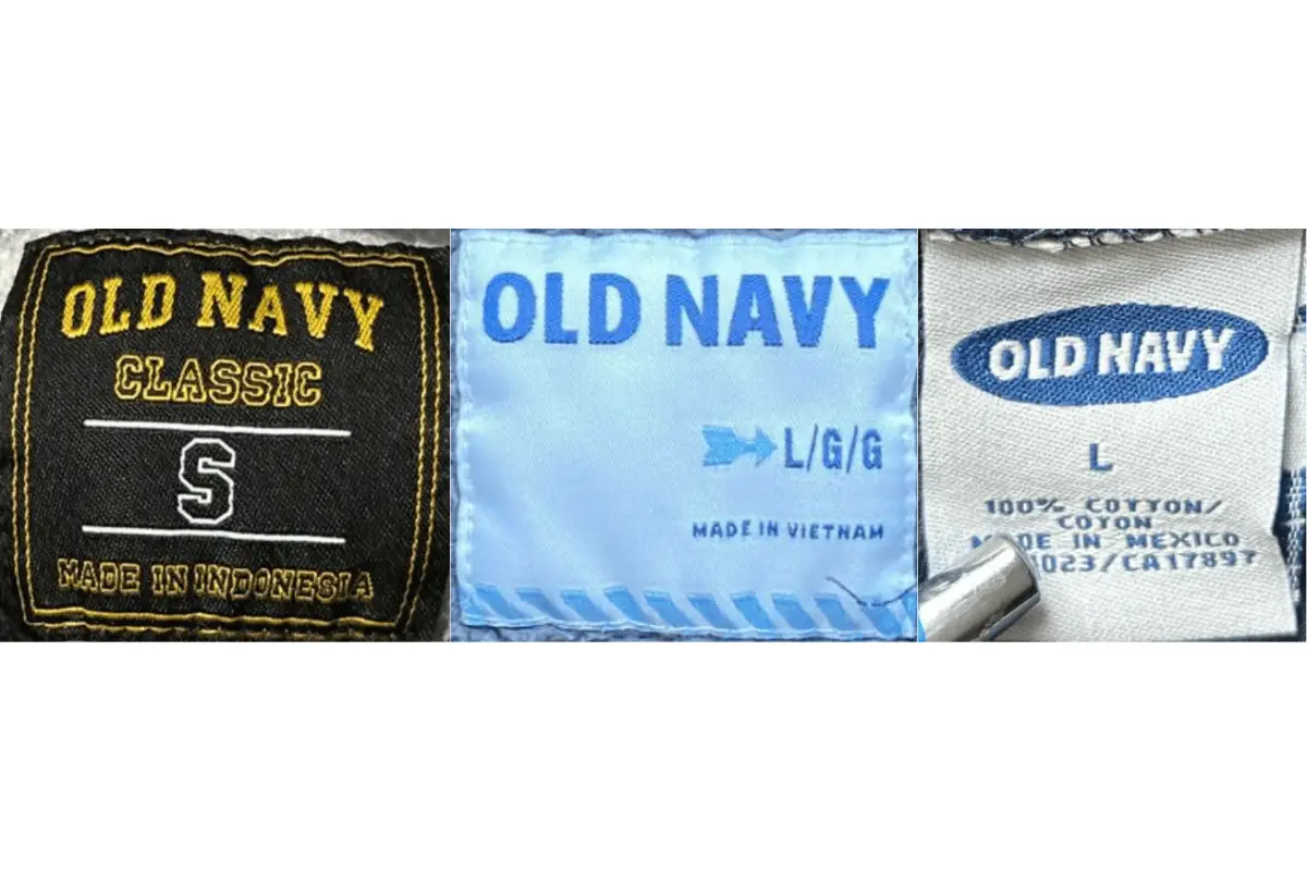
2000s Old Navy tags
2010s vintage Old Navy tags
- Tags are blue or white, with “OLD NAVY” and additional information in contrasting colors.
- Sometimes include “Pixie” for pants, or “Outlet” for discount items.
- “L/G/G” sizing includes international measurements.
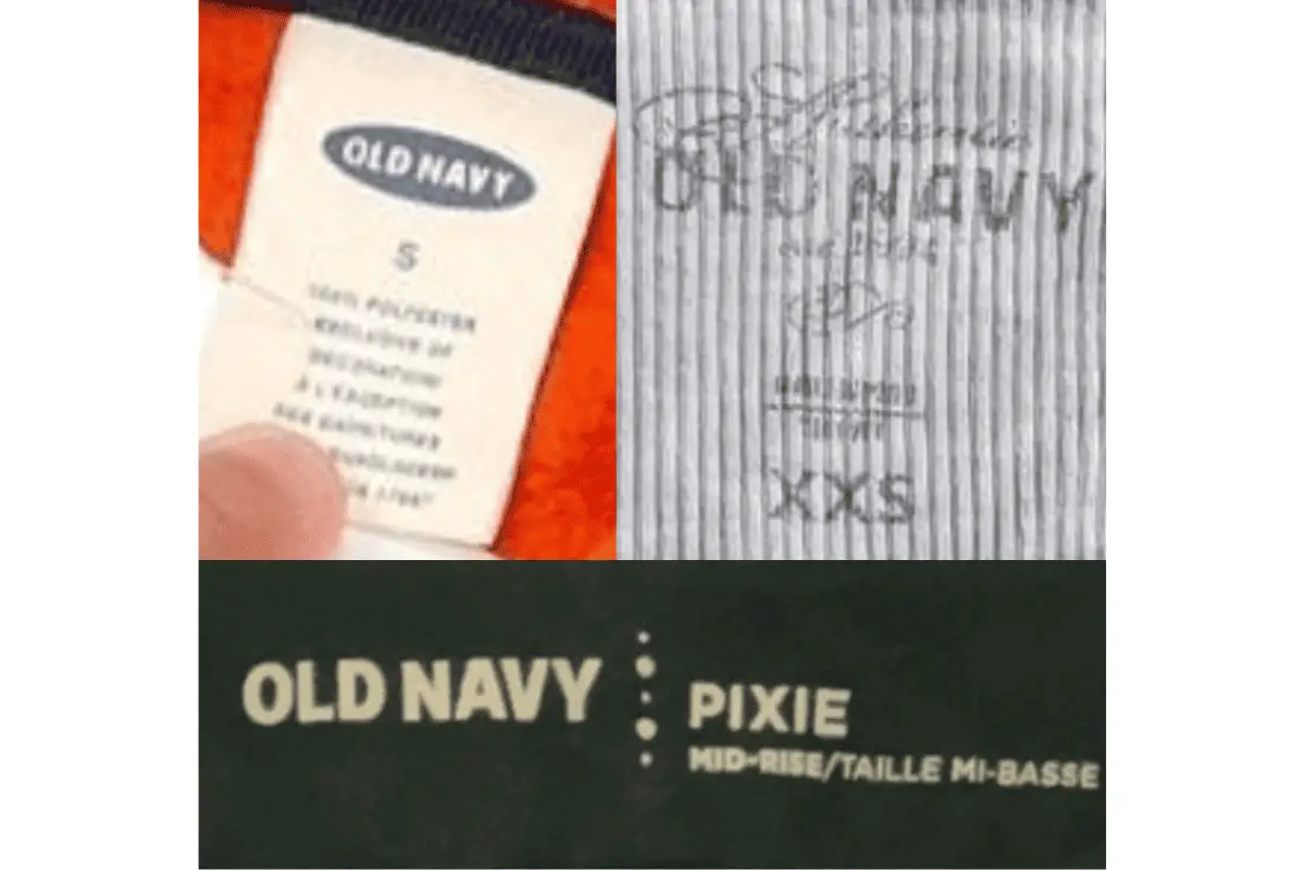
2010s Old Navy tags


2 Comments