Balmain, a legendary French fashion house, has been synonymous with luxury and refinement since Pierre Balmain first opened its doors in 1945. Born into a family that owned a drapery business and a fashion boutique, Pierre Balmain was destined to shape the world of high fashion. Despite initially studying architecture, his love for fashion led him to work for notable designers like Robert Piguet and Lucien Lelong before he ventured out on his own. He quickly became a “king of French fashion,” dressing stars like Marlene Dietrich, Ava Gardner, and even royal figures.
His legacy of elegance and exclusivity is reflected in the brand’s iconic logo and tags, which have evolved across decades while maintaining a distinct visual identity. From the characteristic, wide-spaced letters of the original “BALMAIN PARIS” logo to today’s bolder, simplified designs, each iteration tells a story of sophistication and adaptability.
Following Balmain’s death, the brand passed through the hands of several notable designers like Erik Mortensen, Oscar de la Renta, and Christophe Decarnin. Each brought their unique vision while upholding the core values of the house. However, it wasn’t until the current era under Olivier Rousteing that the brand found a seamless blend of heritage and modernity. Rousteing’s tenure has seen Balmain diversify into accessories, collaborate with global stars like Cara Delevingne, and continue its expansion into new markets.
Through the evolution of its logos and tags, Balmain’s storied history and unwavering commitment to luxury shine through, guiding vintage enthusiasts in identifying and appreciating its timeless pieces. Whether you admire the bold “PB” logo of the 1960s or the more streamlined modern fonts, each design era captures a moment in Balmain’s illustrious journey—a journey that remains influential in high fashion today.
Insightful Pierre Balmain Interview
How to tell if Pierre Balmain is vintage from the logo
Balmain’s logos have evolved alongside the fashion house’s storied legacy, reflecting its timeless elegance and dedication to Pierre Balmain’s original vision. When Pierre Balmain debuted his first boutique in Paris in 1945, he quickly garnered a clientele of high-profile names like Vivien Leigh and Brigitte Bardot, who admired his distinct Jolie Madame style.
Over the decades, the logo has transformed from the geometric “PB” monogram emblem to today’s sleek “B” icon that cleverly integrates the initials of both “Pierre” and “Paris.” Despite these changes, the branding has always been rooted in sophistication and refinement, with creative directors like Eric Mortensen, Oscar de la Renta, and Olivier Rousteing ensuring a balance between honoring tradition and embracing modernity.
From the 1945 labyrinth-like “PB” framed in black and white to the iconic “Balmain Paris” wordmark of today, each logo iteration is a testament to Balmain’s enduring influence in haute couture. The brand’s bold typography, featuring a geometric sans-serif font in the current logo, is a fitting representation of its contemporary luxury identity. The unwavering black-and-white color palette has remained a constant throughout the decades, underscoring Balmain’s commitment to sophistication and timeless style.
1945 to 1983 Pierre Balmain logo
- Logo features “BALMAIN PARIS” with distinctive, wide letter spacing.
- The “A” letters have a characteristic stylized design with inward angles, giving a unique look.
- The logo emphasizes the brand’s elegance and exclusivity.

1945 to 1983 Pierre Balmain logo
1983 to 2018 Pierre Balmain logo
- Logo retains the iconic “BALMAIN PARIS” styling, with the letters becoming more refined.
- The letter “A” retains its unique design from earlier years.
- The logo maintains the traditional, luxury aesthetic of the brand.

1983 to 2018 Pierre Balmain logo
2018 to now Pierre Balmain logo
- The logo continues with the “BALMAIN PARIS” structure but uses a bolder and simpler font.
- The letters are wider, more uniform, and modernized.
- The redesign emphasizes a contemporary luxury identity while maintaining the historical brand essence.
2018 to now Pierre Balmain logo
How to tell if Pierre Balmain is vintage from the tags
Balmain’s tags, much like its logos, are a window into the brand’s storied journey through decades of haute couture. Each era has seen unique design trends reflecting Balmain’s evolving aesthetic while maintaining Pierre Balmain’s original spirit. In the 1950s, the tags bore bold, capital letters spelling out “PIERRE BALMAIN” above “PARIS,” with special lines like “CHAPEAUX” and “Florilège.” Moving into the 1960s and 1970s, the brand introduced the iconic “PB” monogram alongside “PIERRE BALMAIN,” sometimes adding line names such as “Les Tricots” and international manufacturing locations.
By the 1990s, the tags had adopted colorful backgrounds, often in blue, brown, or black, contrasting with striking text. In the 2000s and 2010s, Balmain continued refining its aesthetic with tags that included size labels, fabric composition, and a sleek, contemporary “PB” monogram beside the brand name. Each tag iteration represents a harmonious blend of heritage and innovation, providing a tactile timeline of Balmain’s relentless pursuit of elegance and creativity.
Need help with vintage label identification? Submit a picture on our vintage tag identification page, and we’ll assist you!
1950s vintage Pierre Balmain tags
- Tags often feature “PIERRE BALMAIN” in bold, capital letters, with “PARIS” underneath.
- They include unique text such as “CHAPEAUX” and “Florilège” for specific lines.
- These tags usually have a cream or white background with black embroidery.
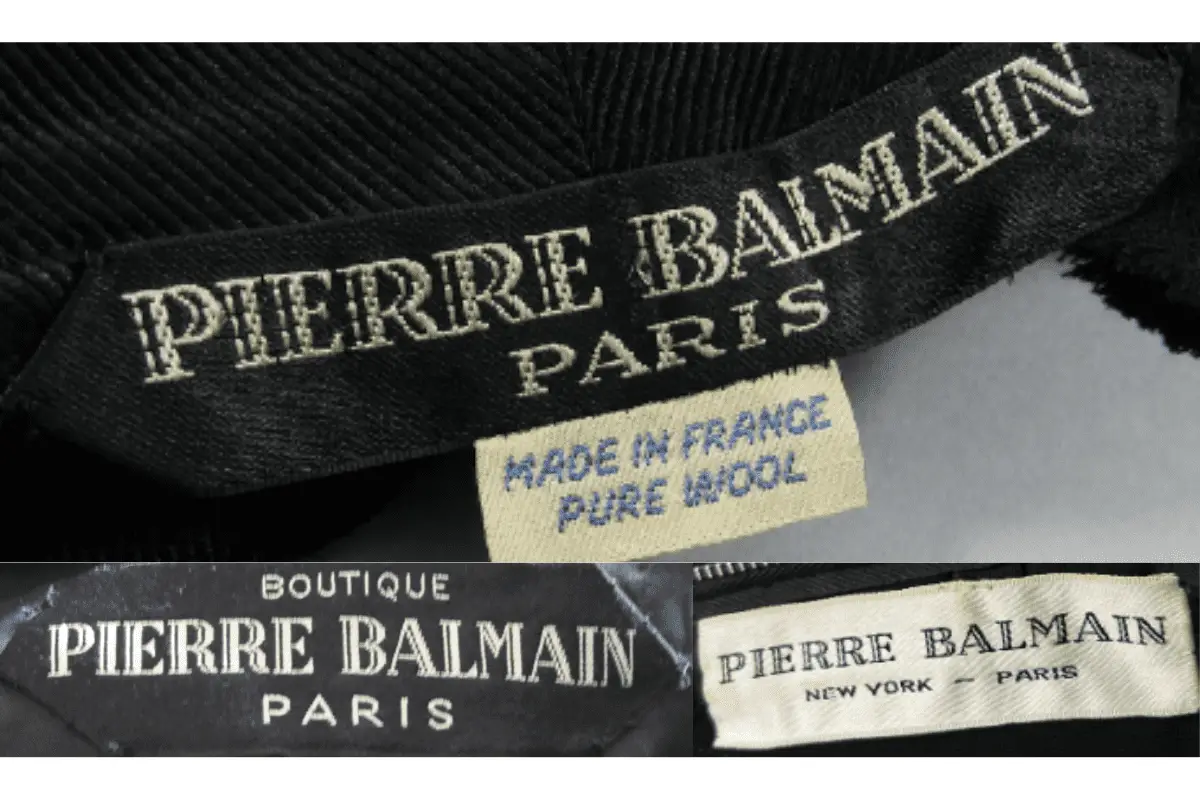
1950s Pierre Balmain tags
1960s vintage Pierre Balmain tags
- Tags include “PIERRE BALMAIN” in bold, capital letters, with “PARIS” beneath.
- Some tags include a square “PB” logo beside the brand name.
- The tags often have a white or cream background with black text.
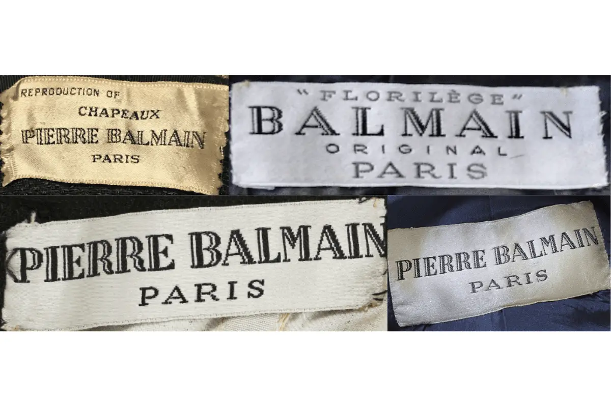
1960s Pierre Balmain tags
1970s vintage Pierre Balmain tags
- Tags prominently display “PIERRE BALMAIN” in bold, uppercase letters with “PARIS” underneath.
- Additional lines, such as “Les Tricots,” appear in some tags.
- The tags often include international manufacturing locations, like Japan or the UK.
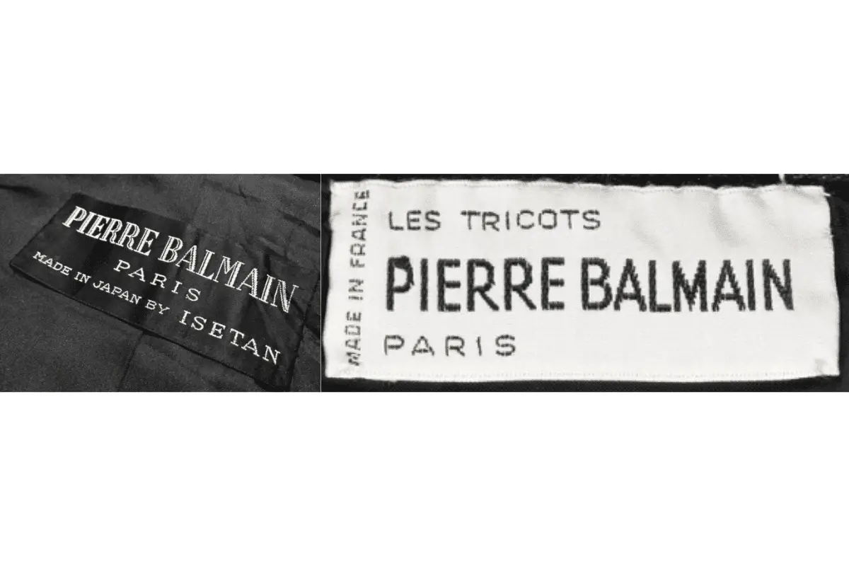
1970s Pierre Balmain tags
1980s vintage Pierre Balmain tags
- Tags generally display “PIERRE BALMAIN” in capital letters, with “PARIS” below.
- Some tags feature specific lines like “BOUTIQUE” or “MADE IN FRANCE.”
- The square “PB” logo is often used next to the brand name.
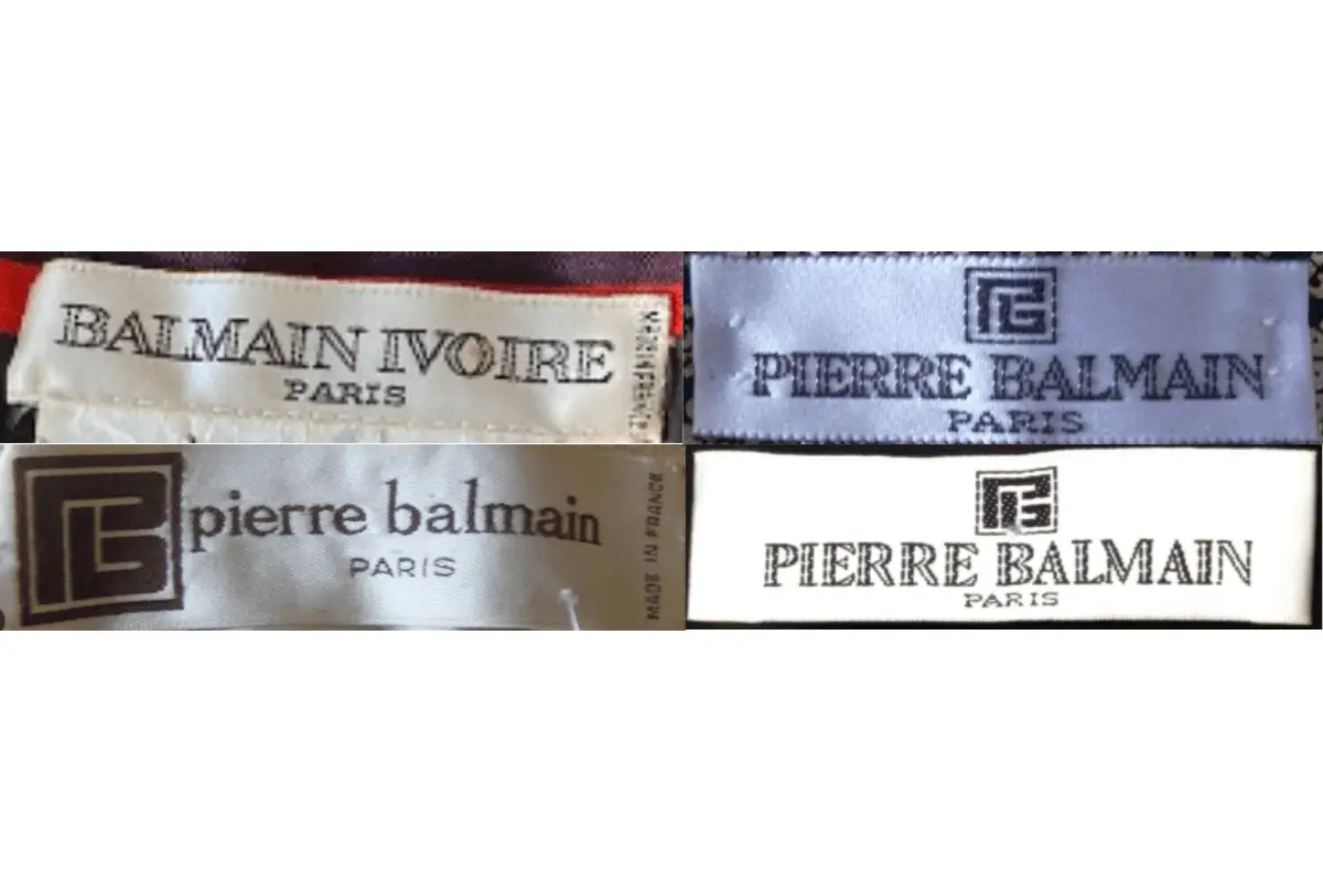
1980s Pierre Balmain tags
1990s vintage Pierre Balmain tags
- Tags include “PIERRE BALMAIN” in bold, capital letters, usually with “PARIS” underneath.
- Some tags incorporate distinctive lines like “GARÇON” or “EXCLUSIVA.”
- Background colors vary, often including blue, brown, or black with contrasting text colors.
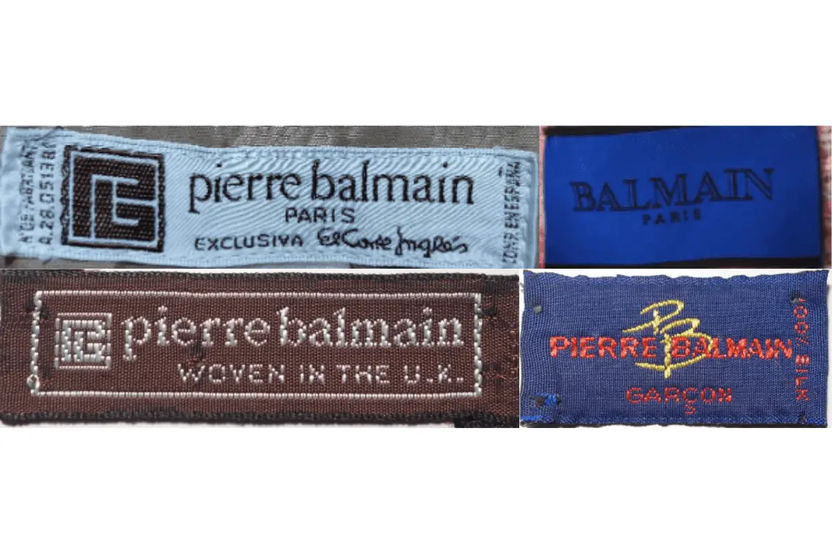
1990s Pierre Balmain tags
2000s vintage Pierre Balmain tags
- Tags feature “PIERRE BALMAIN” in bold uppercase letters with “PARIS” beneath.
- The square “PB” logo continues to appear beside the brand name.
- Fabric composition is sometimes included on separate tags.
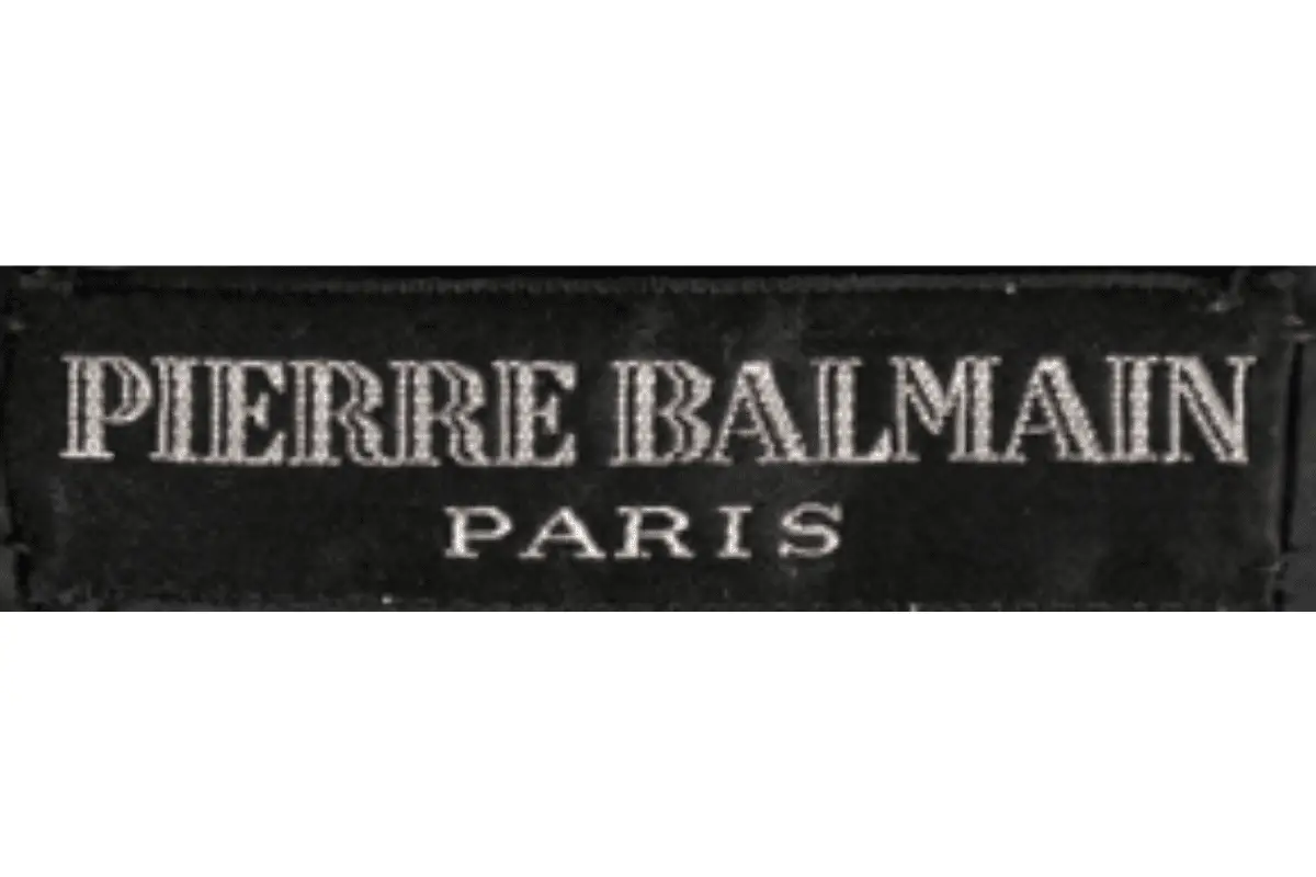
2000s Pierre Balmain tags
2010s vintage Pierre Balmain tags
- Tags display “PIERRE BALMAIN” in uppercase letters, with “PARIS” often appearing below.
- The tags frequently include numerical size labels.
- Text colors contrast against a range of background colors like white, black, and cream.
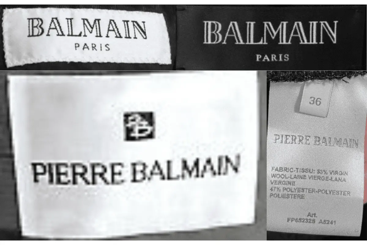
2010s Pierre Balmain tags


We are a group of volunteers and starting a new scheme in our community.
Your web site offered us with valuable information to work on. You’ve done a formidable job and our whole
community will be thankful to you.
casino en ligne
When I originally commented I clicked the “Notify me when new comments are added” checkbox and now each time
a comment is added I get four e-mails with the same comment.
Is there any way you can remove me from that service?
Bless you!
casino en ligne
If some one wants expert view about blogging then i propose him/her to visit this webpage, Keep up the pleasant job.
casino en ligne
It’s amazing to go to see this website and reading the views of all friends concerning this piece of writing,
while I am also eager of getting know-how.
meilleur casino en ligne
What’s up everyone, it’s my first visit at this web site, and article is genuinely
fruitful in favor of me, keep up posting these articles.
casino en ligne France
each time i used to read smaller articles that also clear their motive, and that is also happening with this post which I am reading here.
casino en ligne
Neat blog! Is your theme custom made or did you download it from somewhere?
A theme like yours with a few simple tweeks would really make my blog jump out.
Please let me know where you got your theme.
Many thanks
meilleur casino en ligne
Thank you for the auspicious writeup. It in reality was
a amusement account it. Look complex to far
delivered agreeable from you! By the way, how could we be in contact?
casino en ligne France
It is in reality a great and useful piece of information. I’m happy that you shared this useful information with us.
Please keep us up to date like this. Thanks for sharing.
casino en ligne
After looking over a few of the blog articles on your website, I seriously
appreciate your way of blogging. I saved it to my bookmark
webpage list and will be checking back in the near future.
Please visit my web site too and tell me what you think.
casino en ligne francais
681424 526719Thanks for blogging and i enjoy the blog posting so no public comments.,,,,,,,,,,, 187165
vintageclothingguides.com
vintageclothingguides.com
Nessa versão repaginada da franquia, os prêmios continuam incríveis: você pode faturar até 5.000x o valor da sua aposta, enquanto caça os maiores peixes em alto-mar com recursos como giros grátis turbinados, modificadores exclusivos e multiplicadores crescentes. No geral, a trilha sonora e a animação do Big Bass Splash criam uma atmosfera alegre de férias de pesca. A Pragmatic Play é uma das maiores provedoras de jogos de cassino online do mundo, oferecendo uma biblioteca de títulos impressionante, incluindo slots, jogos de mesa e cassino ao vivo. Reconhecida pela inovação e qualidade, a Pragmatic Play entrega jogos com altos RTPs, gráficos imersivos e funcionalidades avançadas, tornando-se uma das favoritas entre os apostadores. Se você procura os melhores slots online, experiências realistas de cassino ao vivo e jackpots progressivos, a Pragmatic Play tem tudo o que você precisa!
https://jifen.archeryplus.cn/p/2025/17462.html
Roobet is a popular online crypto casino that offers a wide range of games, including slots, table games, and unique mini-games like Mission Uncrossable. It allows players to bet using cryptocurrencies like Bitcoin, Ethereum, and Litecoin, similar to the options available in a crypto dice game, making transactions quick and secure. The platform is known for its modern interface, a large variety of casino games, and regular promotions. Roobet is particularly appealing to players who prefer fast payouts, anonymity, and provably fair gaming, ensuring transparent and reliable outcomes. You can email the site owner to let them know you were blocked. Please include what you were doing when this page came up and the Cloudflare Ray ID found at the bottom of this page. These games share high-stakes excitement with Mission Uncrossable, offering plenty of ways to win big on Roobet.
Build-up play, passing sequences and chance creation tracked
Howdy very nice web site!! Man .. Beautiful .. Amazing
.. I’ll bookmark your website and take the feeds additionally?
I’m glad to seek out so many useful information here within the publish, we’d like develop more strategies
on this regard, thanks for sharing. . . . . .
Hello to every one, because I am really keen of reading this website’s post to be updated regularly.
It carries nice data.
WOW just what I was looking for. Came here by searching for gbgbet
Please let me know if you’re looking for a author for your blog.
You have some really great posts and I think I would be a good asset.
If you ever want to take some of the load off,
I’d absolutely love to write some articles for
your blog in exchange for a link back to mine.
Please blast me an email if interested. Kudos!
Great beat ! I would like to apprentice even as you amend your website, how could i subscribe for a weblog website?
The account aided me a applicable deal. I had been tiny bit acquainted of
this your broadcast provided vivid clear
idea