In the ever-evolving tapestry of global fashion, few brands have managed to weave their identity so seamlessly into the fabric of surf and sportswear culture as Quiksilver. Born on the rugged coastlines of Torquay, Victoria in 1969, Quiksilver initially captured the spirit and demands of the surfing community before catapulting itself onto the global stage, now headquartered in the surf hotspot of Huntington Beach, California. Through a blend of innovation, savvy marketing, and a commitment to quality, Quiksilver has grown into one of the largest surfwear and boardsport equipment manufacturers worldwide, now housed under the umbrella of Boardriders, Inc.
Quiksilver’s journey is a storied saga of peaks and valleys. In 2018, the acquisition of Billabong International Limited expanded its repertoire, including brands like Element and RVCA, further solidifying its place in the surf and boardsport dominion. However, this growth came amidst significant challenges, including a financial slump that led to a Chapter 11 bankruptcy filing in 2015. Despite these tumultuous times, Quiksilver has continued to innovate and adapt, appealing to a broad audience while staying true to its surf roots. The transition in leadership from Bob McKnight to Pierre Agnes and the subsequent changes in strategic direction underscored a commitment to revitalization and growth.
As we explore Quiksilver’s rich history, we also delve into the nuanced evolution of its logo—a symbol that has stood the test of time, morphing in response to changing aesthetic sensibilities and market dynamics. From its inception to its current iteration, the logo not only serves as a hallmark of quality but also as a beacon for collectors and enthusiasts seeking to chart the brand’s evolution. This detailed exploration provides a compelling narrative of how a brand can remain relevant in a highly competitive market by staying true to its roots while embracing change. As Quiksilver continues to surf the waves of the fashion industry, it remains a testament to endurance and adaptability in the ever-changing world of sportswear.
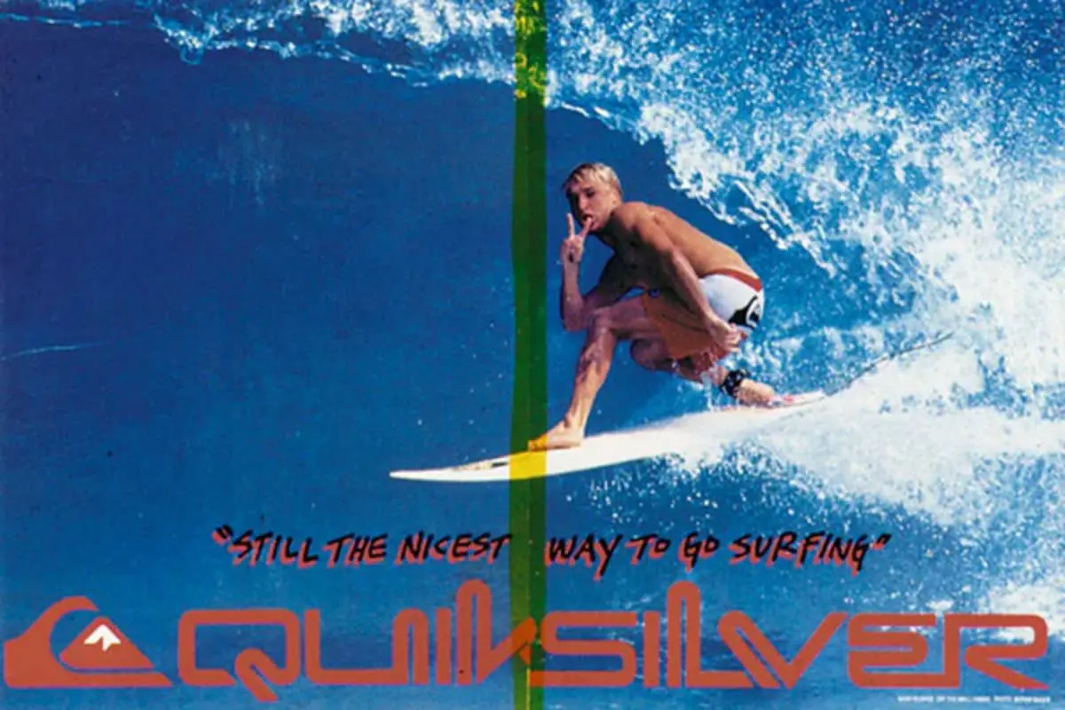
Y2K ‘Dynamite Surfer’ Quiksilver Film
How to tell if Quiksilver is vintage from the logo
Quiksilver, a brand synonymous with surfing culture and apparel, has experienced a dynamic evolution of its logo since its inception. This progression reflects the brand’s response to changing market demands, shifting consumer preferences, and its own growth from a niche surf brand into a global sportswear icon. Each logo iteration not only marks a point in time but also represents Quiksilver’s ongoing commitment to appealing to a younger, more diverse audience while retaining its core identity rooted in surf culture.
The various logos Quiksilver has adopted over the years showcase a blend of artistic styles and branding strategies. Initially, the logos maintained a strong connection with the brand’s surf culture roots, but over time they have incorporated more modern and sleek designs to maintain relevance in the competitive sportswear market. Understanding these changes can give collectors and fans insights into the brand’s history and help identify the era of specific merchandise.
1970 to 1983 Quiksilver logo
- Introduction of the iconic wave and mountain emblem, a nod to Quiksilver’s surf and snow sports duality.
- Uses bold, straightforward typography to emphasize the brand name alongside the emblem.
- Earthy and muted color palettes prevalent, reflecting the early aesthetics of the surf culture.
1970 to 1983 Quicksilver logo
1974 to 1983 Quicksilver logo
1983 to 1997 Quiksilver logo
- Continuation of the wave and mountain but with a slightly refined design to enhance visibility and brand recognition.
- Typography becomes bolder and more pronounced, taking on a more significant role in the logo.
- Introduction of vibrant colors to appeal to the youth and vibrant surf culture of the 80s and 90s.
1983 to 1997 Quicksilver logo
1997 to 2002 Quiksilver logo
- Minor refinements to the emblem for a cleaner look, aligning with the trends of the late 90s.
- Shift towards a more minimalistic approach in the text, dropping shadow effects and sticking to solid colors.
- Increased focus on scalability and adaptability across various media.
1997 to 2002 Quicksilver logo
2002 to 2009 Quiksilver logo
- Slight adjustments in color tones and emblem detailing to modernize the look.
- Typography is streamlined further, emphasizing clarity and modernity.
- Enhanced digital presence reflected through the logo’s adaptability in digital formats.
2002 to 2009 Quicksilver logo
2009 to 2015 Quiksilver logo
- Introduction of a more refined and stylistic font, moving away from the blocky fonts of the past.
- Emblem remains central but is subtly updated to appear more dynamic and fluid.
- Focus on high visibility and distinction in a cluttered market environment.
2009 to 2015 Quicksilver logo
2015 to now Quiksilver logo
- Current logo maintains the traditional elements but with a modern twist for contemporary appeal.
- Use of sharper lines and a cleaner, more corporate font reflects the brand’s evolution.
- Emblem size reduced slightly, signifying a shift towards minimalism in design.
1983 to now Quicksilver logo
2015 to now Quicksilver logo
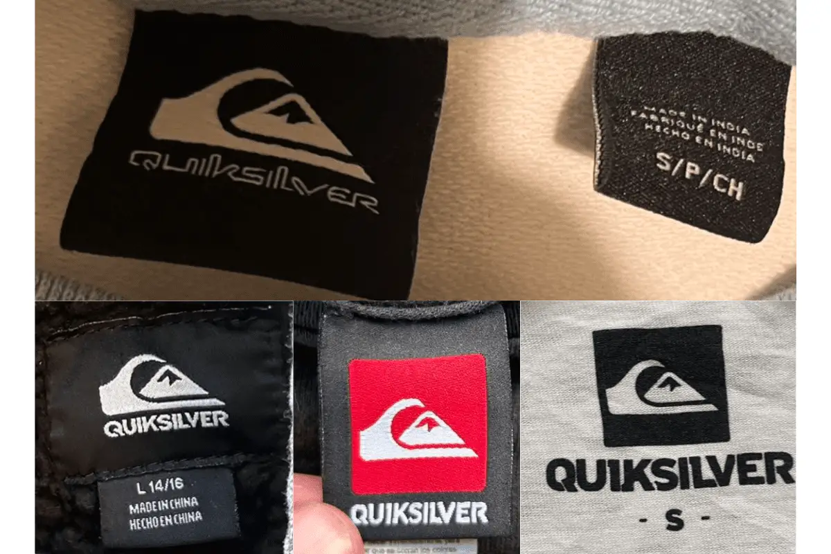
How to tell if Quiksilver is vintage from the tags
Quiksilver, a brand synonymous with the surf and skate culture, has evolved significantly in terms of design and production since its inception. Its distinctive wave-and-mountain logo has remained a constant symbol of its commitment to quality and the adventurous spirit of its wearers. Over the years, Quiksilver tags have transitioned in style, material, and manufacturing location, reflecting broader changes in the global apparel industry. Recognizing the details in these tags can provide valuable insights into the garment’s age and authenticity, making it a fascinating journey for collectors and fashion historians alike.
From vibrant and bold designs of the 1980s to the minimalist and varied tags of the 2010s, each era brought its unique elements to Quiksilver’s branding. Identifying the specific characteristics of Quiksilver tags from different decades helps not only in dating these items but also in appreciating the brand’s trajectory in adapting to changing fashion trends and manufacturing practices. Let’s explore the distinctive features of Quiksilver tags from the 1980s to the 2010s, highlighting what makes each period unique and memorable.
Having trouble identifying vintage tags or labels? Submit a picture on our vintage tag identification page, and we’ll help you out!
1980s vintage Quiksilver tags
- Featured bold, block lettering often in red, white, or blue color schemes.
- Material tags typically included the “Made in USA” label, signifying domestic production.
- Often featured a single large logo with the brand name prominently displayed.
1980s Quiksilver tags
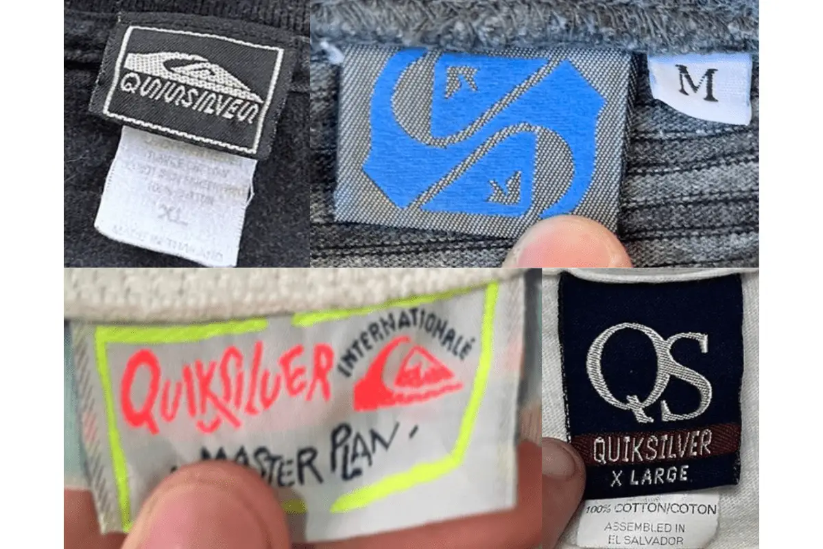
1990s vintage Quiksilver tags
- Tags from this era showed a mix of vibrant colors and began introducing more graphic elements.
- Materials used became more varied, and tags started to include more detailed care instructions.
- Production began to shift overseas, with tags indicating manufacturing in countries like India and Mexico.
1990s Quiksilver tags
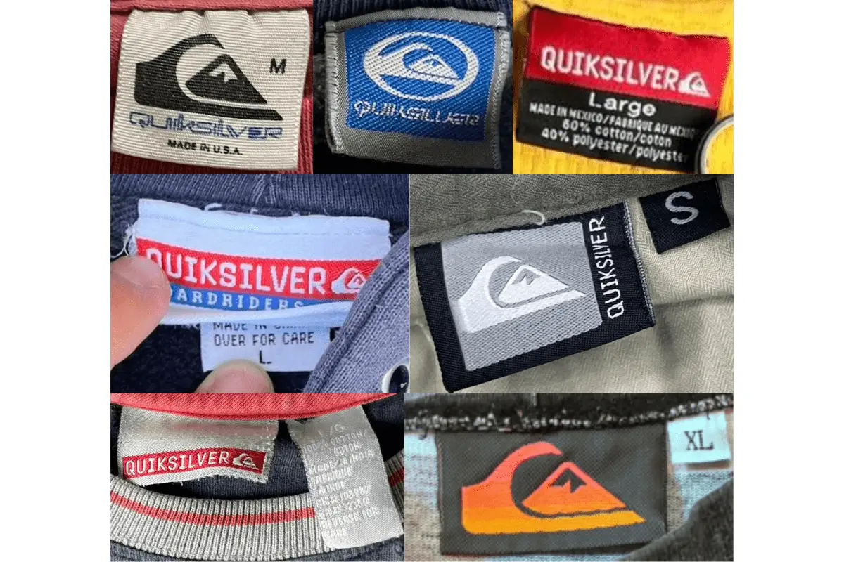
2000s vintage Quiksilver tags
- Introduction of more refined and stylized logos on the tags, reflective of the brand’s growing global presence.
- Utilized a combination of stitched and printed tags to indicate size, care instructions, and origin.
- Began to feature multi-lingual tags, catering to an international market.
2000s Quiksilver tags
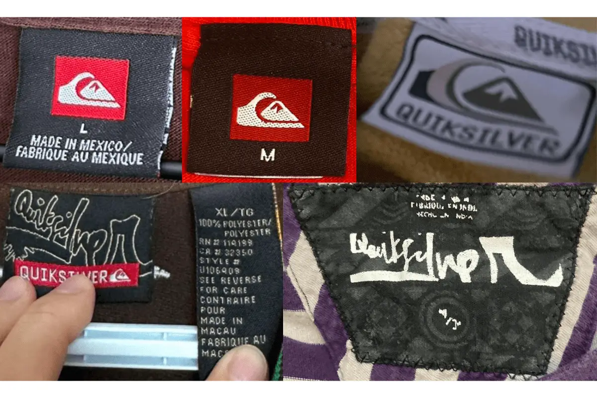
2010s vintage Quiksilver tags
- Modern and minimalist design with less emphasis on colorful presentation.
- Incorporated more sustainable materials and practices into the tag’s information.
- Tags often featured collaborations with designers or special collections, indicated by unique logos and tag styles.
2010s Quiksilver tags


One Comment