Like many of the biggest sportswear brands nowadays, Reebok’s origins can be found in the development of running shoes. Joseph William Foster began developing spiked running shoes in Bolton, Lancashire which he then spun off into a sports shoe company with his sons called J.W. Foster and Sons. They pioneered the use of spikes on running pumps which were later made famous by Harold Abrahams 100m sprint victory at the 1924 Paris Olympics.
In 1958, the grandsons of Joseph William Foster decided to create their own spinoff brand called Reebok. They found the name in a South African dictionary that grandson Joe Foster won in a sprint as a boy. Reebok is a name that refers to a type of African antelope called the grey rhebok. Paul Fireman, an American entrepreneur noticed the Reebok brand at a trade show in America and negotiated a deal to licence and distribute the brand in North America.
The 1982 launch of the Reebok Freestyle aerobics trainers as the first athletic shoe designed for women was a huge success and took the companies USA sales from $1.5 million in 1981 to $13 million in 1983. Reebok also took a foothold in tennis through sponsorship deals with players such as Boris Becker and John McEnroe.
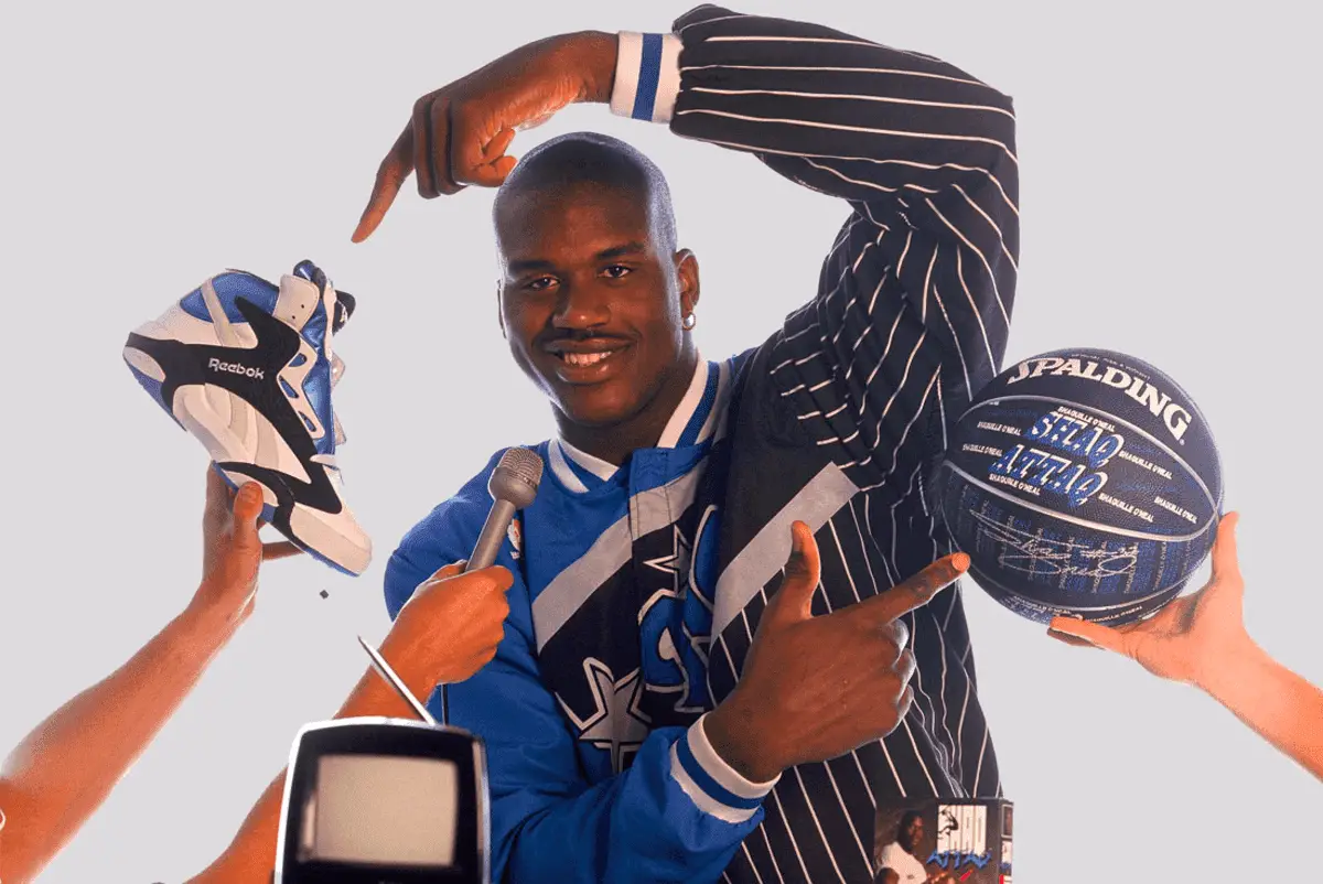
Iconic 90s Shaq Advert
How to tell if Reebok is vintage from the logo
Reebok began expanding from tennis to running and basketball endorsements and sponsorships. In 1984 the brand was purchased by American entrepreneur Paul Fireman who intended to transition Reebok into a performance brand and struck licensing deals with professional athletes and teams in the NBA and NFL. As Reebok began to expand into sports clothing and accessories throughout the 1980s, it would debut the Reebok Pump, one of its most successful shoes that ultimately was worn by more than 100 professional athletes, most notably Shaquille O’Neal. Naturally the Reebok logo would start to proliferate throughout pop culture and the brand would become associated with athletic excellence.
As Reebok would expand into a global brand, its logo would drop reference to its UK origins by removing the Union Jack and over time updating both the font and emblem of the original logo. This means assessing the logo of a Reebok item of clothing is an excellent way to identify its era.
1958 to 1977 Reebok logo
- The very first Reebok logo is vastly different from its future iterations
- It uses both text and an emblem
- The font is thin and capitalises just the R
- The emblem is in the middle of the text and is a silhouette of a torch
1958 Reebok logo
1977 to 1993 Reebok logo
- The second Reebok logo is one of its most well known, as Reeboks explosion in global sales happened at this time
- A blocky font in navy is used with the R dropping slightly below the text
- The Union Jack replaced the torch emblem and is on the right side of the text instead of intersecting through the middle
1977 Reebok logo
1993 to 1997 Reebok logo
- The font largely remained the same, however the R drops slightly lower and a royal blue was used instead of navy
- At this time the Union Jack emblem was removed as ownership of Reebok had been sold to Paul Fireman who wanted the emblem to associate more closely with athletic performance
- This led to the track emblem being introduced
1993 Reebok logo
1997 to 2000 Reebok logo
- The font was slightly updated, removing the curves from the R and K
- Generally speaking at this time, the track emblem was displayed above the text
1997 Reebok logo
2000 to 2005 Reebok logo
- The font saw a significant change in this period, using all lower case letters, becoming italicized and changing to the colour red
- The track emblem was typically displayed on the left hand side within a badge like design
2000 Reebok logo
2005 to 2008 Reebok logo
- The main logo maintained use of a similar italicized tech like font
- The name ‘Reebok’ was shortened to ‘Rbk’
- At the time the track emblem was put inside its own badge design and placed on the right hand side of the text logo
2005 Reebok logo
2008 to 2014 Reebok logo
- A new font was introduced, and whilst it is blocky and thick it was a big departure from the previous font and is slightly reminiscent of earlier fonts used
- The track emblem was dropped from the logo
2008 Reebok logo
2014 to 2019 Reebok logo
- The same font was used for this update to the logo
- A new emblem was created, a red triangle which consists of three parts
2014 Reebok logo
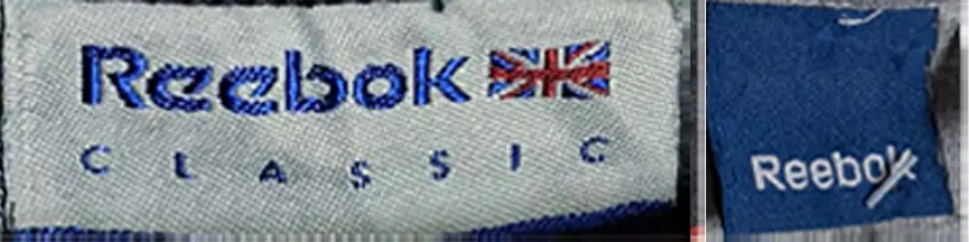
2019 to now Reebok logo
- The logo in recent times has been reverted to its 1990s form
- Using the older font, however with slightly more spacing between the letters
- The track emblem is set below the font instead of beside it
Reebok logo
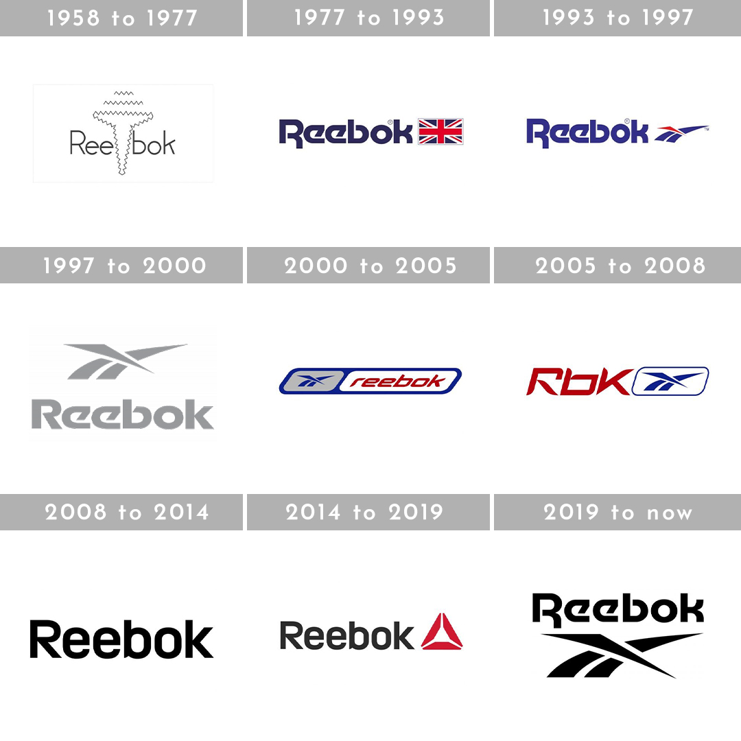
Reebok logos through the years
How to tell if Reebok is vintage from the neck tags
Reebok has updated its tags in line with its logo as its developed over the decades. So whilst the neck tags aren’t a definitive indicator of the age of a Reebok piece, they can help us narrow down a rough era.
Can’t identify your vintage tags? Submit a picture of them on our vintage tag identification form, and let us help you out!
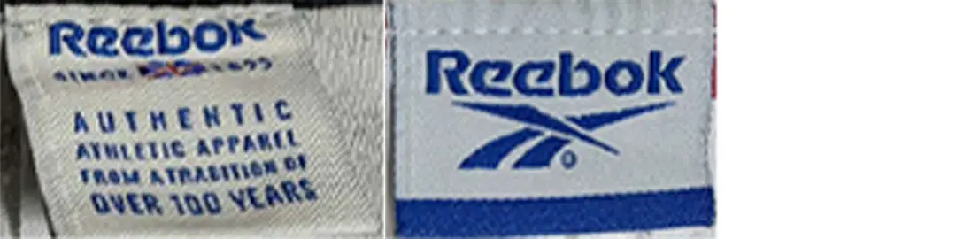
1980s vintage Reebok tags
- Tags from the 80s used the old font where the kick of the R goes below the line of text
- The Union Jack was used as an emblem, or no emblem was added to the tags as shown in the Reebok Warm Up tags

1980s Reebok tags
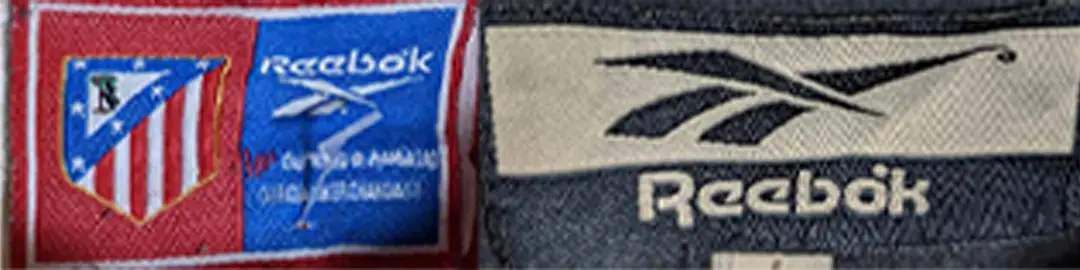
Early to Mid 1990s vintage Reebok tags
- The font remained mostly the same, however the e’s became slightly more curved
- The track emblem was introduced to the tags
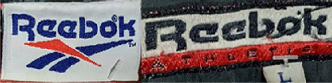
1990s Reebok tags
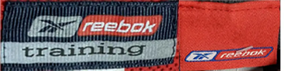
Mid to Late 1990s vintage Reebok tags
- The font was updated, becoming slightly less blocky with the kick of the R moving in line with the rest of the text
- The track emblem was frequently included, however would often be a solid colour instead of the combination of red and blue used in previous designs
1990s Reebok tags
1990s Reebok tags
1990s Reebok tags
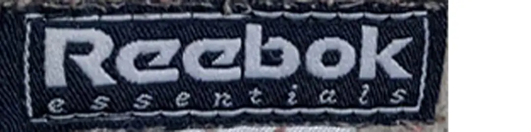
Early to Mid 2000s vintage Reebok tags
- The font was once again updated to a more tech like, thinner font, which is all in lower case
- The text incorporated on the tags was also often in red, or in white with a red background
- The script and track emblem were combined into a badge like design on these tags
2000s Reebok tags

2000s Reebok tags
Mid to Late 2000s vintage Reebok tags
- Two changes occurred to the font at this time, firstly a shortened version of the tech font with the R being capitalised again
- Some of the tags reverted to older blockier fonts
- The track logo was set in a badge like outline
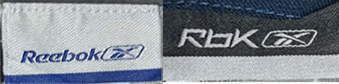
2000s Reebok tags
2010s vintage Reebok tags
- The new font was debuted on the neck tags, and they would often leave the new triangle emblem off
- Tags from this time would sometimes be printed on the inside of the garment
2010s Reebok tags
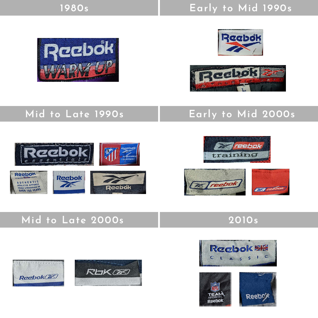
Vintage Reebok tags through the years


One Comment