Rip Curl has etched its name into the annals of surf culture since its inception in 1969. Founded by Doug Warbrick and Brian Singer in the iconic surf town of Torquay, Victoria, Australia, the brand has grown from a small surfboard production operation to one of the world’s most recognized surfwear companies. Alongside Quiksilver and Billabong, Rip Curl stands as a pillar of the surf industry, proudly forming the “Big Three” of surf brands globally. This status is underscored by its expansive reach across Australia, Europe, North America, South America, and South Africa.
The name “Rip Curl” itself carries an air of whimsy and serendipity, inspired by a surfboard Warbrick purchased in 1968, upon which he had scrawled “Rip Curl Hot Dog.” Though the words lacked inherent meaning, they encapsulated the groovy, carefree spirit of the times and the exhilarating essence of surfing the curl. This ethos propelled Rip Curl to venture beyond surfboards, innovating in wetsuit technology by adapting diving gear for surfers, a move that set the brand apart in the early 1970s.
Over the decades, Rip Curl has expanded its footprint beyond surfing to embrace other board sports, including skateboarding, freestyle skiing, snowboarding, and wakeboarding. The brand’s events, such as the Rip Curl SurfSkate Festival and the Rip Curl World Heli Challenge, reflect its dynamic engagement with the broader board sports community. Rip Curl’s influence extends through these disciplines, cementing its reputation not just as a surfwear brand, but as a multifaceted sportswear giant.
The company’s rich history and cultural impact are chronicled in “The Rip Curl Story” by Tim Baker, a book that celebrates 50 years of innovation, adventure, and the unwavering spirit of its founders. Despite attempts to sell the brand in 2012, Rip Curl remains a significant player in the industry, now under the ownership of outdoor specialist Kathmandu since 2019. The appointment of Brooke Farris as CEO in 2021 marked a new chapter, guiding Rip Curl into the future while honoring its storied past.
With such a storied history, understanding the evolution of Rip Curl’s logos and tags provides a window into the brand’s journey through the decades. From the bold, colorful designs of the 1980s to the sleek, minimalist aesthetics of the 2020s, each iteration reflects a moment in time, capturing the spirit and growth of this iconic surfwear brand.
How to tell if Rip Curl is vintage from the logo
Rip Curl has evolved significantly since its inception, with its logo reflecting these changes. This evolution in design helps in identifying the vintage of Rip Curl products. Below, we examine the different logos used by Rip Curl over the decades.
1969 to 2000s Rip Curl logo
- The first Rip Curl logo featured a blue wave inside a diamond-shaped frame.
- This early logo often included the text “RIP CURL” below the emblem, written in a stylized, curved font.
- The design reflects the brand’s strong association with surfing culture from its early days.
1969 to 2000s Rip Curl logo
2000s to 2004 Rip Curl logo
- In the early 2000s, Rip Curl updated their logo to a more streamlined design.
- The emblem now featured a red wave inside a rectangular frame, signifying a modernized brand image.
- The text “RIP CURL” was bold and capitalized, written in a more straightforward, sans-serif font.
2000s to 2004 Rip Curl logo
2004 to 2022 Rip Curl logo
- The 2004 logo saw further simplification and refinement.
- The wave emblem was retained but was now placed beside the brand name, written in a sleeker, italicized font.
- This logo design aimed to emphasize the brand’s dynamic and progressive identity.
2004 to 2022 Rip Curl logo
2022 to now Rip Curl logo
- The most recent logo, introduced in 2022, features a minimalist approach.
- The wave emblem is simplified further and positioned after the brand name.
- The text “RIP CURL” is written in a modern, bold font, reflecting the brand’s current direction and market appeal.
2022 to now Rip Curl logo
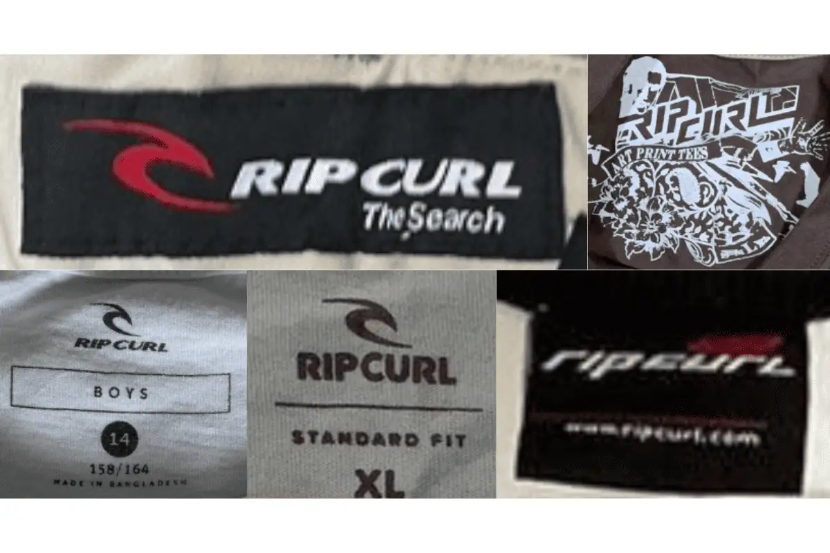
How to tell if Rip Curl is vintage from the tags
Rip Curl has a rich history in the surfing world, and its tags have evolved significantly over the decades. Identifying vintage Rip Curl clothing can be done by examining the tags, which reflect changes in branding, materials, and production locations. Here’s a guide to help you determine the era of your Rip Curl garments based on their tags.
Struggling with vintage tags or labels? Upload a picture on our vintage tag identification page, and we’ll help you out!
1980s vintage Rip Curl tags
- Tags often feature bright colors and bold designs reflective of the era’s aesthetic.
- Includes descriptors like “Made by Surfers for Surfers.”
- Commonly rectangular with vibrant, multi-colored logos and text.
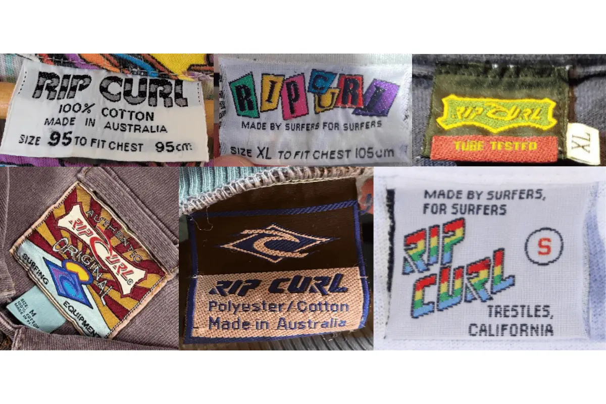
1980s Rip Curl tags
1990s vintage Rip Curl tags
- Tags typically use more subdued colors compared to the 1980s.
- Logos are still prominent but the design is slightly more streamlined.
- Frequently includes slogans like “A Product of the Search.”
- Size indicators often appear on the same tag or on an attached smaller tag.
1990s Rip Curl tags
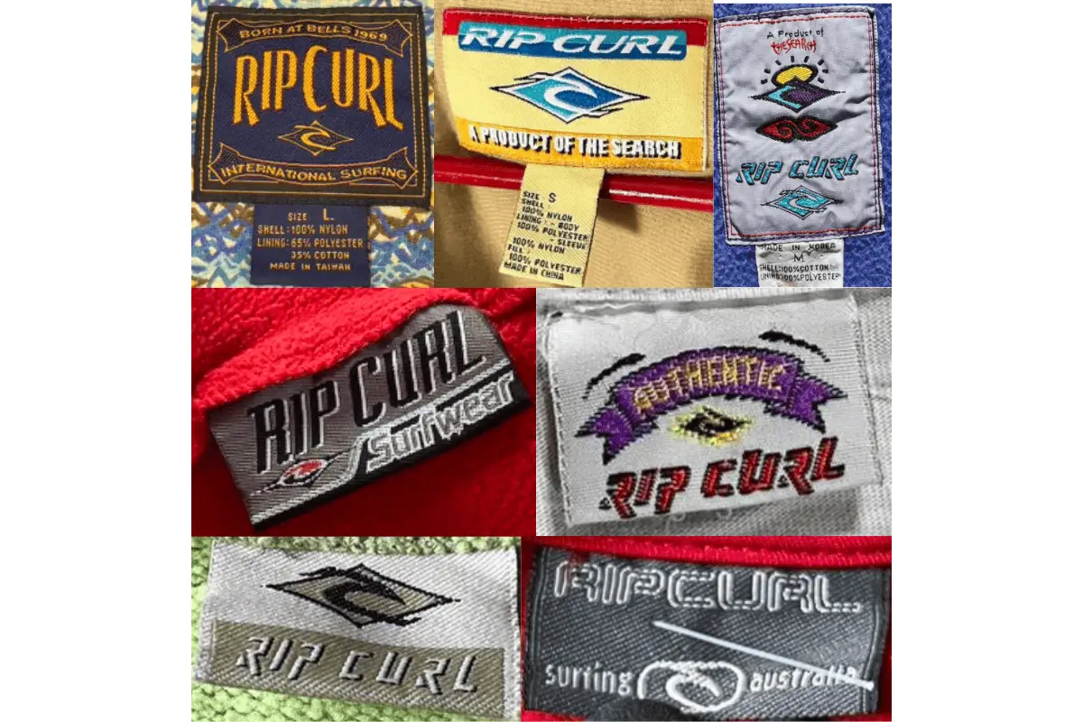
2000s vintage Rip Curl tags
- Introduction of more modern fonts and darker colors.
- Loop tags become more common during this period.
- Tags feature both bold lettering and additional brand slogans or descriptors.
- Often includes production details and material compositions.
2000s Rip Curl tags
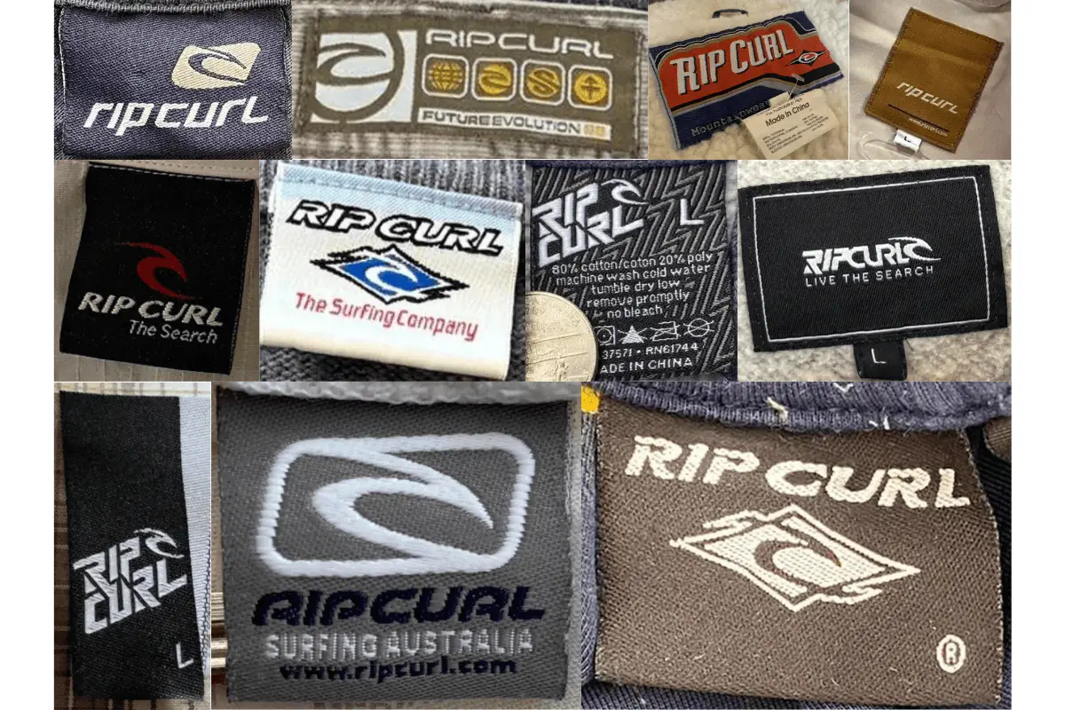
2010s vintage Rip Curl tags
- Modern, sleek design with minimalist logos.
- Variety in tag materials and colors, reflecting a more contemporary branding approach.
- Includes website URLs and more detailed production information.
- Maintains the classic logo while incorporating new branding elements.
2010s Rip Curl tags

One Comment