s.Oliver, officially known as s.Oliver Bernd Freier GmbH & Co. KG, is a testament to how a small boutique can grow into a global fashion powerhouse. Founded in 1969 by Bernd Freier, the brand began as a modest 25-square-meter shop in Würzburg, Germany, named “Sir Oliver” in a nod to the popular Charles Dickens character, Oliver Twist. Freier’s decision to include “Sir” in the name was inspired by the London fashion scene, aiming to evoke an air of international sophistication. Despite its humble beginnings, s.Oliver quickly gained a reputation for its high-quality garments and a keen sense of style, setting the stage for its rapid expansion.
Throughout the 1970s and 1980s, s.Oliver’s growth was fueled by Freier’s strategic decisions, such as bypassing unreliable suppliers and sourcing materials directly from manufacturers in India. This not only ensured the timely delivery of products but also allowed the brand to introduce successful lines like the “Madras Check shirts,” which became a hit in Germany. However, a legal challenge from a perfume brand led to the name being shortened to s.Oliver in 1978, marking a new chapter in the brand’s history. This period also saw s.Oliver expanding its portfolio by acquiring other fashion brands and entering new markets across Europe, further solidifying its status as a leading fashion company.
By the late 1990s and early 2000s, s.Oliver had transformed into a multi-faceted fashion empire, with its products being sold in thousands of stores across Europe. The company’s commitment to innovation was evident in its expansion into new product categories and the opening of its modern headquarters in Rottendorf in 2008. Today, s.Oliver is a household name in over 30 countries, known for its wide range of fashion and lifestyle products. From a small boutique to one of Europe’s top 20 fashion companies, s.Oliver’s journey reflects its enduring appeal and the visionary leadership of its founder, Bernd Freier.
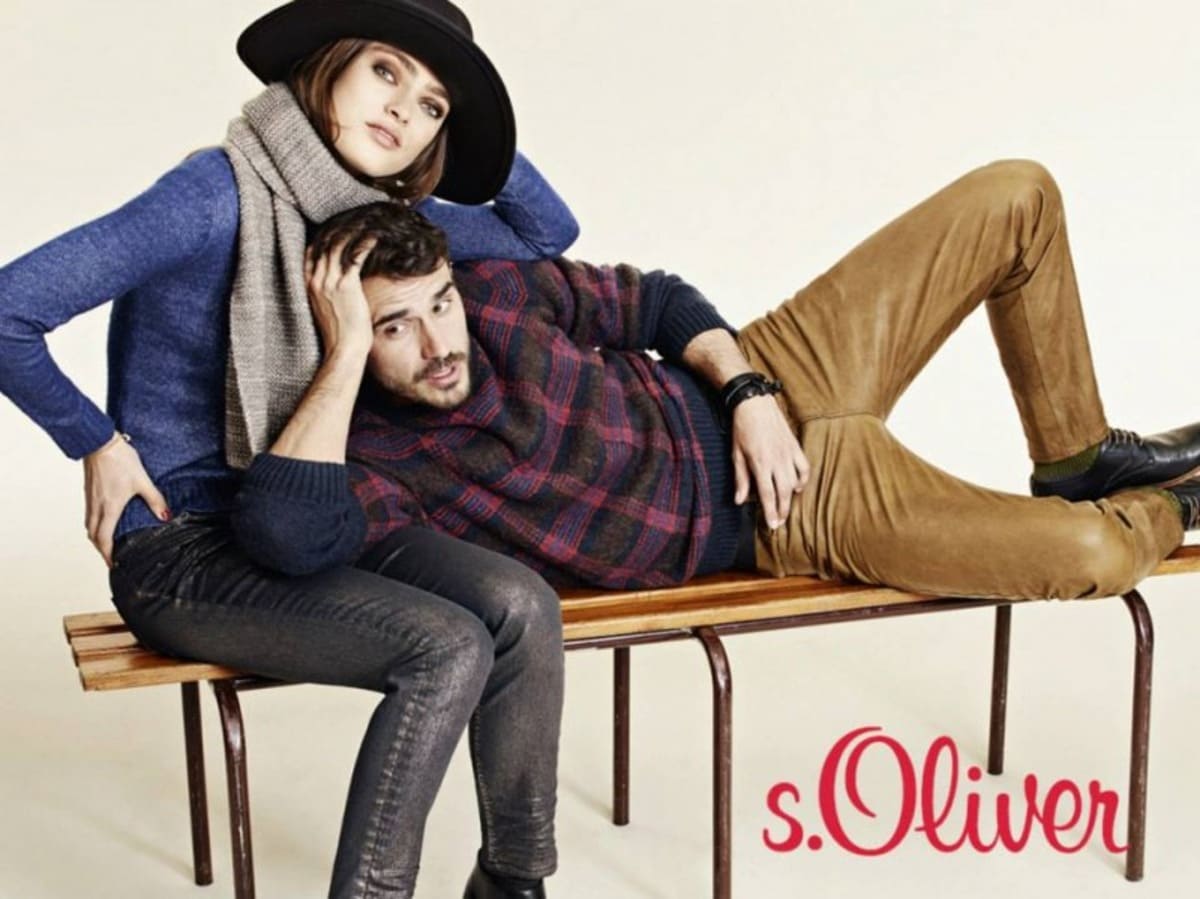
s.Oliver ‘Looks that tell a story’ Commercial
How to tell if s.Oliver is vintage from the logo
s.Oliver, a popular German fashion brand, has seen a variety of logo designs since its inception, reflecting the brand’s evolution in style and identity. The logo’s typography and color schemes have shifted subtly over the decades, making it possible to identify the era of a specific garment by the logo it bears. Here is a guide to understanding these changes based on the logos you provided.
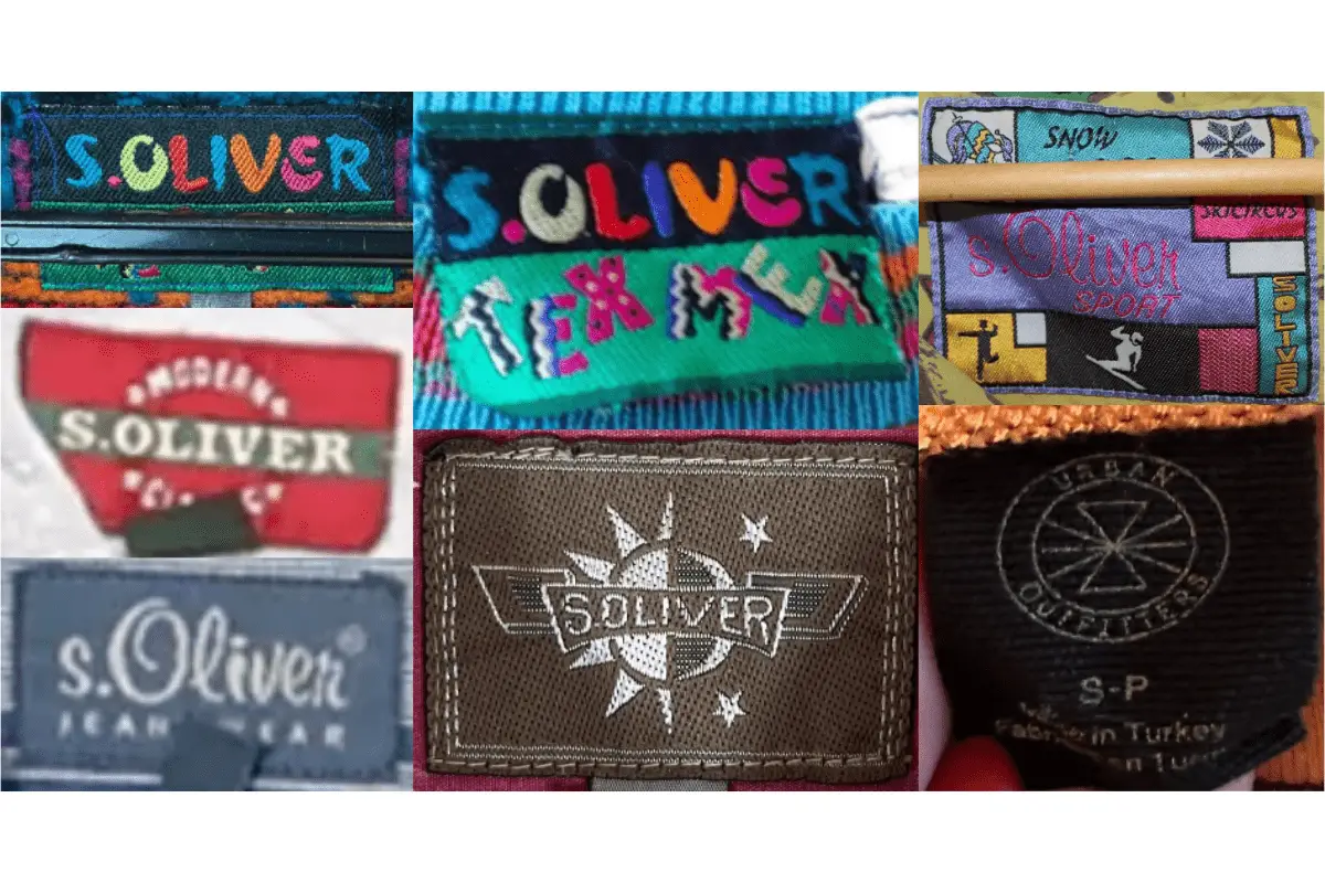
1990s s.Oliver logo
- The 1990s logo of s.Oliver features a playful, multicolored design.
- The letters are slightly distorted, giving a dynamic and vibrant feel that resonates with the youthful fashion trends of that era.
- This logo is commonly seen in embroidery on tags and patches, adding a distinctive 90s flair to the garments.
1990s s.Oliver logo
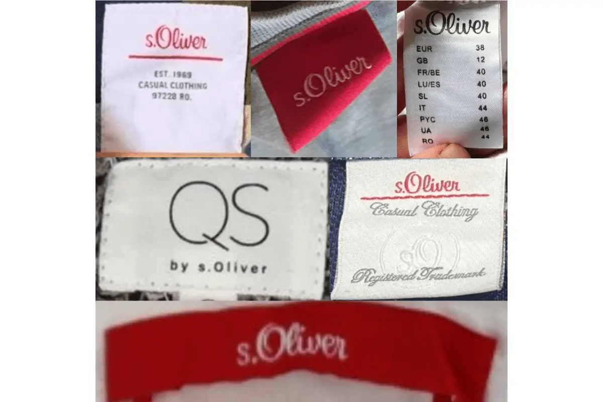
2000s to 2021 s.Oliver logo
- The logo from the 2000s to 2021 returned to a more classic, single-color design.
- The font is more uniform, with clean lines and a bold red color, reflecting a more refined and mature brand image.
- This logo was widely used across various product lines, making it one of the most recognizable iterations of the brand’s identity.
2000s to 2021 s.Oliver logo
2021 to now s.Oliver logo
- The current logo introduced in 2021 is a slight modification of the previous design.
- The font remains largely the same, but there is a subtle shift in the curvature of the letters, giving it a more modern and elegant appearance.
- The color is also a slightly deeper red, signaling a shift towards a more premium positioning in the market.
2021 to now s.Oliver logo
How to tell if s.Oliver is vintage from the tags
The evolution of s.Oliver tags over the decades reflects the brand’s journey from its humble beginnings to a global fashion name. Starting with simpler designs, the tags have gradually embraced more modern aesthetics while maintaining the recognizable s.Oliver logo. Here’s a guide to help you identify the era of s.Oliver garments based on their tags.
Need help with vintage tags or labels? Submit a picture on our vintage tag identification page, and we’ll assist you!
1990s vintage s.Oliver tags
- The tags from the 1990s often feature vibrant colors and playful designs, reflecting the fashion trends of the decade.
- Bright, multi-colored text is a common element, sometimes with additional decorative elements like patterns or logos.
- Some tags also feature denim-inspired designs, emphasizing the casual and youthful vibe of the era.
1990s s.Oliver tags
2000s vintage s.Oliver tags
- Tags from the 2000s generally have a more refined and polished look compared to the 1990s.
- Branding is prominent, often featuring a mix of textures and materials like embroidered logos on fabric tags.
- Many tags during this period used a consistent color scheme with simple yet bold typography, emphasizing the brand’s established identity.

2000s s.Oliver tags
2010s vintage s.Oliver tags
- In the 2010s, s.Oliver tags adopted a more minimalist and modern approach, with cleaner designs and straightforward layouts.
- Tags often include detailed product information, such as size and care instructions, presented in a clear and legible format.
- Some tags also emphasize the brand’s heritage with references to its founding year or classic slogans.
2010s s.Oliver tags


[url=https://canadapharmacy-usa.net/drug/fulvicin/]buy griseofulvin[/url]
buy bactrim