Ann Summers is a British retail giant, renowned for its provocative lingerie and adult toys, with a history dating back over five decades. Founded in 1970 by Michael Caborn-Waterfield, the brand was named after his secretary, Annice Summers, though she soon parted ways with the company. Over the years, Ann Summers has evolved from a small store in Marble Arch, London, to a high-street powerhouse with 80 locations across the UK, Ireland, and the Channel Islands. The brand has successfully blended eroticism with mainstream retail, offering products that cater to a wide audience while maintaining a bold, cheeky identity.
A significant turning point for Ann Summers came in 1971 when brothers Ralph and David Gold acquired the company. They transformed it from a traditional sex shop into a more sophisticated lingerie and sex toy retailer. The appointment of David Gold’s daughter, Jacqueline Gold, as Executive Chair in the 1980s sparked further innovation with the introduction of the Ann Summers Party Plan. This concept allowed women to purchase products in the privacy of their homes, revolutionizing the way sex toys and lingerie were marketed and sold, and propelling the brand to greater success.
Throughout its history, Ann Summers has faced its fair share of controversy and legal challenges, often due to the adult nature of its products. From opposition to advertising campaigns to battles over intellectual property, the company has remained defiant and continues to push boundaries. Despite these hurdles, Ann Summers has become an iconic brand, synonymous with boldness, empowerment, and fun. Today, it remains a staple in the lingerie and adult retail market, known for its daring designs and innovative approach to both products and marketing.
Y2K Ann Summers TV Commercial
How to tell if Ann Summers is vintage from the logo
Ann Summers, a brand that has been around for decades, has maintained a unique and recognizable logo over the years. The logo has evolved slightly to reflect the changing times, but it has always retained its distinctive aesthetic. In this section, we will look at the current version of the Ann Summers logo and explain how to determine its era from specific design features.
1970s to now Ann Summers logo
- The logo prominently features the text “Ann Summers” in a modern, sans-serif font.
- A stylized apple with a bite taken out of it and a heart shape embedded within the apple replaces the letter “A” in “Ann”.
- The color scheme uses a combination of dark pink and red tones, which have become a consistent theme across Ann Summers branding since the 1970s.
- This logo is still in use today with slight refinements, making it difficult to date exact products by logo alone. However, newer items often have crisper, more refined fonts and colors compared to earlier versions.

1970s to now Ann Summers logo
How to tell if Ann Summers is vintage from the tags
The evolution of Ann Summers’ branding over the years is evident through the various tag designs found on their clothing. Ann Summers tags have transitioned from simple and bold logos in the earlier years to more modern, detailed designs in recent decades. Here is a breakdown of how to identify vintage Ann Summers clothing through its tags, based on the images provided.
Need help with vintage tags or labels? Submit a picture on our vintage tag identification page, and we’ll assist you!
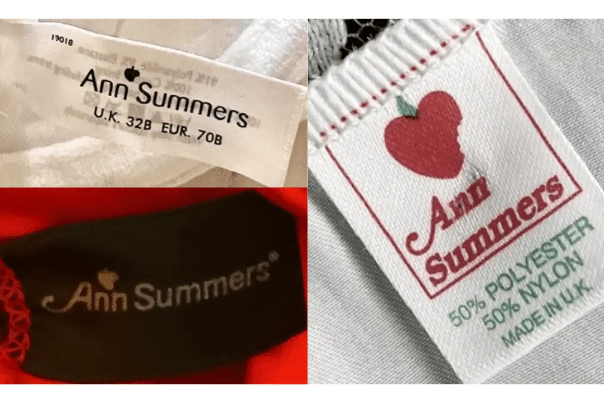
1990s vintage Ann Summers tags
- Features the signature Ann Summers logo with a small heart icon above the letter “A.
- Simple, clean design with black text on white or dark backgrounds.
- Some tags are minimalistic, showing only the size information and a clean typeface.
- Material and country of origin information (e.g., “Made in the UK”) can be present.

1990s Ann Summer tags
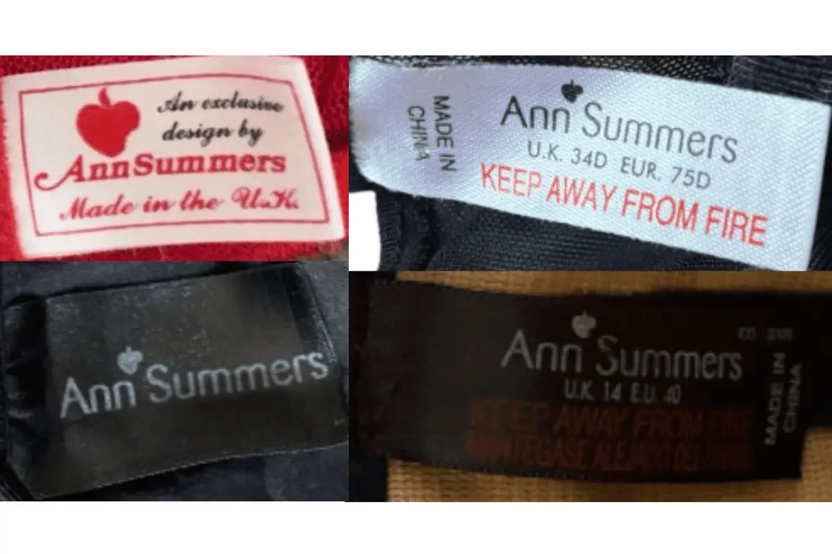
2000s vintage Ann Summers tags
- The heart icon above the “A” in the logo is retained, showing continuity with earlier tags.
- Tags include more detailed information such as material composition (e.g., “50% Polyester, 50% Nylon”) and care instructions.
- Common use of bold, serif fonts, often with red and black coloring.
- Some tags may feature “Made in China” indicating a shift in manufacturing locations.

2000s Ann Summer tags
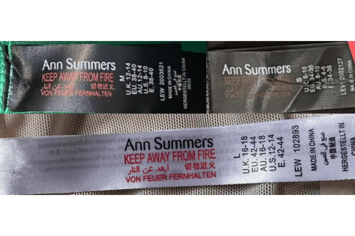
2010s vintage Ann Summers tags
- Modern designs continue with the heart symbol, but the font becomes sleeker and more contemporary.
- Prominent “KEEP AWAY FROM FIRE” warnings in red, often in multiple languages including Arabic, Chinese, and German.
- Country of origin is clearly indicated, often with “Made in China” appearing on the tags.
- Some tags come with additional detailed sizing information for multiple regions such as UK, EU, AU, and US sizes.

2010s Ann Summer tags


