
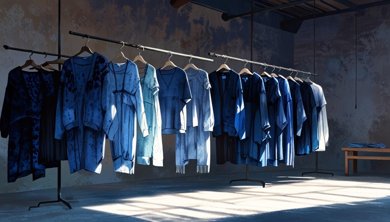
Billabong International Limited, an iconic Australian surfwear brand, has been synonymous with beach culture and adventurous lifestyles since its inception in 1973 by Gordon and Rena Merchant. Specializing in surfing apparel and accessories, Billabong has grown from its humble beginnings to become a global powerhouse in the lifestyle and extreme sports industries. With a name rooted in the Wiradjuri word “bilaba?,” meaning “a creek that runs only during the rainy season,” Billabong’s journey is a tale of resilience, innovation, and adaptation to the ever-changing tides of fashion and business.
The company’s early success was marked by its distinctive wave logo and bold gothic-inspired text, which encapsulated the raw and unrefined spirit of the surf culture of the 1970s. As Billabong expanded its product lines to include not just clothing but also accessories such as watches and backpacks, and diversified into skateboard and snowboard products, the brand’s visual identity evolved. By understanding the transformations in Billabong’s logo and tag designs over the decades, one can gain insight into the era and authenticity of vintage Billabong items.
Billabong’s branding journey mirrors its corporate evolution. The initial logo from 1973 to 2008, featuring a bold, gothic-inspired font and a distinctive wave pattern, represents the brand’s deep roots in the surf culture. This was a time when Billabong was establishing its identity and making its mark on the Australian and global surf scenes. The modernization of the logo between 2008 and 2018, with cleaner, more geometric designs and streamlined sans-serif typefaces, coincided with Billabong’s ambitious global expansion and modernization efforts. The latest iteration, from 2018 to the present, showcases a minimalistic and refined design, reflecting Billabong’s contemporary branding strategy aimed at a broader, more diverse audience.
Beyond logos, the tags on Billabong clothing offer another layer of historical context. From the simple, bold designs of the 1980s to the colorful, detailed tags of the 1990s, and the intricate, information-rich tags of the 2000s and 2010s, each era’s tags tell a story of the brand’s growth and changing market strategies. For vintage enthusiasts and collectors, these details are invaluable for authenticating and dating Billabong garments.
Understanding the evolution of Billabong’s logos and tags is not just about identifying vintage pieces; it’s about appreciating the brand’s rich history and its journey through the highs and lows of the fashion and surf industries. Whether you’re a collector, a reseller, or simply a fan of the brand, recognizing these elements can enhance your appreciation of Billabong’s legacy and its enduring appeal in the world of surf and lifestyle apparel.
Y2K Billabong K5 TV Advert
https://vintageclothingguides.com/humix/video/hjrXsUk6XYu
How to tell if Billabong is vintage from the logo
Billabong has undergone several logo transformations over the years, reflecting its evolution as a brand. The changes in their logo design can help determine the vintage of a Billabong item. Below is a guide to identifying the era of your Billabong product based on its logo.
1973 to 2008 Billabong logo
- The original Billabong logo featured a distinctive wave pattern.
- The text “BILLABONG” was displayed in a bold, gothic-inspired font.
- This logo represents the early surf culture roots of the brand.
1973 to 2008 Billabong logo
2008 to 2018 Billabong logo
- The logo was modernized with a cleaner, more geometric design.
- The waves were more stylized, and the font was updated to a more streamlined, sans-serif typeface.
- This period marked Billabong’s expansion and modernization in the global market.
2008 to 2018 Billabong logo
2018 to now Billabong logo
- The current logo features a refined and minimalistic design.
- The waves are simpler, and the text is in a sleek, modern font.
- This logo represents Billabong’s contemporary branding strategy aimed at a broad audience.
2018 to now Billabong logo
How to tell if Billabong is vintage from the tags
Billabong, a renowned surfwear and lifestyle brand, has seen significant changes in its tag designs over the decades. Each era reflects the evolving branding and design elements that signify the period in which the garment was made. Understanding these nuances can help in identifying vintage Billabong clothing.
Struggling to identify your vintage tags or labels? Upload a picture on our vintage tag identification page, and we’ll help you out!
1980s vintage Billabong tags
- Features bold, curved lettering with the iconic wave logo.
- Tags often state “Made in USA” or other specific locations indicating manufacturing origin.
- Simple color schemes, primarily black and white, with clear, legible fonts.

1980s Billabong tags
1990s vintage Billabong tags
- Introduction of more colorful designs with a variety of background and font colors.
- Tags prominently feature the wave logo and often include size indicators.
- Some tags include additional text such as “Since 1973” to highlight the brand’s heritage.

1990s Billabong tags
2000s vintage Billabong tags
- Modernized look with a mix of bold and minimalist designs.
- Tags may include technical details about the garment, such as fabric composition.
- Increased use of loop tags and more intricate designs, including additional logos and symbols.

2000s Billabong tags
2010s vintage Billabong tags
- Variety of tag styles reflecting different product lines within the brand.
- Use of both traditional and modern fonts, often with additional graphical elements.
- Tags might include QR codes or other digital elements for authenticity verification.

2010s Billabong tags


Great post! We are linking to this great post on our site. Keep up the good writing.
The next time I read a blog, Hopefully it does not fail me just as much as this one. I mean, Yes, it was my choice to read through, but I genuinely believed you would have something interesting to talk about. All I hear is a bunch of moaning about something that you could possibly fix if you were not too busy seeking attention.
I was able to find good information from your blog posts.
??? ?????????????? ??????? ???????? ????????????? ????????, ??????? ????? ??? ???????! ?? ??????? ?????????? ?????, ??????? ??????? ???? ????? ???? ? ??????. ??????? ????? ????? ? ????????? ???????? ?????????????? ? ???????? ??? ???? ???????????? ??? ??????????.
??????????? ????? – https://vivod-iz-zapoya-1.ru/
We absolutely love your blog and find the majority of your post’s to be exactly what I’m looking for. Do you offer guest writers to write content to suit your needs? I wouldn’t mind composing a post or elaborating on a number of the subjects you write about here. Again, awesome weblog!