Hawes & Curtis, founded in 1913 on London’s renowned Jermyn Street, stands as one of Britain’s most respected heritage brands, renowned for its tailored luxury shirts and formalwear. With a history of outfitting royalty and notable figures, the brand quickly became a standard-bearer for classic British style. The partnership of Ralph Hawes and Freddie Curtis brought together a blend of craftsmanship and innovation that has left a lasting impact on men’s fashion. From early on, Hawes & Curtis developed an association with high society, and their focus on premium materials, meticulous tailoring, and timeless designs cemented the brand’s reputation across the UK and beyond.
Over the decades, the brand became especially known for its royal connections. Beginning with a royal warrant from the Prince of Wales in 1922, followed by successive warrants from King George VI and the Duke of Edinburgh, Hawes & Curtis earned a prestigious clientele that included members of the British aristocracy. Their creations, including the distinctive backless evening waistcoat popularized by the Duke of Windsor, captured the era’s demand for elegance with ease, a style that resonated well into the mid-20th century. Even Hollywood icons like Fred Astaire were drawn to the brand’s sophisticated appeal. By the 1930s, Hawes & Curtis was synonymous with refined menswear, influencing formalwear norms both in the UK and internationally.
Today, Hawes & Curtis continues to blend its heritage with contemporary styling, operating stores across the UK and in international markets like Germany and the UAE. Despite changes in ownership and manufacturing practices, the brand remains rooted in its legacy of fine tailoring and British sophistication. The flagship store on Jermyn Street serves as a nod to its origins, while its modern collections appeal to new generations seeking classic style with a touch of tradition.
Hawes Curtis Escape the City Campaign
How to tell if Hawes & Curtis is vintage from the logo
Hawes & Curtis is a renowned British heritage brand, founded in 1913, known for its luxury shirts, formalwear, and accessories. Over the years, the logo has evolved to reflect changing times while maintaining its classic and regal aesthetic. By examining the design of the logo, particularly the lions and shield motif, along with the text style, you can determine the era from which a piece originates. Below are the key changes in the Hawes & Curtis logo across different periods based on the images provided.
1990s Hawes & Curtis logo
- The 1990s logo retains a very classic design with two lions flanking a heraldic shield, a symbol of tradition and heritage.
- The text is serifed and bold, with the ampersand stylized in a more traditional font.
- Below the brand name, “Jermyn Street” is clearly indicated, emphasizing the brand’s prestigious location in London.
- The logo features more intricate detailing on the lions and shield compared to later designs, giving it a refined, vintage appeal.
1990s Hawes & Curtis logo
2000s to now Hawes & Curtis logo
- The modern Hawes & Curtis logo is sleeker, with slightly simplified lines, though the lions and shield motif remains intact.
- The font is more modern and elegant, using a thinner, sans-serif style for the brand name and location details.
- There is a noticeable space between the ampersand, and the text appears less bold compared to the 1990s version, signifying a shift towards minimalism and modern branding aesthetics.
- The overall structure remains the same, keeping its roots in heritage but adopting a more contemporary presentation.
2000s to now Hawes & Curtis logo
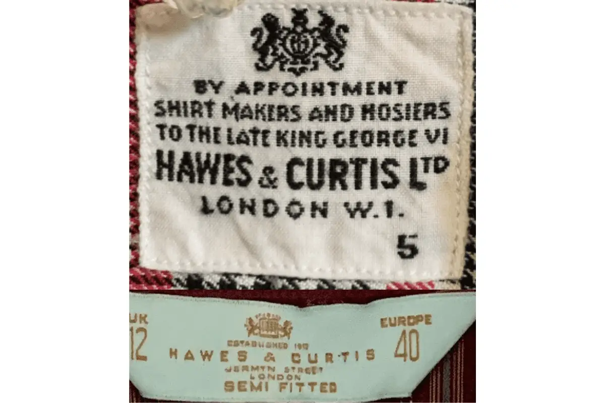
How to tell if Hawes & Curtis is vintage from the tags
Hawes & Curtis, a prestigious Jermyn Street brand, has evolved its tags over the decades to reflect its heritage while also embracing modern elements. The brand’s tags not only highlight its long history but also mark specific design choices that can help identify when a garment was produced. Here’s a breakdown of how to identify vintage Hawes & Curtis items from the 1990s, 2000s, and 2010s based on their tags.
Having difficulty identifying vintage tags or labels? Submit a picture on our vintage tag identification page, and we’ll assist you!
1990s vintage Hawes & Curtis tags
- Typically features the royal appointment “By Appointment Shirt Makers and Hosiers to the Late King George VI.”
- Bold serif font in black, reflecting a formal and traditional design.
- Includes the full “HAWES & CURTIS LTD” name and “London W.1.” with size information displayed separately.
- Emphasizes the brand’s establishment and history with traditional font and simple layout.
1990s Hawes & Curtis tags
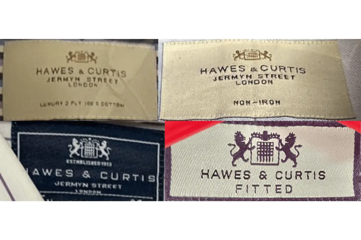
2000s vintage Hawes & Curtis tags
- Tags start to evolve with more modern fonts but retain a classic feel.
- The background colors vary, but the layout still prominently features the brand’s heritage, like “Established 1913” or “Jermyn Street, London.”
- Some tags showcase the lion-and-unicorn emblem, reinforcing the royal connection.
- Size indicators are now more prominently displayed, often included in a contrasting font or box.
2000s Hawes & Curtis tags
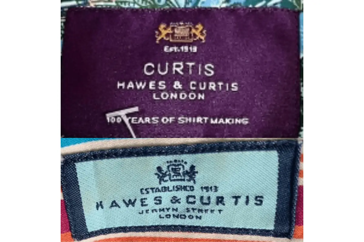
2010s vintage Hawes & Curtis tags
- Bright, bold colors like deep purples and blues are used more frequently.
- Text like “100 Years of Shirt Making” appears, emphasizing the centenary milestone of the brand in 2013.
- The lion emblem remains but is sometimes minimized or modernized in design.
- Text layout becomes cleaner, with sharp, modern fonts while still reflecting a sense of tradition.
2010s Hawes & Curtis tags