Founded in 1980 by Jack Hopkins and Tom Moore in Seal Beach, California, PacSun has grown from a modest surf shop into a major force in American retail. Initially catering to the West Coast surf scene, PacSun quickly made a name for itself by offering a curated selection of surfwear from established brands. Over the years, the company expanded its reach beyond surf culture to embrace skate and streetwear, appealing to a broader youth market across the United States. By the 1990s, PacSun had solidified its position as a go-to retailer for teens and young adults, offering a wide range of apparel and accessories that captured the laid-back, coastal lifestyle of California.
The early 2000s marked a period of rapid expansion for PacSun. The company went public in 1993 and at its peak operated over 1,300 stores nationwide. During this time, PacSun broadened its product offerings to include a diverse mix of brands and styles, reflecting the evolving tastes of its youthful customer base. Despite its success, the brand faced challenges in the late 2000s, including the closure of its d.e.m.o. stores and financial struggles that eventually led to a Chapter 11 bankruptcy filing in 2016. However, through a strategic restructuring and continued focus on youth culture, PacSun emerged from bankruptcy as a privately owned company, now backed by Golden Gate Capital.
Today, PacSun remains a relevant player in the retail industry, particularly among Gen Z shoppers. The brand has adapted to changing fashion trends by embracing streetwear, collaborating with influencers like Kendall and Kylie Jenner, and even launching a gender-neutral collection. With a renewed focus on inclusivity and modern fashion, PacSun continues to evolve while staying true to its roots in the California lifestyle. Despite the ups and downs over the decades, PacSun’s ability to adapt has kept it a staple in American malls and online shopping carts alike.
PacSun Adventure Commercial
How to tell if Pacsun is vintage from the logo
Pacsun, originally known as Pacific Sunwear, has evolved its brand identity significantly over the years, reflecting changes in fashion trends and target demographics. The brand’s logos have gone through several transformations, making them a useful reference for identifying the era of a Pacsun product. Below is a guide to understanding Pacsun’s logos based on the eras they represent.
1983 to 2009 Pacsun logo
- The first logo is characterized by a bold, somewhat playful font with unique stylized elements, such as a small sunburst effect on the letter “S.”
- This logo embodies the early beach and surf culture that Pacsun originally catered to, with a relaxed and fun aesthetic.
- The yellow color scheme was dominant, reinforcing the sunny, Californian vibe of the brand.
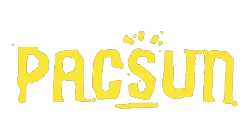
1983 to 2009 Pacsun logo
2009 to 2014 Pacsun logo
- The second logo marks a significant shift, adopting a more minimalist and modern approach.
- The font is sleeker and more streamlined, with a cleaner design that reflects Pacsun’s move towards a broader, more fashion-forward audience.
- Black and white became the primary color scheme, signaling a departure from the playful and surf-oriented past.

2009 to 2014 Pacsun logo
2014 to now Pacsun logo
- The current logo continues the minimalist trend but refines it further with an even more contemporary sans-serif font.
- The design is very simple, with evenly spaced letters, highlighting Pacsun’s alignment with modern streetwear and youth culture.
- This logo reflects Pacsun’s focus on a clean, urban aesthetic, appealing to a generation drawn to simplicity and sophistication in fashion.

2014 to now Pacsun logo
How to tell if Pacsun is vintage from the tags
Pacsun, originally known as Pacific Sunwear, has undergone several transformations over the decades, reflected in the evolution of its clothing tags. From its roots in California surf culture to becoming a major player in the streetwear and lifestyle market, Pacsun’s tags offer clues to the era of each garment. Below, we explore the characteristics of Pacsun tags from the 2000s and 2010s.
Can’t identify those vintage tags or labels? Upload a picture on our vintage tag identification page, and we’ll help you out!
2000s vintage Pacsun tags
- Typically feature a minimalistic design with bold “PACSUN” lettering.
- Often accompanied by additional branding elements such as “LOS ANGELES” or “CALIFORNIA” to emphasize its roots.
- Tags are commonly found in neutral tones, such as black or white, with simple fonts.
- Some tags may include the establishment year “1980,” highlighting the brand’s history.
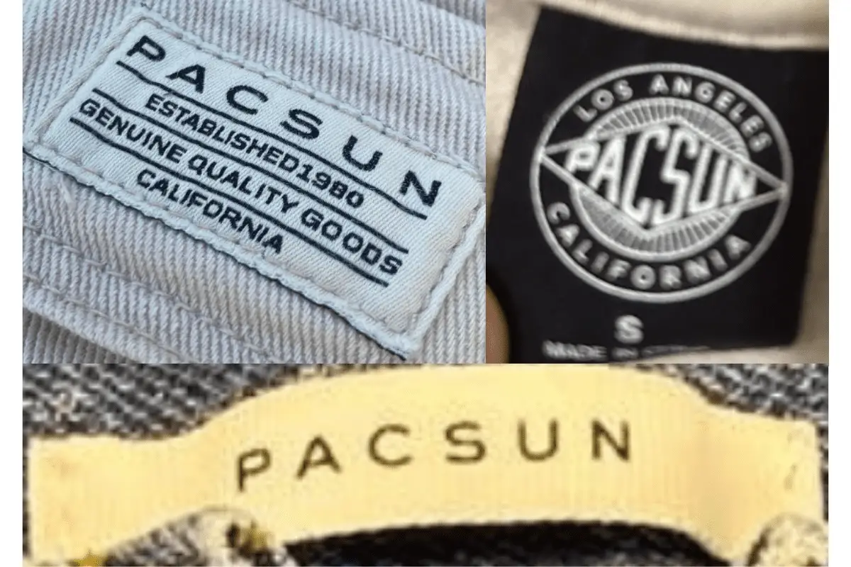
2000s Pacsun tags
2010s vintage Pacsun tags
- Tags during this era maintained the minimalist aesthetic, with a focus on clean lines and bold lettering.
- The inclusion of “LOS ANGELES” in the design became more prevalent, often displayed prominently below the “PACSUN” name.
- Tags from this period might also include subtle design elements, such as circles or other geometric shapes, giving a modern look.
- Materials and colors vary more widely compared to previous decades, reflecting a shift towards a broader, more diverse fashion market.
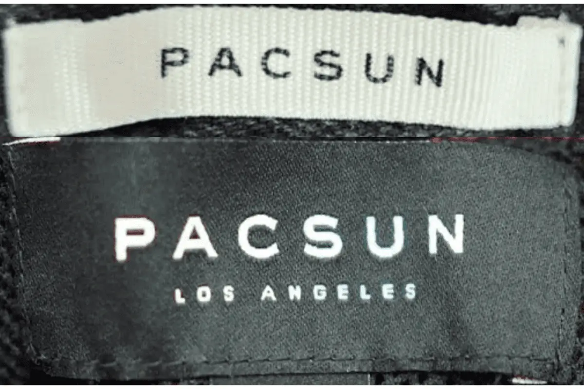
2010s Pacsun tags


New cryptocurrency releases
Thank you for your sharing. I am worried that I lack creative ideas. It is your article that makes me full of hope. Thank you. But, I have a question, can you help me?