Talbots, a name synonymous with classic American style, has a rich history that traces back to the post-war era of the late 1940s. Founded by Rudolf and Nancy Talbot in the charming town of Hingham, Massachusetts, the brand started as a small venture with a simple, yet ambitious vision: to offer women timeless fashion marked by quality and elegance. What began as a modest catalog business quickly grew into a beloved staple for women across the United States, thanks to the Talbots’ keen sense of style and their innovative approach to customer engagement. Their iconic red door, which graced the entrance of their first store, became a symbol of the warm, inviting experience Talbots promised to every customer who walked through it.
Throughout its evolution, Talbots has maintained its commitment to providing women with clothing that balances tradition and modernity, making it a favorite among those who appreciate refined, yet accessible fashion. The brand’s journey from a quaint New England store to a nationwide presence reflects its adaptability and enduring appeal. Over the decades, Talbots expanded its reach, both through physical stores and a growing catalog business, which allowed women from all corners of the country to access their thoughtfully curated collections. This expansion was driven by a deep understanding of their customer base, catering to women who sought out clothing that offered both sophistication and practicality.
In the 1980s, Talbots experienced significant growth under the ownership of JUSCO Co., Ltd., and later as a publicly traded company. Despite these changes, the brand has remained true to its roots, continuing to offer clothing that embodies the essence of New England charm and elegance. Today, Talbots stands as a testament to the enduring power of classic fashion. With nearly 500 stores across the United States, the brand remains a go-to for women who value quality, timeless style, and a touch of tradition in their wardrobes.
Y2K Talbots TV Commercial
How to tell if Talbots is vintage from the logo
Talbots has been a prominent brand in women’s fashion for decades, known for its classic American style. The evolution of the Talbots logo reflects the brand’s journey from a traditional aesthetic to a more modern and streamlined identity. By examining the changes in the Talbots logo over the years, you can identify the era from which a particular piece of clothing or accessory originates, making it easier to determine if your Talbots item is vintage.
1960s to 1990s Talbots logo
- The logo from this era features a script font with a distinctive flourish, emphasizing a more personalized and boutique feel.
- The elongated and flowing letters are characteristic of mid-20th-century design, which favored elegance and sophistication.
- This logo was often used on store signage, tags, and marketing materials during Talbots’ growth phase in the American market.

1960s to 1990s Talbots logo
1980s to now Talbots logo
- In this period, Talbots adopted a more structured and oval-shaped logo, featuring a bold, uppercase serif font.
- The color scheme typically involves a rich yellow and red, giving the brand a more classic, timeless appeal.
- This logo marked Talbots’ expansion into a wider market, aiming to be recognized as a premium retailer of women’s clothing.

1980s to now Talbots logo
2000s to now Talbots logo
- The current logo features a minimalist, sans-serif font, reflecting a modern and clean design aesthetic.
- The emphasis on simplicity and clarity aligns with contemporary branding trends, focusing on versatility and broad appeal.
- This logo is used across all of Talbots’ branding, from their website to physical store displays, representing the brand’s current identity.

2000s to now Talbots logo
How to tell if Talbots is vintage from the tags
Talbots has a rich history dating back to the 1940s, and its evolution in branding and garment labels offers a fascinating journey through fashion history. The labels have changed in design, typography, and materials, reflecting broader trends in the fashion industry and the brand’s own development. Below, we explore how to identify vintage Talbots clothing based on the tags from different eras.
Need help with vintage tags or labels? Submit a picture on our vintage tag identification page, and we’ll assist you!
1960s vintage Talbots tags
- Simple, elegant design reflecting the brand’s early years.
- Tags typically feature minimalist text, often just the brand name “Talbots.
- Made with a straightforward black-and-white color scheme.
- Small tags, often sewn into the back of the neck or waistline.
- Sometimes includes additional details like “in Hingham, Massachusetts,” indicating the brand’s roots.
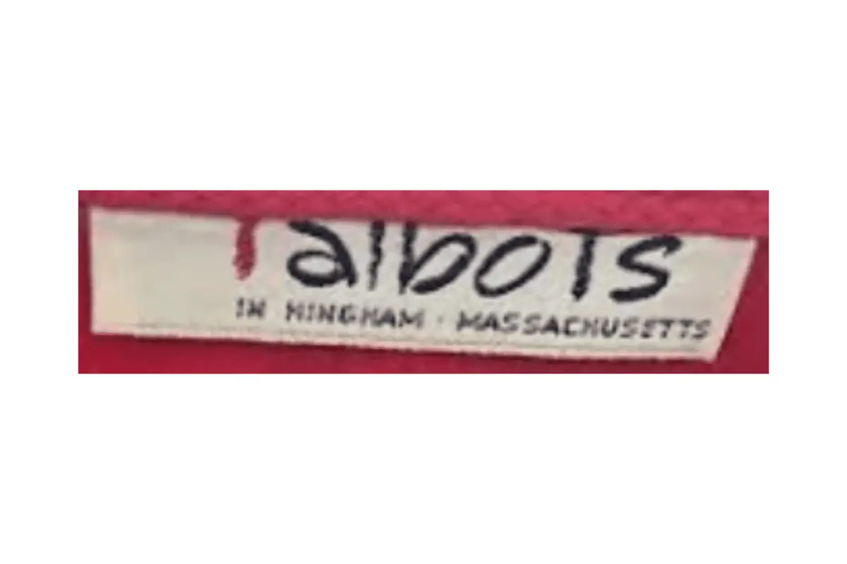
1960s Talbots tags
1970s vintage Talbots tags
- Introduction of a more stylized logo with a red underline beneath the “T” in “Talbots.
- Some tags include “Petites” or other sizing information below the main logo.
- Use of a simple serif font, often in black or dark colors.
- Tags are still fairly small, usually with a clean, uncluttered design.
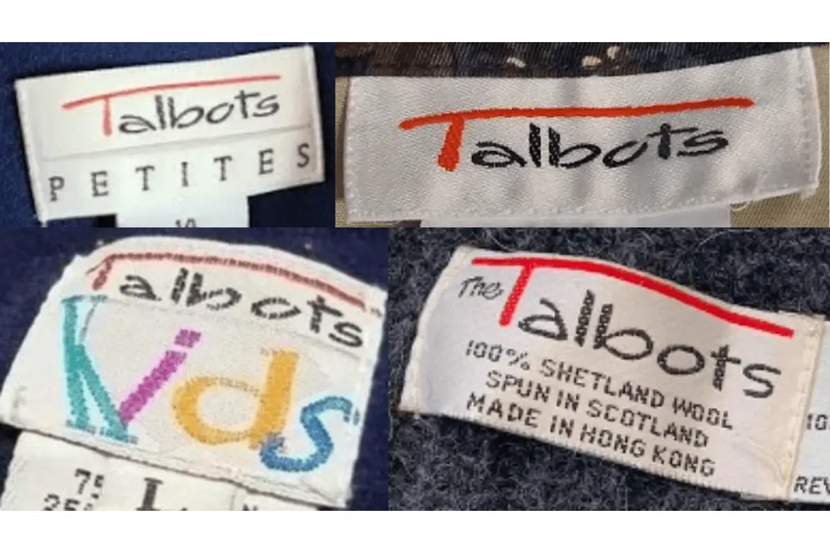
1970s Talbots tags
1980s vintage Talbots tags
- Refinement of the logo, with a bolder, more modern font.
- Introduction of oval-shaped tags with a beige background and red underline, giving a distinctive look.
- Tags often include additional text like “Petites” or collaboration details like “Albert Nipon Petites.
- Increased use of color and more complex tag designs, reflecting the fashion trends of the era.
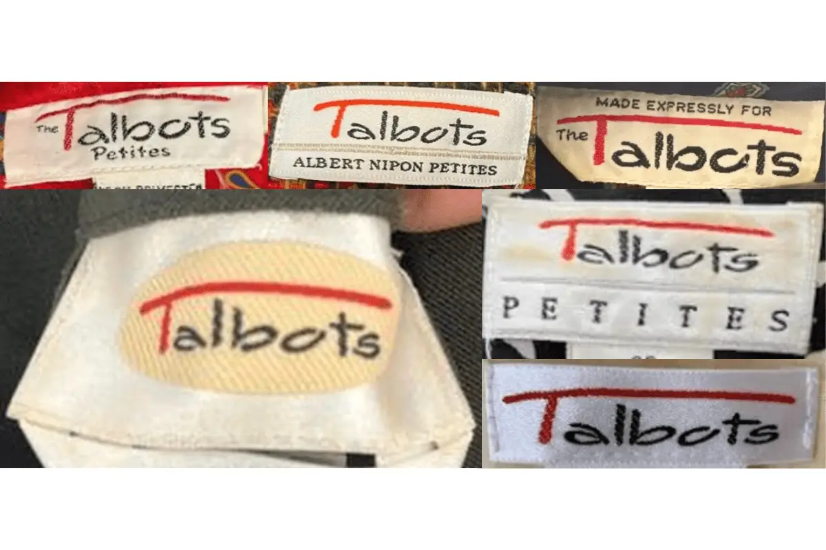
1980s Talbots tags
1990s vintage Talbots tags
- Continued use of the iconic red underline beneath the “T” in “Talbots.
- Tags start to incorporate more detailed information, such as fabric content and country of origin.
- Introduction of the “Collection” line, with tags featuring more sophisticated typography and a higher-end look.
- More diversity in tag shapes and sizes, with some tags adopting a black-and-white color scheme.
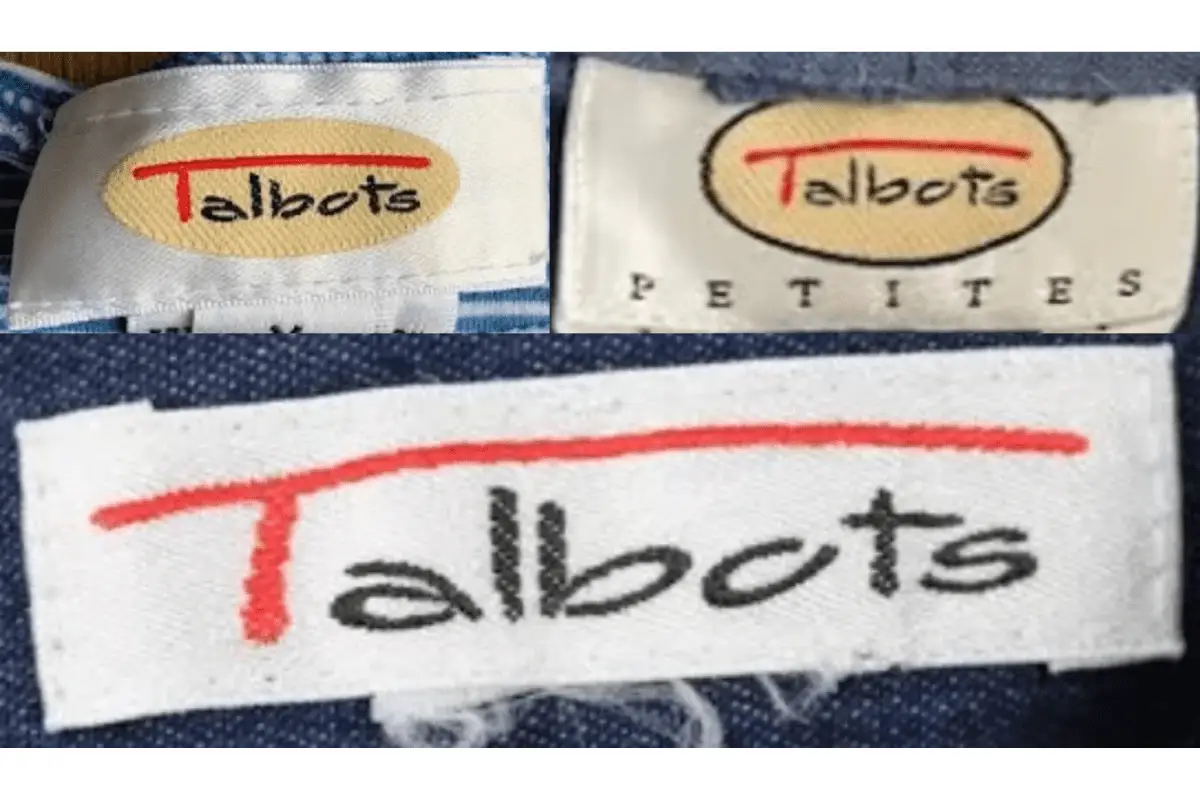
1990s Talbots tags
2000s vintage Talbots tags
- Modernization of the logo with cleaner, more streamlined designs.
- Use of different materials and textures for the tags, moving towards a more luxurious feel.
- Introduction of special collections, with tags reflecting the particular line (e.g., “Collection” or “Petites”).
- More emphasis on branding consistency, with the red underline beneath the “T” becoming a staple across different tag designs.
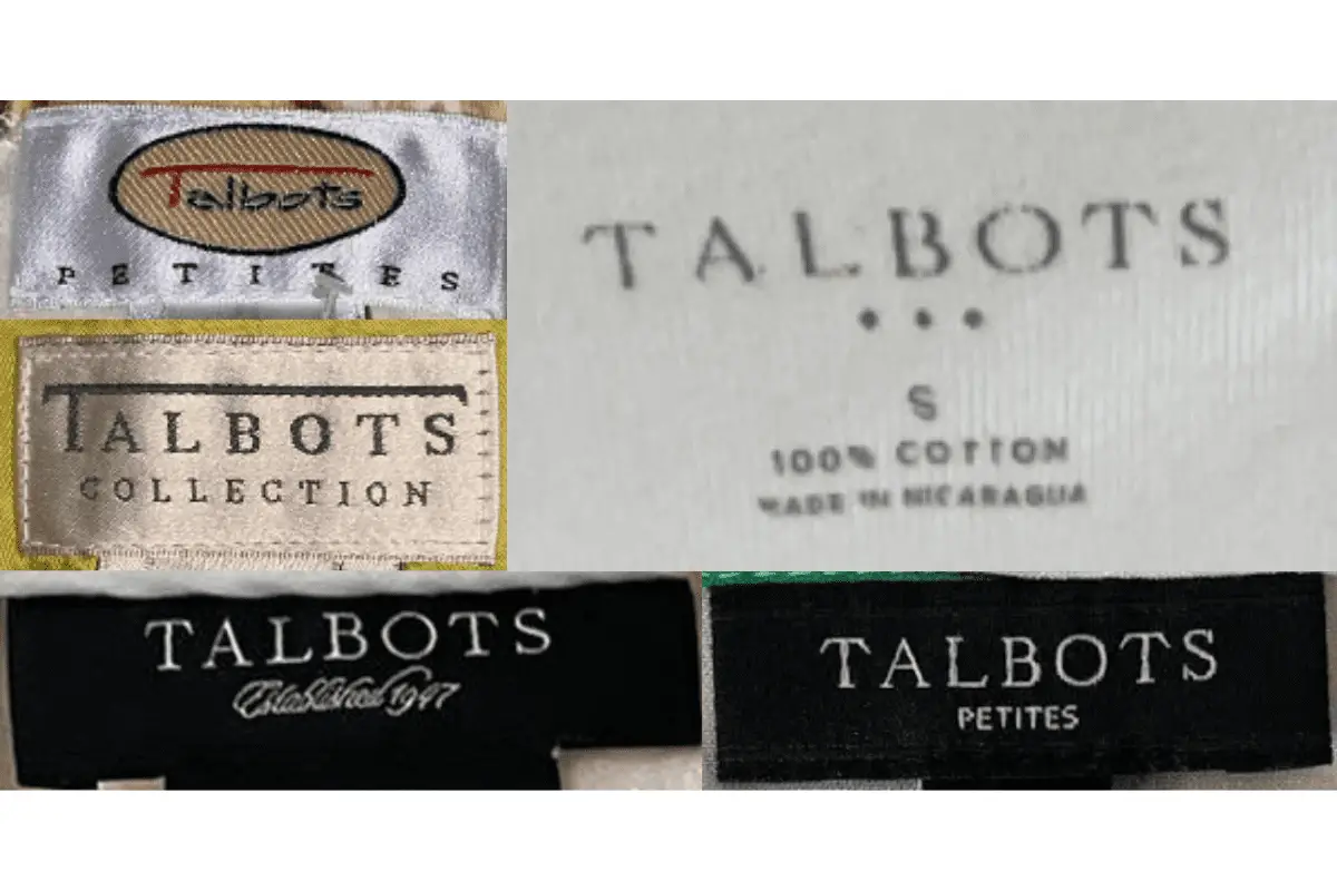
2000s Talbots tags


Your point of view caught my eye and was very interesting. Thanks. I have a question for you.