The Limited is a name that resonates with generations of fashion-conscious consumers, tracing its origins back to the early 1960s. Founded by Leslie Wexner in 1963, The Limited started as a modest women’s clothing store in Upper Arlington, Ohio, and grew into a retail empire that influenced American fashion for decades. Wexner, who borrowed $10,000 to launch the store, envisioned a brand that catered specifically to the needs of younger women, which was a departure from his parents’ more traditional general merchandise store. The Limited’s focus on trendy, accessible fashion for women quickly struck a chord, setting the stage for its expansion into a major player in the retail industry.
The brand’s growth was meteoric, marked by strategic acquisitions and an evolving product line that kept pace with changing fashion trends. By the 1980s, The Limited had become a household name, not just for its own stores, but also for its portfolio of other iconic brands, including Victoria’s Secret, Express, and Bath & Body Works. The company’s ability to adapt to the shifting retail landscape, coupled with Wexner’s keen business acumen, propelled it to new heights throughout the late 20th century. The Limited’s influence extended far beyond clothing, as it became synonymous with the rise of the American shopping mall culture, where its stores were a staple.
However, the new millennium brought significant challenges. The Limited struggled to maintain its relevance in an increasingly competitive retail environment, leading to the sale of its remaining shares and a shift in ownership. Despite these hurdles, The Limited’s legacy endures. Today, the brand is owned by Sycamore Partners and is sold exclusively through Belk, a Southern department store. While its physical stores have shuttered, The Limited’s impact on fashion and retail remains a significant chapter in American retail history. Understanding the brand’s journey through its logos and tags not only offers a glimpse into its past but also provides collectors and fashion enthusiasts with valuable insights into its evolution.
How to tell if The Limited is vintage from the logo
The Limited has undergone several transformations in its branding over the decades, which can be traced through the evolution of its logo. The changes in typography, design elements, and overall style offer valuable clues for identifying the era of a particular piece. Below is a guide to understanding how The Limited’s logo has evolved, based on the logos provided.
1963 to 1975 The Limited logo
- The earliest logo from The Limited features a classic and elegant serif font.
- The words “the Limited” are in lowercase, with “Limited” capitalized, signaling the brand’s focus on sophistication.
- The logo is framed within a unique shield-like shape, emphasizing a more formal and refined aesthetic.
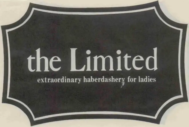
1963 to 1975 The Limited logo
1975 to 1980s The Limited logo
- The logo evolves to a more modern and simplistic design, moving away from the earlier serif font.
- The typography becomes bolder with a more contemporary sans-serif font, highlighting the brand’s shift towards a more youthful and modern image.
- The text is enclosed within a rounded rectangular border, reinforcing a more streamlined and cohesive look.

1975 to 1980s The Limited logo
1976 to 1980s The Limited logo
- This era sees the introduction of a more playful design with the red dot replacing the “d” in “Limited,” adding a pop of color and visual interest.
- The font remains bold and sans-serif, but the addition of the red dot adds a distinctive and memorable element to the logo.
- The design is more horizontal and elongated, catering to the brand’s growing appeal in casual fashion.

1976 to 1980s The Limited logo
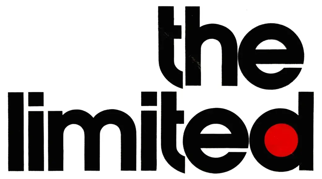
1976 to 1980s The Limited logo
1980s to 1990 The Limited logo
- The logo from this era adopts a more solid and authoritative look with a thicker, more robust font.
- The text “THE LIMITED” is enclosed within a two-toned rectangular block, indicating a strong brand presence and identity.
- The design reflects the brand’s expansion and dominance in the retail market during this period.

1980s to 1990 The Limited logo
1990 to 2018 The Limited logo
- The logo simplifies further, reflecting the minimalistic trends of the 1990s and 2000s.
- The font is clean, slim, and uppercase, creating a modern and sleek appearance.
- The logo is no longer enclosed, giving it a more open and accessible feel, aligning with the brand’s focus on a broader customer base.

1990 to 2018 The Limited logo
2012 to 2018 The Limited logo
- This logo represents a more minimalist and elegant design, with thin, spaced-out letters.
- The font is all uppercase and sans-serif, emphasizing simplicity and modernity.
- The logo is paired with a bold, contrasting black and white background, signifying a return to classic and timeless branding.
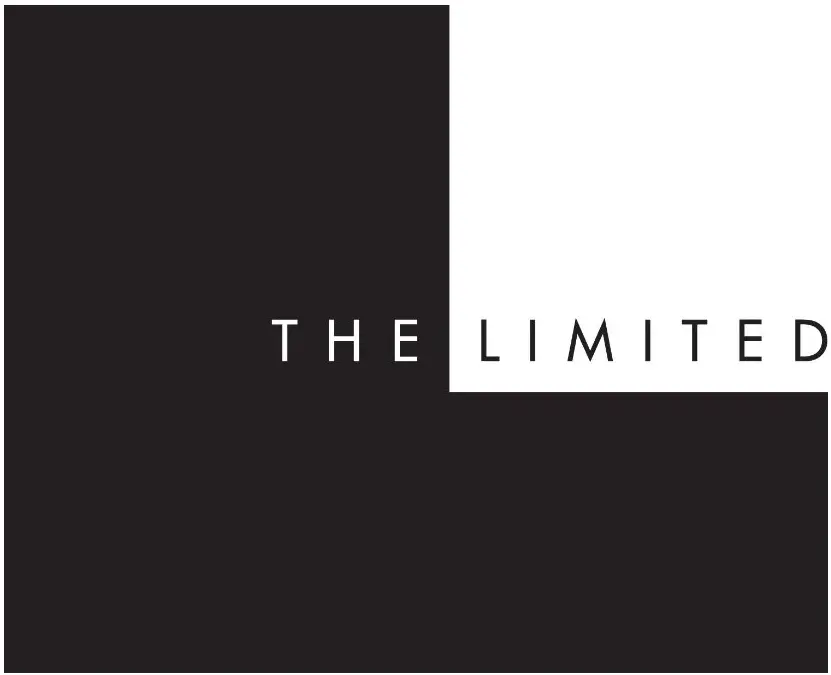
2012 to 2018 The Limited logo
How to tell if The Limited is vintage from the tags
The Limited, a popular brand known for its fashionable and accessible clothing, has gone through various phases of brand evolution, reflected in the design of its garment tags. Over the decades, The Limited has updated its logo and tag design to reflect the changing trends and brand identity. By examining the details of these tags, one can determine the era in which a particular piece was manufactured. Below is a breakdown of vintage tags from The Limited across the 1970s to the 2010s.
Having difficulty identifying vintage tags or labels? Submit a picture on our vintage tag identification page, and we’ll assist you!
1970s vintage The Limited tags
- Simple, rounded logo with a playful, lowercase font.
- Tags often featured the full brand name in a bold and straightforward style.
- Occasionally, additional text like “Made in Korea” is found, indicating production details.
- The tags typically used neutral colors such as black or white as a background.
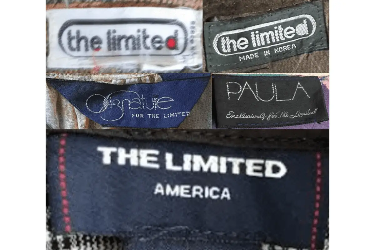
1970s The Limited tags
1980s vintage The Limited tags
- The logo became more refined with a more modern, minimalist approach.
- Tags from this era often used a serif font, giving them a more sophisticated appearance.
- Branding sometimes included the word “America,” emphasizing its national identity.
- Use of darker colors became more common, with black tags and white lettering being prevalent.
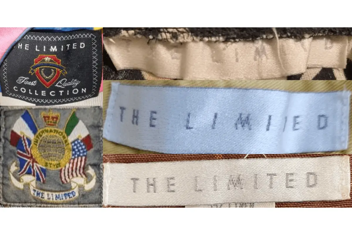
1980s The Limited tags
1990s vintage The Limited tags
- The brand’s identity became more streamlined with simple and clean fonts.
- Tags from this period often included additional phrases like “The Limited Stretch” indicating fabric innovations.
- The logo was generally centered on the tag, maintaining a consistent brand presentation.
- Occasionally, more elaborate designs such as “Finest Quality Collection” tags were introduced, indicating premium lines.
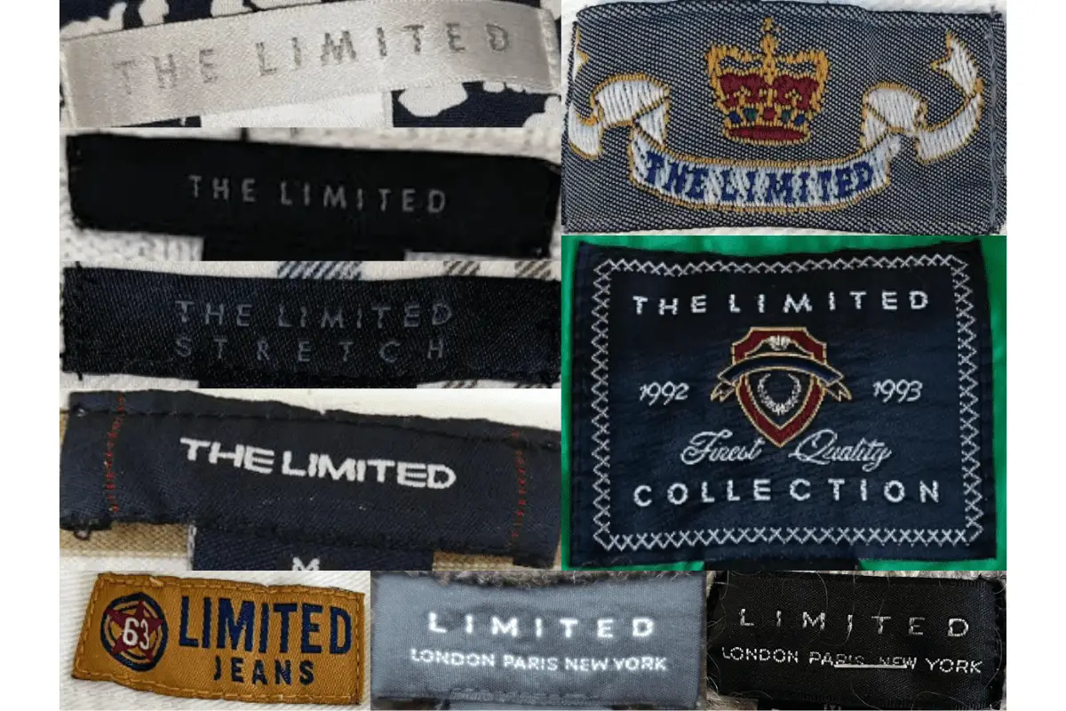
1990s The Limited tags
2000s vintage The Limited tags
- Continued use of minimalistic designs with a focus on elegance and simplicity.
- Tags often featured a more condensed font, sometimes italicized for a modern look.
- Special editions, such as “Limited Edition” tags, started to appear, reflecting the brand’s exclusivity.
- Consistent use of black tags with white or light-colored text persisted, maintaining brand consistency.
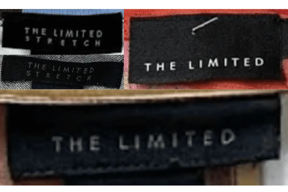
2000s The Limited tags
2010s vintage The Limited tags
- Modernized tag designs with sleek, sharp fonts and clean lines.
- Some tags featured phrases like “Essential Shirt,” indicating specific product lines.
- The brand name “The Limited” is typically presented in a bold, uppercase font.
- Colors remained consistent with previous decades, focusing on simplicity and contrast.
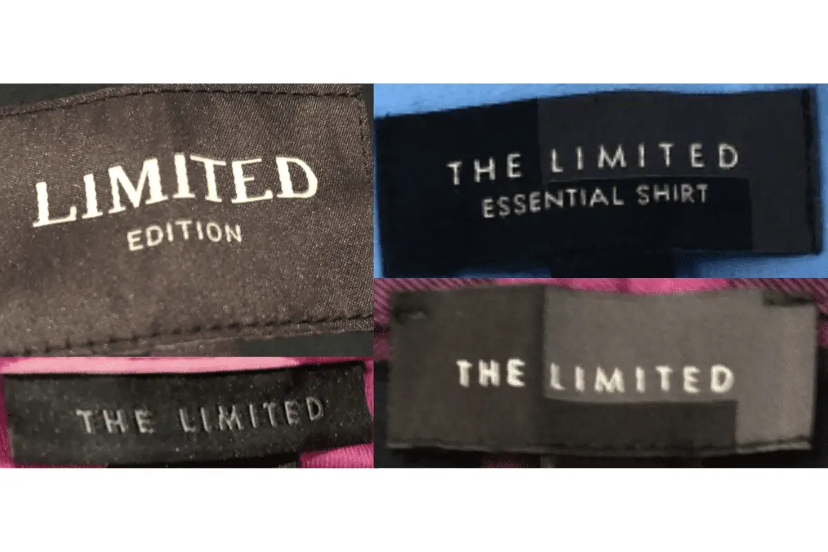
2010s The Limited tags



Your point of view caught my eye and was very interesting. Thanks. I have a question for you.
Your point of view caught my eye and was very interesting. Thanks. I have a question for you.